Here's the latest variant picture for Australia.
BA.1 (Omicron) is perhaps more dominant in Australia than in any other country.
While there was an existing Delta outbreak in 2 states, the arrival of Omicron was just before most NPIs were abandoned, with most not reinstated
🧵
BA.1 (Omicron) is perhaps more dominant in Australia than in any other country.
While there was an existing Delta outbreak in 2 states, the arrival of Omicron was just before most NPIs were abandoned, with most not reinstated
🧵

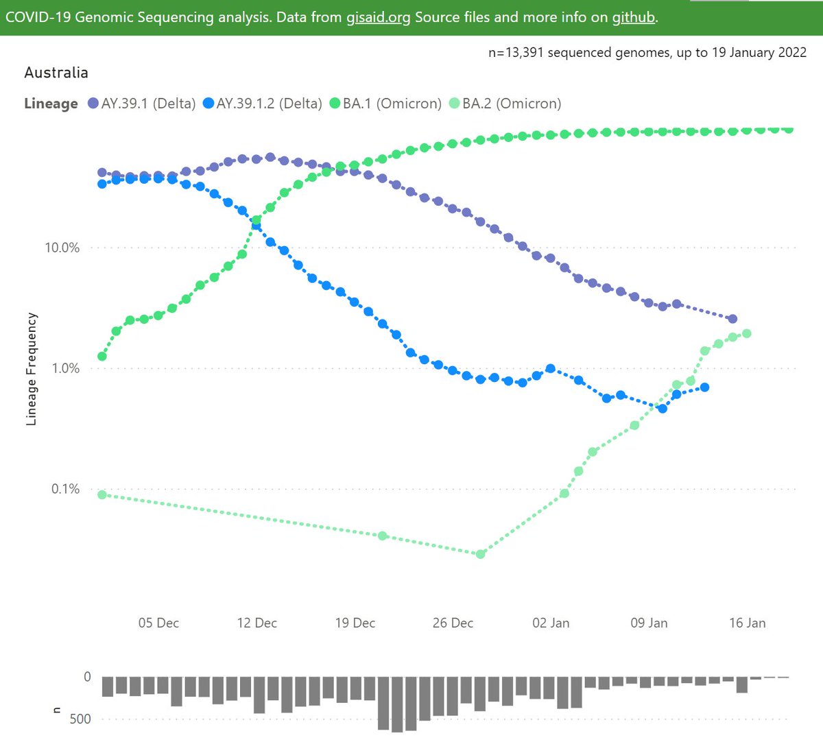
The BA.2 sibling Omicron lineage is present, but at relatively low frequency.
BA.2 is out-competing BA.1 in several countries around the world, as shown on this thread.
BA.2 is out-competing BA.1 in several countries around the world, as shown on this thread.
https://twitter.com/Mike_Honey_/status/1485408294038810624?s=20
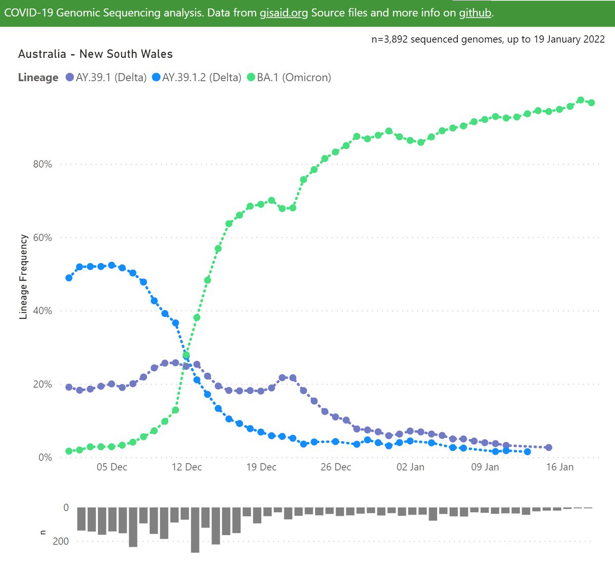
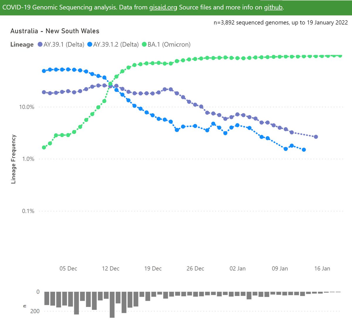
The Australian states each have fairly discrete outbreaks with quite different profiles.
Here's New South Wales, where NPIs were first dropped as BA.1 arrived, and multiple super-spreader events in mid-December. Together that paved the way for the total dominance at ~95%.
Here's New South Wales, where NPIs were first dropped as BA.1 arrived, and multiple super-spreader events in mid-December. Together that paved the way for the total dominance at ~95%.
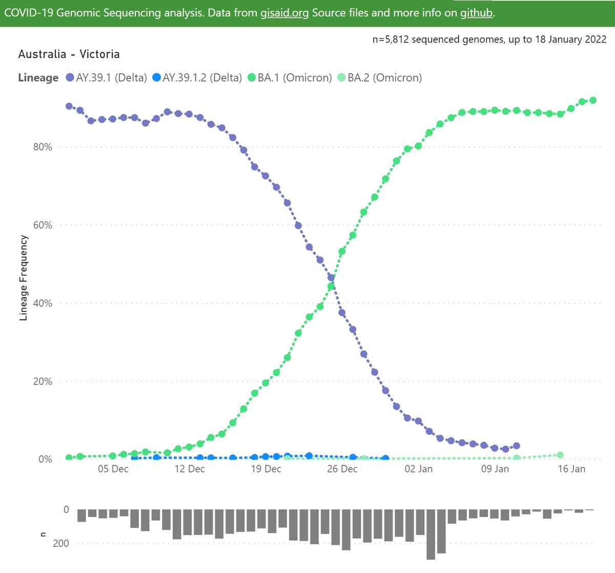
Victoria's profile is quite different. There was a larger Delta outbreak for Omicron to overcome.
By now the end result is becoming similar to NSW, with BA.1 at ~92%.
By now the end result is becoming similar to NSW, with BA.1 at ~92%.

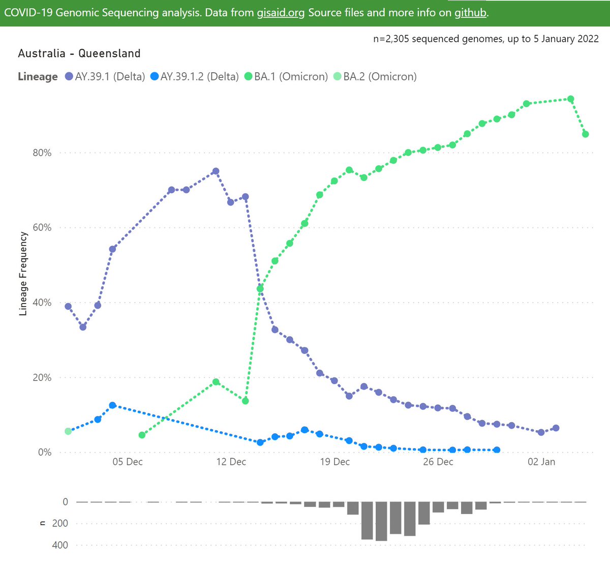
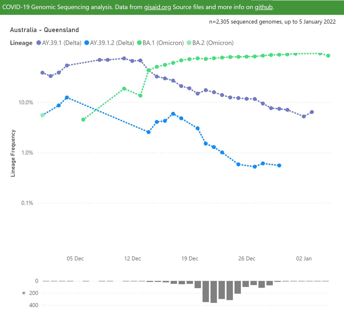
Queensland has been dominated by Omicron - the Delta outbreaks before NPIs were dropped were well controlled.
Queensland's samples have been a bit thin since the holiday break and are unusually lagging the larger states at present.
Queensland's samples have been a bit thin since the holiday break and are unusually lagging the larger states at present.
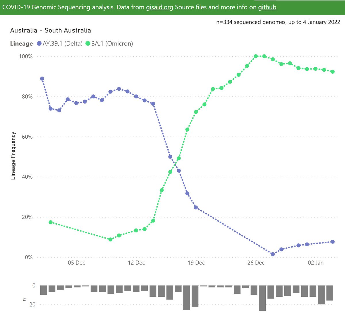
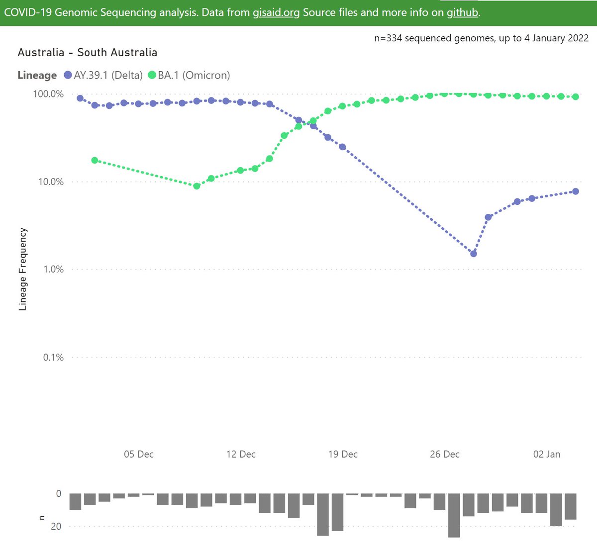
At one point in late December, South Australia had the purest Omicron outbreak in Australia, probably globally.
It's interesting to see Delta has been hanging on since, even though the prior Delta outbreak was at relatively low case rates.
It's interesting to see Delta has been hanging on since, even though the prior Delta outbreak was at relatively low case rates.
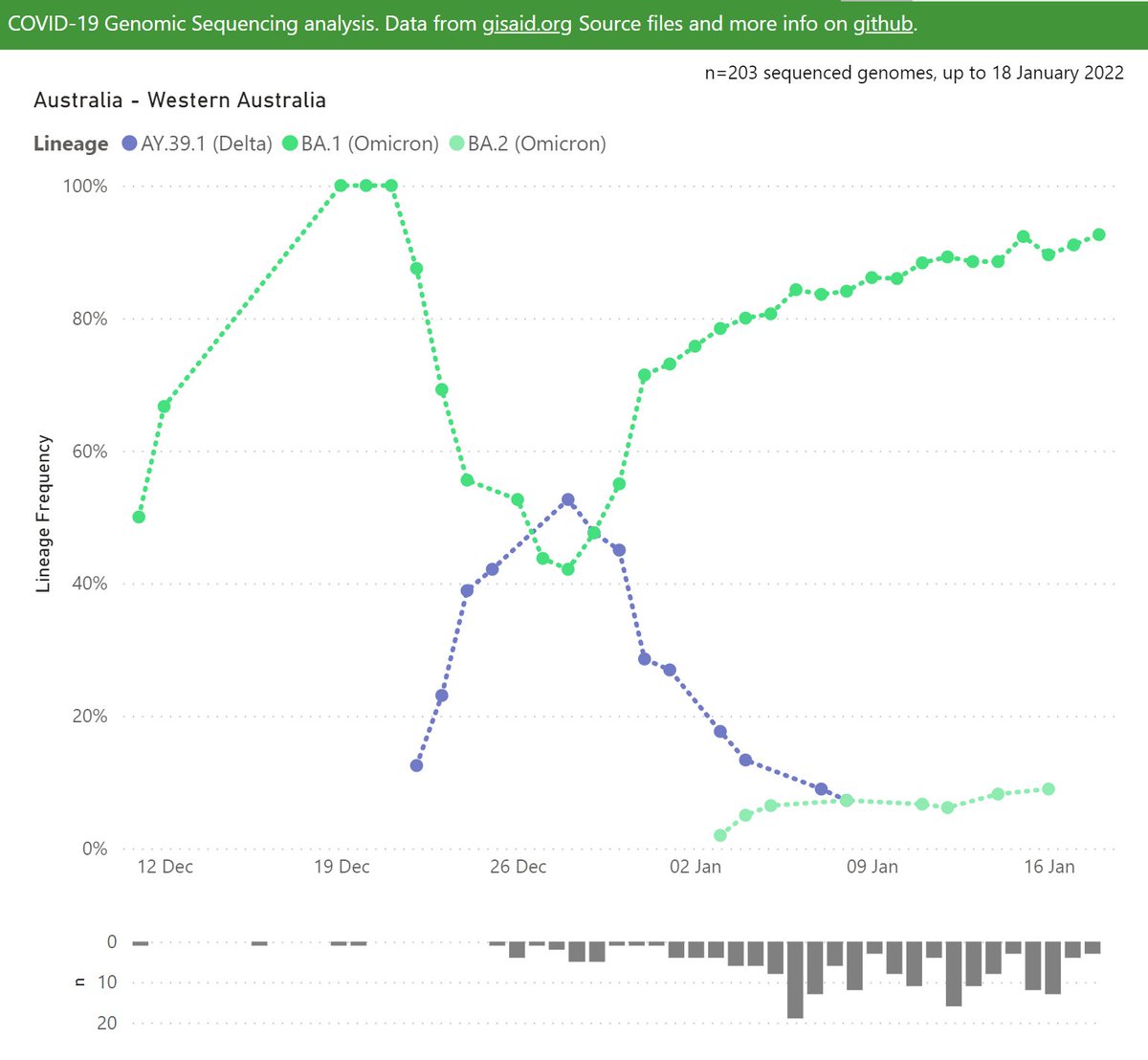
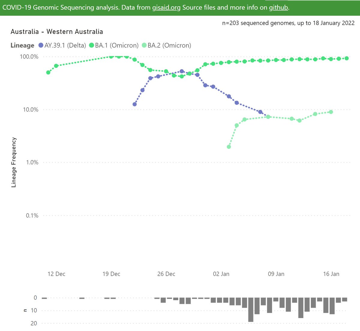
In Western Australia, a few small Delta and Omicron community outbreaks occurred during December and early January.
Now a larger outbreak of Omicron has started, which looks likely to be BA.1
Now a larger outbreak of Omicron has started, which looks likely to be BA.1
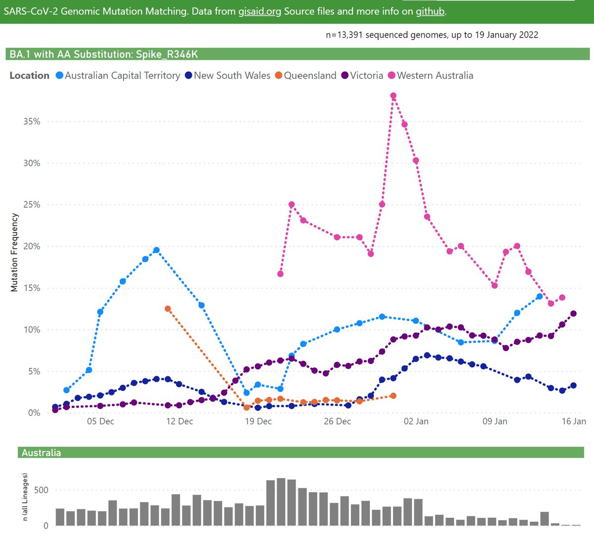
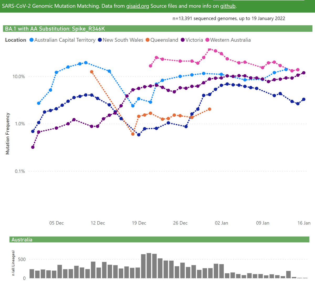
BA.1 with the Spike R346K mutation was classified quite recently as BA.1.1. That mutation is understood to give increased immunity escape.
That lineage change has not yet flowed out to databases and websites.
Here's the frequency of BA.1.1 in Australian samples:
That lineage change has not yet flowed out to databases and websites.
Here's the frequency of BA.1.1 in Australian samples:
Here's my recent thread on BA.1.1 globally
https://twitter.com/Mike_Honey_/status/1485522285117452288?s=20
• • •
Missing some Tweet in this thread? You can try to
force a refresh