Here's what's new in Android 13 Developer Preview 1
(thread)
(thread)
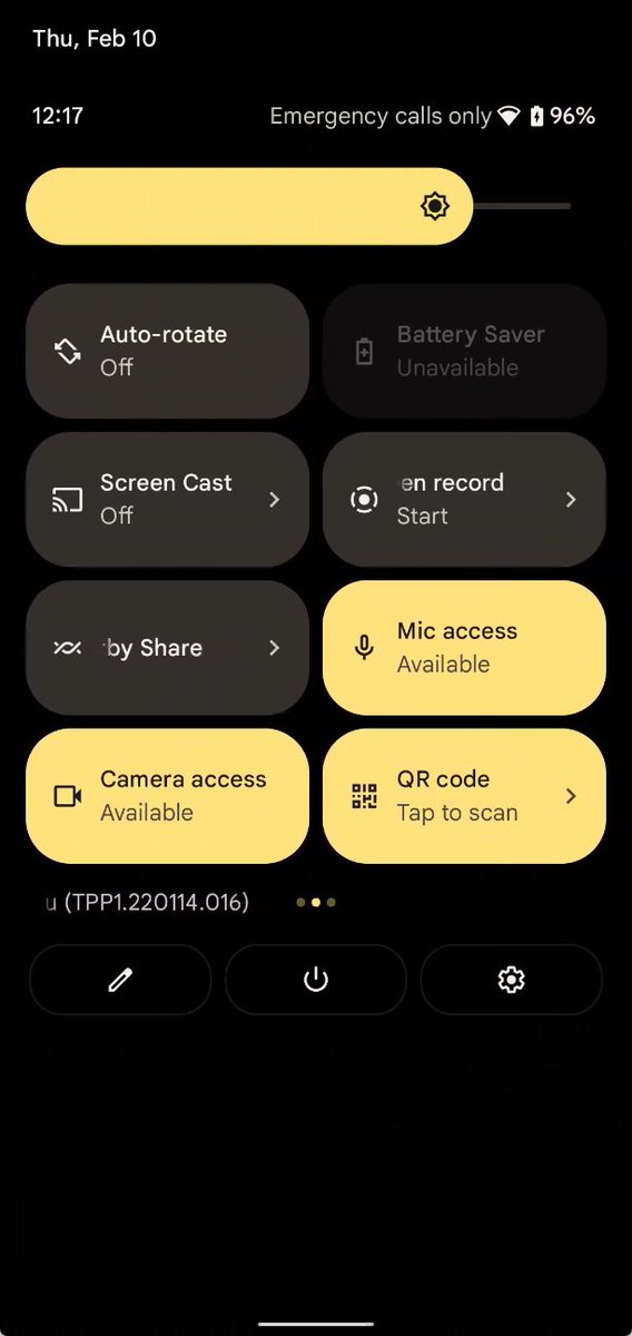
A Quick Setting tile to launch a QR code scanner is here. It's grayed out by default, but you can enable it w/
'cmd device_config put systemui default_qr_code_scanner {component}'
where {component} is the component of a QR code scanner activity (can be anything really)

'cmd device_config put systemui default_qr_code_scanner {component}'
where {component} is the component of a QR code scanner activity (can be anything really)

The media output picker UI has been redesigned. The volume slider for each connected device is larger and prettier. 

It seems Themed App Icons aren't yet enabled in DP1. I added a monochromatic icon to a test app and <monochrome android:drawable="@drawable/ic_test_mono" /> in ic_launcher.xml, but the icon isn't themed.
The Launcher3 feature flag/boolean pref are likely not set to true yet.
The Launcher3 feature flag/boolean pref are likely not set to true yet.

This build is quite old, by the way. If it seems like there aren't many new features in Android 13, it's because the Developer Preview 1 build is way behind the current internal code.
New foreground service manager w/ a Quick Setting tile. Tapping it opens a dialog that shows the currently running apps.
This is disabled by default in 13 DP1.

This is disabled by default in 13 DP1.


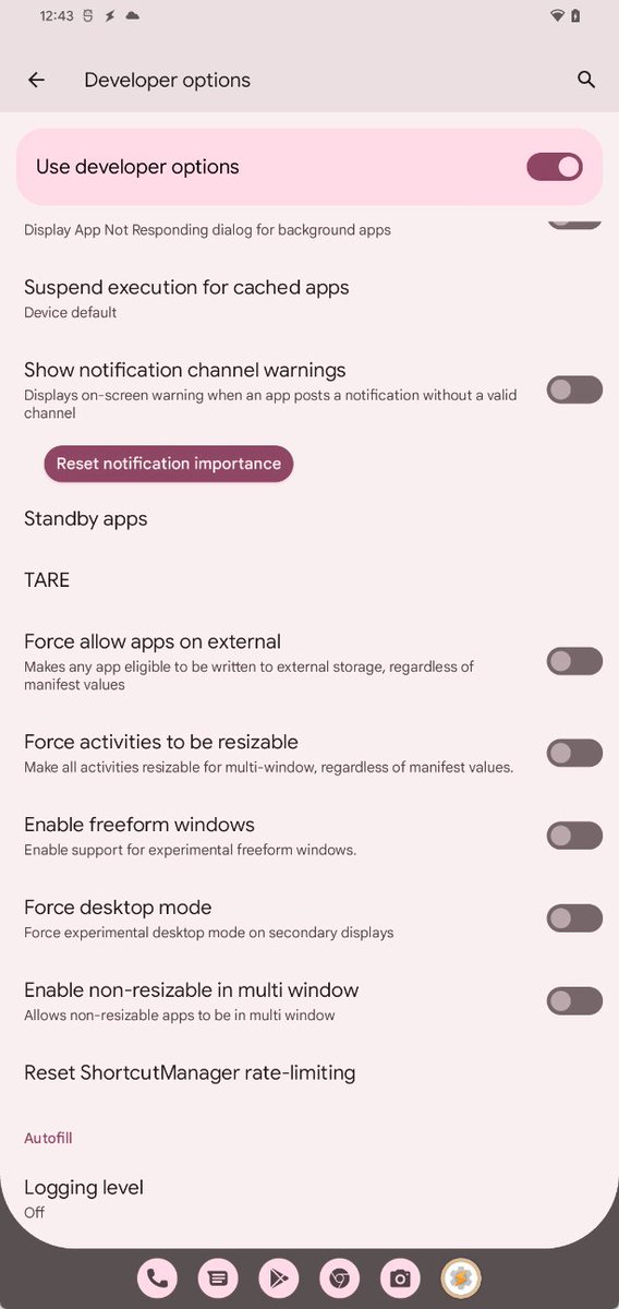
The Android Resource Economy (TARE) has been added to Developer Options. TARE manages how apps queue tasks by delegating "credits" to apps that they can "spend" on queuing tasks. 




Seems runtime permissions for notifications is here, even if Google didn't announce it. The new android.permission.POST_NOTIFICATIONS permission has a protection level of 'dangerous'. It's pre-granted to certain apps and will only be enforced on apps targeting the new API level. 


Under Settings > System > Gestures > System navigation, a new submenu has been added for the 3-button navigation that lets you disable "hold Home to invoke assistant". 


Privacy dashboard is testing a new "show 7 days" mode that lets you see which apps have accessed "dangerous"/runtime permissions in the last 7 days as opposed to the last 24 hours. This is not enabled by default. 


Android 13 adds a smart idle maintenance service, which intelligently determines when to trigger filesystem defragmentation without hurting the lifetime of the UFS storage chip.
'sm idle-maint [run|abort]]
AOSP commits: android-review.googlesource.com/q/topic:smart-…
'sm idle-maint [run|abort]]
AOSP commits: android-review.googlesource.com/q/topic:smart-…

Going to publish my deep dive now on @Esperdev with all the surface-level stuff I've found. Will continue to dig around to see what Google added but hasn't enabled.
Setting your phone to silent will also disable all haptics - even ones for gesture nav. Already heard a few complaints about this change. 


The split screen button in PiP windows is here, but I suspect that's because this build was built before the code change that disabled this feature by default was merged. So it's possible it'll be disabled by default in future previews, and only enabled on large screen devices. 

For some reason, per-app language preferences - one of the features Google announced in the Android 13 DP1 blog post - isn't enabled by default. However, it is there. 


Android 12L Beta 3 introduced the 6x5 app grid size for large screen devices, but it seems that in Android 13, this is the *only* grid size available on large screen devices. 


AppSearch experimental flags has added "Google Suggest" as an option. Haven't investigated what it's supposed to do yet.

https://twitter.com/MishaalRahman/status/1415357094375608328

Android 13 has a hidden "clipboard auto clear" feature. This feature clears the primary clipboard item after a set amount of time. Yes, Gboard does this, but this feature works with all input methods. You can learn more about it here: blog.esper.io/android-13-dee…
This is disabled by default, but Android 13 can show the user profile switcher on the lock screen keyguard (ie. the place where you enter your PIN/password/pattern). Probably intended for large screen devices.
For details/screenshots, click the link!
blog.esper.io/android-13-dee…
For details/screenshots, click the link!
blog.esper.io/android-13-dee…
Lock screen rotation is now enabled by default (finally), but the lock screen will only rotate on large screen devices.
blog.esper.io/android-13-dee…
blog.esper.io/android-13-dee…
The UI demo for the Media Tap To Transfer feature reported by @AndroidPolice is present in Android 13 DP1. However, there are still few hints about how it'll actually work.
For details and screenshots, click the link: blog.esper.io/android-13-dee…
For details and screenshots, click the link: blog.esper.io/android-13-dee…
Last post for tonight. Google is testing a redesign of the media player UI. It doesn't seem finished yet as there's no album art, but it hints at what's coming.
Details and screenshots: blog.esper.io/android-13-dee…
Thanks to @kdrag0n for his help w/ this and the previous feature!
Details and screenshots: blog.esper.io/android-13-dee…
Thanks to @kdrag0n for his help w/ this and the previous feature!
I have a couple of more things I found that I plan to talk about tomorrow, so keep an eye out on this thread + the @Esperdev blog!
I'm back with more! Today, I've added two new sections to my deep dive that cover the BIG changes that Google is preparing to make to the tablet experience in Android 13.
The first one is hub mode, also called communal mode. This feature is intended to let users share apps between profiles on a common surface, which could be a revamped screen saver (!)
blog.esper.io/android-13-dee…
blog.esper.io/android-13-dee…
The second one is, as I've just alluded to, a screen saver revamp. Google is preparing to introduce "complications" (think watches/Wear OS) to screen savers. Couple this w/ the dock-related changes, and it's clear that hub tablets are getting some love!
blog.esper.io/android-13-dee…
blog.esper.io/android-13-dee…
There may be app widget integration w/ complications as well.
And "idle" monitoring that uses the ambient light sensor to check for low light conditions/dream state and enters doze mode appropriately.
New mainline modules in Android 13:
com.android.auxiliary
com.android.cronet
com.android.nearby
com.android.sepolicy
com.android.supplementalprocess
com.android.uwb
com.android.auxiliary
com.android.cronet
com.android.nearby
com.android.sepolicy
com.android.supplementalprocess
com.android.uwb
Yes, it's true: Google is introducing Material You dynamic color styles that adjust the hue and chroma values when monet generates the 5 MY tonal palettes.
Details here on how it works: blog.esper.io/android-13-dee…
Details here on how it works: blog.esper.io/android-13-dee…
• • •
Missing some Tweet in this thread? You can try to
force a refresh


