Steve ✦ Lowtwait Profile picture
Mar 15, 2022 13 tweets 5 min read Read on X
Let's discuss pushing the boundaries of distortion and style for cinematic and emotional impact.

An environment design thread: Image
Spoiler alert. We have this #BigCityGreens episode called Big Trouble where Tilly "goes bad" and wrestles with her internal demons.

That emotional conflict is what this thread is about. Image
There's this shot in the storyboard (by @Hug_bees) where Tilly faces her guilt over some bad decisions.

The background is drawn in a distorted manner to reflect the turbulent emotional struggle within her.

How do I push that feeling in the final background design? Image
I started by roughing out the room in more detail to match the existing designs.

I used no perspective guides in this one but overall stuck with the distorted composition of the board panel. Image
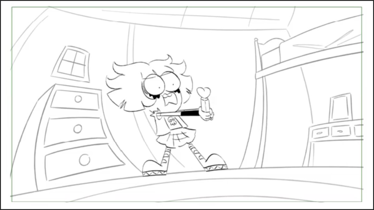
Before I show you how I cleaned it up, let's look at Tilly's Pez dispenser manifesting her guilt.

This storyboard panel has sketchy, hatched line work.

This was my muse.

So as Art Director, I decided this would be the aesthetic for part of the sequence. Image
And so in the background design, I cleaned it up with a gestural, sketchy line quality.

This fits with the emotional impact of the scene in that it's a rough moment for Tilly.

But this still wasn't enough. Image
I added sketchy textures on many of the major surfaces.

If it were just the outlines, then I knew the sketchiness would get lost once the scene was painted.

Extra textures gives the painter a way to further maintain and push the intended sketchiness.

This is my final design: Image
In final paint, the sketchy textures come alive.

The environment works well to set the stage for the emotional torment of Tilly's guilt. Image
But then there's a critical moment where she feels the pain of her guilt enveloped around her like a nightmare.

And it looks like this. Image
You don't always have to stick to an established style within a project.

Sometimes it makes sense to break into new aesthetics for emotional impact.
The final character design of the creepy Pez dispenser also maintained the sketchy line quality, helping to pull the whole sequence together. ImageImage
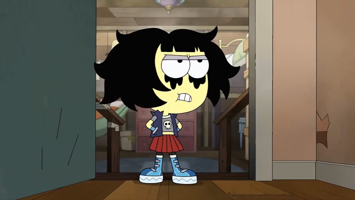
Here's a look at the final composited shot of animation, and the storyboard panel for the scene.

This is one of those instances where the intension of the storyboard translated directly to the finished episode. ImageImage
Want more drawing insights? I got you covered.

All my best tweets:
stevelowtwait.com/lessons

• • •

Missing some Tweet in this thread? You can try to force a refresh
 

Keep Current with Steve ✦ Lowtwait

Steve ✦ Lowtwait Profile picture

Stay in touch and get notified when new unrolls are available from this author!

Read all threads

This Thread may be Removed Anytime!

PDF

Twitter may remove this content at anytime! Save it as PDF for later use!

Try unrolling a thread yourself!

how to unroll video
  1. Follow @ThreadReaderApp to mention us!

  2. From a Twitter thread mention us with a keyword "unroll"
@threadreaderapp unroll

Practice here first or read more on our help page!

More from @Lowtwait

Mar 9, 2022
Designing a TV animation background of a biker bar, and how to add snow.

A step-by-step thread: Image
Here I start with the storyboard panel. It's quite rough and basic, a simple box building with a funny name.

This allows for a lot of creative freedom but I like that it's somewhat plain and windowless. Image
I rough the design over the storyboard making most of my creative choices.

Thinking about lighting in color, I add the pole on the left for an off-screen light source.

The type I hand drew for a specific style.

The motorcycles I backed in because bikers often do that. Image
Read 14 tweets
Oct 13, 2020
From storyboard to background design.

Drawing a pirate ship dinner theater. Heck yeah!

A TV animation step-by-step thread: ImageImage
First, define perspective.

I lay some pre-made grids over the storyboard panel and adjust them with Photoshop's perspective tool. I eyeball it this time instead of using vanishing points.

The horizon line (dark blue) is near the top of the frame so we look down into the room. Image
Then using the storyboard as a guide, I rough in the architecture and major elements.

Though I used reference for the pirate ship, it's a theater stage, not a seafaring vessel, so I cheated a lot of the logistics of a ship.

That's fine. It's a cartoon. Image
Read 11 tweets
Oct 1, 2020
Let's combine 2 drawing tricks I recently covered:

- Drawing half a scene for symmetrical design.
- Applying dynamic perspective in Photoshop.

Another step-by-step thread: Image
Since it's October, I chose this shot of a Halloween superstore from #BigCityGreens.

I drew a vertical line through the exact center of the canvas as a guide.

Placing my vanishing point low in the scene will create the perspective of looking upward. Image
Because this is a symmetrical scene, I only needed to draw half the rough up to my vertical centerline.

This is my first trick.

Even the pumpkin with its clever infinity symbol eyes are symmetrical. Image
Read 15 tweets
Sep 29, 2020
Let's study this masterful scene from Bambi to learn about framing characters using foreground elements.

What looks like random branches is carefully planned out to work for multiple character actions.

A breakdown thread: Image
The scene opens with Bambi's mother fully in frame behind some foliage.

A character's face is the most important feature audiences connect with.

So even in this brief action of a single step forward, her eyes and nose are visible, framed by branches. Image
Designing multiple "windows" between the branches (negative space) helps control the audience's focus.

As Mother stops and pulls back, her face now obscured, we are directed toward Bambi entering into his own window. Image
Read 13 tweets
Sep 28, 2020
My rule of thumb for #CharacterDesign is that you should be able to recognize your characters by their silhouettes.

This boils down to shape.

For human characters, hair is a defining facet of shape.

A step-by-step thread of how I use shape: Image
I start out with bald heads.

In this case, it's my own character. In the story, there's a reason for her to have several different hairstyles.

Her bald head is like a blank canvas, a template to draw upon. Image
I draw various simplified shapes, even if they're weird, like (B).

I decided she'll have wavy hair so that's my base. What can I do with that?

The character style here isn't too outrageous so I don't go crazy. Image
Read 9 tweets
Sep 25, 2020
How I drew this library with its curved, scalloped ceiling using 1-point perspective.

A TV animation background design step-by-step thread: Image
I start by planning my perspective over the storyboard panel here.

See my vanishing point in blue?

Placing it behind a shelf simplifies the amount of work. I only need to draw one row of shelving units receding in space. (A library is tedious to draw as it is.) Image
In this shot, the shadowed character on the stairs is important.

I make sure he's within the perspective of the left side bookshelves so they help guide the viewer toward him. Image
Read 12 tweets

Did Thread Reader help you today?

Support us! We are indie developers!


This site is made by just two indie developers on a laptop doing marketing, support and development! Read more about the story.

Become a Premium Member ($3/month or $30/year) and get exclusive features!

Become Premium

Don't want to be a Premium member but still want to support us?

Make a small donation by buying us coffee ($5) or help with server cost ($10)

Donate via Paypal

Or Donate anonymously using crypto!

Ethereum

0xfe58350B80634f60Fa6Dc149a72b4DFbc17D341E copy

Bitcoin

3ATGMxNzCUFzxpMCHL5sWSt4DVtS8UqXpi copy

Thank you for your support!

Follow Us!

:(