1/ The stringency index is an arbitrary number which flattens out the extreme measures.
But let's give it a go: Summed up OWID stringency (all time). Sorted and ranked.
The trend is still clear. It gives the opposite to what was claimed.
But let's give it a go: Summed up OWID stringency (all time). Sorted and ranked.
The trend is still clear. It gives the opposite to what was claimed.
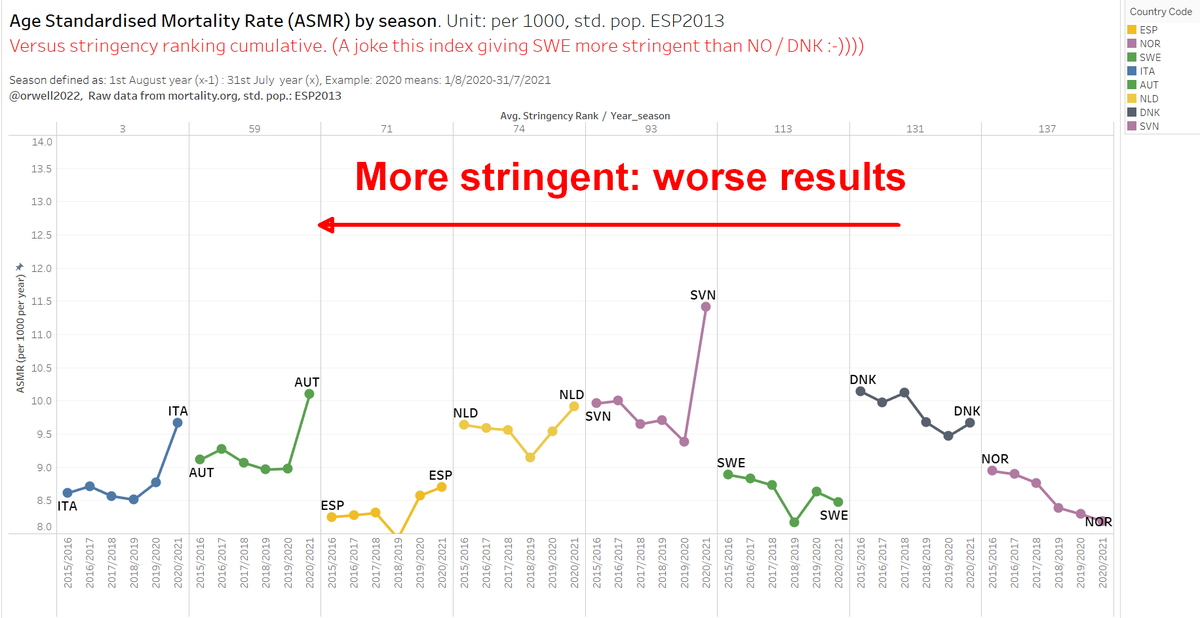
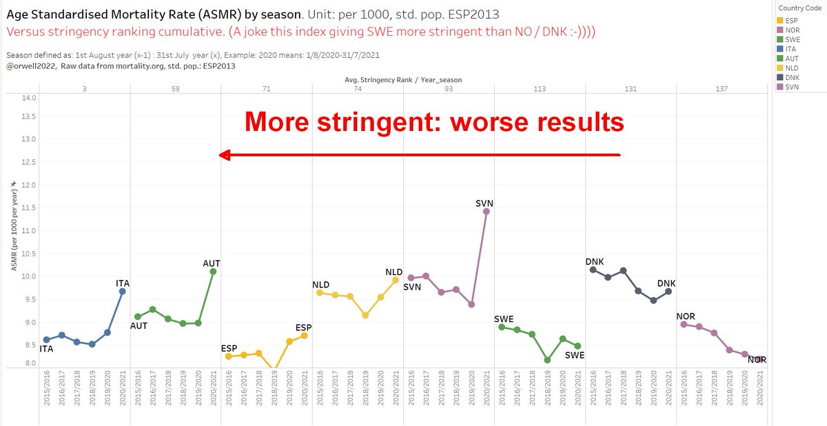
2/ The sum gives a higher stringency to SWE than NO and DNK. That's a joke showing how useless such arbitary numbers are. 😅
Still, NO, DNK, SWE are comparable in rank. But NO and DNK went further: masking, QR, lockdowns...not Sweden.
Still, NO, DNK, SWE are comparable in rank. But NO and DNK went further: masking, QR, lockdowns...not Sweden.
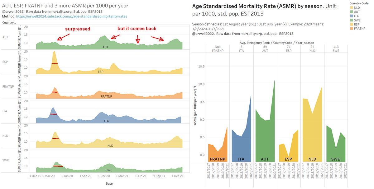
4/ You may noticed that I don’t do “excess”. I prefer to see it graphically. It’s easy for a trained eye.
SWE, NO, DNK: all is on trend < 1 sigma = insignificant.
Spain: maybe + half sigma = Insignificant.
Austria, Italy: +2 sigma. Bad
Slovenia: +3 sigma. Very bad
SWE, NO, DNK: all is on trend < 1 sigma = insignificant.
Spain: maybe + half sigma = Insignificant.
Austria, Italy: +2 sigma. Bad
Slovenia: +3 sigma. Very bad
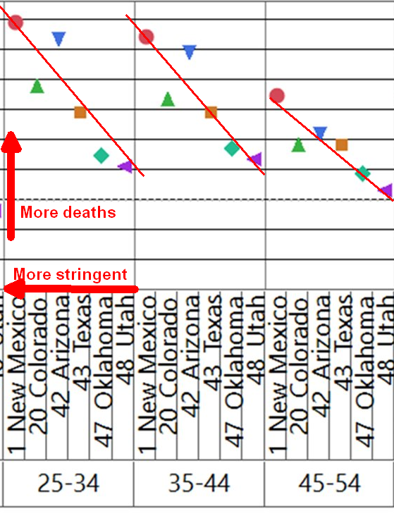
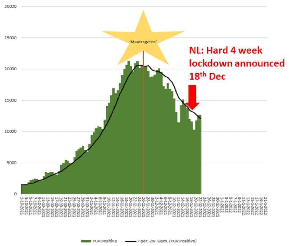
5/ Most countries practiced a punishment rather than prevention by applying post peak measures.
So I would rather call it #punishmentindex.
Austria and Germany are also mastering this post peak lockdown approach perfectly. It's a type of religious griefing.
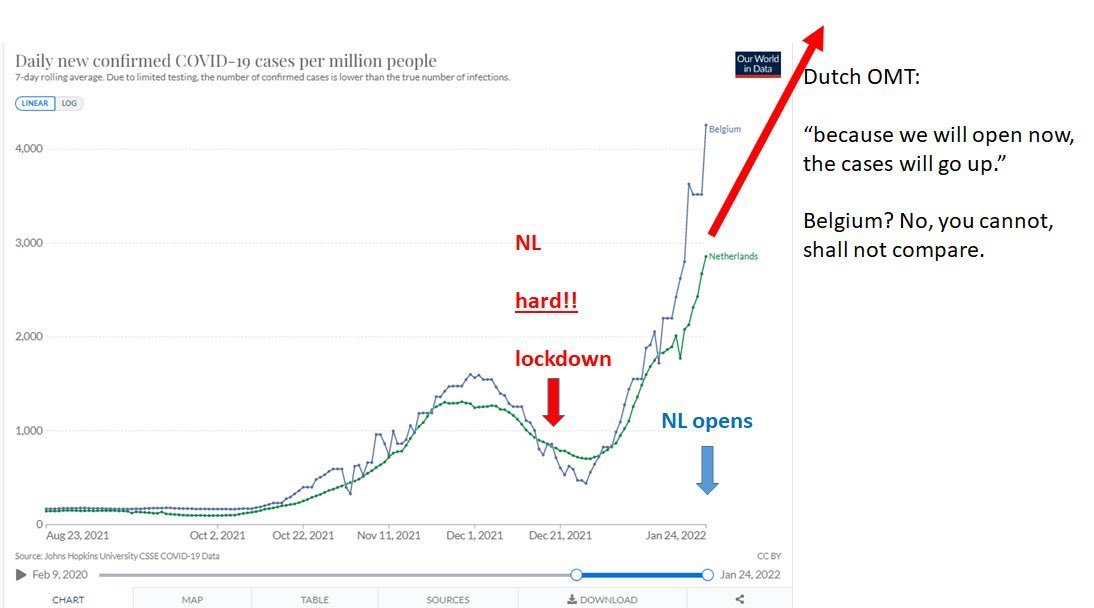
Example NL
So I would rather call it #punishmentindex.
Austria and Germany are also mastering this post peak lockdown approach perfectly. It's a type of religious griefing.
Example NL
6/ The "punishment" may correlate with culture tendencies towards autocratic systems. Let's have a look on the #punishmentindex.
The usual suspects are bad: IT, DE, AT, GR.
Skandinavia shines. I'm proud.
FR why?
The Slavic countries (beaten by history) have learned.
The usual suspects are bad: IT, DE, AT, GR.
Skandinavia shines. I'm proud.
FR why?
The Slavic countries (beaten by history) have learned.
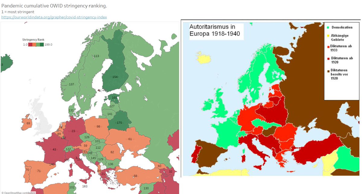
7/ Poland and Slovenia (I think SI should be top 5. The time sum flattens out what they really did) are outliers.
Those 2 are also the loudest in pushing for war.
Like most 😷 🔴🔴🔴 💉💉💉profiles.
Makes sense. Will they soon have 3 guns in their bio? "We want WW3"?
Those 2 are also the loudest in pushing for war.
Like most 😷 🔴🔴🔴 💉💉💉profiles.
Makes sense. Will they soon have 3 guns in their bio? "We want WW3"?
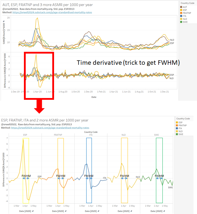
8/ The fact that most countries did mostly useless measures can be prooven by the absence of the “flattening”.
The FWHM is the same for most countries. If measures worked, this parameter should have given a signal (higher FWHM with stringency).
But let's see if we can see it?
The FWHM is the same for most countries. If measures worked, this parameter should have given a signal (higher FWHM with stringency).
But let's see if we can see it?
9/ FWHM: So what do we see? You either supress it (AT), or it's out of the bag. But it simply comes back later (AT). The overall 2 year result for AT, IT, ES, NL was negative compared with SWE.
Interessting: some flatting (peak 2020Q1) in SWE seen. They did better with much less
Interessting: some flatting (peak 2020Q1) in SWE seen. They did better with much less
10/ The only places where prolonged measures may have given a benefit is NZ and Australia. They managed to escape Wuhan, Alpha, Betta, Delta with a radical island isolation strategy. That's not an option on continents.
NZ will go through this with Omicron (luck) and vaccines.
NZ will go through this with Omicron (luck) and vaccines.
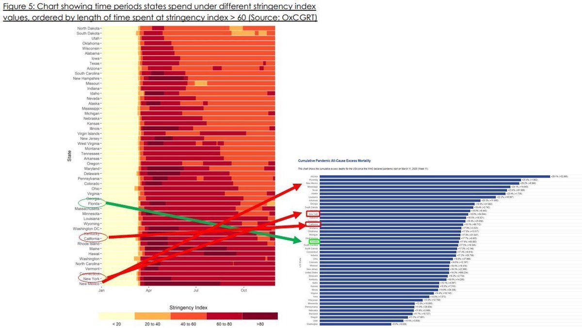
10/ So what did Oxford do to burry this unconvenient fact about Sweden?
They went full Orwellian and changed the weight.
Rewrote history to fit the official truth and narrative.
"Lockdowns and radical freedom removals over years work."
They went full Orwellian and changed the weight.
Rewrote history to fit the official truth and narrative.
"Lockdowns and radical freedom removals over years work."
https://twitter.com/TTBikeFit/status/1359911266173730816?s=20&t=6pUhlMXOvVV0l2fwCCFHAA

11/ So let's extract FWHM a bit more systematic. They all look the same, except of course Austria which completely suppressed peak 2020 Q1, but then paid the price later (and added collateral damage).
• • •
Missing some Tweet in this thread? You can try to
force a refresh