1/9
🧵 on the yield curve and how to read it.
Bottom line
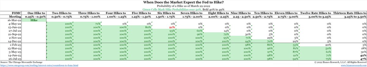
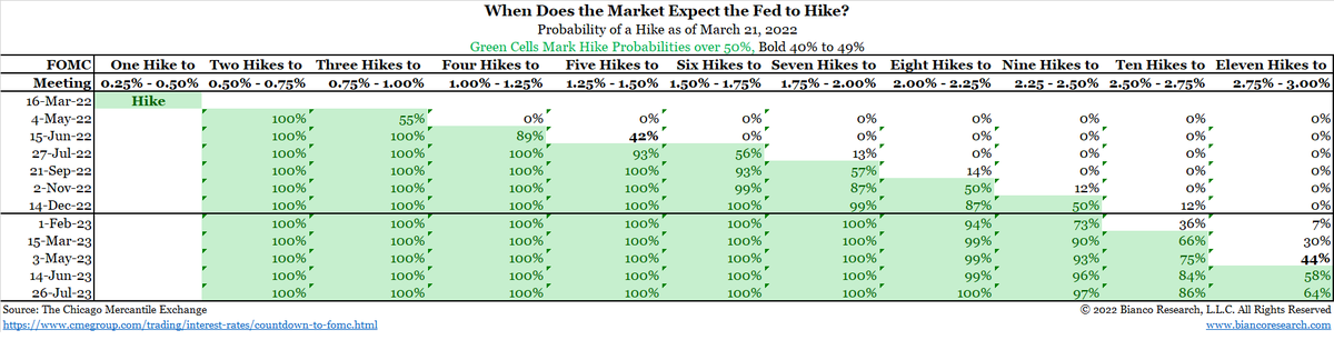
* Curves with no longer than 2-years (i.e, 3M/2Y) are steepening A LOT. They are signaling many rate hikes are coming.
See the table, 12 hikes are now priced in for the next year. Yes ... 12!
@lisaabramowicz1
🧵 on the yield curve and how to read it.
Bottom line
* Curves with no longer than 2-years (i.e, 3M/2Y) are steepening A LOT. They are signaling many rate hikes are coming.
See the table, 12 hikes are now priced in for the next year. Yes ... 12!
@lisaabramowicz1

2/9
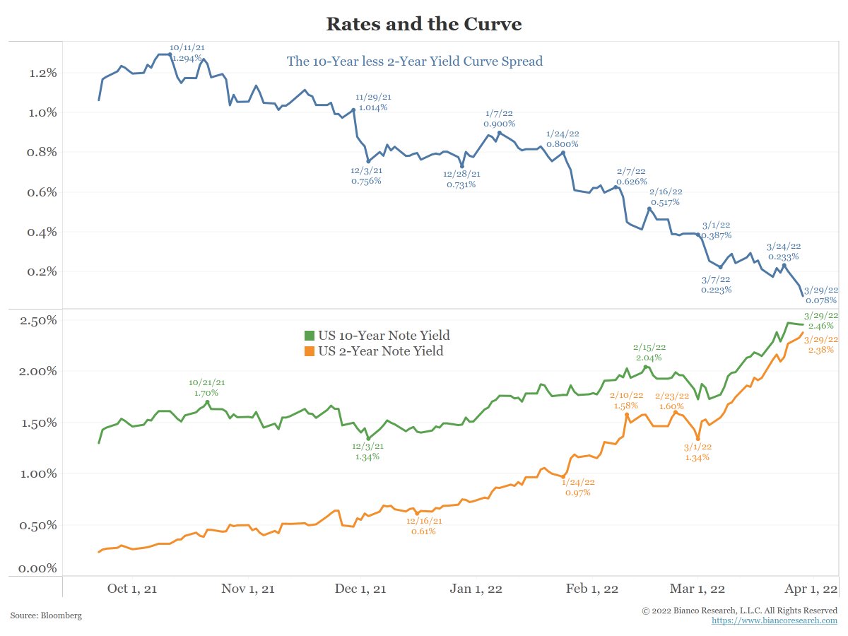
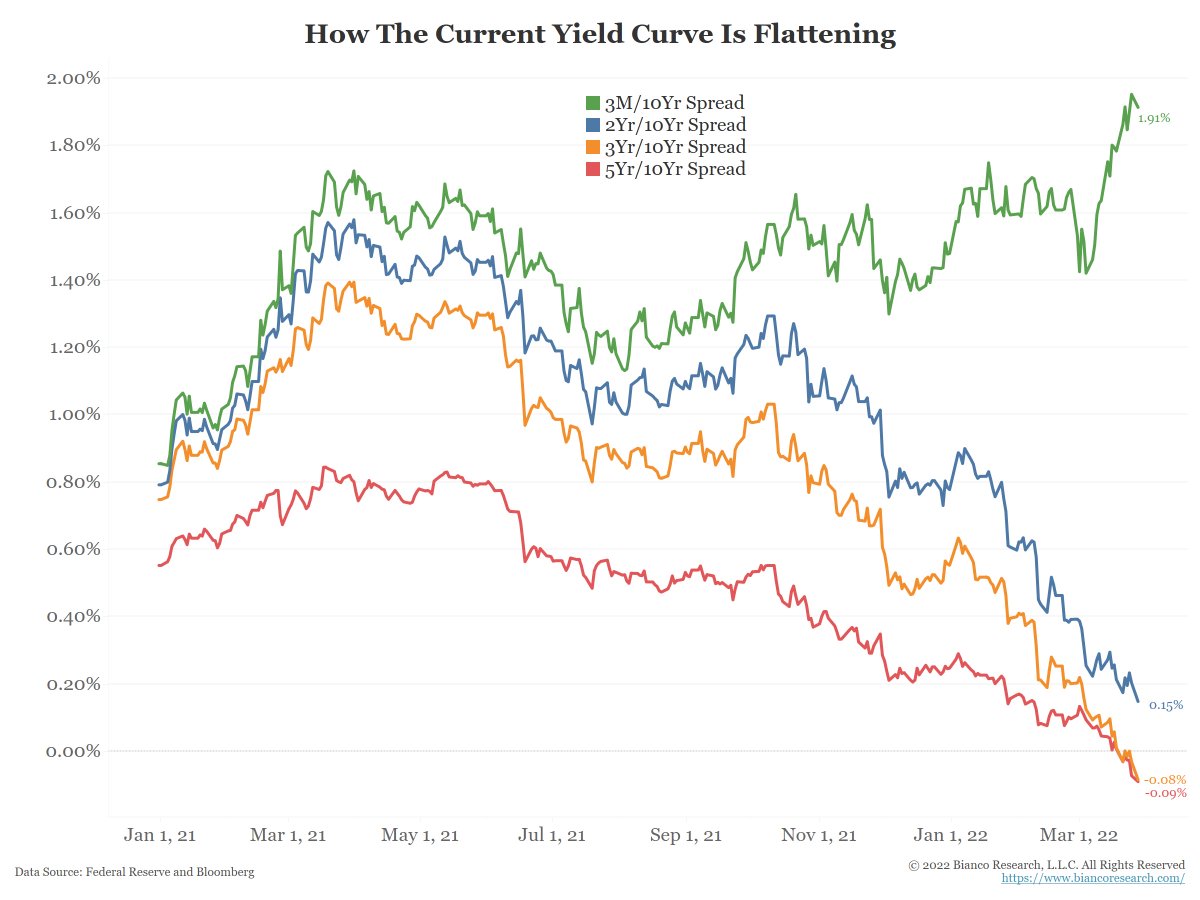
* Curves no shorter then 2-years (i.e., 2Yr/10Yr) are flattening a lot and many are inverting.
So, we believe they are signaling the huge number of rate hikes will break something in markets, the economy, and/or the financial plumbing (repo).
Details below.
* Curves no shorter then 2-years (i.e., 2Yr/10Yr) are flattening a lot and many are inverting.
So, we believe they are signaling the huge number of rate hikes will break something in markets, the economy, and/or the financial plumbing (repo).
Details below.
3/9
2018 Engstrom & Sharpe argued an inverted 10y2y curve did not mean recession. The FOMC was so impressed (or wanted this to be the case) that they invited them to an FOMC meeting to explain it.
The curve inverted in 2019 and a year later, recession.
federalreserve.gov/econres/notes/…
2018 Engstrom & Sharpe argued an inverted 10y2y curve did not mean recession. The FOMC was so impressed (or wanted this to be the case) that they invited them to an FOMC meeting to explain it.
The curve inverted in 2019 and a year later, recession.
federalreserve.gov/econres/notes/…
4/9
We don't know the counterfactual if the pandemic did not happen.
That said, we believe there was solid evidence pre-pandemic the economy was beginning to struggle.
They are doubling down with an update to their 2018 paper, out Friday.
federalreserve.gov/econres/notes/…
We don't know the counterfactual if the pandemic did not happen.
That said, we believe there was solid evidence pre-pandemic the economy was beginning to struggle.
They are doubling down with an update to their 2018 paper, out Friday.
federalreserve.gov/econres/notes/…
5/9
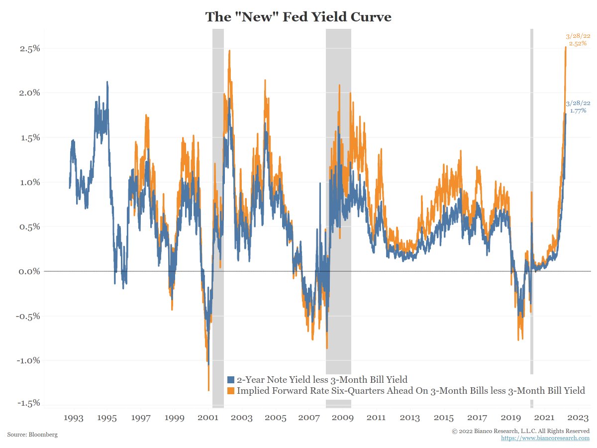
They believe the orange curve matters more; the 3-month yield now versus the swap curve's estimate where 3M yields will be in 6 quarters?
For those without a Bloomberg, the blue line is the standard 2yr/3M curve. It is almost the same thing (and goes back further).
They believe the orange curve matters more; the 3-month yield now versus the swap curve's estimate where 3M yields will be in 6 quarters?
For those without a Bloomberg, the blue line is the standard 2yr/3M curve. It is almost the same thing (and goes back further).
6/9
This orange yield curve above makes sense.
When this curve inverts it means things are already broken and a recession has either started or is enviable. The Fed is in panic mode cutting rates to stop it.
So, with it a record wide curve, no worries, right?
This orange yield curve above makes sense.
When this curve inverts it means things are already broken and a recession has either started or is enviable. The Fed is in panic mode cutting rates to stop it.
So, with it a record wide curve, no worries, right?
7/9
Well as the next chart shows, the curves no shorter than 2-years (red, orange, blue) are inverting while curves no longer than 2year (green) are going in the opposite direction massively steepening.
How do we reconcile this?
Well as the next chart shows, the curves no shorter than 2-years (red, orange, blue) are inverting while curves no longer than 2year (green) are going in the opposite direction massively steepening.
How do we reconcile this?
8/9
The Fed starts hiking for valid reasons, like inflation. The problem is they don't when to stop, overdo it, and break something,
Why would the Fed go too far?
Because nothing matters but inflation, and they have to get it down, as Nate Silver noted
The Fed starts hiking for valid reasons, like inflation. The problem is they don't when to stop, overdo it, and break something,
Why would the Fed go too far?
Because nothing matters but inflation, and they have to get it down, as Nate Silver noted
https://twitter.com/natesilver538/status/1508079380614066180?s=21&t=5rkbywX0ygLkWddaFrmkew
9/9
This is why we have been arguing the Fed has no choice they have to hike until it hurts. And if that causes a recession or bear market, so be it.
I believe this is what the short and long yield curves are signaling.
No recession now but headed that way with no off-ramp.
This is why we have been arguing the Fed has no choice they have to hike until it hurts. And if that causes a recession or bear market, so be it.
I believe this is what the short and long yield curves are signaling.
No recession now but headed that way with no off-ramp.
• • •
Missing some Tweet in this thread? You can try to
force a refresh