Need to make a complex idea simple but visual stories feel too hard?
Here’s 8 visual frameworks borrowed from maths to explain concepts clearly, in just a few lines 👇
Borrow frameworks from maths to improve your visual idea communication skills - here are 8 you can use to explain things from relationships through to behaviours.
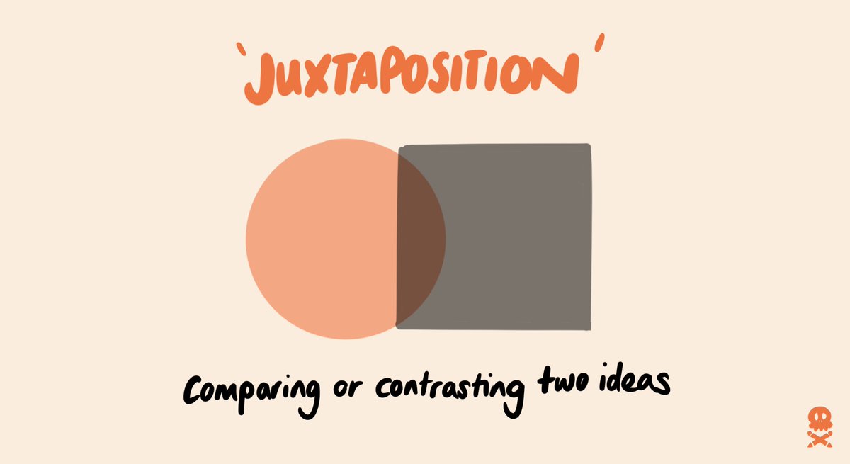
Here's an example of how I've used a Venn diagram to explain my company @NiftyFoxCreativ niche.
Here's an example of using a bar chart to show what is most important to completing #ship30for30
Here's an example of using a line chart to show what success really looks like (the more you show up and put the reps in, the greater the results over time)
Here's an example of using a pie chart to show the TRUE components that make up success
Here's an example of using a scatter plot to show how my mood changes with how I use social media
Here's an example of how to use a funnel chart to show behaviour - here's my take on Shipper posting consistency throughout #ship30for30
Here's a flowchart example on how to make good decisions, inspired by @refuse2choose essay on decision making
Here's how to use a network diagram to explain how teams or people are connected
Liked this & want more?
🚀 RT first tweet in this thread
👍 Follow me @evansnifty
🧩 Buy atomic visual templates to create your own here: bit.ly/3LRx2i2
🏴☠️ Learn how to create atomic visuals with 100s of other pencil pirates in May - sign up at pencil-pirates.com
• • •
Missing some Tweet in this thread? You can try to
force a refresh
I teach 100s of creators, researchers & PhD students every week.
The NUMBER 1 question I get asked?
How do I overcome imposter syndrome?
Here's how in 5 steps 👇
Firstly, what is it? I think Neil Gaiman said it best: ‘it’s the unshakeable conviction that you are getting away with something and that any moment now they will discover you’.
My story: I have imposter syndrome around not having a PhD when working with academics. There, I said it. Yet I worked as a social researcher at universities, co-authored papers & was a manager in HE. I worry I’m not a good enough designer, despite designing for big clients.
I've spent the last 6 years testing over 250 different visual frameworks with 360+ clients to visualise ideas with clarity.
Here are the 34 frameworks worth knowing, condensed into 4 tweets, so you can turn complexity into clarity in seconds 👇
9 visual metaphors from storytelling
❄️ The Iceberg - what you can't see
🪐 Space - relationships
🚗 Journey - process
🛠 Engine - systems
🌷Flower - results
🏔Mountain - challenge
🧱 Bricks - components
🌲 Tree - outcomes
🗺 Map - routes
@revue for creating a subscriber list and newsletter for wannabe Pencil Pirates. Easy to use, subscribe direct from my bio and looks clean. Importing subscribers can be a challenge though.
I teach over a 100 people a week how to visualise their ideas online.
Here are my top 6 tools for creating engaging online lessons 👇.
ONBOARDING - set the tone
Use @lu.ma - great event interface, community features, automatic zoom meeting additions, sends calendar invites in right timezone AND even has some basic feedback features built in post session.
THE SET UP - Make it a seamless experience
I hate screen share in Zoom with a passion. It disconnects you from your audience, & makes it hard to teach engagingly.
I use @OBSProject to create camera 'scenes' that combine different windows into one camera feed = NO SCREEN SHARE
According to the Oxford English Dictionary, inspiration is the ‘process of being mentally stimulated to do or feel something, especially to do something creative’.
Sounds a bit like magic doesn’t it?
It’s not.
Here’s the secret:
Inspiration at its core is JUXTAPOSITION.
Both in creating the conditions for it to happen,
and in formulating your idea by looking for patterns in things you wouldn’t ordinarily see as related.