Colin Angus Profile picture
Apr 11 7 tweets 2 min read
Feels as though I should get in on the #30DayChartChallenge action at some point.

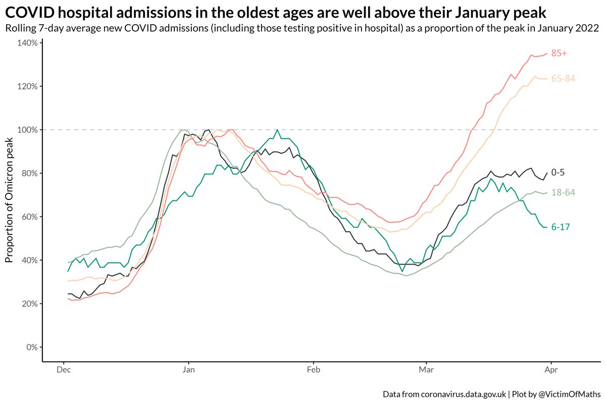
Spent far too long failing to make a custom legend for this, so you'll just have to work it out for yourself. Image
The black lines are scaled to the peak consumption level across the whole 1961-2019 period. Bars run clockwise from 1961-2019.
Some things I find particularly interesting:

The rise of wine drinking in North West Europe Image
The collapse of wine drinking in major wine-producing countries Image
The rise of beer in North East Europe Image
Not much going on in the middle Image

• • •

Missing some Tweet in this thread? You can try to force a refresh
 

Keep Current with Colin Angus

Colin Angus Profile picture

Stay in touch and get notified when new unrolls are available from this author!

Read all threads

This Thread may be Removed Anytime!

PDF

Twitter may remove this content at anytime! Save it as PDF for later use!

Try unrolling a thread yourself!

how to unroll video
  1. Follow @ThreadReaderApp to mention us!

  2. From a Twitter thread mention us with a keyword "unroll"
@threadreaderapp unroll

Practice here first or read more on our help page!

More from @VictimOfMaths

Apr 13
I posted this graph yesterday as part of the #30DayChartChallenge and a few people have asked some reasonable questions about why I chose to present this data in this way.

So I thought I'd write a thread to explain my thought process... A stacked bar chart showing...
The first thing to say is that I don't think any dataset has some inherently 'right' type of graph. There are just different graph types which may be more or less effective at highlighting different aspects of the data.
The second is that there is no truly neutral presentation of data. Your choice of graph type, colour, scale, structure and annotations will all influence what message people take away or what patterns people see.
Read 29 tweets
Apr 6
It seems likely that COVID cases are now falling (although hard to be certain), but it's striking, and concerning, how much worse the impact on hospital admissions has been for older age groups with BA.2 than BA.1.

This would be a good time to get a lot of boosters in arms.
I think this divergence is a combination of a) the waning impact of 3rd dose boosters in the Autumn, which will affect older age first as they were boosted first and b) possibly a difference in the way different age groups have reacted to the removal of restrictions...
...with some people who have been effectively shielding for 2 years now starting to mix more, whereas younger people were perhaps already closer to 'normal' levels of socialising, so the change in behaviour (and thus exposure risk) may have been bigger for older ages.
Read 5 tweets
Mar 18
A short(ish) thread on the COVID situation in English hospitals.

The majority of people in hospital with COVID are being treated for something else, but the number of people being treated *for* COVID has started to rise again as a result of the recent increase in prevalence.
There remains a fair bit of regional variation in these two trends. In London, only around a quarter of patients with COVID are being treated for COVID, while that proportion compared to 55% of patients in the South West.
(insert usual caveats about 'incidental' cases still placing a heavy burden on NHS services, potentially turning into 'for' cases and increasing risks of nosocomial spread here)
Read 11 tweets
Mar 16
Down with this sort of thing.

Last week's data suggested a chunk of this rise is 'incidental' admissions where people aren't being admitted *for* COVID, but as @AdeleGroyer has shown, the number of people catching COVID in hospitals has also been increasing rather worryingly. Image
Some perspective on those rises - admission rates are still very low, thankfully, for younger age groups. Image
R code for these plots is here:
github.com/VictimOfMaths/…
Read 4 tweets
Mar 10
NHS England have just published their latest COVID admissions breakdown by age. Which means I can update this plot of admission rates.

You can see the recent uptick in admissions, but I'm really struck by how slowly admissions have fallen since the Omicron peak.
Compare and contrast with the speed with which things fell back last winter. Note the change in the colour scale, because things were *much* worse back then.
Obviously some confounding with people being admitted 'with' COVID not 'for' it, but cases have fallen similarly fast after both peaks, I think.

Here are both plots as heatmaps if that's more your kind of thing:
Read 4 tweets
Mar 10
This also looks like good news - the recent increase in people in English hospitals with positive COVID tests is mostly driven by patients who are being treated for something else, *not* COVID.
There are some big regional differences in this breakdown.

Reassuring in particular that the big rise in COVID hospital patients in the South West is almost entirely driven by these 'incidental' COVID diagnoses.
This points to a genuine increase in COVID prevalence in recent weeks, most likely connected to some combination of BA.2's growth advantage over BA.1 and the removal of restrictions and resulting shift in people's behaviour with greater mixing.
Read 8 tweets

Did Thread Reader help you today?

Support us! We are indie developers!


This site is made by just two indie developers on a laptop doing marketing, support and development! Read more about the story.

Become a Premium Member ($3/month or $30/year) and get exclusive features!

Become Premium

Don't want to be a Premium member but still want to support us?

Make a small donation by buying us coffee ($5) or help with server cost ($10)

Donate via Paypal

Or Donate anonymously using crypto!

Ethereum

0xfe58350B80634f60Fa6Dc149a72b4DFbc17D341E copy

Bitcoin

3ATGMxNzCUFzxpMCHL5sWSt4DVtS8UqXpi copy

Thank you for your support!

Follow Us on Twitter!

:(