
Alcohol policy modeller in @sarg_scharr @sheffielduni | Health inequalities | COVID-19 | Data visualisation | RStats | Cake | Cycling | Pedantry | Birds

 We used publicly available mortality data to calculate age-standardised mortality rates for each cause and country from 2001-2021.
 This represents the second largest single year increase in at least the past two decades, behind only last year.
 Interesting that there is still a gap for alcohol-specific death among men between Scotland & Northern Ireland, but the rates for women are almost identical.
 Here's the same data on a conventional map, if that's more the way you roll.
 1/ The rise in long-term sickness started *before* the pandemic - back in early 2019 (so too early to be COVID before we knew what COVID was before anyone suggests that) - what gives?

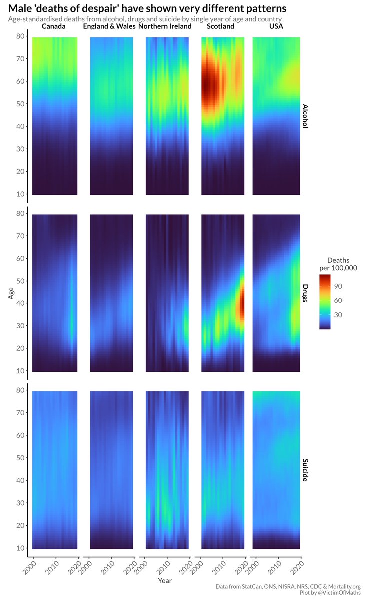 There has been a lot of (very interesting) research focused on these so-called 'deaths of despair' in the US, but, driven by the opioid crisis, this work often talks about how unique the US is in having an epidemic of midlife deaths of despair.
 We found *loads* of studies - 201 studies with a combined total of almost 95,000 participants.
 1) Overall life expectancy is unequal.
 And this is only going to look even worse in 12 months time when the calculations will include 2020 *and* 2021.
 The first thing to say is that I don't think any dataset has some inherently 'right' type of graph. There are just different graph types which may be more or less effective at highlighting different aspects of the data.
 R code here:
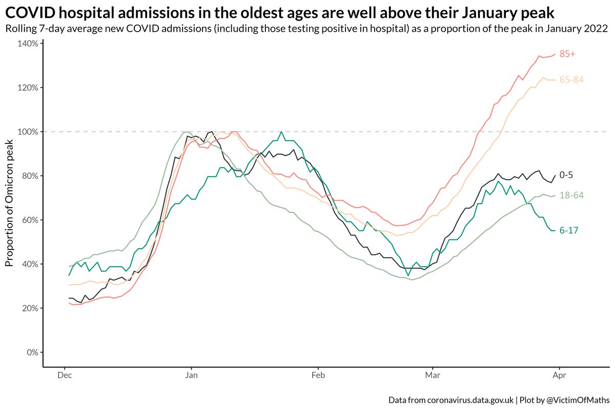 I think this divergence is a combination of a) the waning impact of 3rd dose boosters in the Autumn, which will affect older age first as they were boosted first and b) possibly a difference in the way different age groups have reacted to the removal of restrictions...
 There remains a fair bit of regional variation in these two trends. In London, only around a quarter of patients with COVID are being treated for COVID, while that proportion compared to 55% of patients in the South West.
 Some perspective on those rises - admission rates are still very low, thankfully, for younger age groups.
 Compare and contrast with the speed with which things fell back last winter. Note the change in the colour scale, because things were *much* worse back then.
 There are some big regional differences in this breakdown.
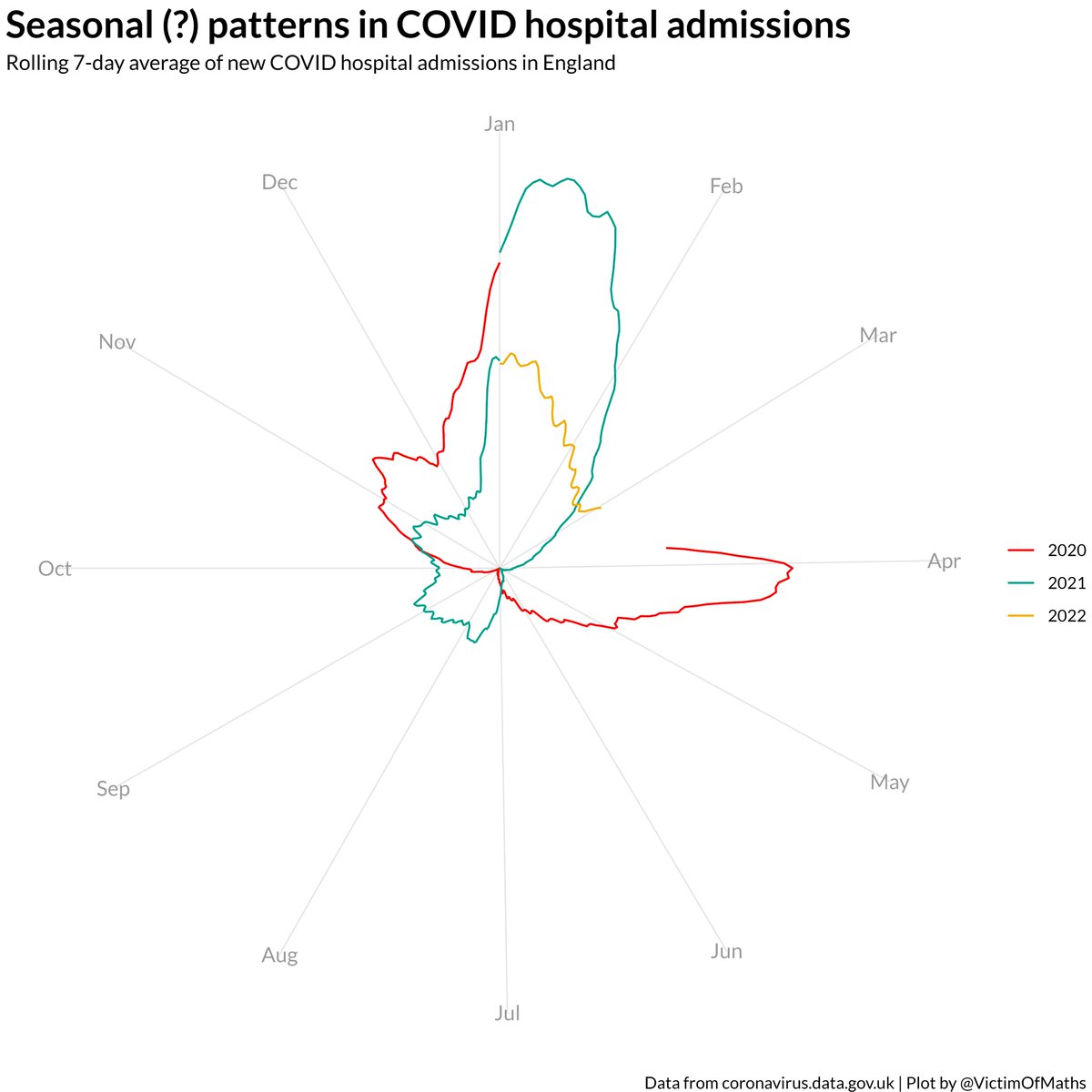 ...(e.g. people meeting more inside in the winter) but the idea that seasonality is some immutable, irresistable force that explains the vast majority of changes in the COVID data just doesn't seem to match with the basic facts as I see them...