Bitcoin will likely evolve from the early go-go days to a more mature two-way market, driven by network growth and the pace of adoption, less by scarcity (which is written in stone and mostly baked in). So let’s do a deep-dive on historical adoption curves. 🧵 

The chart above shows various S-curves going back to the early 1800s. Using the Historical Statistics of the United States database and the UN’s World Development Indicators, I found many interesting adoption curves in the US and around the world. /2
The chart shows growth of the US railway network during the early 1800s, cement & steel production during the industrial revolution of the late 1800s, the adoption of telephones around the turn of the century, and motor vehicle registrations during the early 1900s. /3
For the 20th Century, I found data for miles flown and the percentage of households with radios, TVs, and VCRs. And just to delve into the more-obscure side of things, I found the data for trolley miles in the 1920s, as well as measles immunizations. /4
More recently, we have global adoption curves for mobile phones, internet usage, and broadband subscriptions. And of course, I also show the growing network for Bitcoin and Ethereum. /5
While measuring very different things, these adoption curves show a similar pattern. And while most of these S-curves travel up and to the right, that’s not always the case, as some innovations become obsolete and get replaced by something else. /6
I had to create a common denominator to make the curves comparable. Miles flown and measles vaccinations do not use the same scale, after all. So I measured all these curves on a per capita basis (using either the US or global population, depending on the time series used). /7
The point is to show the shape of the curve on a log scale, rather than focusing on the starting or ending point. So, everything is shown as a percentage of population, on a log-scale. /8
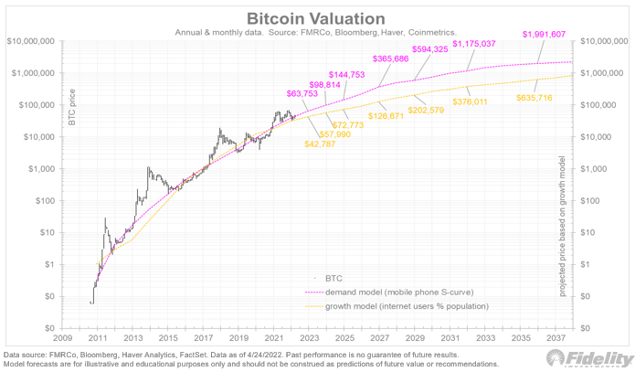
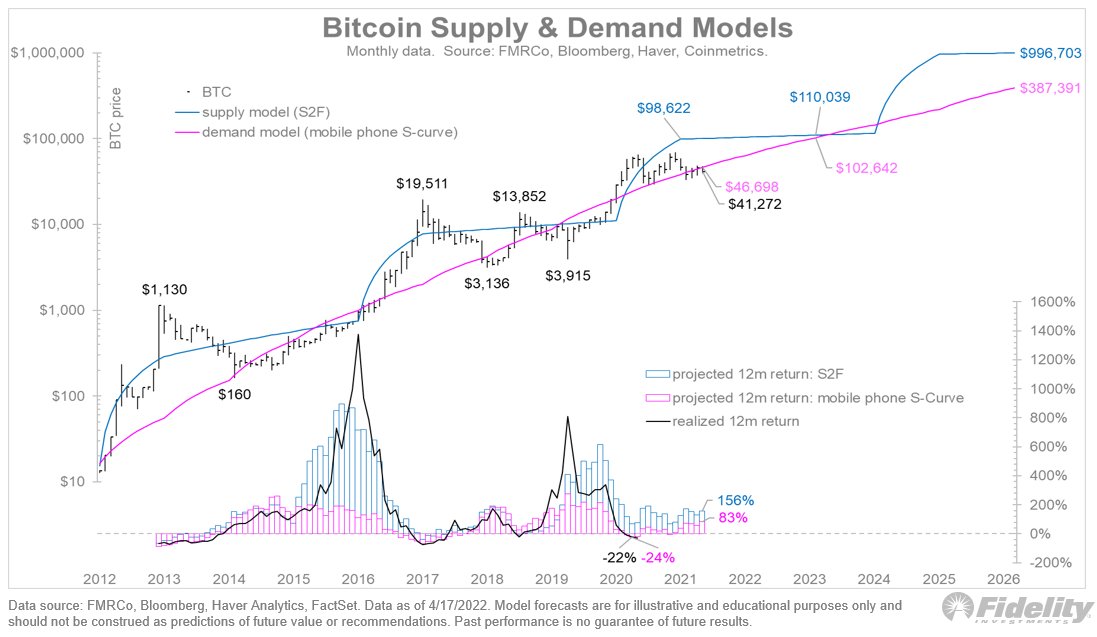
What can these S-curves teach us about Bitcoin? Per Metcalfe’s Law, the larger a network gets, the more valuable it becomes. So, getting the curve right means getting the value right. /9
Continuing my last thought about Bitcoin and how its adoption curve compares to other "next big things" in history: This chart lines up curves for inventions such as cars and telephones and matches them to the start of the Bitcoin network in 2009. /10

Next, I normalize not only the starting point but also the starting value for all these curves. I do this by calculating a power regression curve for each of the independent values against the dependent value (Bitcoin), based on the shape of Bitcoin’s adoption curve. /11

Now we see that both BTC and ETH are following very closely in the footsteps of past adoption curves, whether they are old infrastructure curves like cement or steel production, or new digital infrastructure curves like internet and broadband. /12
While all these curves show exponential growth from here (even the trolley curve takes another decade before it declines), there’s a growing dispersion in the slope of these curves. /13
For the valuation of Bitcoin, this is a challenge. Even if we assume that the adoption curve will continue to grow (as is implied above), it’s difficult to calculate an expected return if you don’t know the slope of that curve. /14
Perhaps we can narrow the range of analogs to get a better picture of Bitcoin’s potential growth. The next chart highlights only the railroad, cement and steel curves, as well as internet, mobile phones and broadband. And trolley miles, just to play devil’s advocate. /15

The analogs now show a more unified set of outcomes, still up and to the right, but with fewer outliers. /16
It does appear that Bitcoin’s adoption curve might be flattening out a little earlier than the other curves (at least on a log scale), but perhaps I am reading too much into a yearly time series. /17
As for that trolley curve, in no way do I mean to suggest that Bitcoin will go the way of trolleys. But I am keeping the comparison in there as a sanity check. Not all S-curves come to fruition, and this is something we should keep in mind. /18
More on Bitcoin S-curves in the next thread. /END
• • •
Missing some Tweet in this thread? You can try to
force a refresh