Here's my latest update on the outbreak of Hepatitis of unknown origin (NOVHEP), with 659 cases now reported.

First a summary of the reported cases of NOVHEP, both as absolute counts and as a % of the population.
🧵
While the US is now ahead of the UK on total cases, it remains a lot lower by % of population.

Ireland has joined the UK as the leading 2 countries by % of population, with Cyprus and Israel close behind.
Here's a dataviz comparing NOVHEP with COVID-19 cases.

Here's the global picture, for the Omicron period.

The top charts show absolute cases, the bottom charts are % of the population.

Left charts show just the countries with NOVHEP, right charts compare to those with no cases
Here are the same charts for the period when Delta was dominant.

A diagonal trend (linear regression) line with points tightly clustered along it indicates a precise correlation.

Anyone else finding the left charts for Delta quite striking?
My inspo for the previous charts was analysis by @nishiurah, who focussed on the OECD countries, for the Omicron period.

In the interactive dataviz you can choose whatever time period and set of countries you are interested in.
github.com/Mike-Honey/cov…
@Leggomyfuego1 appears to have the most complete dataset for NOVHEP - a huge effort that I really appreciate.

To support my robots, I've dropped the latest copy of that pdf in a new github repo, along with an Excel version of the cases data.
github.com/Mike-Honey/nov…
@Leggomyfuego1 faces a huge challenge assessing global news reports in many languages.

I've managed to connect them with a volunteer who is monitoring the Spanish-language media.

I'm sure help would be welcome to cover other languages or focus on particular countries/regions.

• • •

Missing some Tweet in this thread? You can try to force a refresh
 

Keep Current with Mike Honey 💉💉💉

Mike Honey 💉💉💉 Profile picture

Stay in touch and get notified when new unrolls are available from this author!

Read all threads

This Thread may be Removed Anytime!

PDF

Twitter may remove this content at anytime! Save it as PDF for later use!

Try unrolling a thread yourself!

how to unroll video
  1. Follow @ThreadReaderApp to mention us!

  2. From a Twitter thread mention us with a keyword "unroll"
@threadreaderapp unroll

Practice here first or read more on our help page!

More from @Mike_Honey_

May 20
Here's a new report on the outbreak of Monkeypox, with 128 cases now reported.

First, a summary of the countries reporting cases of Monkeypox, both as absolute counts and as a % of their population.
🧵
And here's a page of exploratory visuals, that highlight a few of the key attributes.

The one that jumped out at me was that all known case genders are male. That seems wildly unrepresentative for a population of 100+.
The source data is being curated by a team at global.health, lead by @MOUGK - many thanks for that crucial work.
Read 7 tweets
May 19
Here's the latest variant picture for Australia.

BA.2 remains dominant.

Details below for the new lineages with the "Delta" (L452R) mutation - BA.2.12.1, BA.4 and BA.5. 👇
🧵
BA.2.12.1 (Spike L452Q & L452R mutations) is rising rapidly in the US and Canada.

25 Samples have been reported in Australia, most frequently from NSW, rising to 2.5% frequency. NSW Health are prioritising sequencing for travellers.

Data from Victoria lags by about a month.
BA.4 (Spike L452R mutation, others) quickly became dominant over BA.2.* in South Africa, and has started rising in Austria.

20 Samples have been reported in Australia, most frequently from NSW, rising to 1.7% frequency. NSW Health has confirmed community transmission.
Read 8 tweets
May 19
The US CDC has a system of COVID-19 Community Levels which they can apply to any community (state, county, city etc) to evaluate risk.

In this thread, I'll compare those levels to Australia and its states and territories.
cdc.gov/coronavirus/20…
🧵
The first metric they look at is "Cases per 100,000 people for the past 7 days", being fewer than or more than 200.

All regions of Australia have been well over that mark for the Omicron outbreak.

So I'm focussing on the last 2 rows in the CDC table.
Their next metric is Admissions per 100K (7-day total).

Australia doesn't publish that data, but you can see from the first 2 charts on this OWID page the "in Hospital" numbers are a very close proxy, for the US and other comparable countries.
ourworldindata.org/covid-hospital…
Read 15 tweets
May 18
Here's the latest covid stats for Australia, covering the last 8 weeks.

The recent trend is up for all indicators.

States and territories below.
🧵
Here's NSW, VIC, QLD and SA.

In NSW, most indicators are fairly flat.

In VIC, cases, ICU and deaths are all growing.

In QLD, all indicators are rising recently, most quite rapidly.

In SA, cases have been rising again recently.
Here's WA, TAS, NT and ACT.

In WA, cases continue to rise sharply, now dragging the other indicators upwards.

In TAS and NT, cases have started growing again.

In ACT, cases and hospitalisations have been rising slowly for 3-4 weeks.
Read 4 tweets
May 18
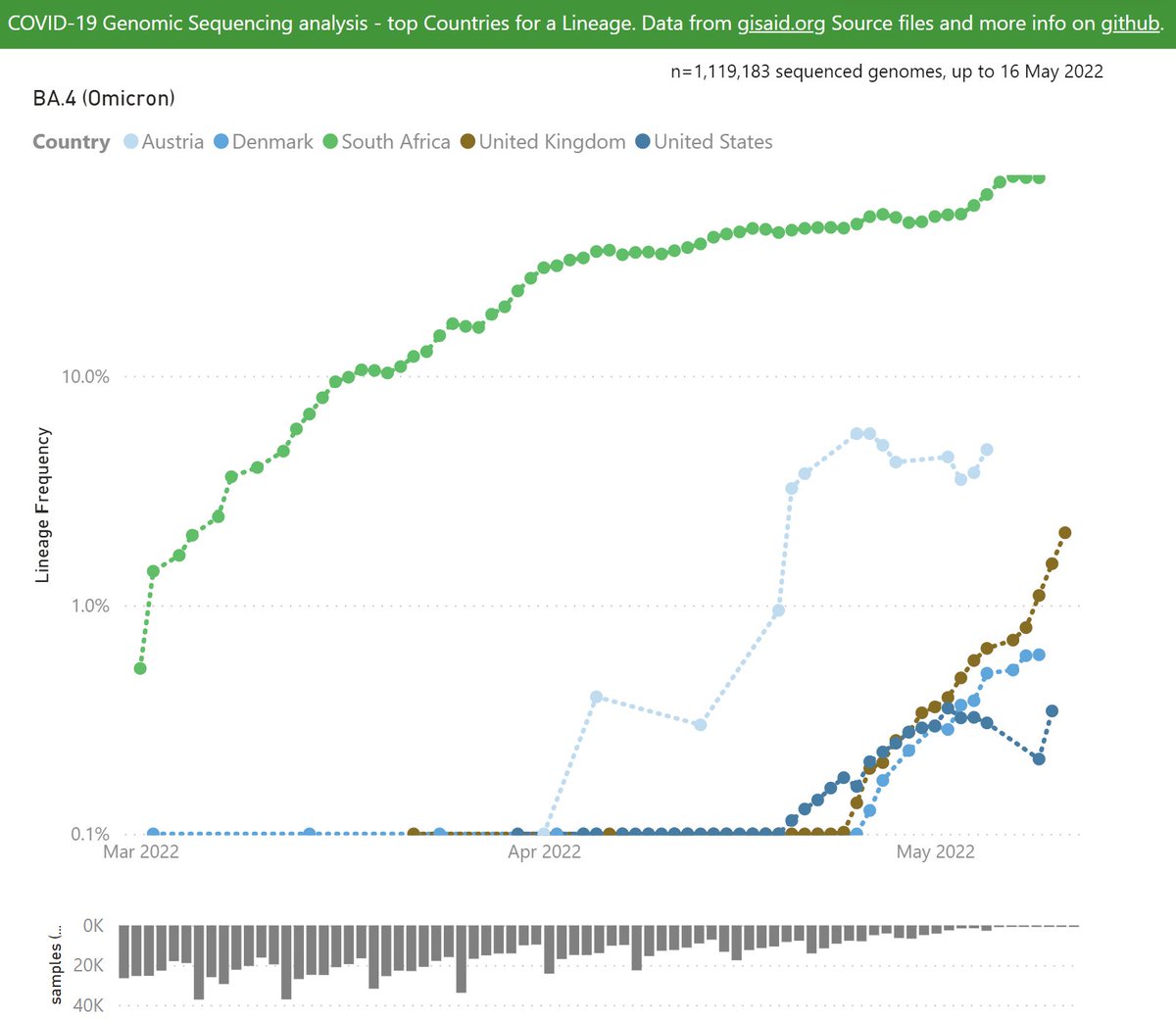
Here's the latest variant picture for the new BA.4 and BA.5 lineages.

BA.4 in South Africa has reached 70% of recent samples.

Austria and other countries are reporting community transmission of BA.4, at low frequencies so far, but with steady growth.
🧵 ImageImage
BA.5 in South Africa reached 25% of recent samples.

Portugal has reported weeks of community transmission of BA.4, growing rapidly past 20%.
🧵 ImageImage
Note the Frequency is calculated for each country independently, compared to all the recent samples sequenced in that country.

Linear and Log Y-axis presented - log axis helps compare growth rates.
Read 6 tweets
May 18
Here's my latest update on the outbreak of Hepatitis of unknown origin (NOVHEP).

First a summary of the reported cases of NOVHEP, both as absolute counts and % of population
🧵 Image
The UK and European countries dominate by % of population.

On this basis, Canada and the US have similar rates. Image
Here's a dataviz comparing NOVHEP with COVID-19 cases.

Here's the global picture, for the Omicron period.

The top charts show absolute cases, bottom charts are % of population.

Left charts show just the countries with NOVHEP, right charts compare to those with no cases. Image
Read 10 tweets

Did Thread Reader help you today?

Support us! We are indie developers!


This site is made by just two indie developers on a laptop doing marketing, support and development! Read more about the story.

Become a Premium Member ($3/month or $30/year) and get exclusive features!

Become Premium

Don't want to be a Premium member but still want to support us?

Make a small donation by buying us coffee ($5) or help with server cost ($10)

Donate via Paypal

Or Donate anonymously using crypto!

Ethereum

0xfe58350B80634f60Fa6Dc149a72b4DFbc17D341E copy

Bitcoin

3ATGMxNzCUFzxpMCHL5sWSt4DVtS8UqXpi copy

Thank you for your support!

Follow Us on Twitter!

:(