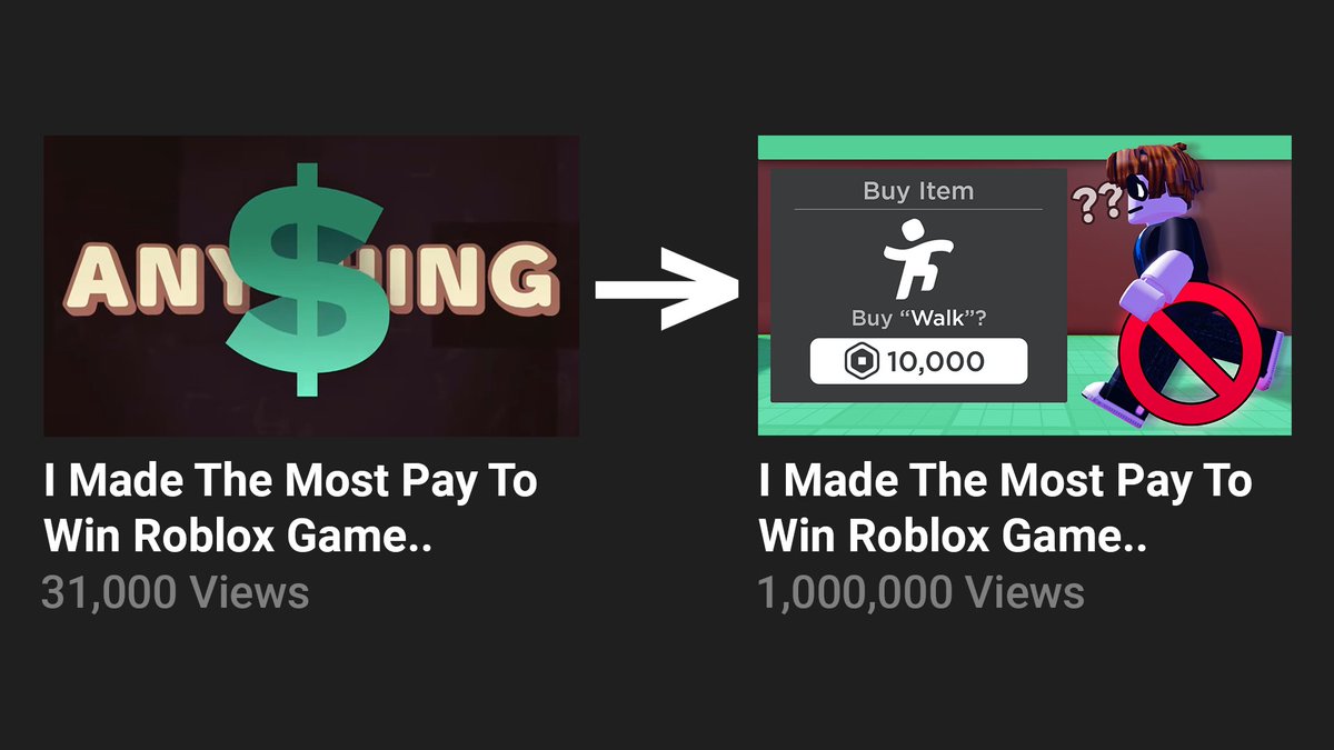
One of my thumbnails has changed an entire Roblox video's performance
31K Views -> 1M Views
(20K Views Per Hour)
⏳ Steal the process of how I did it: (thread)
#Roblox #RobloxDev #RobloxGFX
31K Views -> 1M Views
(20K Views Per Hour)
⏳ Steal the process of how I did it: (thread)
#Roblox #RobloxDev #RobloxGFX

1. Straight To The Point
In your thumbnail, you always need to be straight to the point. The old thumbnail had no association with the title or video itself, which is why it didn't do very good in the first place (the only thing related would've been the $ sign).
In your thumbnail, you always need to be straight to the point. The old thumbnail had no association with the title or video itself, which is why it didn't do very good in the first place (the only thing related would've been the $ sign).
2. Background
The background itself is unique, as it's not a background with green grass and blue sky, but instead green grass and brown background, which made it more unique than video thumbnails
The background itself is unique, as it's not a background with green grass and blue sky, but instead green grass and brown background, which made it more unique than video thumbnails
3. Color
Color is very important when you make an thumbnail, and specifically making objects stand out in your thumbnail. The prohibited sign and the purchase prompt UI stood out from the thumbnail because they we're the only ones that had a unique color.
Color is very important when you make an thumbnail, and specifically making objects stand out in your thumbnail. The prohibited sign and the purchase prompt UI stood out from the thumbnail because they we're the only ones that had a unique color.
4. Size
Size is very important in your thumbnails, especially knowing how to not waste your space! Imagine if the prompt UI was way smaller, you wouldn't see anything other than you can't walk (and not knowing that you need to pay for it since it would be too small!).
Size is very important in your thumbnails, especially knowing how to not waste your space! Imagine if the prompt UI was way smaller, you wouldn't see anything other than you can't walk (and not knowing that you need to pay for it since it would be too small!).
5. Style
The style is what sets you apart from other thumbnails. I've mastered my style to the point it's unique comparing to the usual cartoony video roblox thumbnail, which is really overused now.
The style is what sets you apart from other thumbnails. I've mastered my style to the point it's unique comparing to the usual cartoony video roblox thumbnail, which is really overused now.
6. Text
In my thumbnails, I always follow the 4 word rule:
Don't have any more words than 4 in your thumbnail. You need to acknowledge the viewer will look at your thumbnail for 1-3 seconds only, so make it simplified.
In my thumbnails, I always follow the 4 word rule:
Don't have any more words than 4 in your thumbnail. You need to acknowledge the viewer will look at your thumbnail for 1-3 seconds only, so make it simplified.
And that's the end of the thread!
If you found this useful for your thumbnails, consider following!
I'm also available for thumbnail work!
✍️ Contact me here, on Twitter. My DMs are open.
twitter.com/messages/compo…
If you found this useful for your thumbnails, consider following!
I'm also available for thumbnail work!
✍️ Contact me here, on Twitter. My DMs are open.
twitter.com/messages/compo…
• • •
Missing some Tweet in this thread? You can try to
force a refresh


