
⚠ Warning: this chart is lying to you!
🍬 The chart in this example is trying to suggest a strong correlation between sugar intake and obesity in the US between 1980 and 2000. It does so by carefully choosing the vertical axis ranges so both lines nicely align.
(1/5)
🍬 The chart in this example is trying to suggest a strong correlation between sugar intake and obesity in the US between 1980 and 2000. It does so by carefully choosing the vertical axis ranges so both lines nicely align.
(1/5)

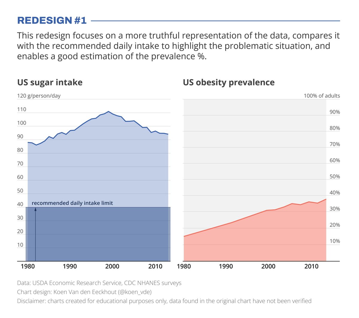
🧐 But with a closer look we can see something else is going on. Sugar intake levels are rising by 30% (from 85g to 110g), while obesity prevalence is rising by 164% (from 14% to 37% of the population). For an accurate comparison, these lines shouldn't nicely align at all!
(2/5)
(2/5)
📊 I've created two redesigns to present some better solutions for this visualization. In redesign 1 we focus on a presentation which is as truthful as possible, comparing the data with the recommended intake level, and enabling an accurate estimation of the prevalence %.
(3/5)
(3/5)
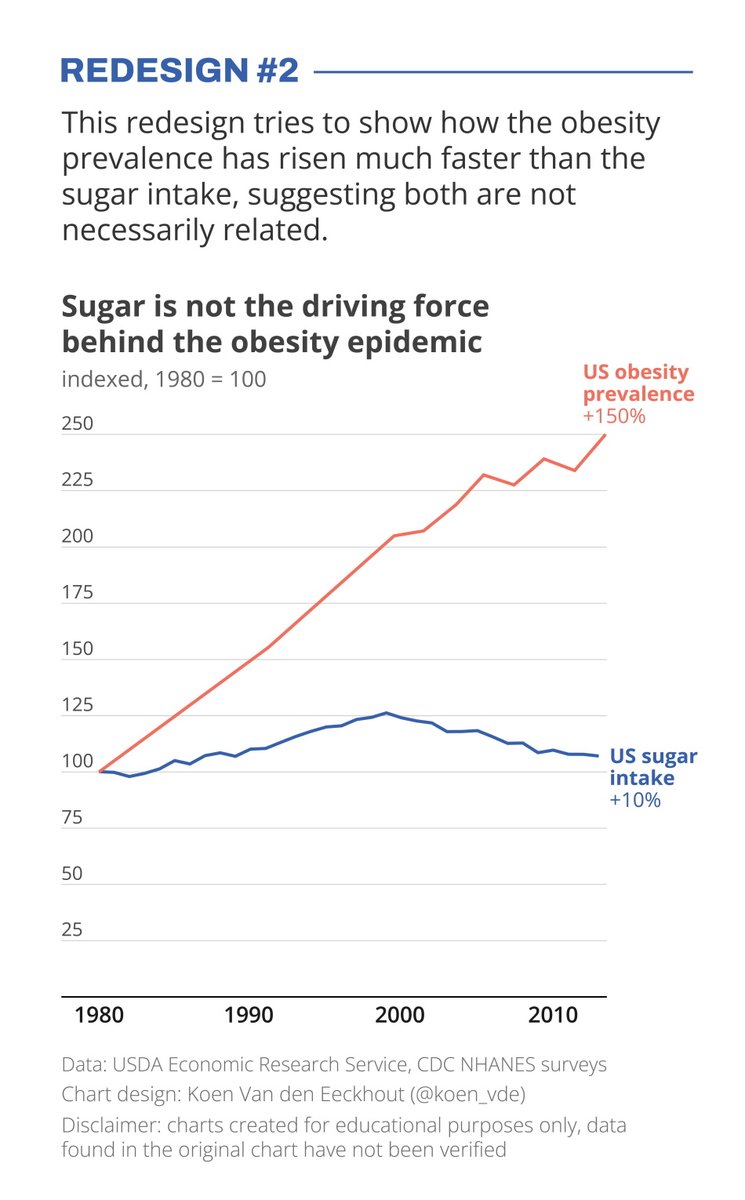
In redesign 2 we focus on showing how much faster the obesity prevalence has grown compared to the sugar intake, which has remained relatively stable.
(4/5)
(4/5)
📣 Depending on the message you want to bring, one presentation might be preferable above the other. But in any case, manipulating your vertical axes to suggest a strong correlation which might not be there, is not very nice!
(5/5)
#dataviz #datavisualization #informationdesign
(5/5)
#dataviz #datavisualization #informationdesign
Additional disclaimer: this redesign is for educational purposes only, to show how the same data, presented in different ways, could lead to an opposite message compared with the original chart. This message (sugar intake is unrelated to obesity) is most probably NOT TRUE.
Additional disclaimer: charts were created for educational purposes only, to show the impact of axis choices in showing a message. Especially for redesign 2 the stated message is probably NOT TRUE. I should have been more careful in that respect.
• • •
Missing some Tweet in this thread? You can try to
force a refresh


