COVID-in-wastewater for BC Lower Mainland, to 4-June-2022. πŸͺ‘
From bccdc.ca/Health-Info-Si…
Red line at zero level added to emphasize that relatively high levels persist in wastewater, discordant with the low level of officially reported cases. (1/n)
#covid19bc Image
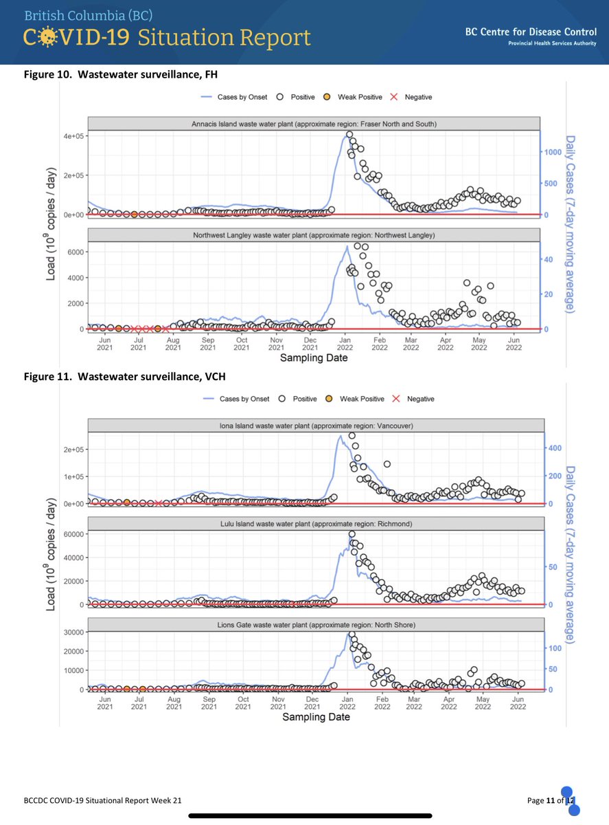
The graph is dominated by the Jan-Dec peak, which effectively and conveniently scales down the current persistent high levels. The eye tends not to catch that the levels post-peak are much higher than the levels before. (2/n) Image
The description in the text seems determined to ignore these persistent high levels, and appears to focus on shorter-term bumps and noise in order to use the word β€œdecreased”… (3/n) Image
…which is unfortunate, because recent trends in hospitalizations and deaths make sense when one realizes that the wastewater data reveal a persistent high level of infection.
This high level of infection is not shown by the official case count… (4/n)
bccdc.ca/Health-Info-Si… Image
…the official case count that is based on limited and non-representative official PCR testing.
Official testing (MSP) is shown by the almost-illegible doted lines.
The solid lines are government + private PCR tests. (5/n)
bccdc.ca/Health-Info-Si… Image
This matters because we cannot manage personal/societal risk and resources without clear and timely data on infections.
It would not be difficult or expensive to do ongoing PCR testing on a representative sample, using statistics to extrapolate to the population as a whole. (6/n)
And yet, here we are.
(7/n)
A better COVID wastewater graph from the relentless robot @YVRCovidPlots πŸ€–should be available tomorrow.

@CDCofBC
@realreporter @MickSweetman @PennyDaflos

@GreaterfoolVan @SusanDavidsonM2 @crystalmundypsy

@biotimylated @COVIDPoops19

(8/n)

β€’ β€’ β€’

Missing some Tweet in this thread? You can try to force a refresh
γ€€

Keep Current with Daniel A. Walker πŸ‡¨πŸ‡¦πŸ‡ΊπŸ‡¦πŸŒ»πŸ˜·πŸ’‰πŸš΄πŸ»

Daniel A. Walker πŸ‡¨πŸ‡¦πŸ‡ΊπŸ‡¦πŸŒ»πŸ˜·πŸ’‰πŸš΄πŸ» Profile picture

Stay in touch and get notified when new unrolls are available from this author!

Read all threads

This Thread may be Removed Anytime!

PDF

Twitter may remove this content at anytime! Save it as PDF for later use!

Try unrolling a thread yourself!

how to unroll video
  1. Follow @ThreadReaderApp to mention us!

  2. From a Twitter thread mention us with a keyword "unroll"
@threadreaderapp unroll

Practice here first or read more on our help page!

More from @danwalker9999

Dec 18, 2023
@emilyakopp Offshoring of risky virological lab work to countries with lower or zero biosafety requirements is an old strategy.
Lassa/Ebola lab, Kenema Government Hospital, Sierra Leone.


reuters.com/article/us-bio…
who.int/news-room/feat…
ncbi.nlm.nih.gov/pmc/articles/P…
vhfc.org


Image
Image
Image
@emilyakopp Ebola at BSL-2.


Supplementary Figure 1A. ncbi.nlm.nih.gov/pmc/articles/P…
ncbi.nlm.nih.gov/pmc/articles/P…

Image
Image
@emilyakopp Setting up Ebola PCR lab at BSL-2, Kenema Government Hospital, 2014.
Fig 2A of

ncbi.nlm.nih.gov/pmc/articles/P…

Image
Image
Read 4 tweets
Apr 11, 2023
Anyone who believes that China has or will provide reliable data to elucidate the origin of COVID should carefully study the statements made in this April 8 press conference.
Links to full conference appended.
@Ayjchan @JamieMetzl @mvankerkhove @mstandaert
news.cgtn.com/news/2023-04-0…
Entire press conference with voice-over English translation of Standard Chinese (54m)
news.cgtn.com/news/2023-04-0…
Entire press conference in original Standard Chinese (51m29s).
english.scio.gov.cn/pressroom/node…
Read 8 tweets
Nov 24, 2022
The geospatial analysis in Worobey2022 relies on a centering model to determine the origin point of COVID in Wuhan Dec 2019.
This model is not valid.
doi.org/10.1126/scienc…
The centering model can be stated as follows: the spatial pattern of the home residence of severe cases is centered on the origin point, with spatial density decreasing away from the origin point.
Fig 2A and B of Worobey2022 provide insight into the authors' logic.
β€œWe hypothesized that if the Huanan market were the epicenter of the pandemic, then early cases should fall not just unexpectedly near to it but should also be unexpectedly centered on it”
Read 23 tweets
Aug 27, 2022
This thread examines two claims in Worobey et al:
Dec-2019 COVID case-residences in Wuhan were not concentrated in (1) areas of high population density or (2) areas with a high proportion of older persons.
science.org/doi/10.1126/sc…
The specific claims in Worobey et al:
🌐Dec-2019 cases did not reside in areas with high population density of (1) all age groups or (2) older persons.
🌐Fig 1E, S9 and S10 are enlisted to support the claims.
Fig 1E purports to represent the spatial distribution of COVID cases in Wuhan in Jan-Feb-2020.
It includes no population density data, and therefore cannot be used to support the claims.
Read 25 tweets
Aug 19, 2022
This thread addresses the claim in Worobey et al that KDE analysis shows centering of Dec 2019 COVID case-residences on the Huanan Market.
science.org/doi/10.1126/sc…
This apparent centering is an artifact due to use of an overly-large bandwidth in the KDE calculation. Image
Adjusting the bandwidth parameter to more realistic values shifts the center of the KDE pattern away from the Huanan market, to an neighbourhood north of the market where there truly is a significant cluster of case-residences. Image
Worobey et al base their interpretation on simplified KDE maps in which the influence of each data point is smeared over a large area (oversmoothing).
The pattern is centered on the Huanan Market, but this is simply an artifact of oversmoothing. Image
Read 41 tweets
Aug 15, 2022
Worobey et al. (2022)
science.org/doi/10.1126/sc…
Consider the KDE probability contours for the residences of Dec 2019 cases.
Data from zenodo.org/record/6908012…
*Linked* cases in green.
The map of the linked-cases KDE was omitted from the article... Image
...although the KDEs for all-cases and unlinked-cases were prominently displayed on Fig. 1, and featured in various tweets emitted by the authors. Image
The map ☝️uses the following from the data files supplied with the article at zenodo.org/record/6908012
β–Έ maps β–Έ geojson
β–Έ who_cases_dec-2019.linked.KDE.contours.geojson
β–Έ who_cases_dec-2019.notLinked.KDE.contours.geojson

β–Έ data
β–Έ who_cases_dec-2019.csv
Read 14 tweets

Did Thread Reader help you today?

Support us! We are indie developers!


This site is made by just two indie developers on a laptop doing marketing, support and development! Read more about the story.

Become a Premium Member ($3/month or $30/year) and get exclusive features!

Become Premium

Don't want to be a Premium member but still want to support us?

Make a small donation by buying us coffee ($5) or help with server cost ($10)

Donate via Paypal

Or Donate anonymously using crypto!

Ethereum

0xfe58350B80634f60Fa6Dc149a72b4DFbc17D341E copy

Bitcoin

3ATGMxNzCUFzxpMCHL5sWSt4DVtS8UqXpi copy

Thank you for your support!

Follow Us!

:(