How do the warming stripes start conversations about climate change? #ShowYourStripes
They are stark visuals which, with a single glance, instantly communicate the simple message that the climate is heating up.
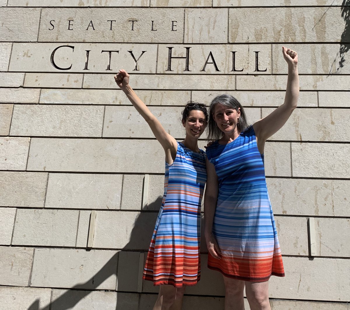
Their strength is the innovative ways that people have adapted them.
They are stark visuals which, with a single glance, instantly communicate the simple message that the climate is heating up.
Their strength is the innovative ways that people have adapted them.

At London Fashion Week, @HouseOfTammam put on a catwalk show with dresses, accessories and a cape with the stripes as a theme, reaching a new audience and winning awards for sustainability engagement. 

The rock band @ENTERSHIKARI used the warming stripes to start climate conversations with music fans during a sell-out festival tour.

https://twitter.com/ed_hawkins/status/1165988138088484867

Another audience was reached by @NetZeroMN who wrapped his @Tesla in Warming Stripes. This design started more climate conversations in a few days than the rest of his life put together!
Importantly, the graphic causes people to ask questions: 'what have you done to your car?'.
Importantly, the graphic causes people to ask questions: 'what have you done to your car?'.

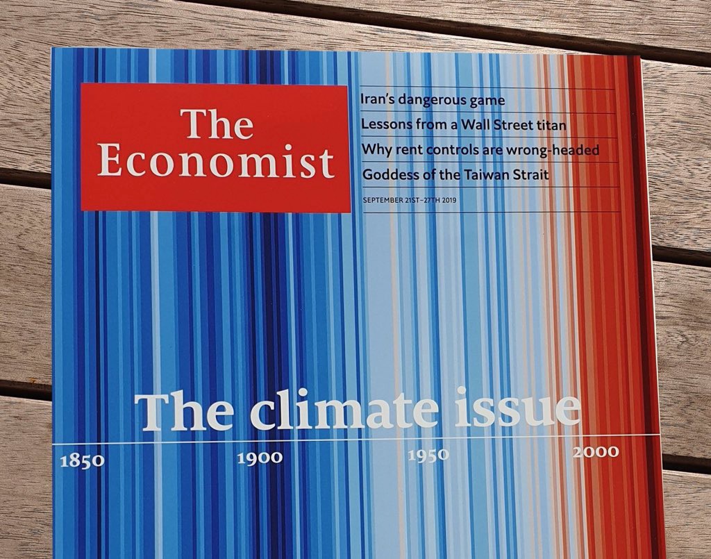
Reaching broad audiences through newspapers, magazines and other media #ShowYourStripes 




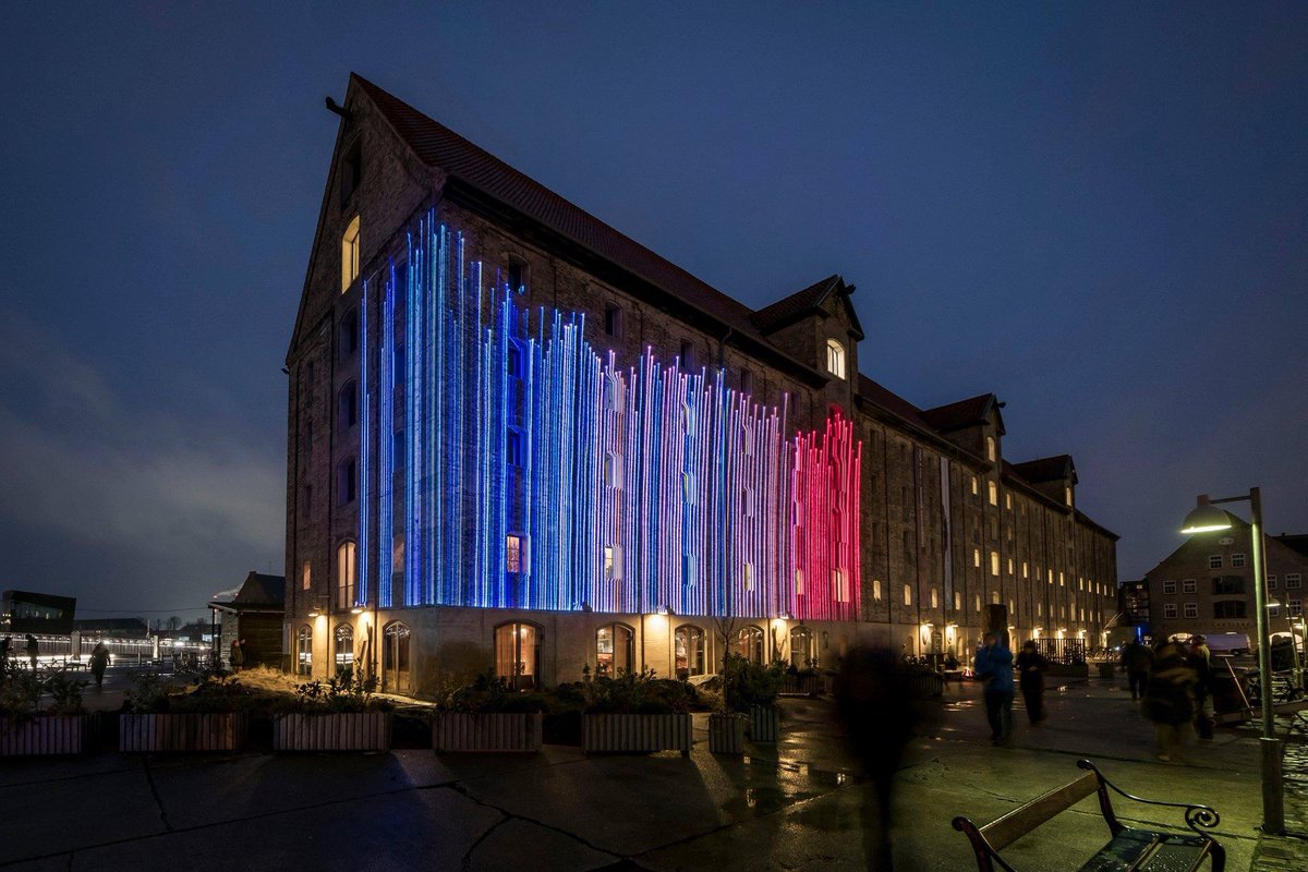
And, innovative light shows communicating to yet another type of audience and starting more conversations. #ShowYourStripes 


At the centre of the groups using the Warming Stripes has always been the TV weather forecaster community, led by @WeatherProf. These trusted voices are an important way that millions of people hear information about how our climate is changing. 


The warming stripes have also been used prominently by those campaigning for more rapid action, consistent with the Paris Agreement to limit global temperature rise. #ShowYourStripes 


And, today, cyclists from @ClimateClassic are cycling along the 1m elevation line in the Netherlands to highlight the risks from sea level rise. 

Buildings and walls have been painted from Spain to Scotland to Jersey to Puerto Rico, amongst many others. #ShowYourStripes 


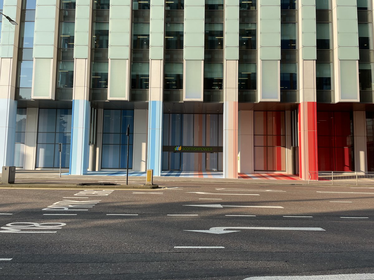


Politicians in the US wore the Warming Stripes to the State of the Union address in 2020, led by @USRepKCastor and @ClimateCrisis: bbc.co.uk/news/av/scienc…
And, the President of Chile (@gabrielboric) wore this #ShowYourStripes mask to the final debate before his election.
And, the President of Chile (@gabrielboric) wore this #ShowYourStripes mask to the final debate before his election.

In Leipzig, a crowd funded effort to paint the Sachsen Bridge has created a version of the Warming Stripes that is visible from space! #ShowYourStripes 


When it is published in October this year, @GretaThunberg's new book on the climate & ecological crises will have the Warming Stripes on the cover, bringing the #ShowYourStripes graphics to a new audience. 

And this use of the graphics as a book cover has a nice link back to the first time I talked about the Warming Stripes at @hayfestival in 2018 at an event with the author @nicolakidsbooks about communicating climate change.
The stripes on the screen are for the town of Hay.

The stripes on the screen are for the town of Hay.


So many other novel & creative ways that people have adapted the warming stripes concept. Wrapping street posts, blowing beautiful glass vases (@CathrynShilling), decorating a shower cubicle and even a snowboard! #ShowYourStripes 


• • •
Missing some Tweet in this thread? You can try to
force a refresh


