COVID-19: Comic and video explanation of transmission
Multiple years into the pandemic and many still don't understand how the airborne transmission of respiratory viruses like COVID-19 work. 🧵1/
The Aerosol Science Research Center in Taiwan has put together an explainer comic and video for people to more easily understand ( aerosol.nsysu.edu.tw/en/scopes/108 ). 2/
The youtube video can be found here ( ). 3/
Hopefully this will help people understand that being in a closed meeting room of people for multiple hours with people spaced exactly 2m apart is not sufficient to prevent transmission from a virus that travels in the air. 4/
With poor ventilation those virosols (virus-laden aerosols) can remain in the air for hours so you might even get infected by someone who was in the previous meeting and is not even there any more. 5/
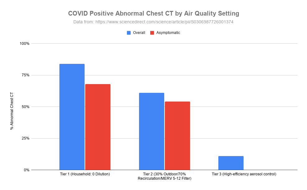
Surface cleaning does *not* stop airborne transmission and physical barriers like plexiglass can actually disrupt air flow and trap higher concentrations of aerosols making things worse. 6/
How do you reduce the chance of airborne transmission?
- improve ventilation & air filtration
- wear mask with proper fit (N95 or better)
- avoid clustering
- keep physical distance (2m is not sufficient for aerosols)
7/
"We are exposed to massively more pollutants, toxins, and pathogens via air than food and water." so fixing and improving air quality helps with so much more than just COVID-19 (
You can see in the graph, COVID makes up the majority of new hospitalizations due to #Flu, #RSV or #COVID throughout the year, and even stays ahead during winter respiratory virus season. 🧵1/
New hospitalizations are increasing again. This last update was the first time Flu hospitalizations (42) were significantly higher than COVID (34) in the same week with RSV at 14 people. 2/
In Ottawa, test positivity for Flu A (bright green) has really increased, COVID is still in second place, but seasonal human coronavirus is almost the same level, followed by Entero/Rhinovirus, and then RSV for the top 5. 3/
Similar to #Canada, babies in the #UK are at higher risk for #hospitalization and #ICU admission from #COVID. Their data looks deeper at infants < 6 months old which have higher ER attendance, hospital admission and severe hospitalisation rates than the oldest adults 90+! 🧵1/
In Canada, babies < 1 years old had the highest ICU admission rates of all age groups from Aug. 27, 2023 to Aug. 24, 2024. Read on to see more details including Flu and RSV too ( ). 3/
The @elastomaskpro () is a NIOSH approved reusable N95 elastomeric respirator. It is made of silicone so a higher chance it will fit and seal well and is super breathable at the same time. Read on to find out more about my experience with it. 🧵1/ elastomaskpro.com
Full disclosure: ElastoMaskPro sent me a unit to evaluate. There were no strings attached, they just asked that I provided feedback after I tried it. This thread is the first time they are seeing my feedback, they did not review anything before it being posted here. 2/
The ElastoMaskPro is very cost effective at the current sale price of $29.99 which includes two N95 filtering pucks. You can continue using the filters until they either get too dirty or there is increased breathing resistance. 3/
Ottawa updated its #respiratory #virus data again after a break for the holidays, respiratory related ED visits are up especially in kids 0-3, then 4-11 and age 80+. 🧵1/
Quite a mixture of different viruses testing positive in the lab right now so people can pick up a variety of bugs in the air. 2/
New hospitalizations also jumped a lot in the last two reporting weeks, not just due to #RSV but a big spike in #COVID as well.
#Variant update for #Ontario, #Canada (to Dec 10, 2024)
The KP.3.1.1 #DeFLuQE variant has finally been surpassed with XEC now in top place above 20% while the other 5 (MC.* and XEC.* descendants) remain < 7%. Graph tools by @Mike_Honey_ 🧵1/
XEC is a combination of KP.3.3 and KS.1.1 that recombined together. MC.1 is a direct descendant of KP.3.1.1 with one spike mutation at T571I. To learn more about how variant naming works, you can read this article I wrote with @paulseaman31 ( ). 2/docs.google.com/document/d/1q0…
This Sankey graph shows the proportion of variants from PCR test genomic sequencing in Ontario since October 27, 2024. You can follow the lineage backwards to see where a variant is a descendant from. 3/
This is a good example of why it is useful to understand the importance of population *rate* and not just look at raw numbers. The first graph shows raw numbers and the second graph population rate. 🧵1/ #ED #Respiratory #Virus #Population #Ottawa
Ottawa Public Health makes only the raw data available for All causes and respiratory-related emergency department visits to Ottawa hospitals by age group and week ( ). 2/open.ottawa.ca/datasets/ottaw…
If I take the data and plot all the ages together, you can at least see all of the age groups at the same time but it is just the raw numbers. 3/