PhD Biomedical researcher, data scientist, and finder of large prime numbers. Views are my own. @jeffgilchrist@mstdn....
 While the "official" season for Flu and RSV is over, you might be surprised to learn that hospitalizations usually don't completely stop over the summer. 2/
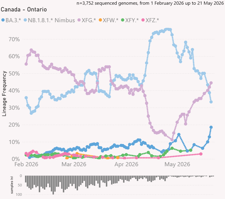 The BA.3.2 "Cicada" family increased to 19% but the low # of sequences means results are not very representative. 2/
 Looking at age groups, those age 75+ and 65-74 tied for having the highest rates of hospitalization due to COVID and both increased since last update. The only other age group with hospitalizations was 50-64, no children this past update. 2/
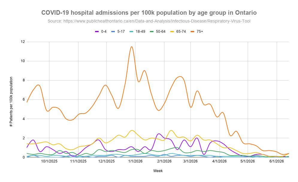
 Looking at age groups, those age 75+ had the highest rates of hospitalization due to COVID but decreased since last update. Tied for second place are the 0-4 and 65-74 age groups. 2/
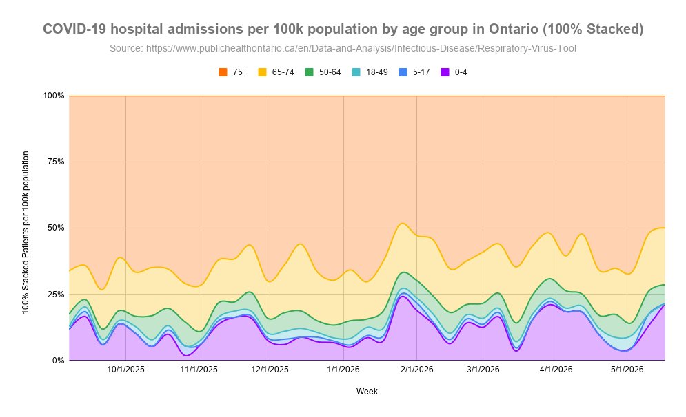
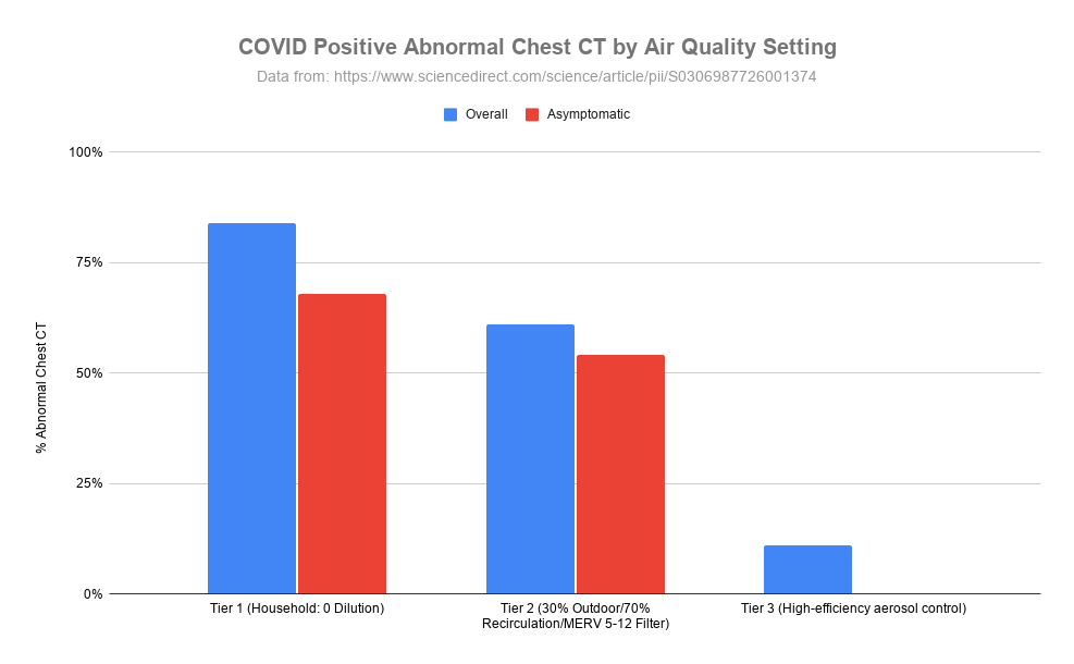 An interesting hypothesis-generating study was published recently that asked if an infected person's condition can become even worse by re-inhaling their own virus particles ( ). 2/sciencedirect.com/science/articl…
 Looking at age groups, those age 75+ had the highest rates of hospitalization due to COVID but decreased since last update. Second place is age 65-74 which increased, and third place is age 0-4 which also increased. 2/
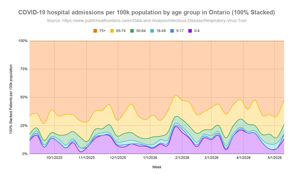
 Ontario released another month of sequencing data by age and we continue to see high ratios of Cicada in children with another 51 BA.3.2.2.* sequences out of 617 new sequences ( ). 2/publichealthontario.ca/-/media/docume…
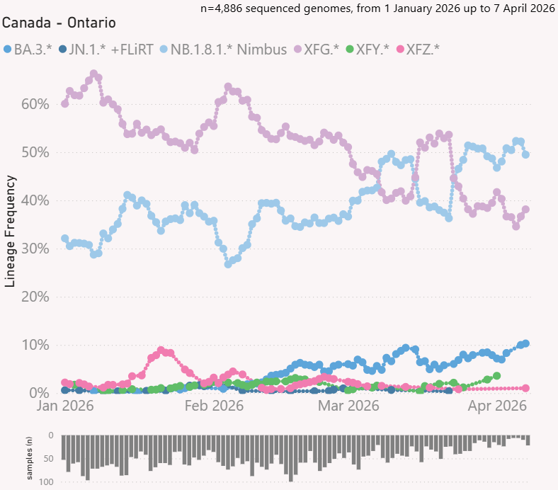 The BA.3.2 "Cicada" family has been slowing climbing and now above 10%. 2/
 Looking at age groups, those age 75+ had the highest rates of hospitalization due to COVID but decreased since last update. Second place is age 0-4 and their levels are currently increasing while age 65-74 has the third highest rate and also decreased since last update. 2/
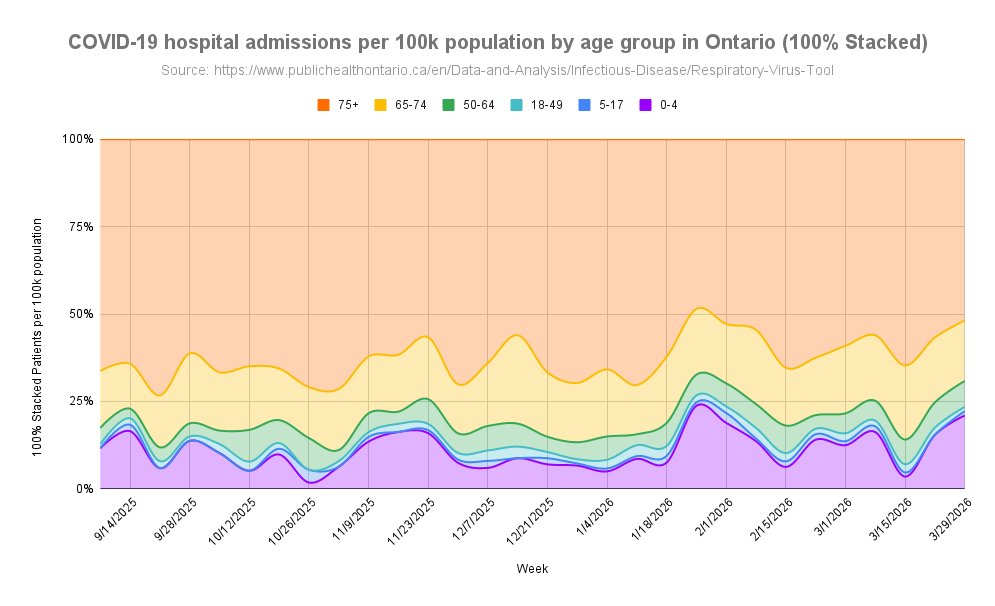
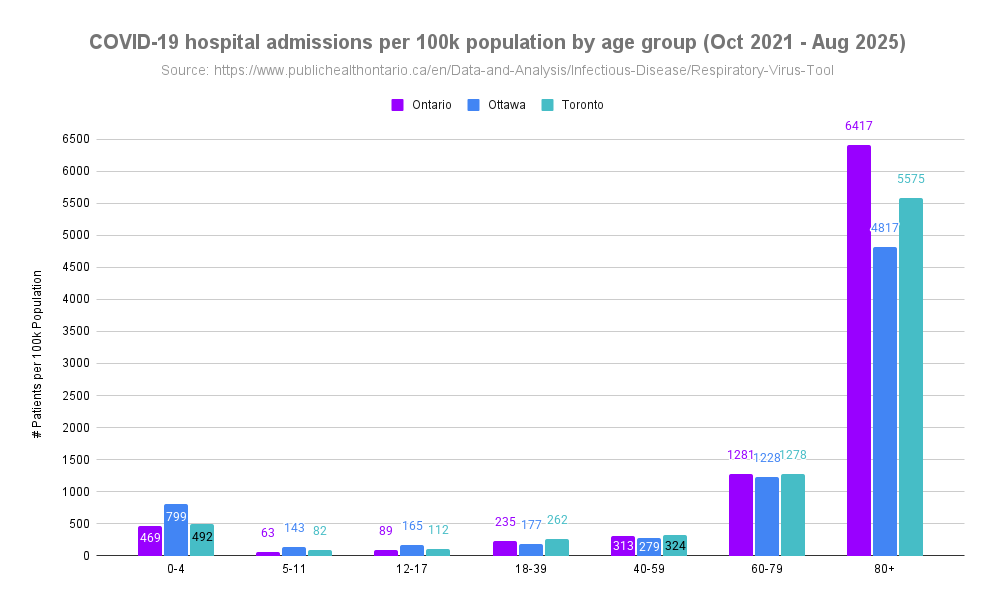 We have heard from many sources throughout the pandemic that COVID isn't serious in children or they are not impacted as much as adults with some people still claiming this today. 2/
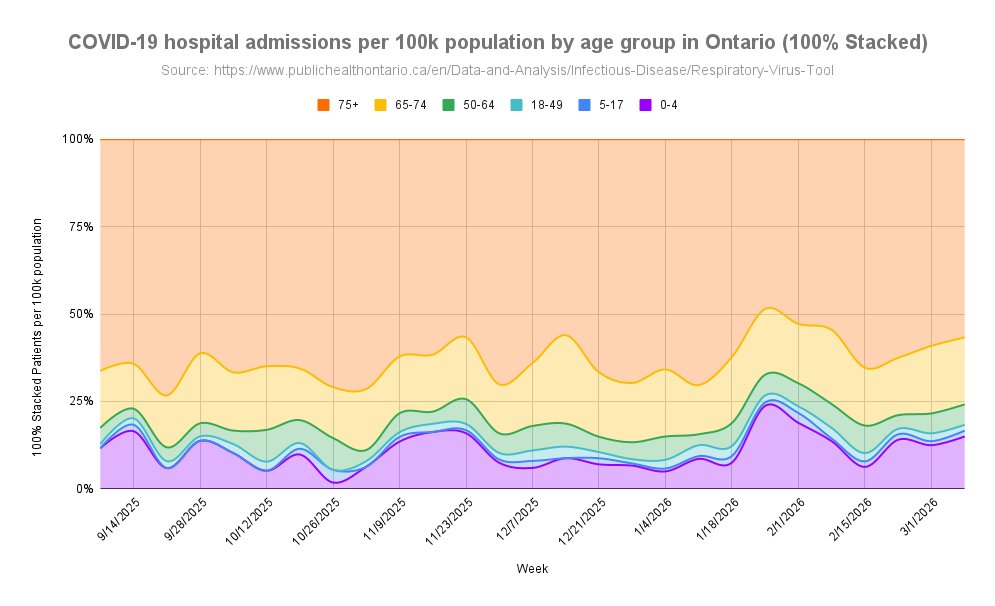
 Looking at age groups, those age 75+ had the highest rates of hospitalization due to COVID but decreased since last update. Second place is age 65-74 and their levels are currently decreasing while age 0-4 has the third highest rate and also decreased since last update. 2/
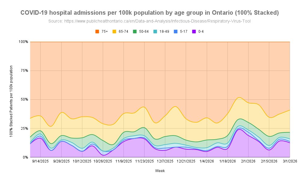
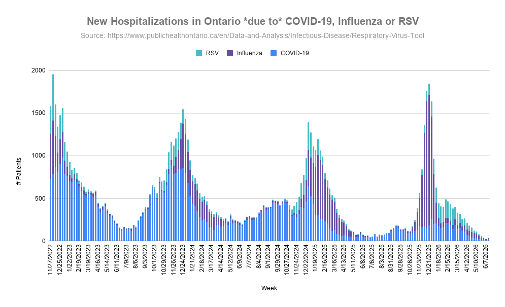
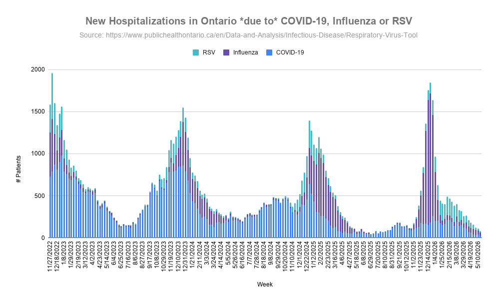
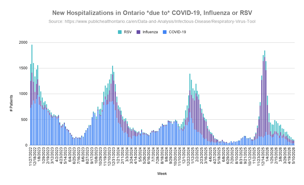
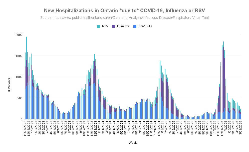
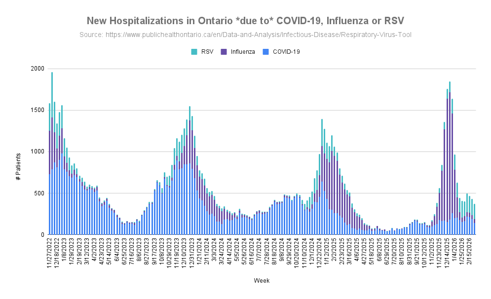
 Looking back over the past few years, new hospitalizations for RSV have remained pretty stable the last two years around 2,500 and a decrease from 2023, while COVID has been significantly dropping each year, 26,571 in 2023 to 15,739 in 2024 to 6,788 in 2025. 2/
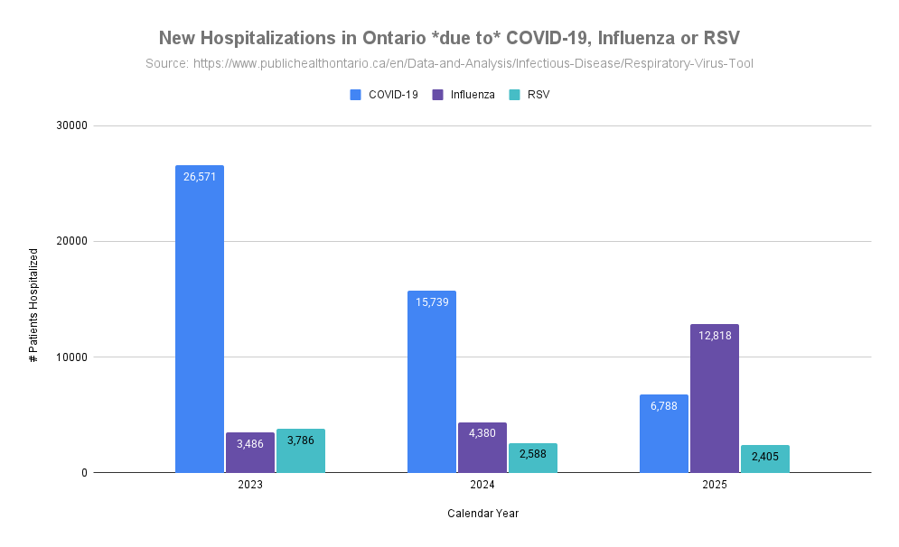
 Protection mostly depends on how well that mask fits your specific face and one that does not fit well, much of the air you breathe will go around the filter material and filter 0% of those particles. 2/
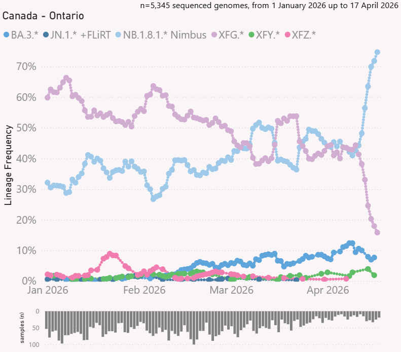
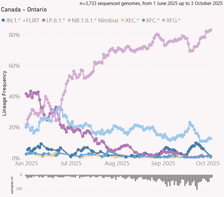 Looking at specific variants, XFG.3 has dropped considerably and its descendent XFG.3.15 now takes first place at 6.2%, followed by XFG.3 at 5.2% and XFG.2 at 4.5%. 2/
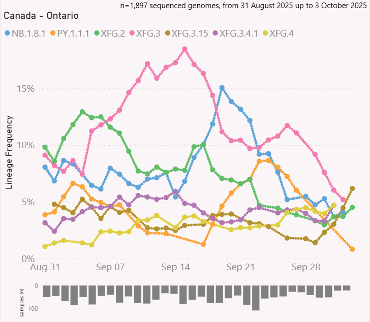
 Looking at specific variants as of mid August, XFG.5.1 is most prevalent at 13%, NB.1.8.1 in second at 10%, XFG.2 in third at 8.6% and XFG.3 in fourth at 7.4%. 2/

 The web version of this article with nice table of contents and easy to share with others can be found here ( tinyurl.com/AQHIwildfire ) and ( docs.google.com/document/d/1s9… ). 2/

 The EPA maps fine particulate pollution to their Air Quality Index where anything above 125.5 PM is Very Unhealthy which is a "Health alert: The risk of health effects is increased for everyone" ( ). 2/airnow.gov/aqi/aqi-basics/
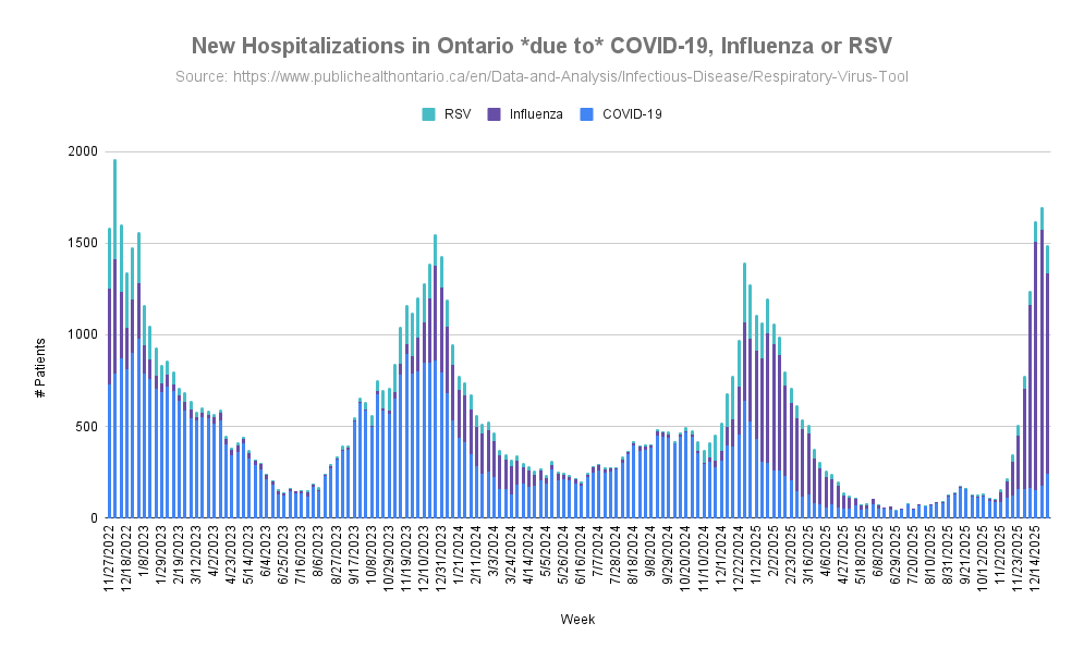
 New hospitalizations are increasing again. This last update was the first time Flu hospitalizations (42) were significantly higher than COVID (34) in the same week with RSV at 14 people. 2/


 Full disclosure: ElastoMaskPro sent me a unit to evaluate. There were no strings attached, they just asked that I provided feedback after I tried it. This thread is the first time they are seeing my feedback, they did not review anything before it being posted here. 2/
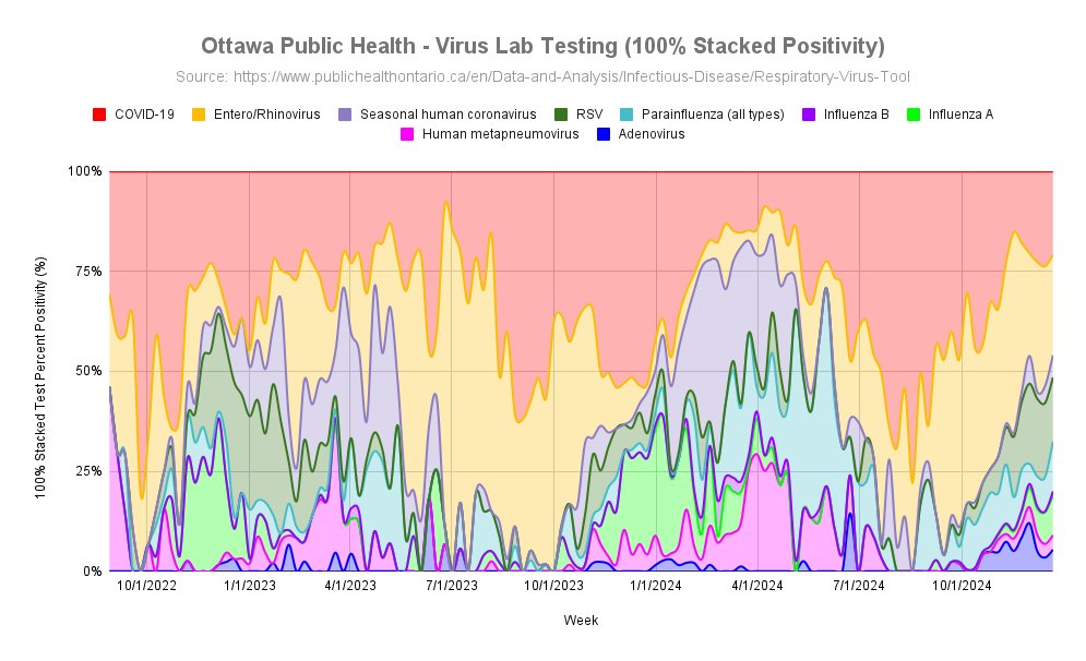
 Quite a mixture of different viruses testing positive in the lab right now so people can pick up a variety of bugs in the air. 2/