HowTo: Budget Studio ver.1.22474487139...
This is an update (and slightly messy version) of the Budget Studio. It provides a much finer lighting control while still being pretty cheap!
You'll need:
- 1x FC Room/Apt
- 3x White Screens
- 1x platform of your choice
#gposeguide

This is an update (and slightly messy version) of the Budget Studio. It provides a much finer lighting control while still being pretty cheap!
You'll need:
- 1x FC Room/Apt
- 3x White Screens
- 1x platform of your choice
#gposeguide


So here's how it works: Different Point Light types have different falloff distances. We can use that to our advantage; Type 1 Point lights will be the bread and butter of this setup. 

Position your platform far enough from a Type 1 Light source, and it'll project very little falloff on the White Screen. This way you can use the Type 1 Light Source to illuminate the back of your character, for example, while still being far away enough from the backdrop! 

But where to position the Screens and the stand? Well, you see - housing spaces can actually be divided into a large grid, determined by the columns.
So apartments and FC Rooms measure 4x3; small Houses are 4x5 (actually 3x3 + 3x5) and Mediums are 4x6 (same caveats apply.)
So apartments and FC Rooms measure 4x3; small Houses are 4x5 (actually 3x3 + 3x5) and Mediums are 4x6 (same caveats apply.)
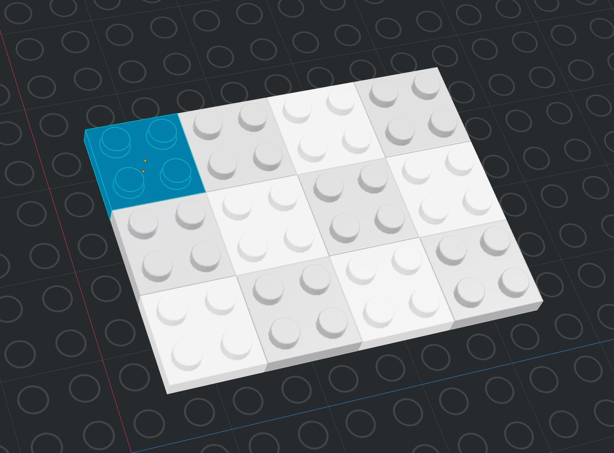
Now here's the thing: The base of a White Screen measures exactly 1x1! So back to our Lego board, you can position the elements like so: 

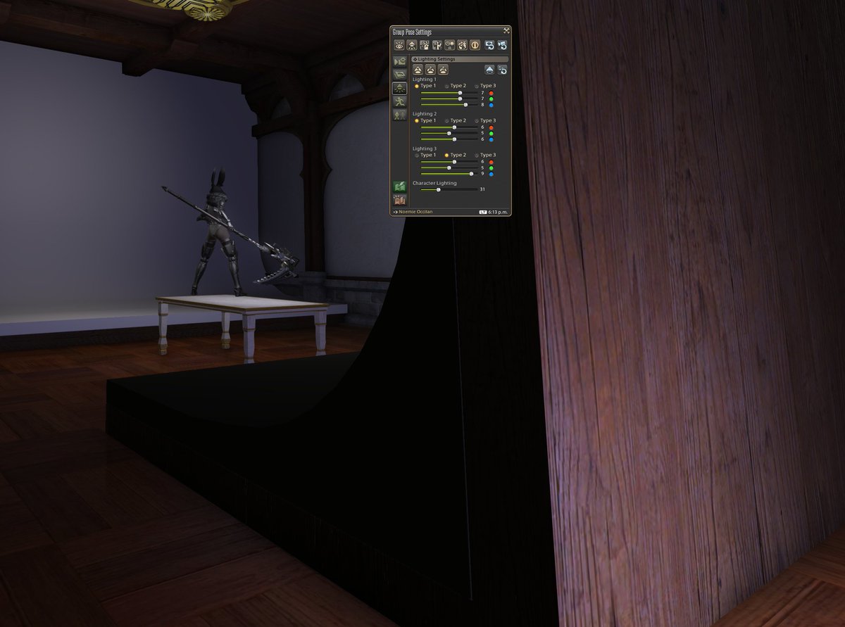
And behold the real thing! (Anticlimactic, I know.) In this setup, I also included a set of White Screens dyed Snow White on the opposite side to provide more backdrop options. 

Let's position a very intense Type 1 source behind the character. Turning to the front of the character, notice how the background stays dark, but with a very strong rim light. 


The third point light is set to Type 2 and positioned behind the White Screen, to provide a different rim light source. 


Time for some GShade magic. Cocktail, from Neneko's Summer Vibes set; Character Lighting is set up to 72, and some minor adjustments to lights 1 and 2. 

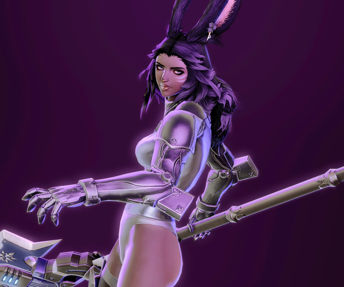
This shot was done using this new setup. It was made with a medium type 1 yellow source to her back left top side, and a type 1 weak steel gray source to the back top right. The background lighting is very subtle and provided by a weak white source immediately behind her. 
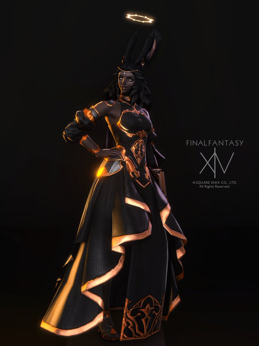
A type-1 purple source at the weapon's location, type-1 golden to the character's back left side, key type-1 white-purplish light to the character's front top right side. 

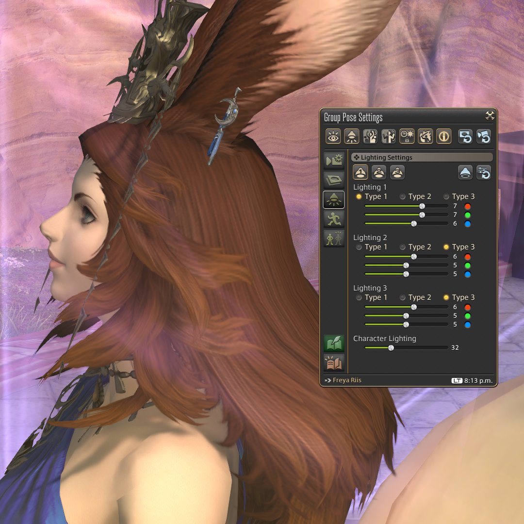
And finally, one using the white background. Same concept, but the backlight is actually a type 2 orange source to project a strong falloff. White and Orange Type 1s on the front to provide shades - look how well defined the belly and arm shades end up, giving it a nice volume. 

• • •
Missing some Tweet in this thread? You can try to
force a refresh


