Hey, designers and developers, does anyone use fractional font sizes in your designs?
No? Read further to know how one simple trick can make your text look sharper, help with paddings, and perhaps even become an essential part of your design system.
#ui #ux #uiux #typography
No? Read further to know how one simple trick can make your text look sharper, help with paddings, and perhaps even become an essential part of your design system.
#ui #ux #uiux #typography
First of all, why do we even use whole numbers, like 14 or 16px, for font sizes?
Because it’s comfy! We’re humans, and our brains tend to stick with simple round numbers.
Because it’s comfy! We’re humans, and our brains tend to stick with simple round numbers.
However, the problem is that, in terms of real pixels, the actual visible size of the character doesn’t match the given font size value, and in most cases, this visible size doesn’t match the pixel grid.
So we end up with a text which is blurry at the top.
So we end up with a text which is blurry at the top.

(There are reasons why these things are quite complex in fonts. We can talk about them some other time. Like this tweet if you’re interested.)
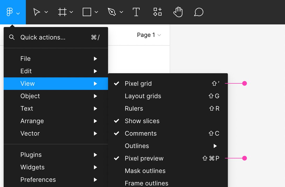
To check it in your design, first, turn on the pixel grid display. `View → Pixel Grid` in Figma, `View → Canvas → Show Pixel Grid on Zoom` in Sketch.
Then, turn on pixel preview. `View → Pixel Preview` in Figma, `View → Canvas → Show Pixels on Zoom` in Sketch.
Then, turn on pixel preview. `View → Pixel Preview` in Figma, `View → Canvas → Show Pixels on Zoom` in Sketch.
And then zoom in on the text enough to see the pixels.
Don’t count on retina displays hiding this effect. The difference is noticeable even with high pixel density.
Don’t you want to provide razor-sharp text for your readers?
Don’t you want to provide razor-sharp text for your readers?
So, let’s get out of our comfort zone and slightly reverse the priorities!
Let’s make the height of our capital letters a round number of pixels rather than specifying a round number for the font size.
Let’s make the height of our capital letters a round number of pixels rather than specifying a round number for the font size.
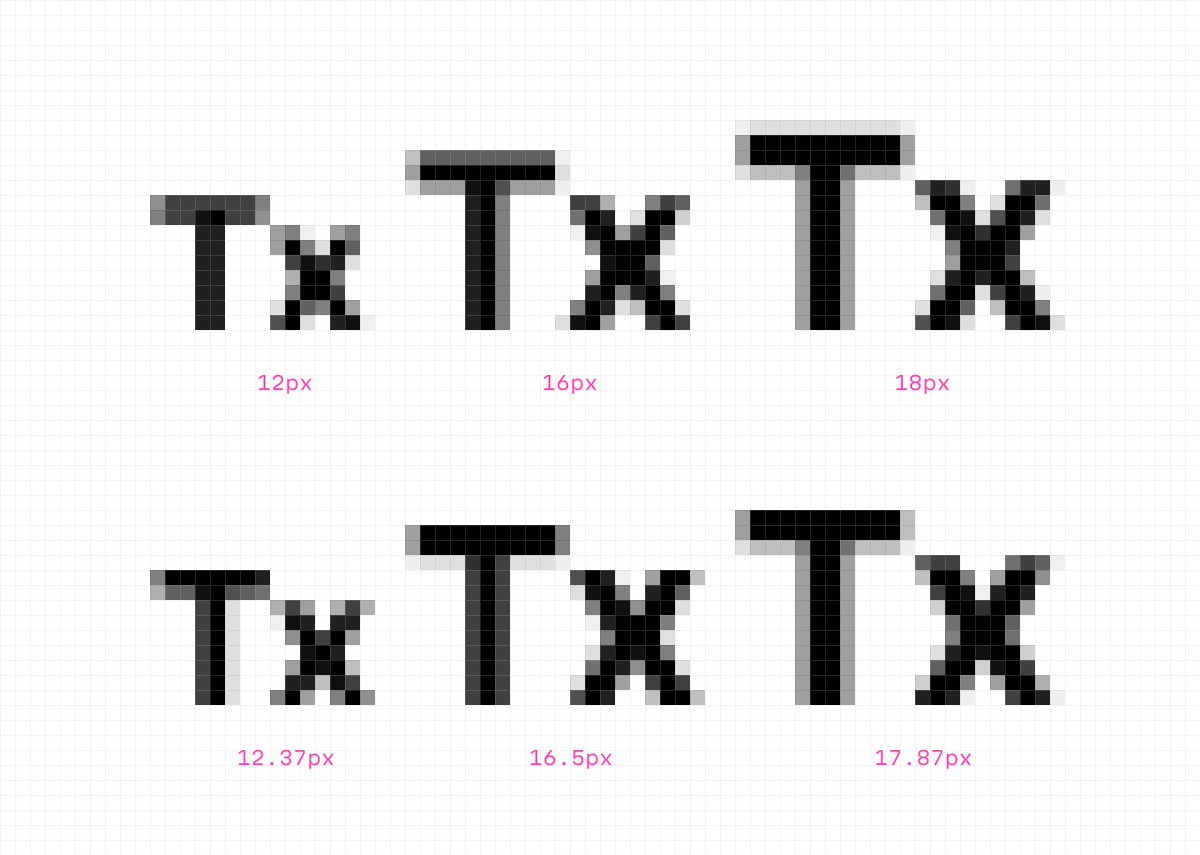
For this example I took the great Inter font by @rsms.
The text labels on the top are set for the most popular font sizes: 12, 16, and 18px. The ones on the bottom have been slightly tweaked to achieve the closest pixel-perfect height.
Just like that. Isn’t it simple?
The text labels on the top are set for the most popular font sizes: 12, 16, and 18px. The ones on the bottom have been slightly tweaked to achieve the closest pixel-perfect height.
Just like that. Isn’t it simple?
Besides text sharpness, this approach brings us a few benefits.
👇
👇
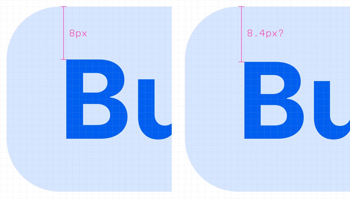
1. Since the cap height takes the whole amount of pixels, the space above the text (on a button, for example) takes the whole amount of pixels too. This makes it easier to adjust the text label’s vertical position of UI elements.
2. Also, if you use something like a 4px baseline grid in your design system, you can set visible font sizes according to it.
I have some more tips and tricks on that. Follow me and don’t miss anything: @romanshamin_en.
I have some more tips and tricks on that. Follow me and don’t miss anything: @romanshamin_en.
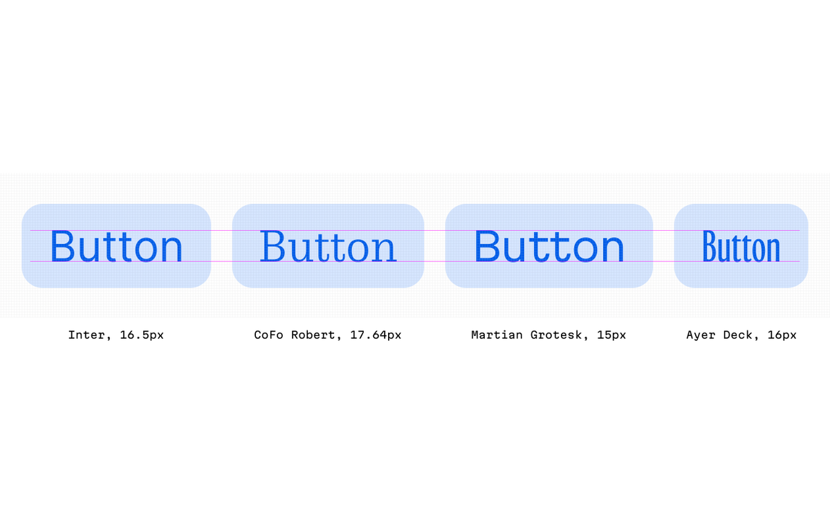
3. And, if one day you have to swap the font family for another, this new font will look the same size as the previous one.
Of course, that is, if you set its cap heights to the same size in pixels.
Of course, that is, if you set its cap heights to the same size in pixels.
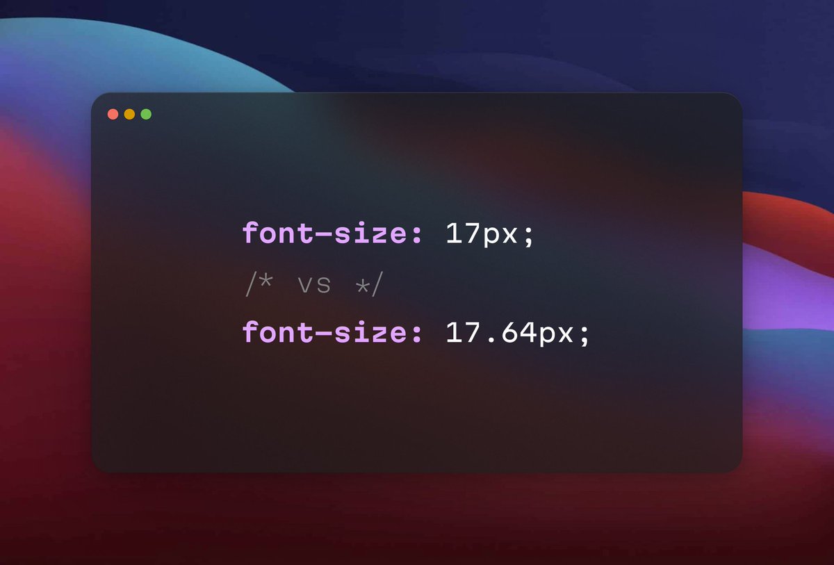
Okay, how to calculate the font size to achieve that pixel perfect cap height?
There’s a formula. If you want maximum precision and you’re ready to extract a few parameters from the font `hhea` table, just ping in DM or in replies.
But… I recommend finding it manually!
There’s a formula. If you want maximum precision and you’re ready to extract a few parameters from the font `hhea` table, just ping in DM or in replies.
But… I recommend finding it manually!
Just zoom in to see the top of the text label very closely. It must be about 6400% of the zoom option or higher.
Increase or decrease the value by 0.1 or 0.2 points in the font size text field. Then repeat with 0.01 to make the shape fit the pixel grid perfectly.
That’s it!
Increase or decrease the value by 0.1 or 0.2 points in the font size text field. Then repeat with 0.01 to make the shape fit the pixel grid perfectly.
That’s it!
* * *
I know it can take time to wrap your brain around using fractional sizes. Sometimes numbers can turn out long and ugly. Don’t worry about it, browsers don’t care. And, to be honest, it’s their primary job to count numbers quickly.
I know it can take time to wrap your brain around using fractional sizes. Sometimes numbers can turn out long and ugly. Don’t worry about it, browsers don’t care. And, to be honest, it’s their primary job to count numbers quickly.
Frontend developers also don’t have to constantly deal with them. They can put these values to CSS custom properties.
This little trick is just one essential part of the design system we made in @evilmartians.
Want to read more about it? Take a look at the thread of my teammate @antiflasher explaining why it’s worth having system versus not:
Want to read more about it? Take a look at the thread of my teammate @antiflasher explaining why it’s worth having system versus not:
https://twitter.com/antiflasher/status/1544630261664649217
I mostly write about all the aspects of building design systems. Also, I’m working on creating a font family and sharing the process on my Twitter.
If you’re interested, follow me: @romanshamin_en.
If you’re interested, follow me: @romanshamin_en.
Well, this is it. Try this on your next project and let me know what you think!
TL;DR
Using fractional values for your UI typography gives:
— extra text sharpness
— predictable vertical space
— advanced typography for design systems
— simpler font family swapping
🙌
TL;DR
Using fractional values for your UI typography gives:
— extra text sharpness
— predictable vertical space
— advanced typography for design systems
— simpler font family swapping
🙌
P. S. Okay, since this got viral, here are some of my articles you may find interesting.
1/4
Accessible design from the get-go | evilmartians.com/chronicles/acc…
1/4
Accessible design from the get-go | evilmartians.com/chronicles/acc…
• • •
Missing some Tweet in this thread? You can try to
force a refresh