Roman Shamin Profile picture
Head of design @evilmartians • https://t.co/zVBG5W9hxH • Free #MartianMono font: https://t.co/pavvE1jDxz • Martian Grotesk font: https://t.co/RnJbTwkQu8
Sep 29, 2023 27 tweets 8 min read
Introducing #Harmony, a new UI color palette for product designers.

Harmony combines cutting-edge color technology, providing precise UI element contrast control, extremely consistent color shades, and P3 gamut support.

It’s free and available in Figma Community. Begin here:

You’ll discover the palette neatly organized in the “Harmony Primitives” collection. Utilize it to craft aliases for your semantic tokens and set up UI theming modes.

P. S. Keep mirrored contrast pairs in mind (we’ll delve into these later).figma.com/community/file…
Aug 25, 2022 34 tweets 10 min read
The vertical metrics of the Martian Grotesk and Mono typeface family are one reason they work great in UIs.

In this thread, I explain how “equal” metrics—metrics that lead to equal space above and below the text—can make digital design and development easier.

#uiux #typography Text “Vertical metrics in U... In a line of text, every letter has its own visible shape and size. However, when we implement a line of text with HTML/CSS in the browser, or by using text labels in XCode, we’re actually working with the invisible rectangular area around it.

This area is called a bounding box. Two texts “Halg”, the one o...
Jul 12, 2022 24 tweets 6 min read
Hey, designers and developers, does anyone use fractional font sizes in your designs?

No? Read further to know how one simple trick can make your text look sharper, help with paddings, and perhaps even become an essential part of your design system.

#ui #ux #uiux #typography Image 
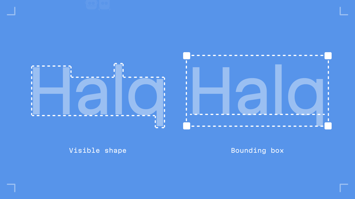
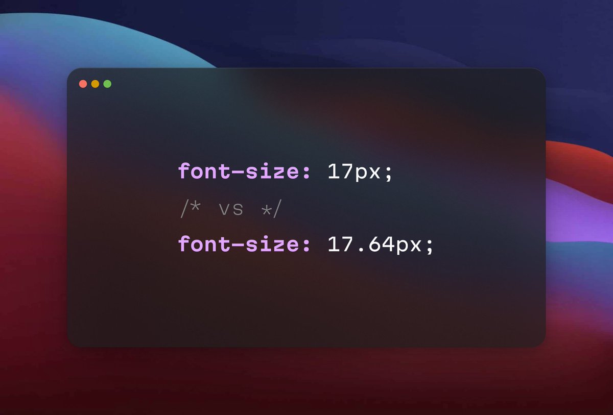
First of all, why do we even use whole numbers, like 14 or 16px, for font sizes?

Because it’s comfy! We’re humans, and our brains tend to stick with simple round numbers.