Ed Hawkins Profile picture
Jul 26 7 tweets 3 min read
As expected, the new #readingfc home kit has provoked some strong reactions!

- Love it!
- Like the idea but not the design
- Worst kit ever!

Whatever your view, the kit has started a conversation.

So, what do the sleeves represent and what does the science say?
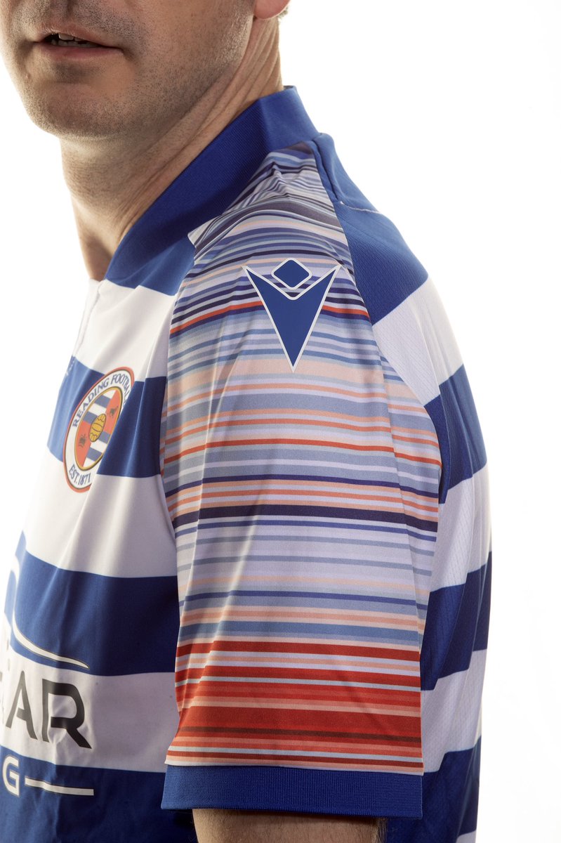
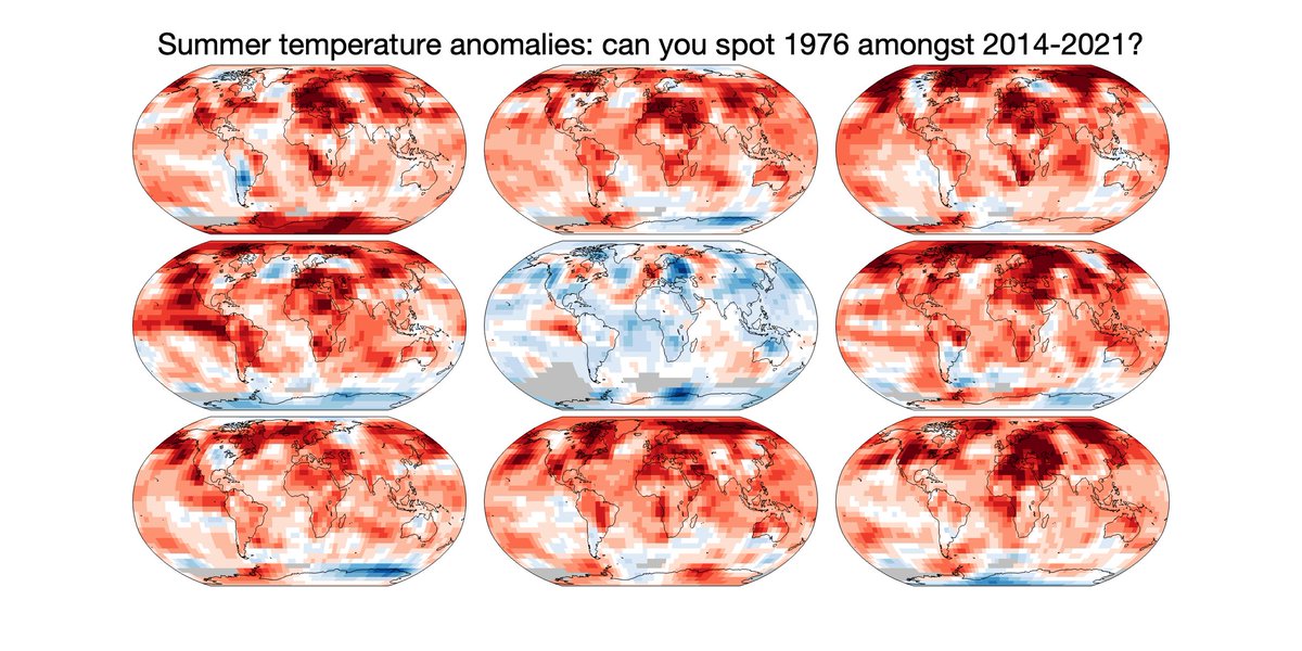
The sleeve colours represent the change in annual temperature in Reading, with one stripe per year. Red for hotter years.

Since the club was founded in 1871, temperatures in Berkshire have risen 1.5°C.

This is primarily due to us burning fossil fuels such as coal, oil & gas.
None of this is controversial.

The science is clear and has been understood for decades.

Every national government recognises that rising temperatures are caused by our actions & that these bring severe consequences which we should avoid.

But what actions need to be taken?
To stop the planet from warming further we need to cut global emissions of greenhouse gases to almost zero.

The quicker we do this, the less bad are the consequences.

Every country needs to act, & every person will need to make some changes.

Football needs to play its part.
Making the necessary changes can be hard. For example, the @ReadingFC shirt sponsor is a car leasing company. How is this consistent?

In the UK all sales of new cars will be electric from 2030 onwards (or possibly hybrid until 2035). This is set in legislation. Change is coming.
This kit choice is the start of a journey. All businesses are going to need to make changes, and many will save money by doing so. But changes are also required in legislation to enable and encourage better choices.
The UK has decided to be net-zero carbon emissions by 2050 and a ‘citizens assembly’, representing the whole population, recently discussed how to achieve this.

You can read their report: climateassembly.uk/report/

• • •

Missing some Tweet in this thread? You can try to force a refresh
 

Keep Current with Ed Hawkins

Ed Hawkins Profile picture

Stay in touch and get notified when new unrolls are available from this author!

Read all threads

This Thread may be Removed Anytime!

PDF

Twitter may remove this content at anytime! Save it as PDF for later use!

Try unrolling a thread yourself!

how to unroll video
  1. Follow @ThreadReaderApp to mention us!

  2. From a Twitter thread mention us with a keyword "unroll"
@threadreaderapp unroll

Practice here first or read more on our help page!

More from @ed_hawkins

Jun 21
How do the warming stripes start conversations about climate change? #ShowYourStripes
They are stark visuals which, with a single glance, instantly communicate the simple message that the climate is heating up.
Their strength is the innovative ways that people have adapted them.
At London Fashion Week, @HouseOfTammam put on a catwalk show with dresses, accessories and a cape with the stripes as a theme, reaching a new audience and winning awards for sustainability engagement.
The rock band @ENTERSHIKARI used the warming stripes to start climate conversations with music fans during a sell-out festival tour.
Read 16 tweets
Jun 20
Whenever climate change & UK heatwaves are discussed someone will always say: 'but what about 1976?', as if this was evidence that the climate has not changed.
And, yes, summer 1976 was hot in the UK. It may not be obvious which map is 1976 when comparing with the last 8 summers.
But, taking a global view is important. Variations in the weather mean that locally some years are hotter & some cooler.
1976 clearly stands out as unusual. It was far cooler virtually everywhere when compared to the last 8 summers.
The UK happened to be an exception that year.
Local experiences of weather events are important - people are realising that we are living through more frequent & more intense heatwaves overall.
But relying on feelings about events from nearly 50 years ago is not a reliable way to understand the changes that are happening.
Read 4 tweets
May 26
Delighted that the Warming Stripes were chosen for the cover of @GretaThunberg's new book.
These 172 coloured stripes represent how global average temperatures have increased from 1850 to 2021. Billions of observations taken by many thousands of observers in one simple graphic.
The graphic used for this book continues the stripes backwards in time on the spine & back cover. For the period before 1850, information from 'paleo' sources are used, i.e. data from tree rings, corals etc. Because of the dimensions of the book the back cover goes back to 1630s.
The paleo-data is actually available for the last 2000 years, and highlights the unprecedented nature of the recent warming. The rapid change is mainly caused by our burning of fossil fuels to generate energy, starting with the invention of the steam engine. Image
Read 8 tweets
Dec 19, 2021
How do scientists assess policy-relevant risks?

A short thread.
When making policy decisions with uncertain information, the most likely outcome is usually not the most relevant.

This is because unlikely events do happen. And these unlikely events can have severe consequences.

Policy-makers need to avoid severe consequences occurring.
With covid, the potential severe consequences are that health services are overrun with patients, causing cascading effects with staff off sick, cancelled appointments, deaths, more long-covid and knock-on effects throughout society.
Read 9 tweets
Aug 18, 2021
Some figures from Chapter 1 of the new IPCC AR6 physical climate science report: ipcc.ch/report/ar6/wg1…

1/ Baselines and reference periods. Ever been confused about different climate baselines? Figures 1.11 and 1.12 may help, along with the discussion in Section 1.4.1.
2/ Climate variability. Short term fluctuations in the climate can temporarily obscure or enhance longer term trends. The size of the fluctuations depends on the variable of interest and spatial scale.

Figure 1.13 and Section 1.4.2 may help explain this.
3/ Emergence. Both the rate of change & the size of climate fluctuations matter for how climate change is experienced. The tropics tends to warm less but has smaller variations so has a larger 'signal-to-noise' ratio; the change is more apparent.
See Figure 1.14 & Section 1.4.2.
Read 15 tweets
Jul 16, 2021
Dear @BBCNews: this phrase, used in several recent articles, is not a fair representation of the science on extremes.

”Experts say that climate change is expected to increase the frequency of extreme weather events, but linking any single event to global warming is complicated.”
How about “Experts say that climate change is already increasing the frequency of extreme weather events, and many single events have been shown to have been made worse by global warming.” instead?
Perhaps @BBCAmos, @MattMcGrathBBC, @RHarrabin or @davidshukmanbbc could chat (again?) with the news team? The science has moved on and it would be great to see that reflected in the news coverage of extreme weather events, rather than the current inaccurate stock phrase.
Read 4 tweets

Did Thread Reader help you today?

Support us! We are indie developers!


This site is made by just two indie developers on a laptop doing marketing, support and development! Read more about the story.

Become a Premium Member ($3/month or $30/year) and get exclusive features!

Become Premium

Don't want to be a Premium member but still want to support us?

Make a small donation by buying us coffee ($5) or help with server cost ($10)

Donate via Paypal

Or Donate anonymously using crypto!

Ethereum

0xfe58350B80634f60Fa6Dc149a72b4DFbc17D341E copy

Bitcoin

3ATGMxNzCUFzxpMCHL5sWSt4DVtS8UqXpi copy

Thank you for your support!

Follow Us on Twitter!

:(