THREAD: The evolution of Pokémon cards through history, as generated by DALL·E 2
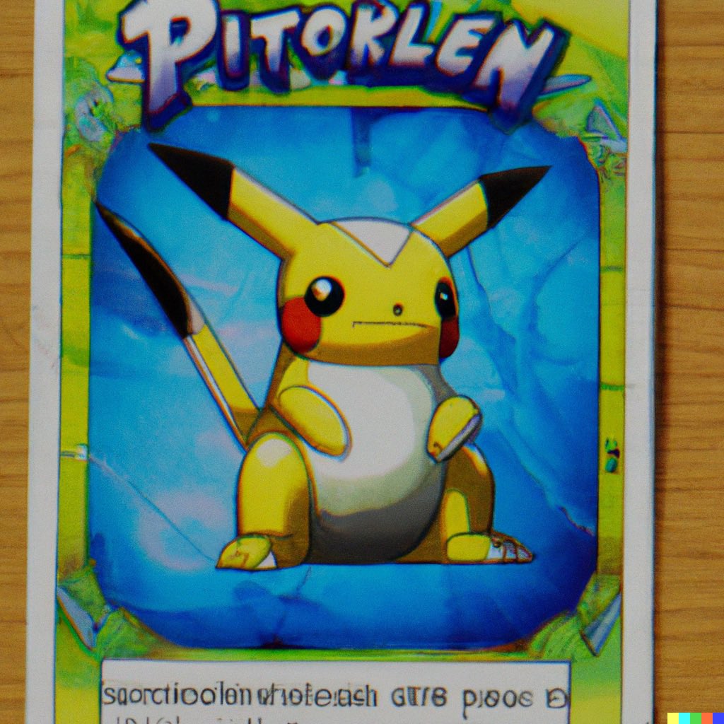
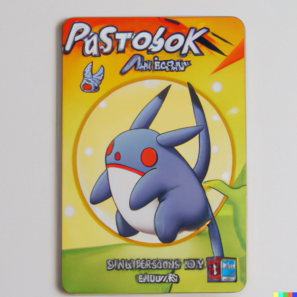
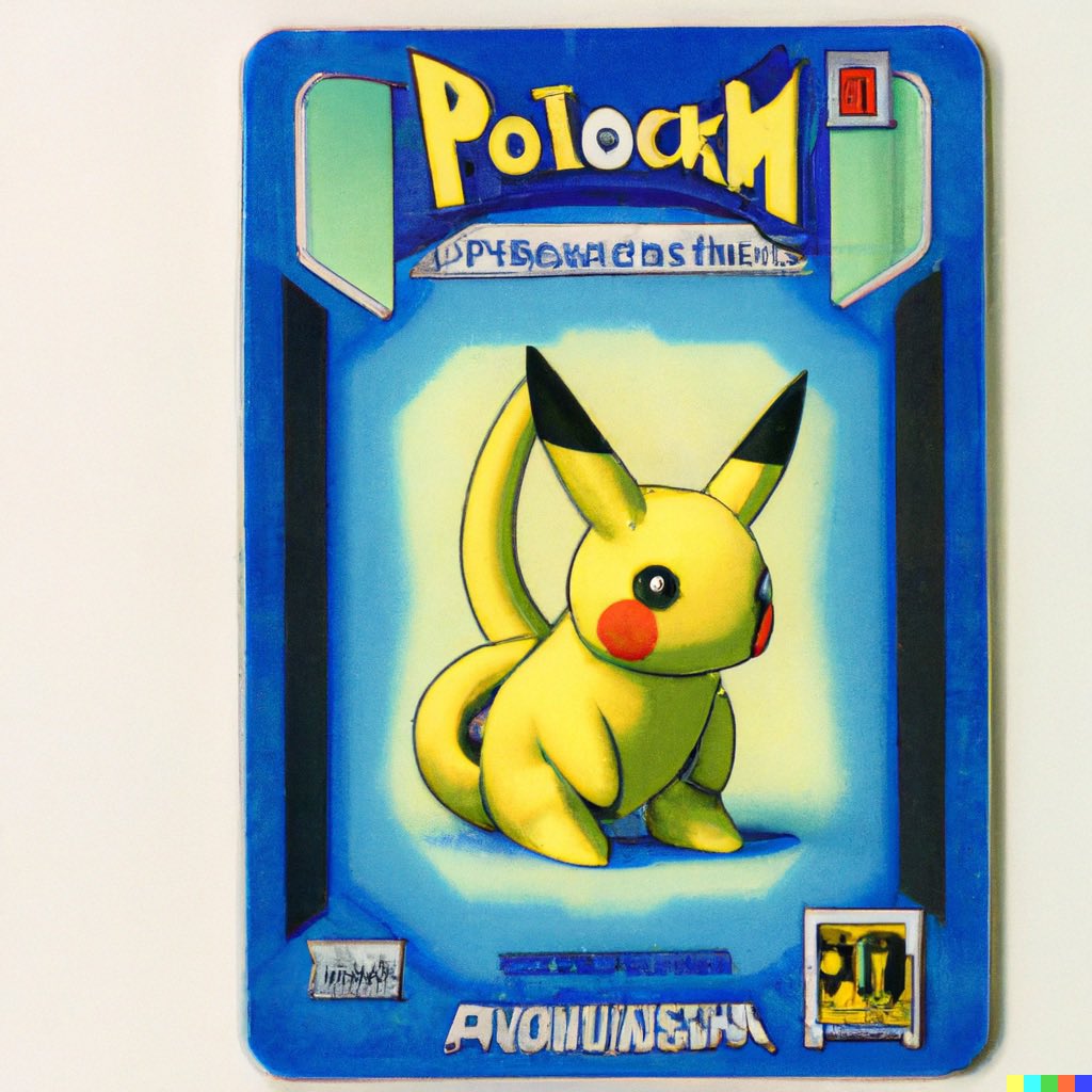
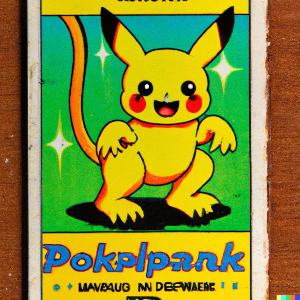
For starters, here’s what DALL·E 2 thinks 21st century Pokémon cards look like, using prompts like “A Pokémon card from 2001”
For starters, here’s what DALL·E 2 thinks 21st century Pokémon cards look like, using prompts like “A Pokémon card from 2001”
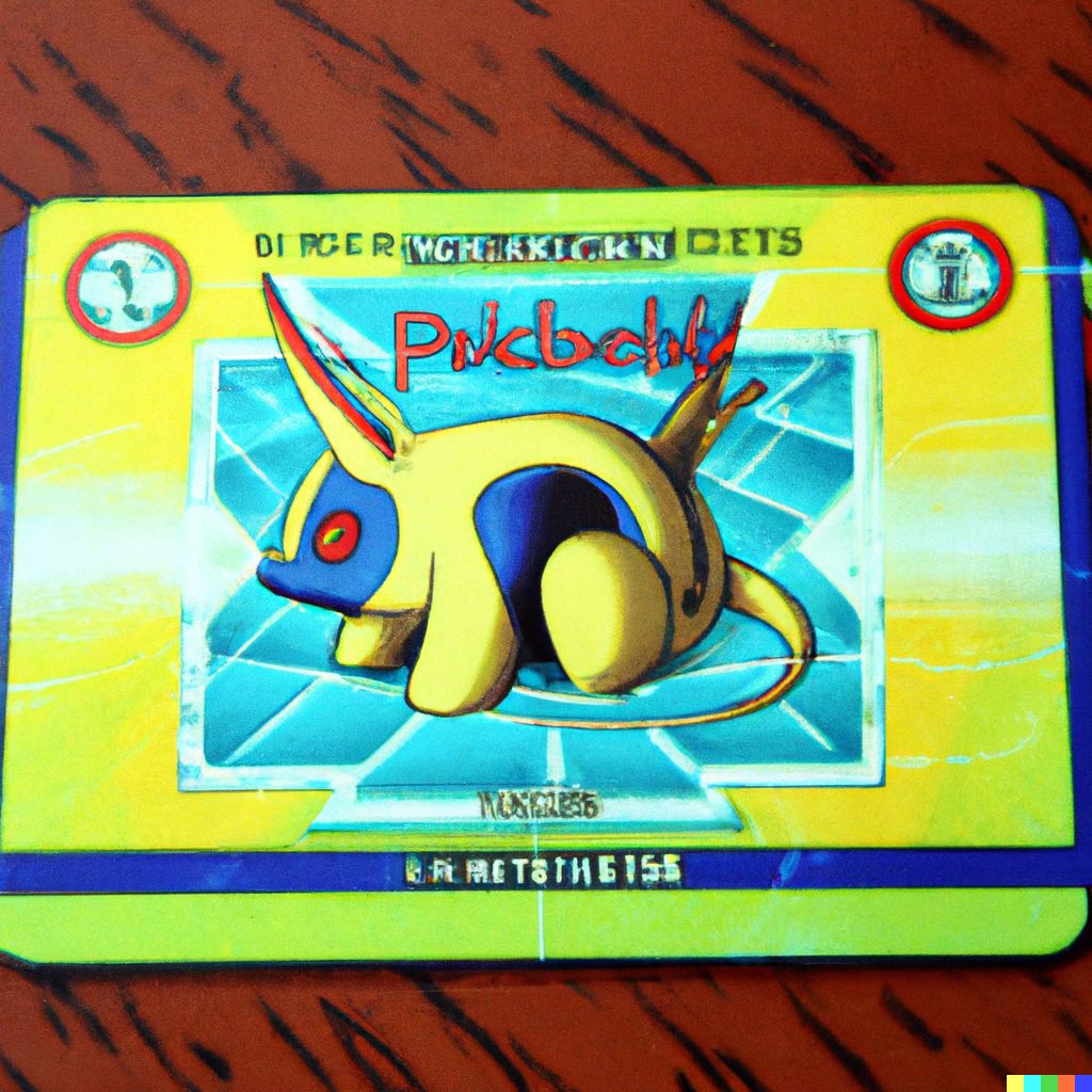
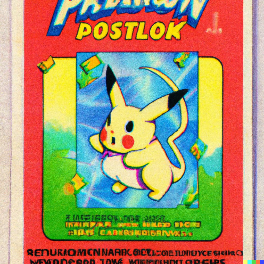
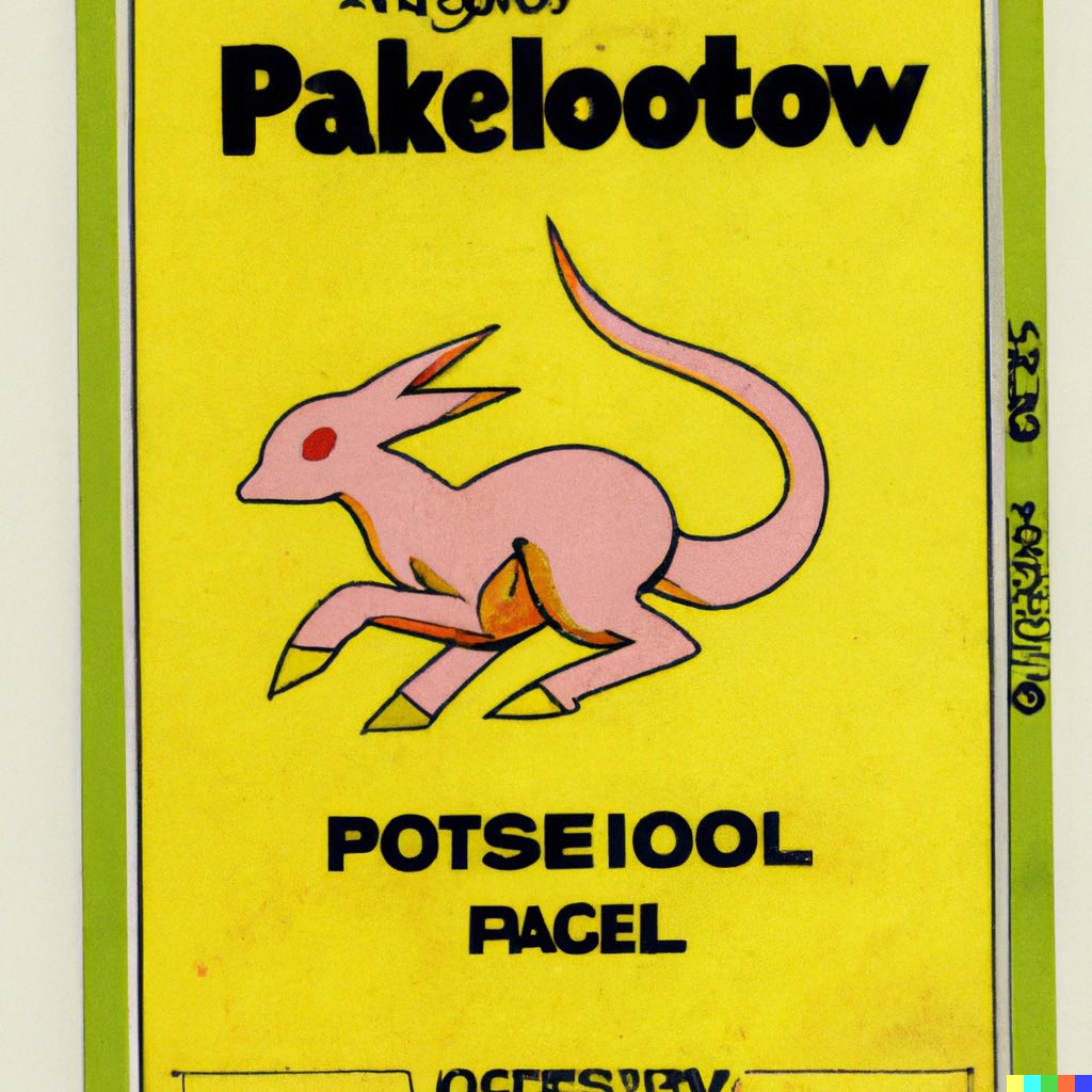
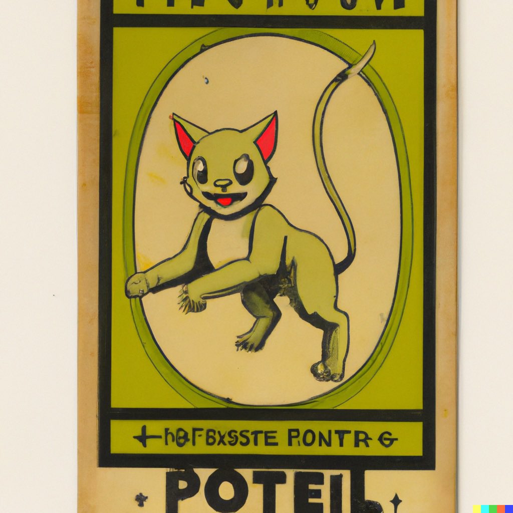
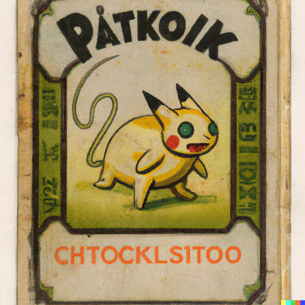
By changing the year in the prompt, we can ask for older Pokémon cards. These ones are from various years in the 1980s. #dalle2
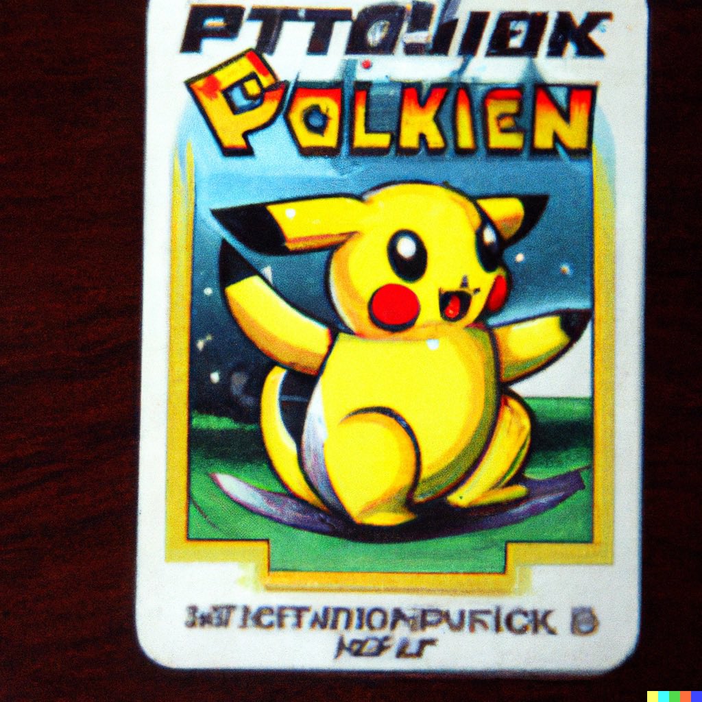


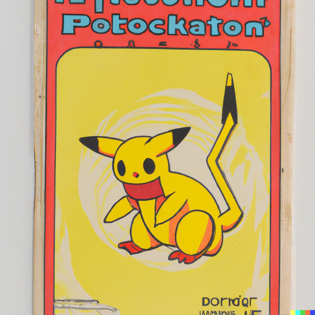
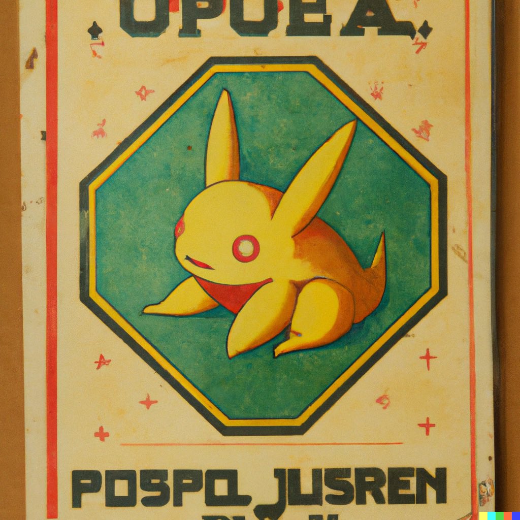
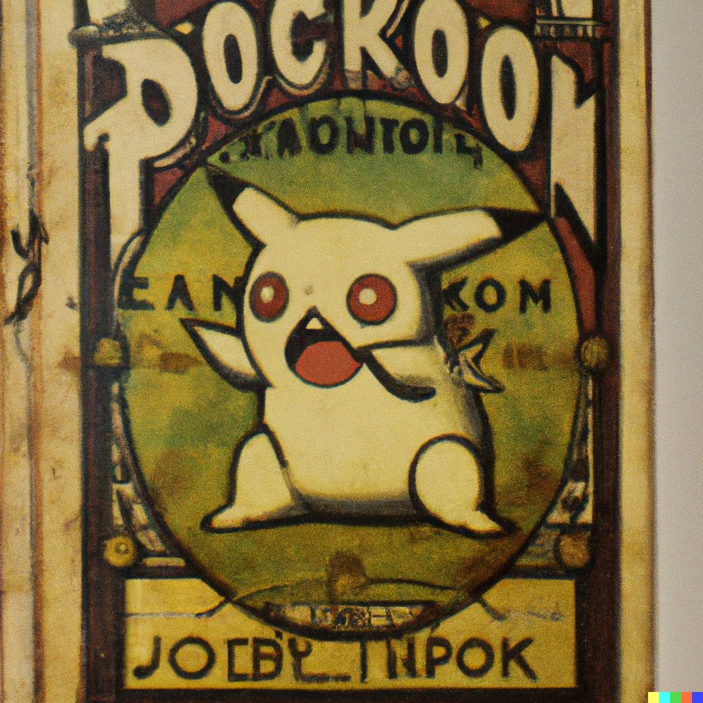
Let’s keep going backward in time. Here are Pokémon cards of the 1970s #dalle2
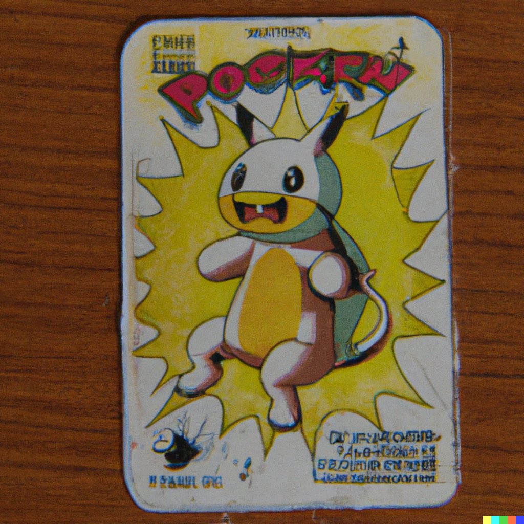
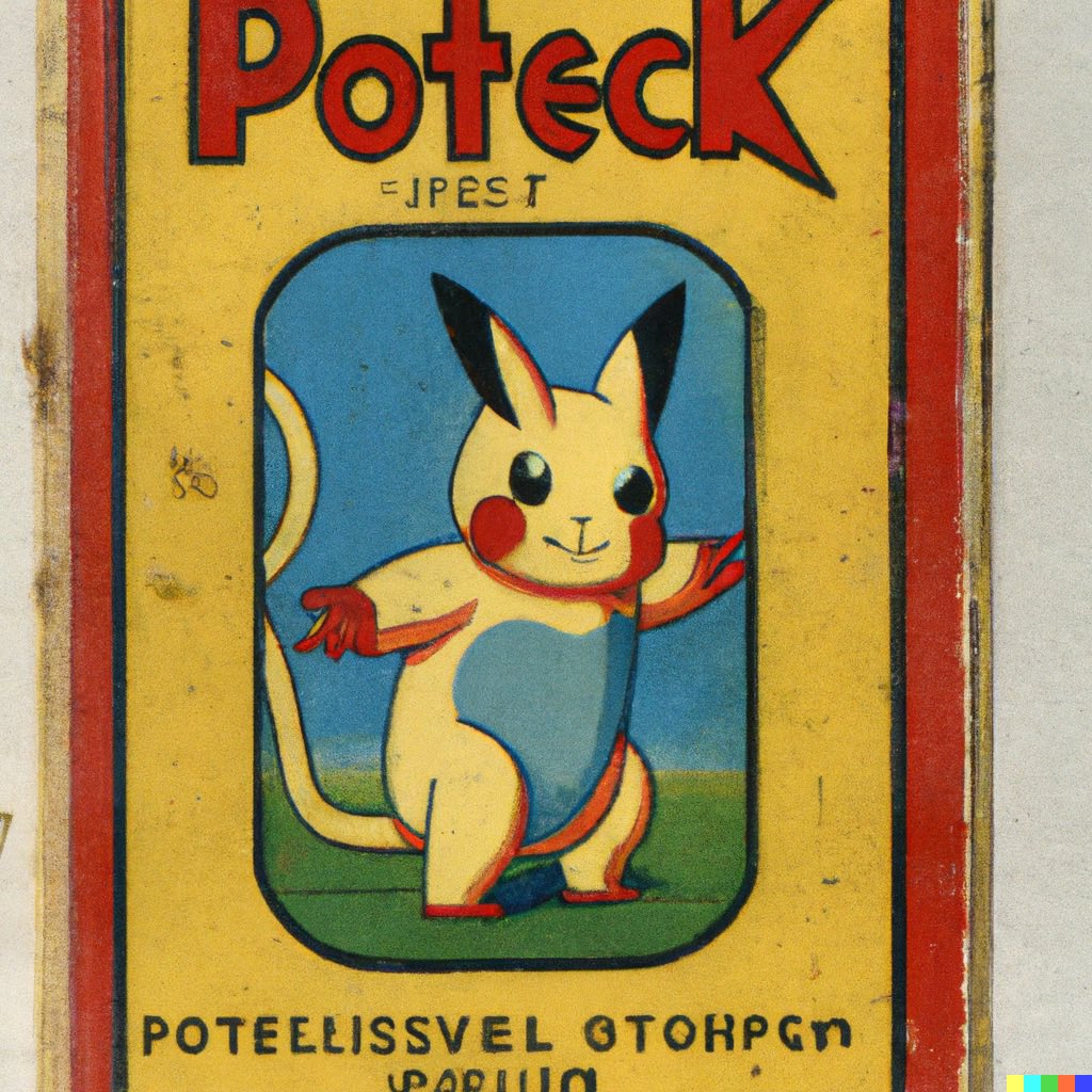
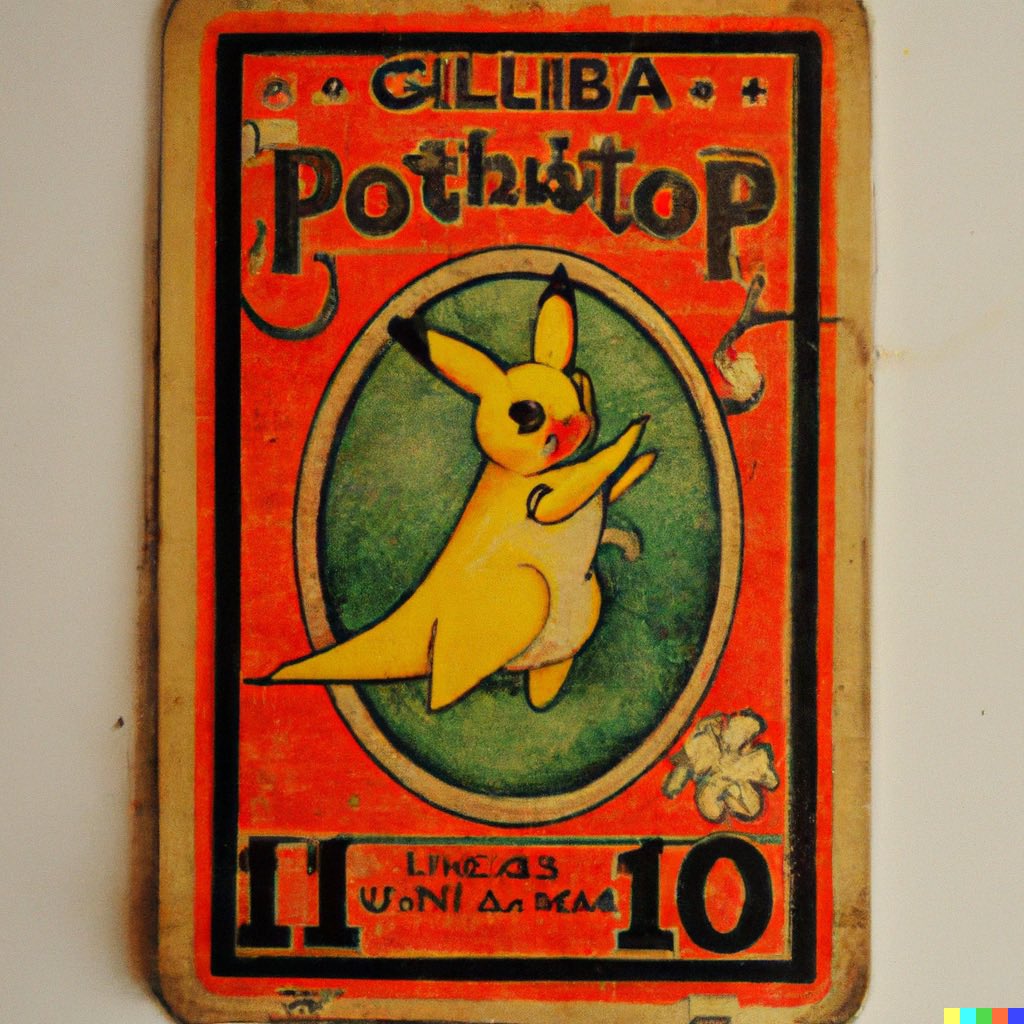
Pokémon cards of the 1960s #dalle2


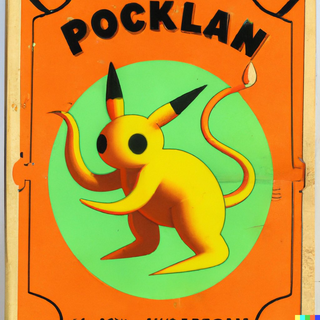

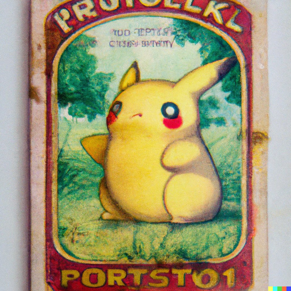
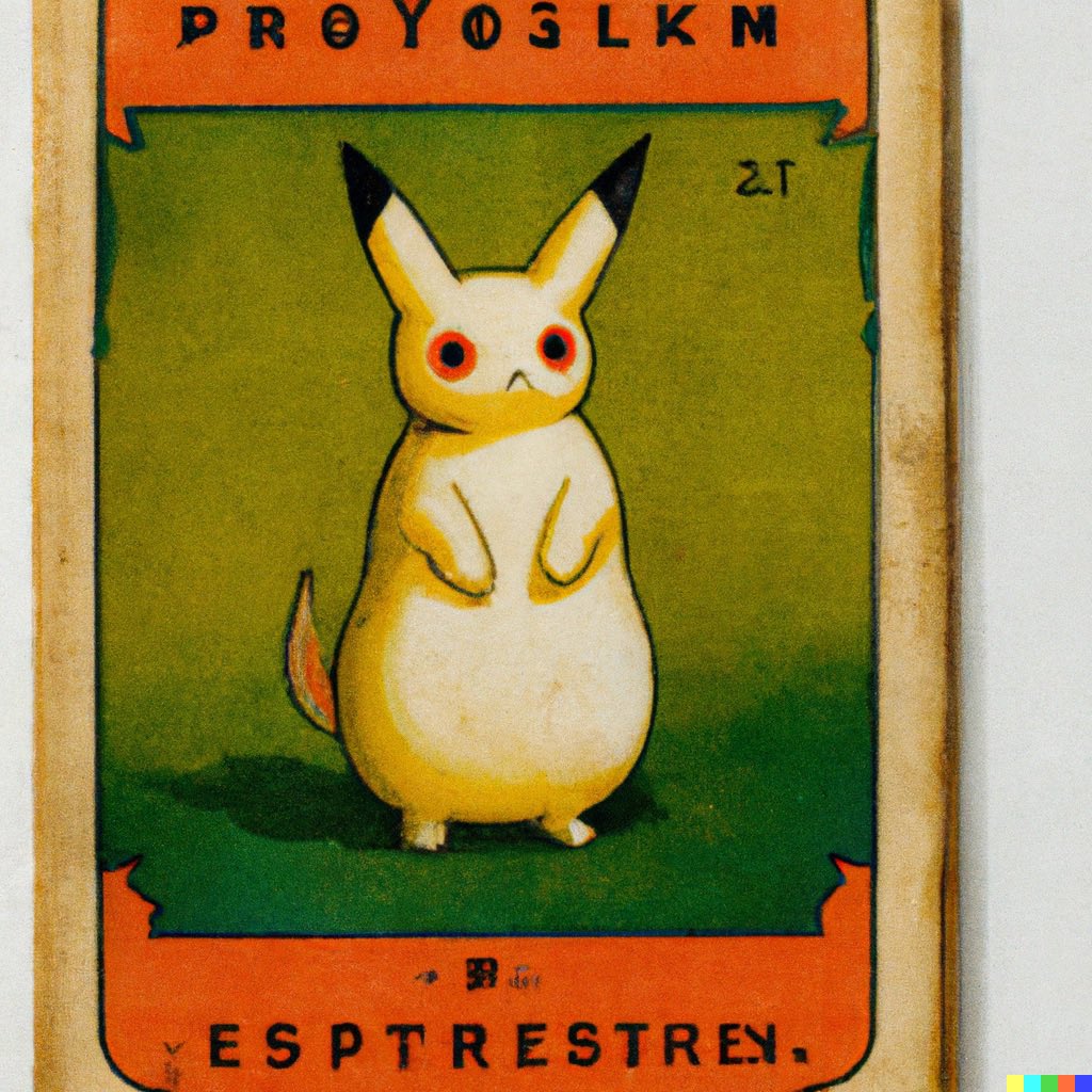
Pokémon cards of the 1950s #dalle2


Pokémon cards of the 1940s #dalle2


Pokémon cards of the 1930s #dalle2


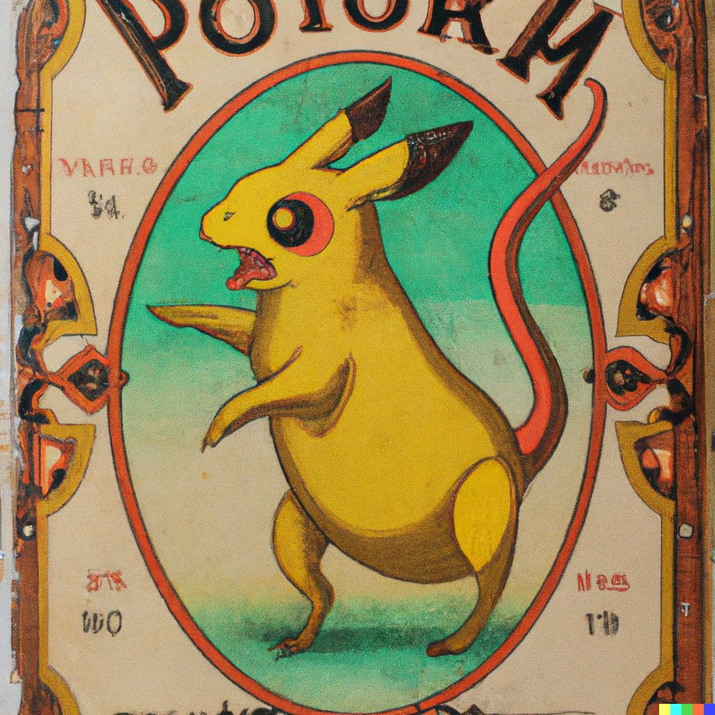
Pokémon cards of the 1920s #dalle2


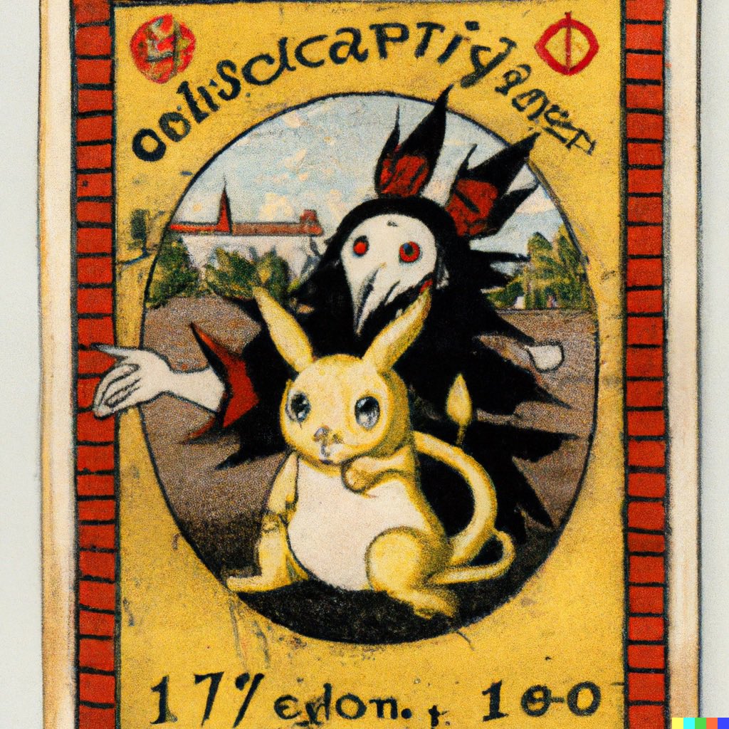
Pokémon cards of the 1910s #dalle2


Pokémon cards from the 1900s #dalle2


Pokémon cards of the 1890s #dalle2


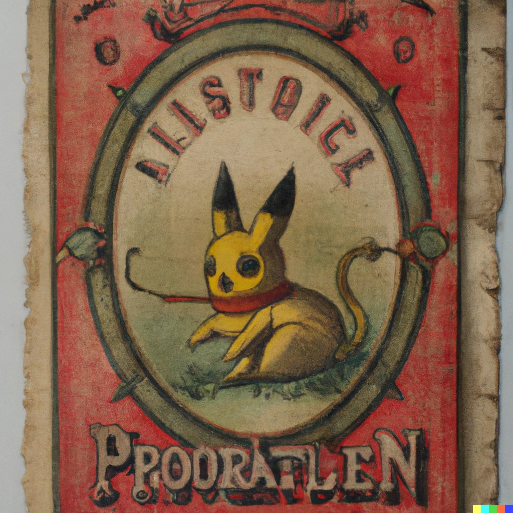
Pokémon cards of the 1880s #dalle2


Pokémon cards of the 1860s-70s #dalle2


Pokémon cards of the 1840s-50s #dalle2


Pokémon cards of the 1820s-30s #dalle2


Pokémon cards from circa 1800 #dalle2


Pokémon cards from the mid to late 1700s #dalle2


Pokémon cards from the early 1700s #dalle2


Pokémon cards from the late 1600s #dalle2
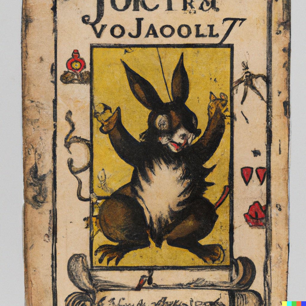


Pokémon cards from the early 1600s #dalle2


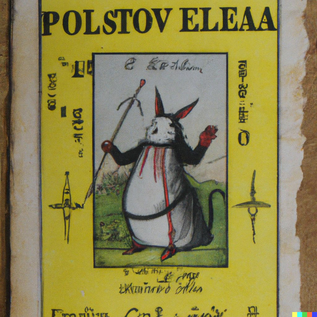
Pokémon cards from the late 1500s #dalle2


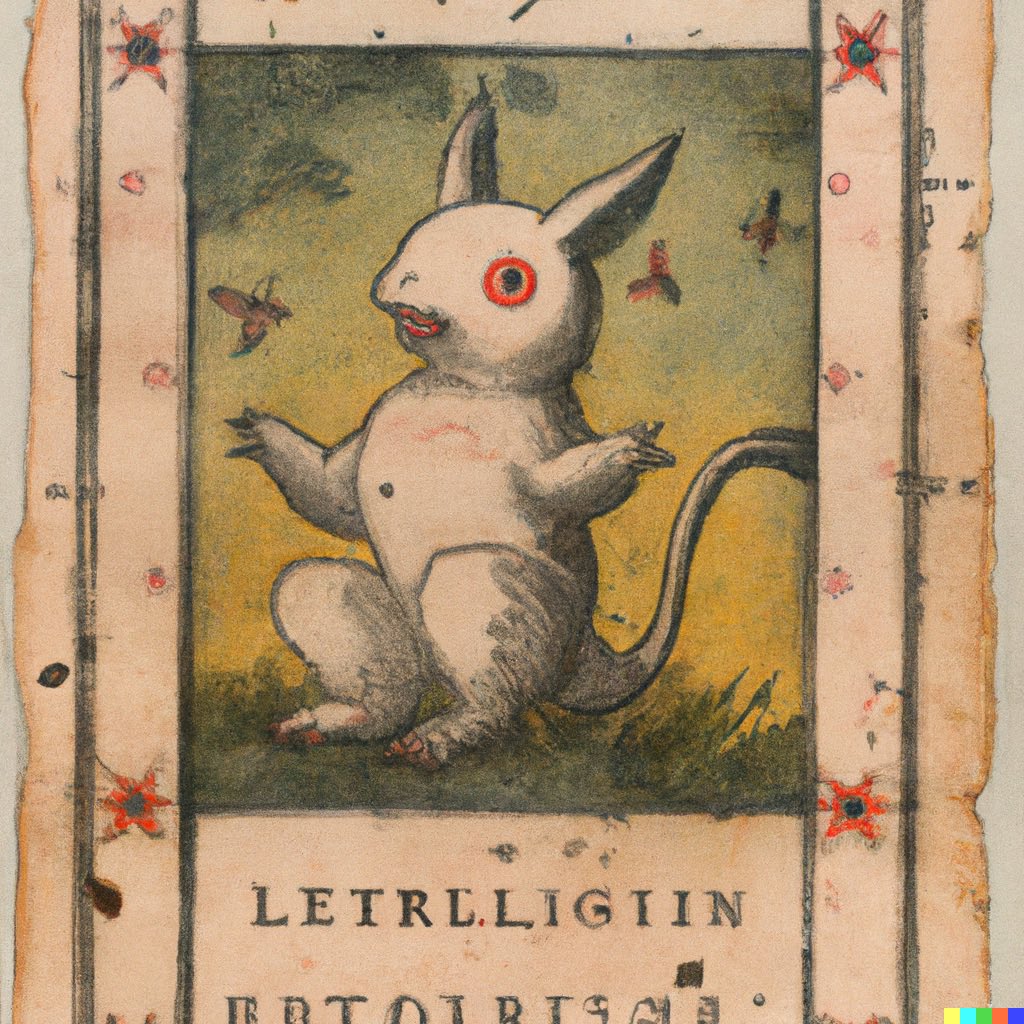
Pokémon cards from the early 1500s #dalle2


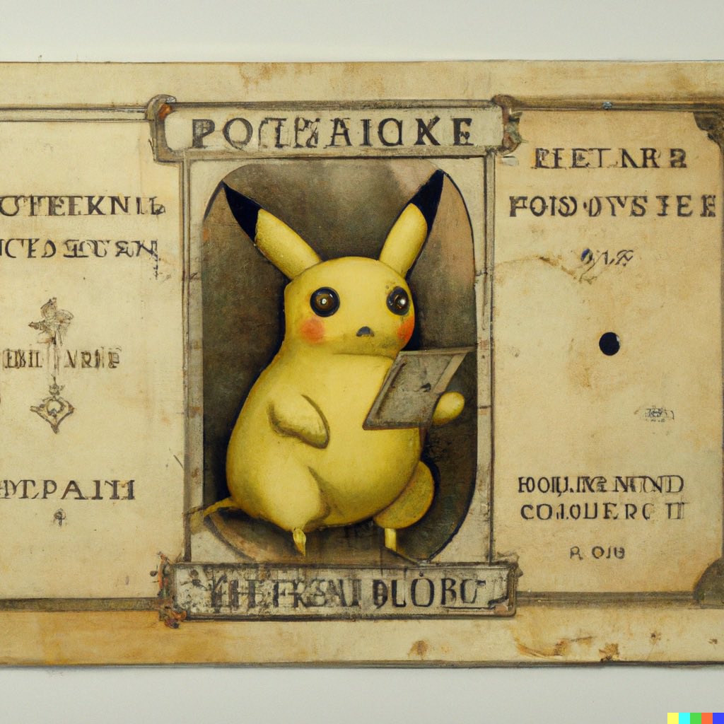
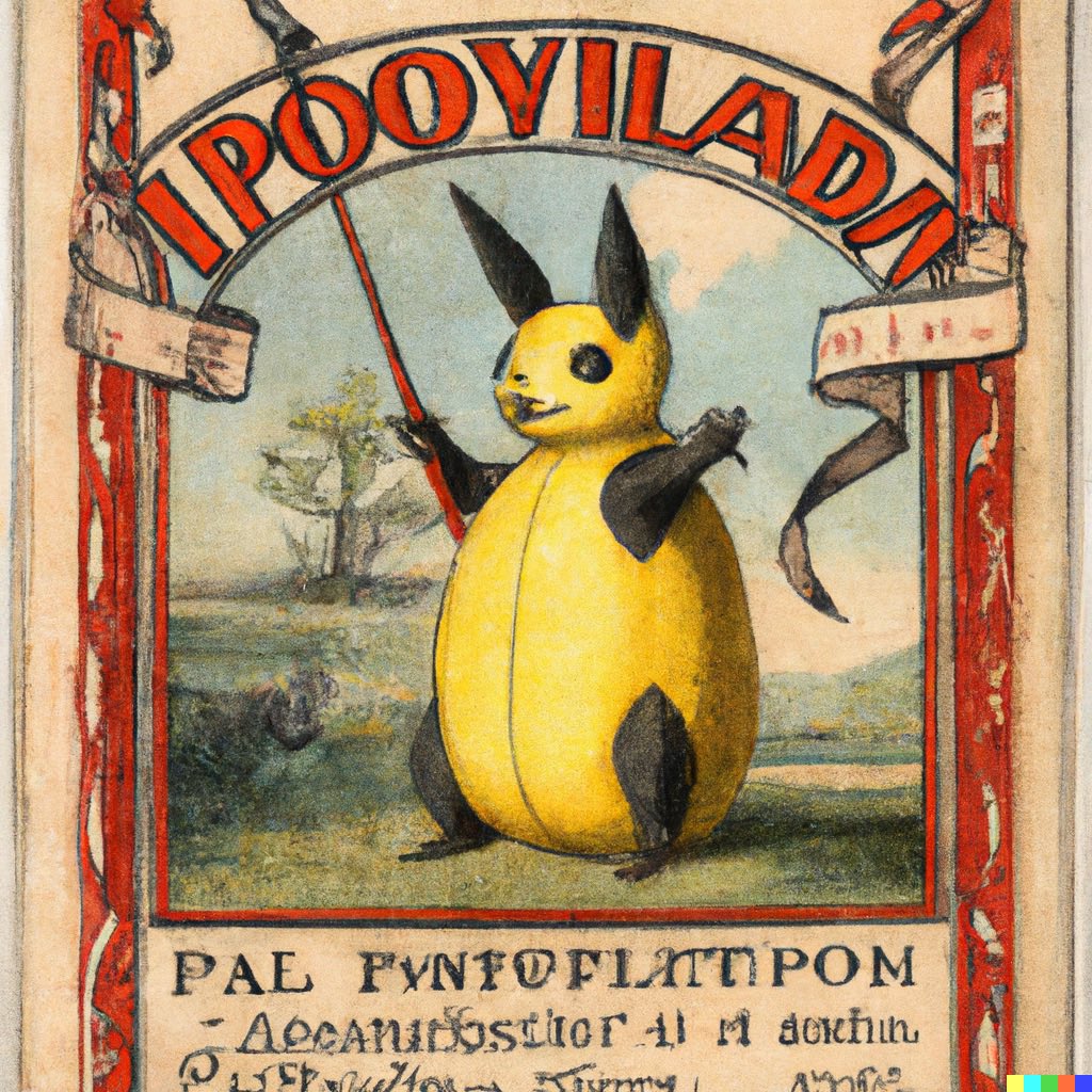
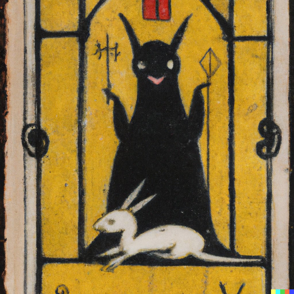
Pokémon cards from the 1400s #dalle2


Pokémon cards from the 1300s #dalle2
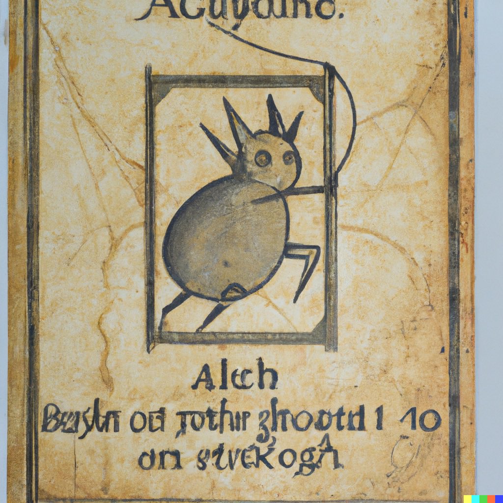


Pokémon cards from 1000-1300 CE #dalle2


Pokémon cards from 500-1000 CE #dalle2


Pokémon cards from 300 BCE to 500 CE #dalle2


Pokémon cards from 500-800 BCE #dalle2


Pokémon cards from 1100-1300 BCE #dalle2


Pokémon cards from 1500-2500 BCE #dalle2


Pokémon cards from 2500-4000 BCE #dalle2


Neolithic Pokémon cards #dalle2


A Pokémon card from approximately 4.1 billion years ago, during the Hadean, when the Earth’s crust was still solidifying #dalle2

A Pokémon card drifting though space before the solar system formed #dalle2

A Pokémon card from beyond time and space #dalle2

And, finally: A Pokémon card from the Big Bang #dalle2

• • •
Missing some Tweet in this thread? You can try to
force a refresh