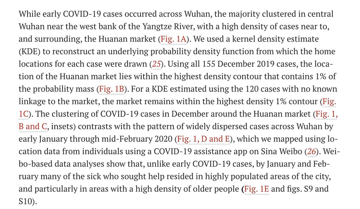
This thread addresses the claim in Worobey et al that KDE analysis shows centering of Dec 2019 COVID case-residences on the Huanan Market.
science.org/doi/10.1126/sc…
This apparent centering is an artifact due to use of an overly-large bandwidth in the KDE calculation.
science.org/doi/10.1126/sc…
This apparent centering is an artifact due to use of an overly-large bandwidth in the KDE calculation.

Adjusting the bandwidth parameter to more realistic values shifts the center of the KDE pattern away from the Huanan market, to an neighbourhood north of the market where there truly is a significant cluster of case-residences.

Worobey et al base their interpretation on simplified KDE maps in which the influence of each data point is smeared over a large area (oversmoothing).
The pattern is centered on the Huanan Market, but this is simply an artifact of oversmoothing.
The pattern is centered on the Huanan Market, but this is simply an artifact of oversmoothing.

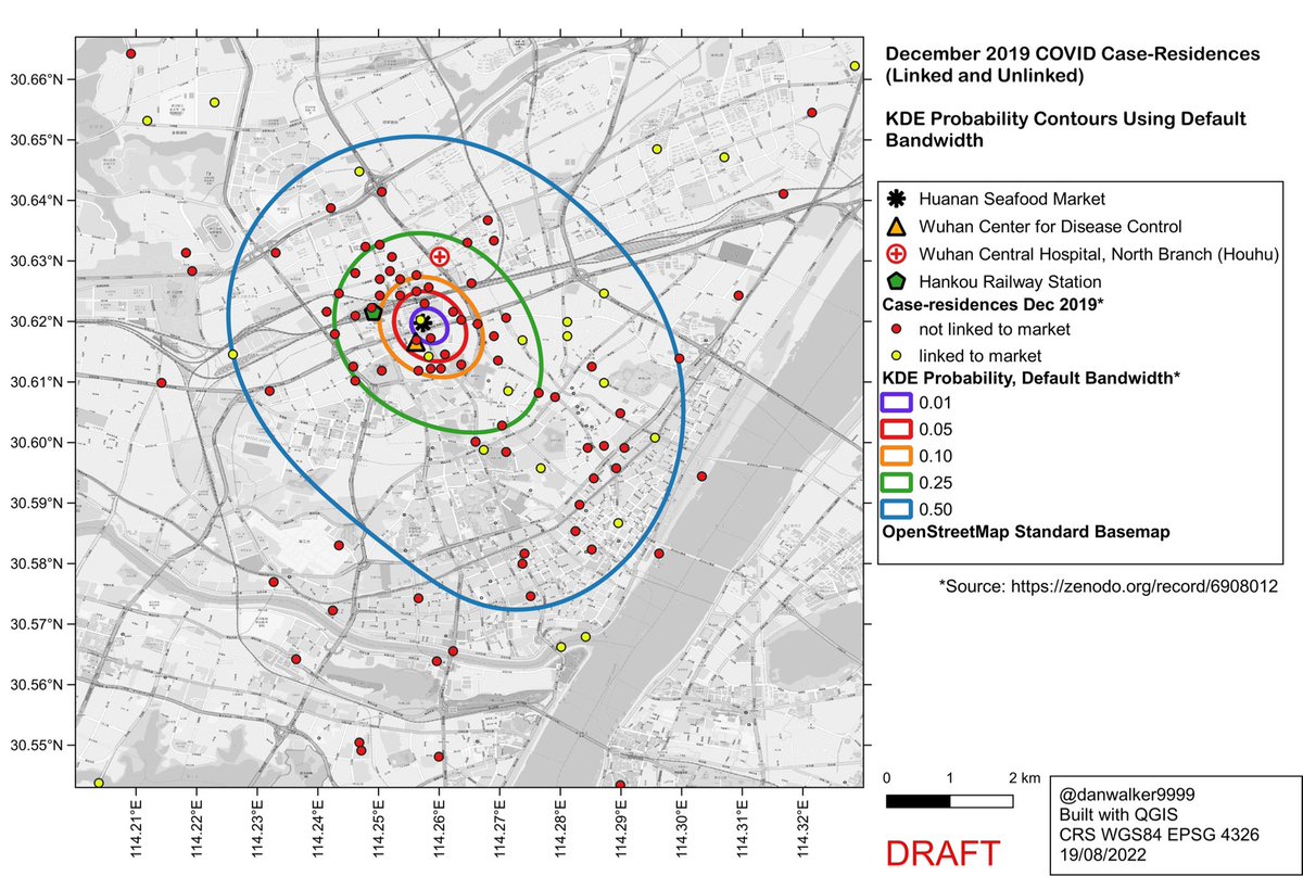
Worobey et al place significant interpretational weight on the oversmoothed KDE maps, and particularly the apparent centering on the Huanan Market.
The oversmoothed KDE and its 1% probability contour are emphasized in Fig 1b and c, and in associated text, with the additional claim that a similar centering is shown by the KDE for subset of 120 cases which were epidemiologically unlinked to the Huanan Market.
The oversmoothed KDE and its 1% contour are further emphasized in the various tweets by the authors…
https://twitter.com/MichaelWorobey/status/1551949577774739457
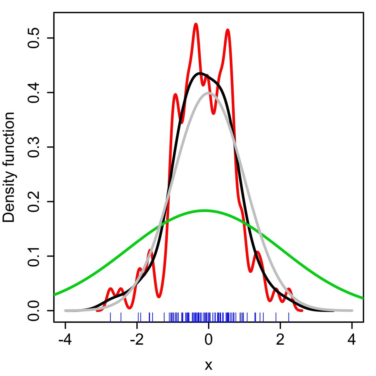
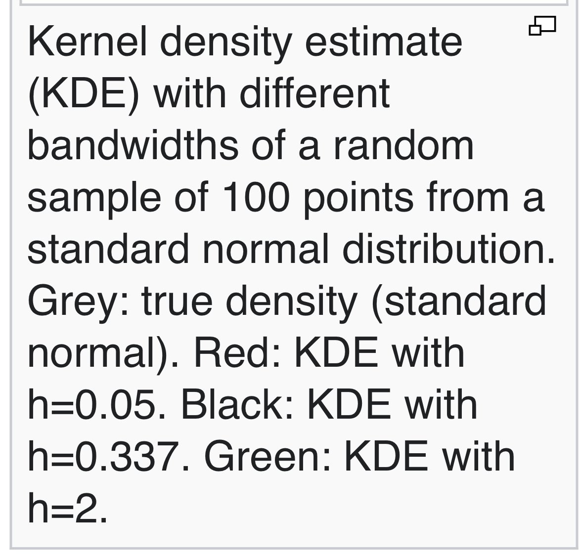
KDE (Kernel Density Estimation) is a non-parametric method to estimate the distribution of a population of univariate or multivariate data. It is used in GIS to generate heat maps.
en.wikipedia.org/wiki/Kernel_de…
en.wikipedia.org/wiki/Kernel_de…
It works by placing a kernel function over each data point, and summing those functions to get the KDE.
Easiest to visualize in 1D.
Data: black bars.
Kernel function: red dashed line.
KDE: blue line.
Credit: en.wikipedia.org/wiki/User:Drle…
Easiest to visualize in 1D.
Data: black bars.
Kernel function: red dashed line.
KDE: blue line.
Credit: en.wikipedia.org/wiki/User:Drle…

The KDE is:
▪️not sensitive to the *shape* of the kernel function
▪️very sensitive to the *area of influence* of the kernel function (the bandwidth parameter).
Over-large bandwidths result in oversmoothing.
en.wikipedia.org/wiki/Kernel_de…
en.wikipedia.org/wiki/User:Drle…
▪️not sensitive to the *shape* of the kernel function
▪️very sensitive to the *area of influence* of the kernel function (the bandwidth parameter).
Over-large bandwidths result in oversmoothing.
en.wikipedia.org/wiki/Kernel_de…
en.wikipedia.org/wiki/User:Drle…
Here’s an animation to illustrate the influence of bandwidth on KDE in 1D
kdepy.readthedocs.io/en/latest/band…
kdepy.readthedocs.io/en/latest/band…
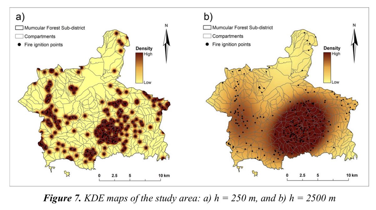
2D mapping example of undersmoothed and oversmoothed KDEs for a study of wildfire ignition points.
These maps illustrate a key aspect of generating KDE maps: the need to select a just-right value for the bandwidth.
aloki.hu/pdf/1604_47014…
These maps illustrate a key aspect of generating KDE maps: the need to select a just-right value for the bandwidth.
aloki.hu/pdf/1604_47014…
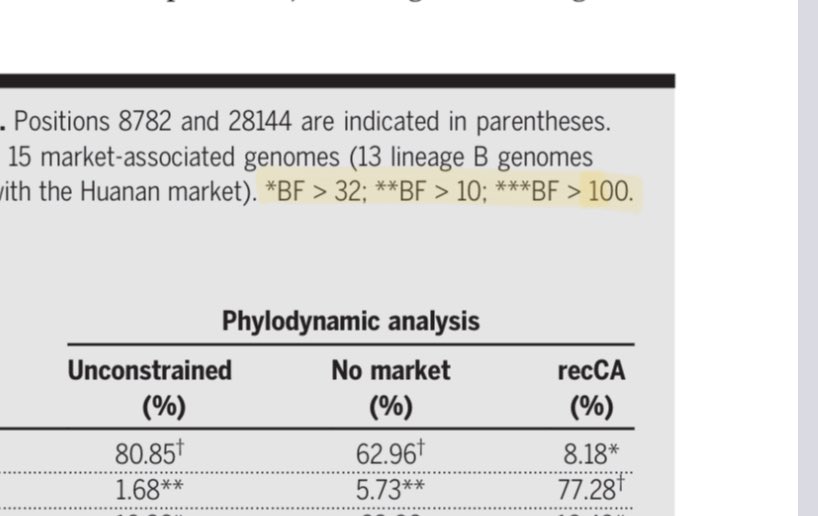
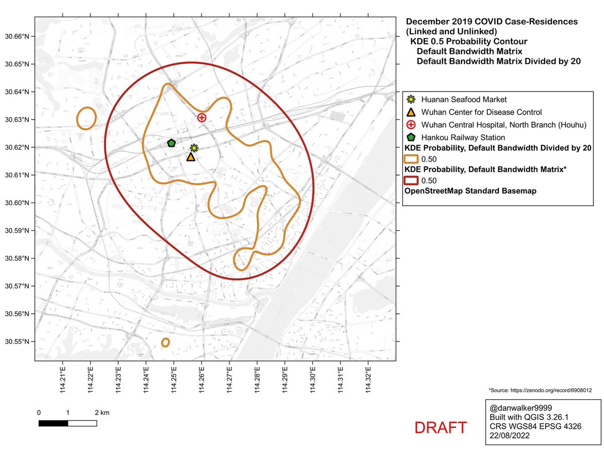
Worobey et al (2022) used the ‘kde’ function in the ‘ks’ package in R to generate their KDEs.
cran.r-project.org/web/packages/k…
They used the default bandwidth option in ‘kde’, yielding oversmoothed KDEs which ignore local clusters and encompass large area without data points.
cran.r-project.org/web/packages/k…
They used the default bandwidth option in ‘kde’, yielding oversmoothed KDEs which ignore local clusters and encompass large area without data points.
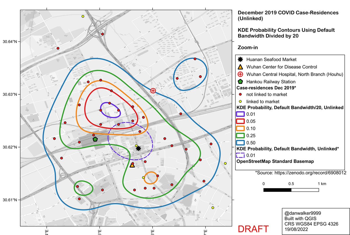
What would the pattern look like if not oversmoothed?
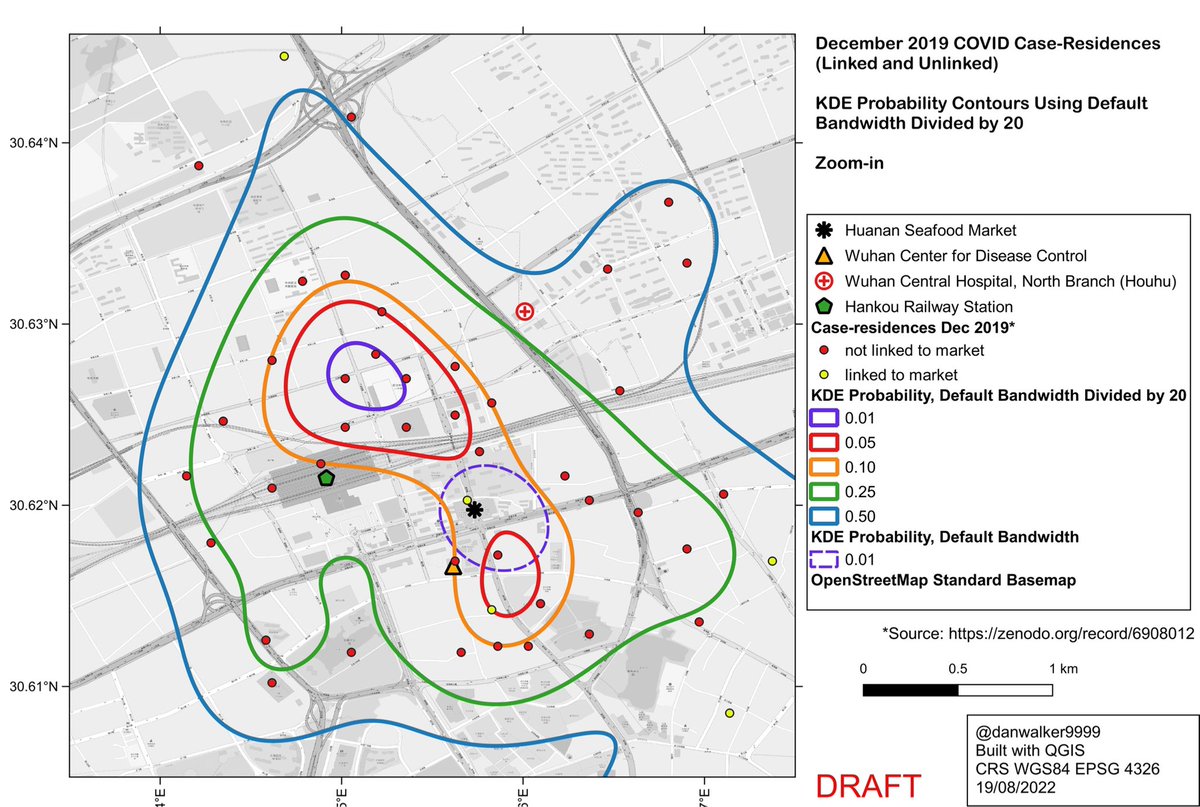
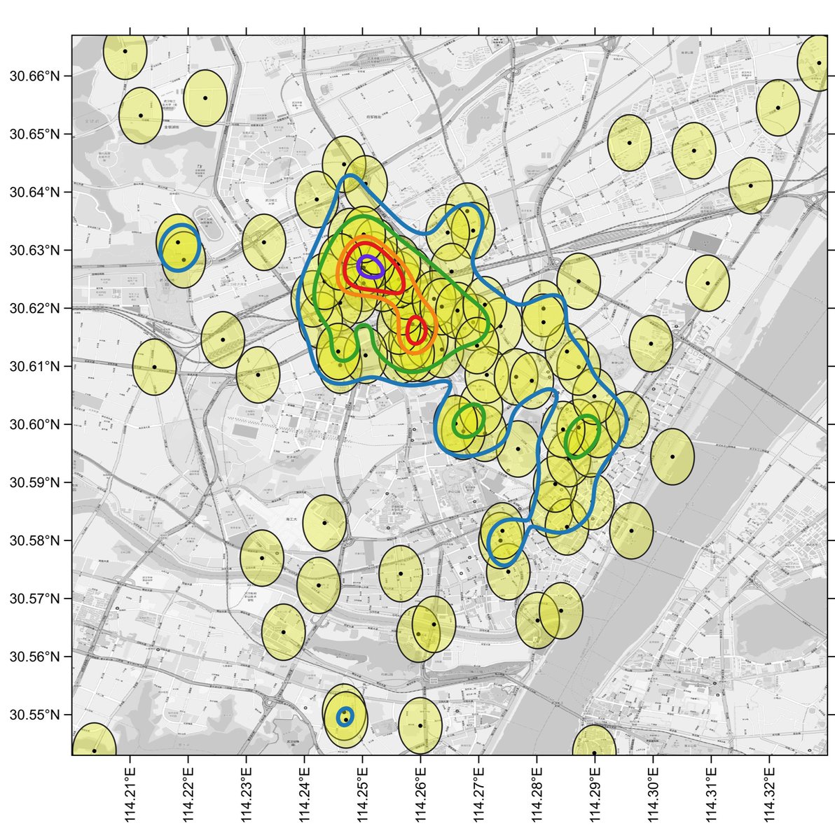
Here are the KDE contours on the full dataset of 155 case-residences (linked and unlinked to the Huanan market), calculated with ‘kde’, using a reduced bandwidth (obtained by dividing the H bandwidth-matrix by 20).
Here are the KDE contours on the full dataset of 155 case-residences (linked and unlinked to the Huanan market), calculated with ‘kde’, using a reduced bandwidth (obtained by dividing the H bandwidth-matrix by 20).
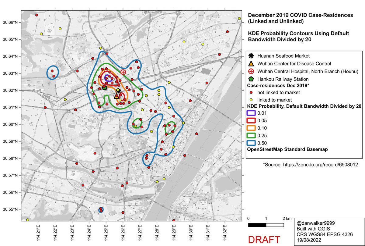
Side-by-side comparison of oversmoothed and reduced-bandwidth versions.
In the reduced-bandwidth version, local patterns are preserved, and the contours do not enclose large areas without data points.
In the reduced-bandwidth version, local patterns are preserved, and the contours do not enclose large areas without data points.
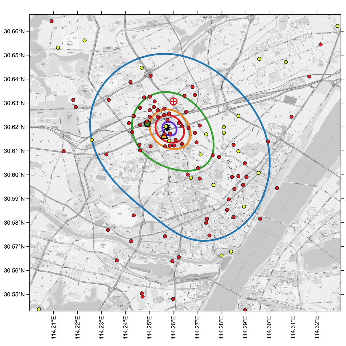

Zooming in, and comparing to the default oversmoothed 1% curve (dashed line), one can see how the oversmoothed 1% curve is an artifact of the high bandwidth, a spatial averaging of the large cluster to the north of the market with a smaller cluster to the south of the market.
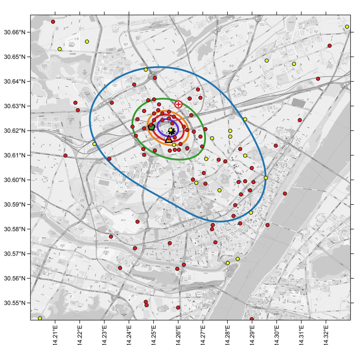
We see similar results if we consider only the cases which were epidemiologically unlinked to the Huanan Market.
The oversmoothed version from Worobey et al…
The oversmoothed version from Worobey et al…
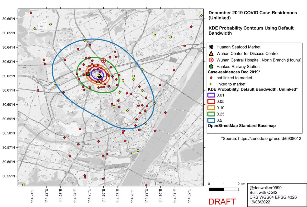
…and reduced-bandwidth version (H matrix divided by 20)…

Side-by-side comparison of oversmoothed and reduced-bandwidth versions.
Again, in the reduced-bandwidth version, local patterns are preserved, and the contours do not enclose large areas without data points.
Again, in the reduced-bandwidth version, local patterns are preserved, and the contours do not enclose large areas without data points.

Zooming in, and comparing to the oversmoothed 1% curve, one sees the same pattern as with linked+unlinked cases: the oversmoothed 1% curve is an artifact, a spatial averaging of the large cluster to the north of the market with a smaller cluster to the south of the market.
Conclusion:
Worobey et al rely on oversmoothed KDEs which provide a misleading representation of the spatial distribution of Dec 2019 case-residences.
This is not a valid spatial analysis, and does not support the contention that the Huanan Market is the origin point of COVID.
Worobey et al rely on oversmoothed KDEs which provide a misleading representation of the spatial distribution of Dec 2019 case-residences.
This is not a valid spatial analysis, and does not support the contention that the Huanan Market is the origin point of COVID.
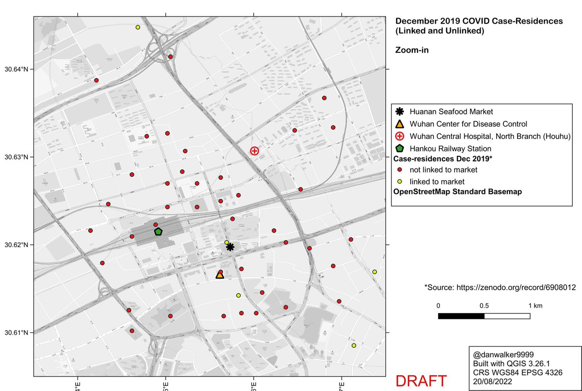
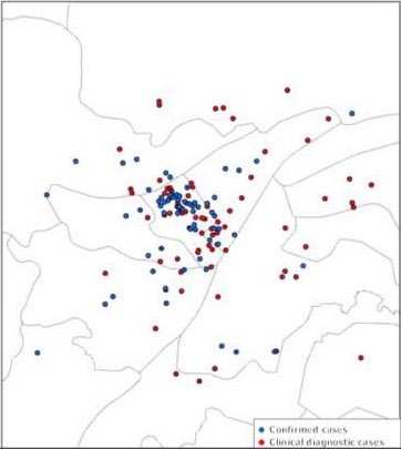
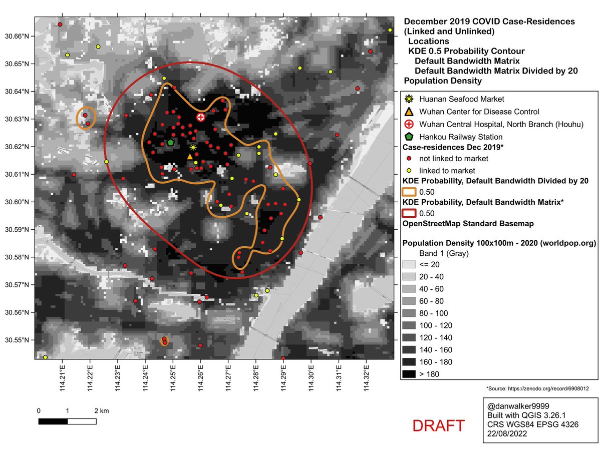
Addendum: it can be useful to look at just the dots, without the distraction of contours

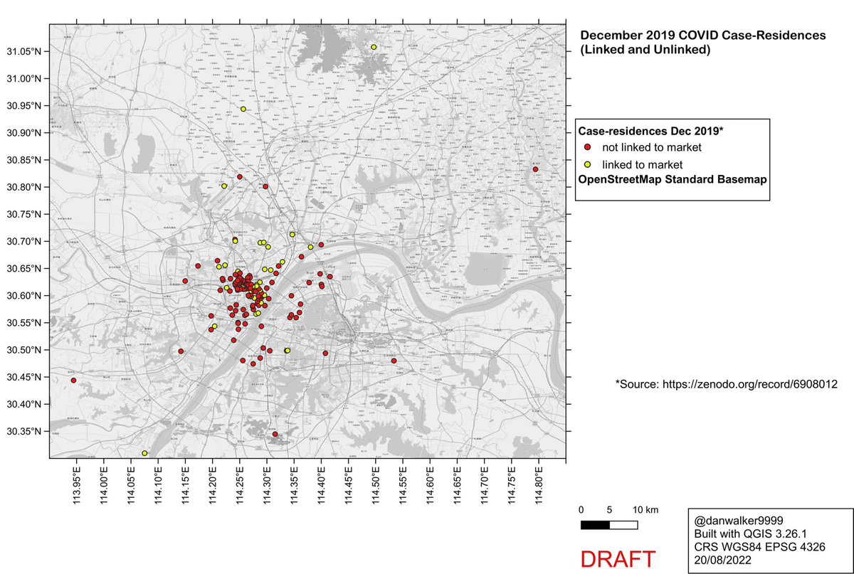
Caveat: case-residence locations shown in this thread are as extracted by Worobey et al from low-res maps in who.int/publications/i…
and include locational error:
🌐error in the original data and plotting of the low-res maps
🌐error in coordinate extraction by Worobey et al
and include locational error:
🌐error in the original data and plotting of the low-res maps
🌐error in coordinate extraction by Worobey et al
Addendum: Bandwidth and Area of Influence
In a KDE, the area of influence around each point is controlled by the kernel function and the bandwidth.
R package ‘ks’ uses the Gaussian kernel function, with a bandwidth of 1 standard deviation (1 sigma).
Image: ncbi.nlm.nih.gov/pmc/articles/P…
In a KDE, the area of influence around each point is controlled by the kernel function and the bandwidth.
R package ‘ks’ uses the Gaussian kernel function, with a bandwidth of 1 standard deviation (1 sigma).
Image: ncbi.nlm.nih.gov/pmc/articles/P…
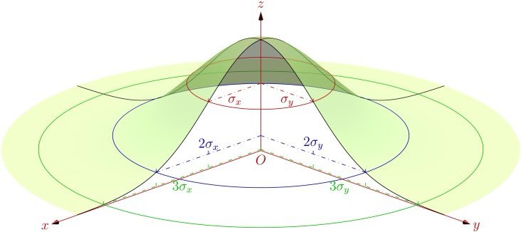
For the Gaussian kernel, the area of influence extends out to at least 2 sigma.
For a univariate Gaussian, you get ~68% and ~95% under 1 and 2 sigma, respectively.
But for a bivariate Gaussian, you get ~39% and ~86%.
(Table 1, ncbi.nlm.nih.gov/pmc/articles/P…
For a univariate Gaussian, you get ~68% and ~95% under 1 and 2 sigma, respectively.
But for a bivariate Gaussian, you get ~39% and ~86%.
(Table 1, ncbi.nlm.nih.gov/pmc/articles/P…

So, for the area of influence that contributes to a KDE around a given location, when using the Gaussian kernel, we should consider at least 2 sigma, i.e., 2 times the bandwidth (which is just 1 sigma). And that still leaves 14% poking out around the edges.

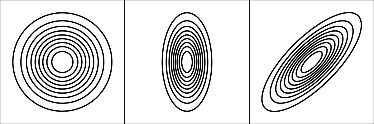
The 2D Gaussian can have an elliptical footprint, and this can be rotated away from the coordinate axes, to accommodate diagonal trends.
The 2D Gaussian calculated by ‘ks’ is generally elliptical and rotated.
Image credit: commons.wikimedia.org/w/index.php?ti…
The 2D Gaussian calculated by ‘ks’ is generally elliptical and rotated.
Image credit: commons.wikimedia.org/w/index.php?ti…
The 2-sigma areas of influence for the linked+unlinked KDE (Fig 1b in Worobey et al), using the default bandwidth matrix. (Rotation is minor and is ignored for this purpose).
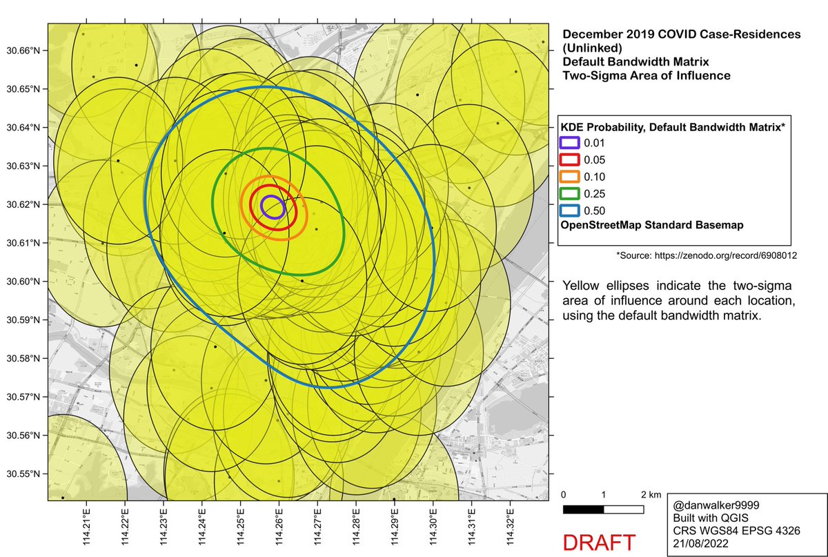
The 2-sigma areas of influence for the linked+unlinked KDE (Fig 1b in Worobey et al), using the default bandwidth matrix divided by 20. (Rotation ignored.)

Side-by-side comparison of areas of influence for default bandwidth matrix as used in Worobey et al Fig 1b (left) and default bandwidth matrix divided by 20 (right).

To address a subtweet criticism by @Samuel_Gregson : reducing bandwidth amounts to “overfitting noise”.
If one considers the KDE as purely data visualization, then overfitting is not applicable.
If one considers the KDE to have predictive power, then overfitting is an issue.
If one considers the KDE as purely data visualization, then overfitting is not applicable.
If one considers the KDE to have predictive power, then overfitting is an issue.
https://twitter.com/Samuel_Gregson/status/1561743730842935296
KDE probability contours with the default bandwidth/20 have a weird shape compared to the smooth contours generated by the default bandwidth.
Is this weird shape simply overfitting that would interfere with use of the KDE to predict where unknown case-residences might be found?
Is this weird shape simply overfitting that would interfere with use of the KDE to predict where unknown case-residences might be found?
The weird shape of the reduced-bandwidth KDE is in fact a good match to population density. It excludes areas of low population density.
As such, it would be a better predictor of where one would expect to find unknown case-residences, as compared to the default-bandwidth KDE.
As such, it would be a better predictor of where one would expect to find unknown case-residences, as compared to the default-bandwidth KDE.
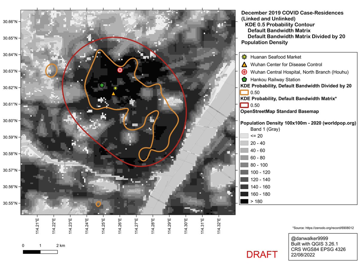
Unsurprisingly, the case-residences largely correspond to areas of high population density, and are sparse or absent in areas of low population density.
The default-bandwidth KDE underfits the data: it would predict case-residences in areas of low population density.
The default-bandwidth KDE underfits the data: it would predict case-residences in areas of low population density.
In R package ‘ks’
cran.r-project.org/web/packages/k…
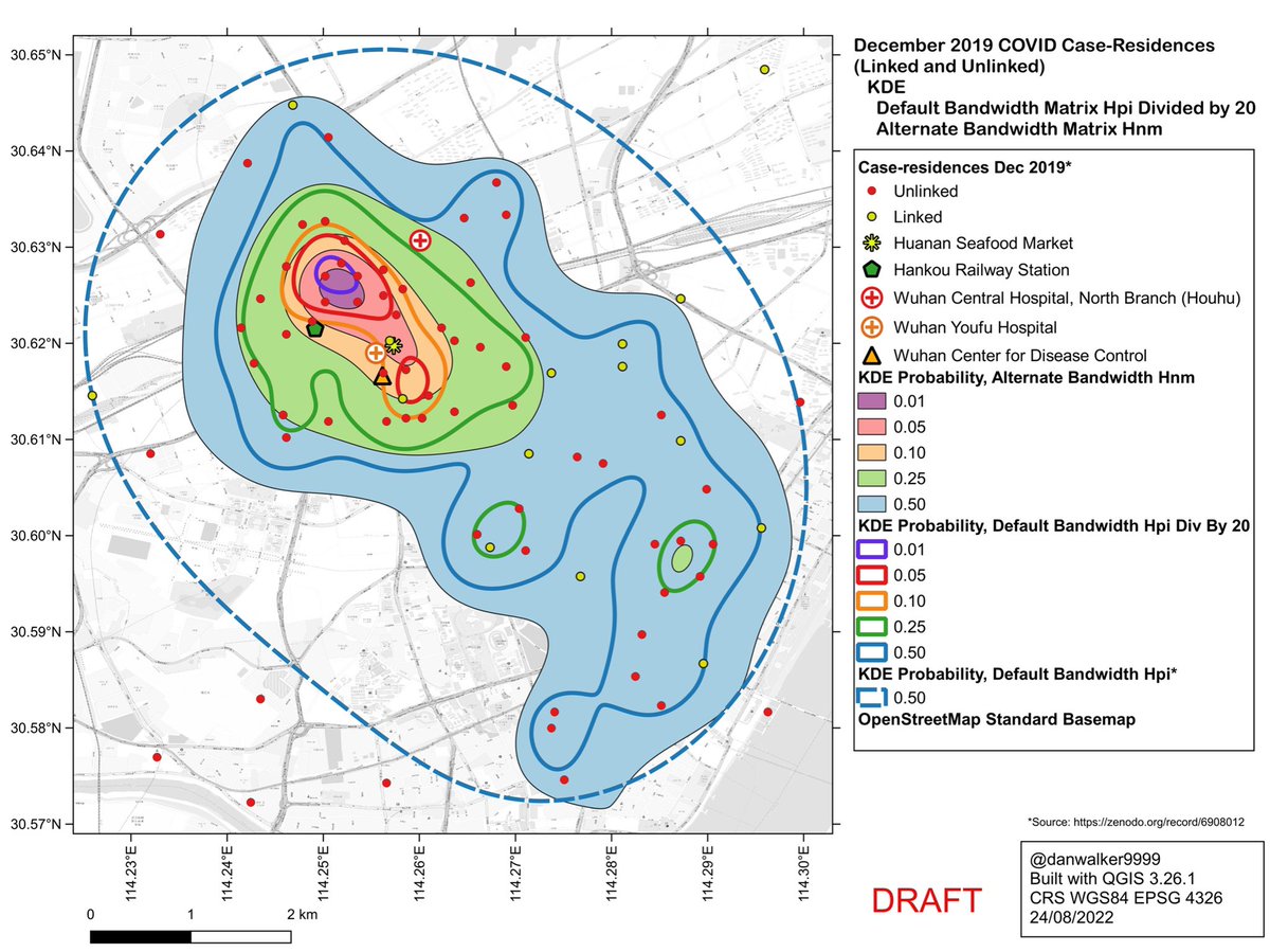
it is possible to use bandwidth algorithms other than the default Hpi used by Worobey et al.
The Hnm bandwidth yields a pattern similar to Hpi divided by 20.
This may be because the Hnm algorithm is tuned to recognize clusters of data.
cran.r-project.org/web/packages/k…
it is possible to use bandwidth algorithms other than the default Hpi used by Worobey et al.
The Hnm bandwidth yields a pattern similar to Hpi divided by 20.
This may be because the Hnm algorithm is tuned to recognize clusters of data.
Self-critique: this map and interpretation ⬇️ will have to be revised, as there are issues with the Worldpop constrained dataset used for the population density layer of the map…
https://twitter.com/danwalker9999/status/1561914114477133825
…for details on the issues with the Worldpop data, refer to this and subsequent tweets (in a separate thread).
https://twitter.com/danwalker9999/status/1564997745957826560
• • •
Missing some Tweet in this thread? You can try to
force a refresh