The vertical metrics of the Martian Grotesk and Mono typeface family are one reason they work great in UIs.
In this thread, I explain how “equal” metrics—metrics that lead to equal space above and below the text—can make digital design and development easier.
#uiux #typography
In this thread, I explain how “equal” metrics—metrics that lead to equal space above and below the text—can make digital design and development easier.
#uiux #typography

In a line of text, every letter has its own visible shape and size. However, when we implement a line of text with HTML/CSS in the browser, or by using text labels in XCode, we’re actually working with the invisible rectangular area around it.
This area is called a bounding box.
This area is called a bounding box.
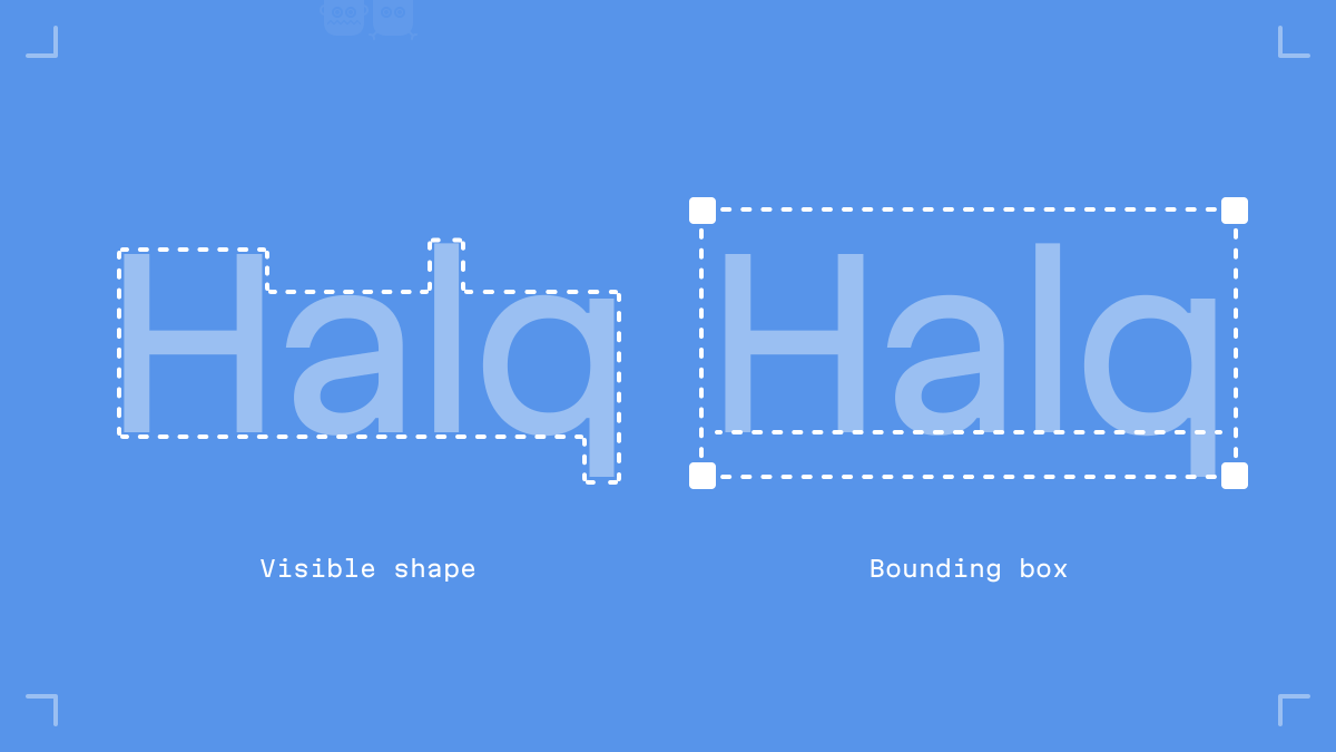
Even if you’re not a designer or a developer, you might notice this box when making slides in Apple Keynote, MS Powerpoint, or Google Slides. When selecting text objects we see the transform box around them; in most cases, this box corresponds to the bounding box.
Since we don’t have access to the font’s inner metrics in CSS—and thus have to deal with the aquarium instead of the fish—the location of the letter’s shape inside its box starts to play an important role when it comes to positioning the text inside buttons, lists, and tables.

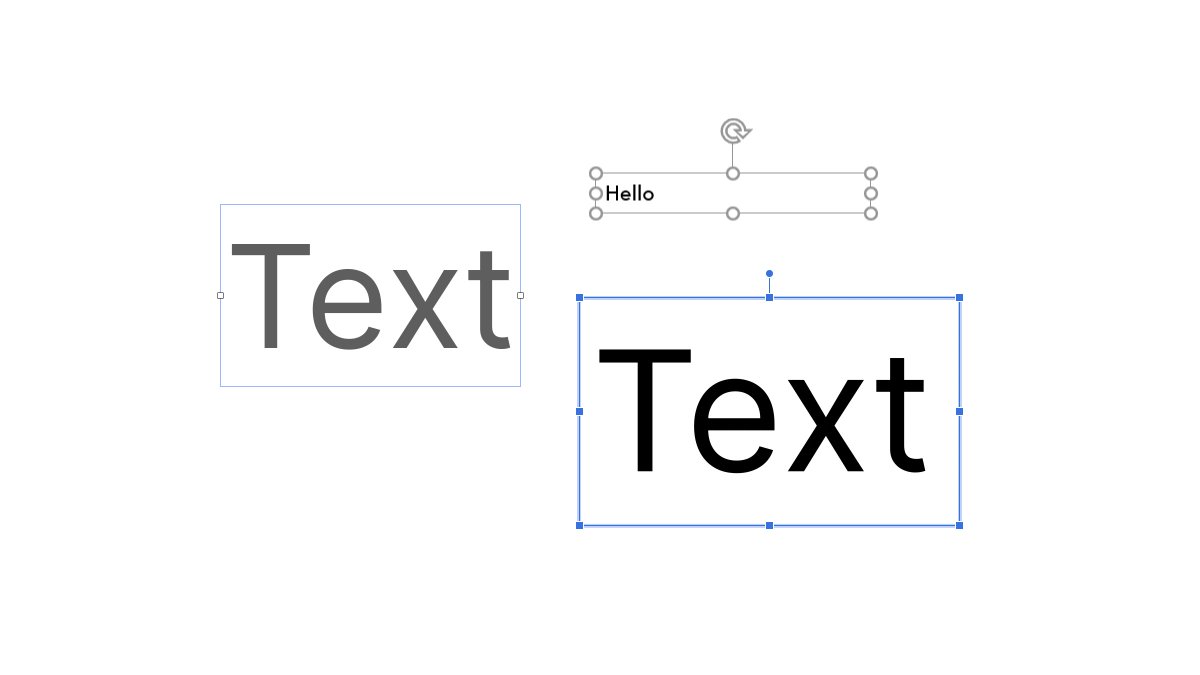
Take a look at the image. Here’s a font whose metrics are set up so the space above the capital B is larger than the space below the baseline. When creating a button, the designer puts the text in the center of the button body and the text label appears to have been shifted down.

This effect occurs because we can only set paddings relative to the bounding box, not the letter shape.
This leads us to two outcomes.
First, for product designers picking a typeface, it follows to give preference to those with equal space on the top and bottom of the bounding box. This choice could save you and your dev team from difficulties with positioning text in the UI.
First, for product designers picking a typeface, it follows to give preference to those with equal space on the top and bottom of the bounding box. This choice could save you and your dev team from difficulties with positioning text in the UI.
Second, for type designers, it makes sense to set up the vertical metrics in a way that guarantees equal space from the cap height to the top of the glyph body and from the baseline to the descender.
One day things may change (more on that later), but at the moment, this setup matters for user interface development.
❓ Would it be helpful if I made and published the list of free and commercial typefaces that are the best suitable for UI design?
Retweet this thread to let me know the answer is yes! 🙌
Retweet this thread to let me know the answer is yes! 🙌
One may ask, “What’s the problem with setting a smaller top spacing and a larger bottom spacing in order to compensate for this shift?”

For building reliable and scalable user interfaces, designers and developers make sure all elements of the design system conform to the same set of rules.
If you make a change and you’re sure the change has been applied everywhere—it’s a good system. On the other hand, if you have to remember dozens of exceptions, it’s not a system at all. Individual side paddings are—by definition—an exception to the rules.
In practice, this means if a text label with special paddings is located next to an icon, aligning them with each other on the web would be a pain. Ask any frontend engineer!

Also, every single text style (headers, regular text, captions) requires individualized adjustment for every single context: tight spacings for all button sizes, airy spacing for tables, and so on.
In a mature project, having so many exceptions like this can be an absolute mess!
In a mature project, having so many exceptions like this can be an absolute mess!
But, if only the typeface were to have “equal” metrics, things would go much easier.
This would enable us to simply set up a `space-size-m` spacing property, then assign it as the top and bottom padding of a `text-size-m` text style to get a `button-size-m` component.
This would enable us to simply set up a `space-size-m` spacing property, then assign it as the top and bottom padding of a `text-size-m` text style to get a `button-size-m` component.
The text label on this button would look centered without any additional adjustments.
Also, the text label would align with checkboxes and radio buttons, icons and arrows in selects, and context menu items.
Also, the text label would align with checkboxes and radio buttons, icons and arrows in selects, and context menu items.

And, in the future, if we have to fix `space-size-m` a bit, replace the font with a new one, or make any other change in the UI, it would require one change in one place in the code, and that’s it—exactly how well designed systems are supposed to work.
So, my dear type designers and foundries, it’s good to be aware that just a few numbers (related to vertical metrics: UPM, Cap Height, and Descender) inside your typeface family can make product designers and frontend developers around the world a little happier.
To the UI designers, consider picking fonts with “equal metrics”.
And frontend engineers, show this thread to your design team.
And frontend engineers, show this thread to your design team.
Okay, how can we check if a font is equipped with suitable metrics?
Create a text object in Figma/Sketch. (You can also do the same thing using an HTML page and a span element with a colored background.)
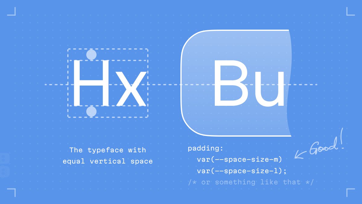
Zoom in and set the line height for this object equal to the cap height.
Create a text object in Figma/Sketch. (You can also do the same thing using an HTML page and a span element with a colored background.)
Zoom in and set the line height for this object equal to the cap height.
If the bounding box perfectly wraps around the capital H, this typeface is great for UIs. The more misaligned the result, the more problems this font will cause.

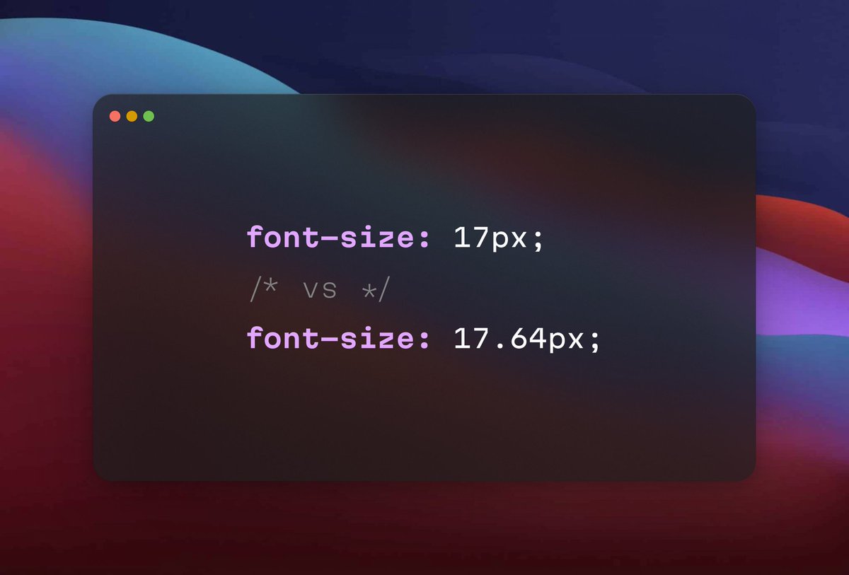
By the way, it’ll be easier to set the line height if you’re using a fractional font size to make the cap height match the pixel grid. Thus, you’ll know the exact value in pixels you should type into the property field.
https://twitter.com/romanshamin_en/status/1546920413908942852
One day, we’ll simply forget about this problem. The `leading-trim` and `text-edge` CSS properties are still early proposals, but nonetheless, they offer hope.
medium.com/microsoft-desi…
medium.com/microsoft-desi…
Also, Capsize by @michaeltaranto could provide salvation in cases where you have to stick to a given font and replacement is non-negotiable: seek-oss.github.io/capsize/
Anyway, to date, the only native way to manage your text labels so they look well aligned is by picking and using a typeface family with “equal” metrics.
This is why, before I drew the very first letter for the Martian Grotesk typeface, I researched and calculated the vertical metrics that would guarantee the text would fit buttons, lists, and forms, like a glove.

But that’s not all. In addition to easy alignment capabilities, these metrics result in an important feature: uppercase and lowercase letter heights fit the pixel grid on some font sizes.

In pixels—which are still the default units in Figma and Sketch—these sizes are multiples of five—10, 15, 20, and so on.
Add to this a regular font hinting, and you get a typeface that makes screen text look legible and extra sharp in most cases, even on non-retina displays.
Add to this a regular font hinting, and you get a typeface that makes screen text look legible and extra sharp in most cases, even on non-retina displays.
So, if you’re looking for a sans-serif font with a strong personality, reliably working for UI development purposes, bookmark Martian Grotesk.
You can purchase it on MyFonts: myfonts.com/collections/ma…
The discount of 60% is valid till Sep 4, 2022.
You can purchase it on MyFonts: myfonts.com/collections/ma…
The discount of 60% is valid till Sep 4, 2022.
Or, check out a free trial on Gumroad: romanshamin.gumroad.com/l/martian-grot…
Additionally, the Martian font family includes the free and open-source Martian Mono.
Get it on GitHub for free: github.com/evilmartians/m…
You’ll love it in your code editor as much as a display font on an avant-garde landing page.
Get it on GitHub for free: github.com/evilmartians/m…
You’ll love it in your code editor as much as a display font on an avant-garde landing page.
If this thread was helpful, follow me: @romanshamin_en.
I’m Head of Design at @evilmartians. I mostly write about typography, design systems, and perceptual color spaces.
Want to read more? Dig into our blog: evilmartians.com/chronicles
I’m Head of Design at @evilmartians. I mostly write about typography, design systems, and perceptual color spaces.
Want to read more? Dig into our blog: evilmartians.com/chronicles
All right, that’s it. Don’t hesitate to let me know what you think!
TL;DR
To designers: consider picking fonts with equal space above the cap height and under the baseline.
To type foundries: consider designing typefaces which make UI design and web development easier.
🙌
TL;DR
To designers: consider picking fonts with equal space above the cap height and under the baseline.
To type foundries: consider designing typefaces which make UI design and web development easier.
🙌
• • •
Missing some Tweet in this thread? You can try to
force a refresh