Ever wondered how a QR code works?
No, me neither but it's low-key fascinating.
(Warning, there is some extremely nerdy shit here.👇 )
No, me neither but it's low-key fascinating.
(Warning, there is some extremely nerdy shit here.👇 )
The Quick Response code was invented by a subsidiary of Toyota to track parts across the manufacturing process.
Barcodes were proving inadequate - they can only be read at certain angles and didn't store much data relative to their size
The QR code solves those issues and more
Barcodes were proving inadequate - they can only be read at certain angles and didn't store much data relative to their size
The QR code solves those issues and more

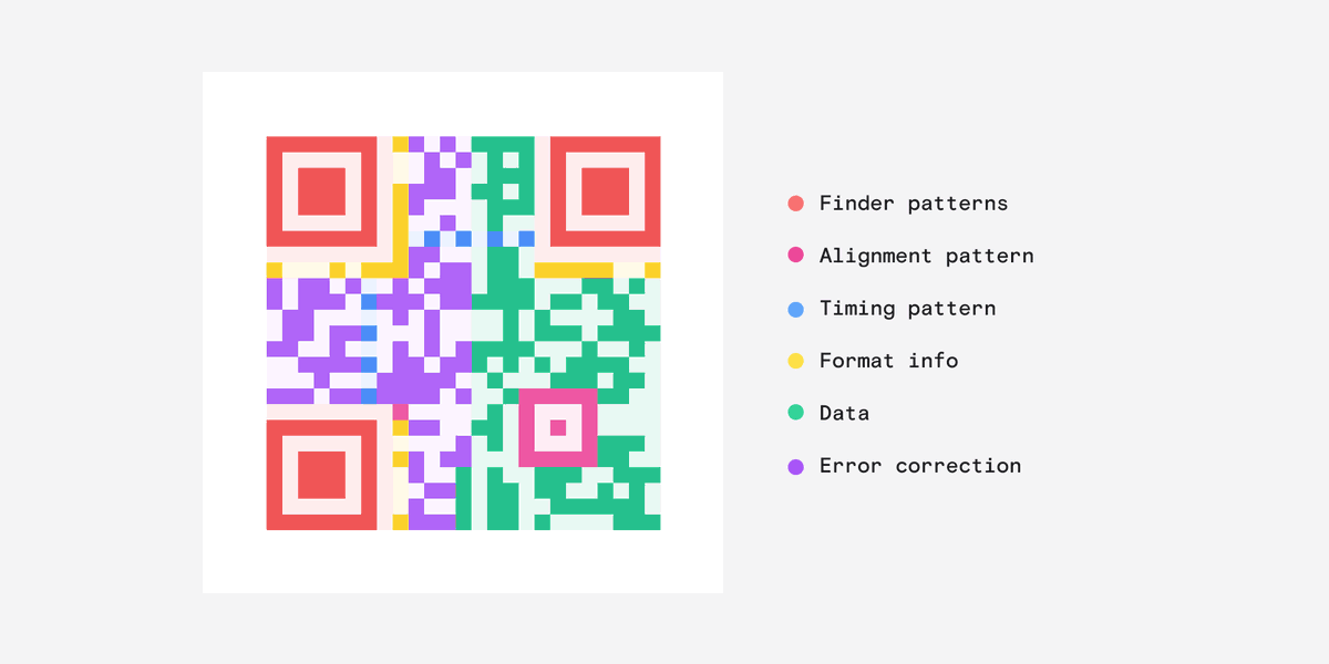
The most distinctive thing about a QR code are these cube shapes, called Finder Patterns, that help your reader detect the code.
The smaller fourth cube, the Alignment Pattern, orientates the code so it can be at any angle and the reader will still know which way is up.
The smaller fourth cube, the Alignment Pattern, orientates the code so it can be at any angle and the reader will still know which way is up.

You've probably never noticed but every QR code has these alternating black and white dots called the Timing Pattern.
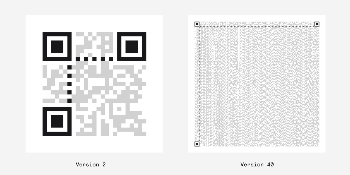
These tell the reader how big a single module is and how big the whole QR code is - known as the version.
Version 1: Smallest
Version 40: Biggest
These tell the reader how big a single module is and how big the whole QR code is - known as the version.
Version 1: Smallest
Version 40: Biggest

Information about the format is stored in these two strips near the Finder patterns.
It's stored twice so its readable even when QR code is partially obscured. (You'll notice that this is a recurring theme.)
It's stored twice so its readable even when QR code is partially obscured. (You'll notice that this is a recurring theme.)
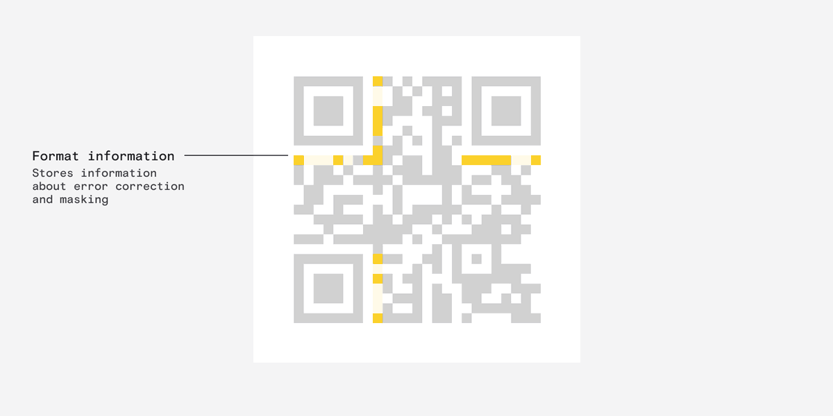
This stores three crucial pieces of information:
- Mask.
- Error correction level
- Error correction format.
I know these sound super fucking boring but they are actually pretty interesting.
- Mask.
- Error correction level
- Error correction format.
I know these sound super fucking boring but they are actually pretty interesting.

First, error correction - what is it?
Essentially, it dictates how much redundant information is stored in the code to ensure it remains readable even when part of it is missing.
Essentially, it dictates how much redundant information is stored in the code to ensure it remains readable even when part of it is missing.

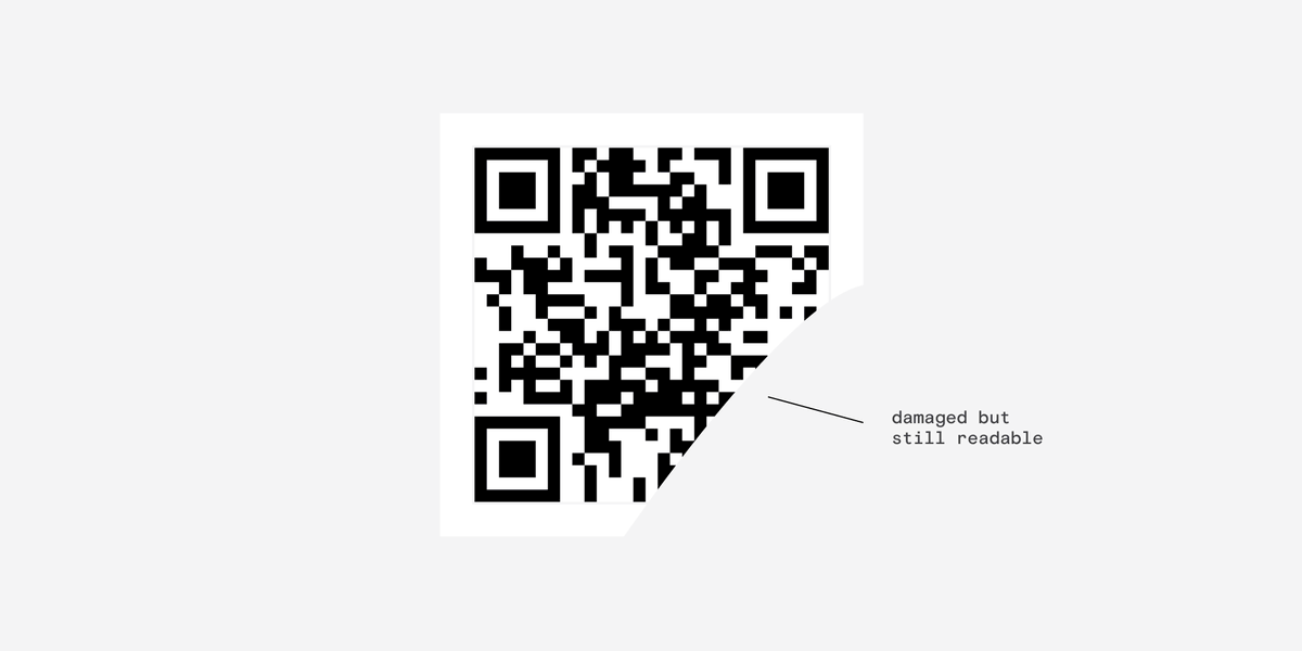
This is pretty amazing - If your code is outdoors you can choose a higher redundancy level to make sure it still functions when obscured.
(try it)
(try it)
Second, the mask - what's that?
Well, QR readers work best when there are the same amount of white and black areas.
But the data might not play ball so a mask is used to even things out.
Well, QR readers work best when there are the same amount of white and black areas.
But the data might not play ball so a mask is used to even things out.
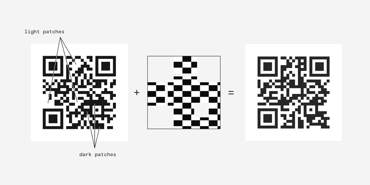
When a mask is applied to the code anything that falls under the dark part of the mask is inverted.
A white area becomes black and black area becomes white.
A white area becomes black and black area becomes white.
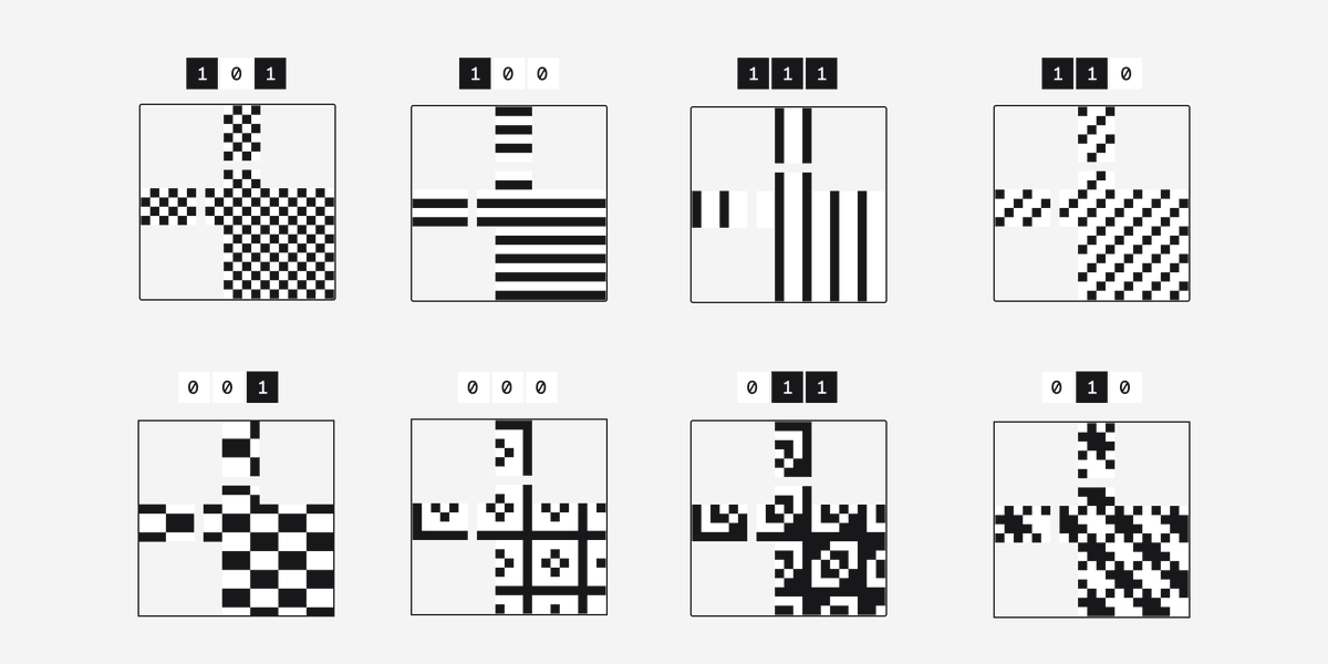
There are 8 standard patterns which are applied one by one.
The pattern that achieves the best result is used and that info is stored so the reader can unapply the mask.
The pattern that achieves the best result is used and that info is stored so the reader can unapply the mask.
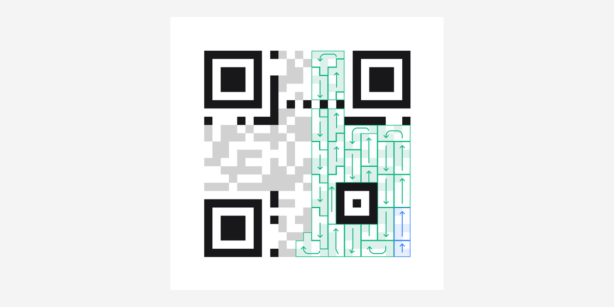
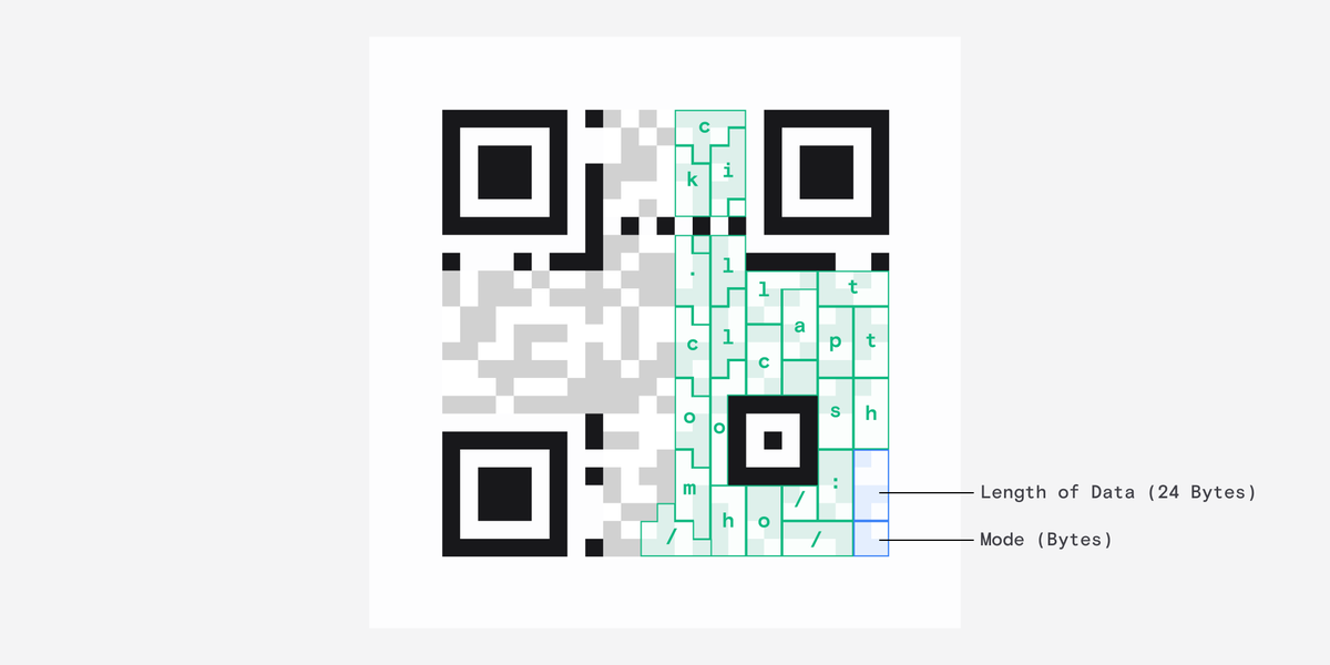
Finally we get to the actual data.
Weirdly, the data starts at the bottom-right corner and winds back up like pictured.
It almost doesn't matter where it starts because it can be read at any angle.
Weirdly, the data starts at the bottom-right corner and winds back up like pictured.
It almost doesn't matter where it starts because it can be read at any angle.
The first chunk of information here tells the reader what mode the data was encoded in and the second tells it the length.
In our case each character takes up 8 bit chunks, otherwise known as bytes, and there are 24 of them.
In our case each character takes up 8 bit chunks, otherwise known as bytes, and there are 24 of them.
There is still a bunch of left over space after our data.
This is where the error correction information is stored so that it can be read if partially obscured. The way this works is actually really really complex so I'll leave that out.
That's basically it!
This is where the error correction information is stored so that it can be read if partially obscured. The way this works is actually really really complex so I'll leave that out.
That's basically it!

For the absolute nerds who made it here, a fun fact:
Perhaps the coolest thing about QR codes is that Denso Wave, the company that invented them, never exercised their patent and released the technology for free!
denso-wave.com/en/technology/…
Perhaps the coolest thing about QR codes is that Denso Wave, the company that invented them, never exercised their patent and released the technology for free!
denso-wave.com/en/technology/…
Apparently, to maximise engagement, I'm supposed to link the original tweet here and encourage you to retweet it.
https://twitter.com/DanHollick/status/1570040185500626947
You can check out the unrolled version here:
typefully.com/DanHollick/qr-…
typefully.com/DanHollick/qr-…
• • •
Missing some Tweet in this thread? You can try to
force a refresh