Today is World #PeaceDay. How far have we come in our quest for a peaceful world?
Conflicts have become more common, but less deadly since World War II. But in recent years more people have died in conflicts than in prior decades.
A 🧵with some key charts:
Conflicts have become more common, but less deadly since World War II. But in recent years more people have died in conflicts than in prior decades.
A 🧵with some key charts:

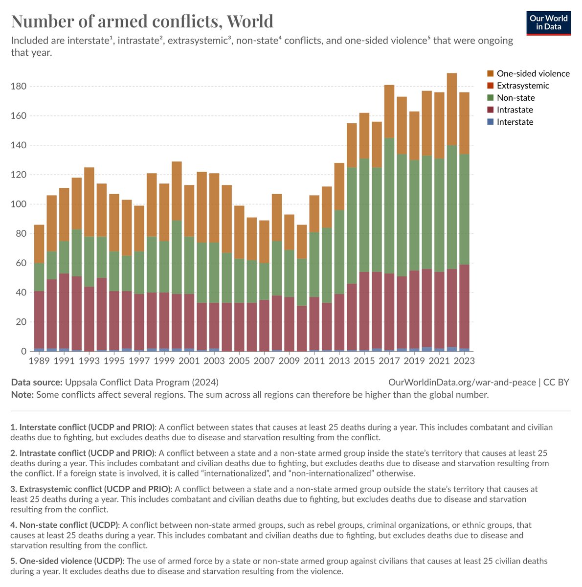
The number of conflicts involving at least one government has increased.
But conflicts between states have almost disappeared.
It is conflicts between governments and parts of their population that have become more common — especially those with foreign involvement.
But conflicts between states have almost disappeared.
It is conflicts between governments and parts of their population that have become more common — especially those with foreign involvement.

Importantly, while there are now more conflicts than in the past, many fewer people die in them.
Shortly after the World Wars, almost half a million people died in conflicts in any given year.
In recent decades, the number was almost always lower than 100,000 people per year.
Shortly after the World Wars, almost half a million people died in conflicts in any given year.
In recent decades, the number was almost always lower than 100,000 people per year.
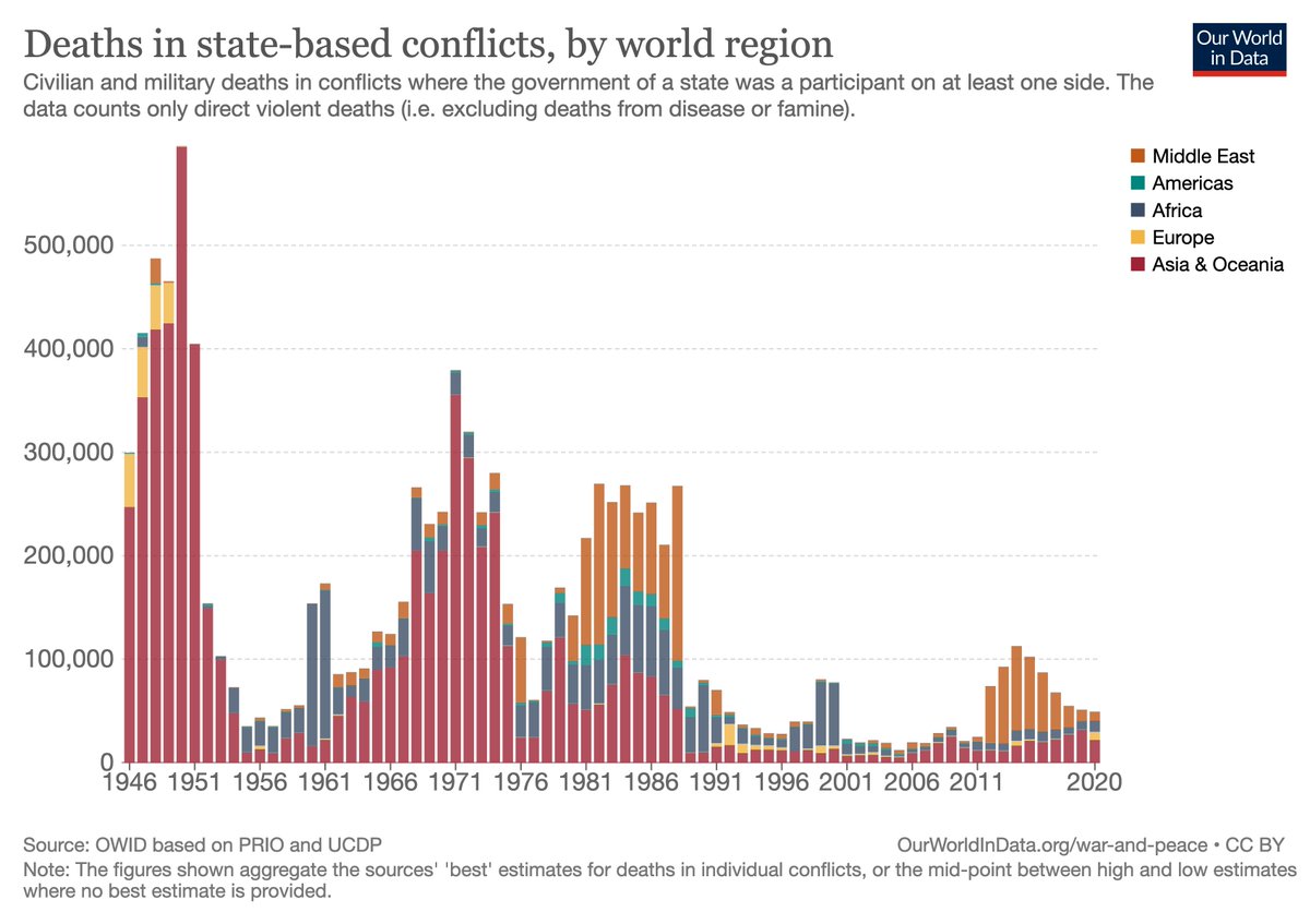
Historically, most people died in Asia & Oceania. Recently, deaths have been concentrated in the Middle East.
Relatively fewer people have died in conflicts in the Americas and Europe.
Relatively fewer people have died in conflicts in the Americas and Europe.

The world population has grown a lot recently. Accounting for that, we see that the share of people dying in conflicts has declined even more.
We also see that in the past, many people died in conflicts between states. Now most people die in conflicts within countries.
We also see that in the past, many people died in conflicts between states. Now most people die in conflicts within countries.

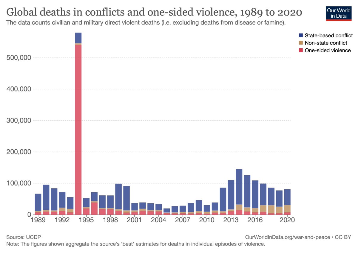
Looking also at deaths from conflicts where no government is involved, we see that most people still die in state-based conflicts.
The major exception is the genocide in Rwanda in 1994.
The major exception is the genocide in Rwanda in 1994.

Finally, we see that the number of people dying in conflicts in the last decade has increased, after being much lower in the 2000s.
The fight for a more peaceful world is therefore far from over.
The fight for a more peaceful world is therefore far from over.
If you now would like to read more about peace and conflict, visit our topic page:
ourworldindata.org/war-and-peace
It has all the charts from above, additional visualizations, and writing on how researchers deal with the many challenges of measuring conflicts and the deaths from them.
ourworldindata.org/war-and-peace
It has all the charts from above, additional visualizations, and writing on how researchers deal with the many challenges of measuring conflicts and the deaths from them.
I am grateful to the many researchers who create the conflict data we use across our work @OurWorldInData.
Special thanks to @UCDP, whose data we use for our main visualizations, and my colleague @JoeHasell for creating the charts themselves.
Special thanks to @UCDP, whose data we use for our main visualizations, and my colleague @JoeHasell for creating the charts themselves.
If you think this thread could be interesting to others: like it, retweet it, or tell them about it!
Do you have any questions or suggestions? Then please send me a message here or email me at bastian@ourworldindata.org.
I look forward to hearing from you!
Do you have any questions or suggestions? Then please send me a message here or email me at bastian@ourworldindata.org.
I look forward to hearing from you!
• • •
Missing some Tweet in this thread? You can try to
force a refresh


