Ben Casselman Profile picture
Oct 4 10 tweets 4 min read
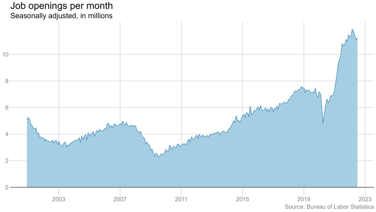
Job openings fell by more than 1 million in August, down to 10 million. Quits edged up (but July was revised down).
#JOLTS
bls.gov/news.release/j…
This was the largest one-month drop in openings on record other than in April 2020. Openings still high by historical standards, but this sure looks like the drop in labor demand we've been watching for. #JOLTS Chart showing monthly job openings.
There were 1.7 jobs per unemployed worker in August, down from a 2-to-1 ratio in July. Consistent with other evidence that the labor market has been cooling. cc @melbournecoal nytimes.com/2022/09/30/bus… Chart showing the number of job openings per unemployed work
Voluntary quits ticked up in August, but July was revised down, and the trend appears to be downward. Quits are a big deal because they're a sign of confidence among workers, and a source of wage pressure for employers. Chart showing voluntary quits per month.
One place we are not seeing any significant sign of a cooldown is in layoffs. They rose trivially in August but remain well below prepandemic levels (which were already low). Chart showing layoffs and other 'involuntary separations' pe
Openings are still elevated in most industries relative to their prepandemic level, but they're down vs a year ago, especially in some of the industries where hiring had been hardest (e.g. leisure & hospitality). Bar chart showing job openings by industry, comparing August
Bit of a different story when we look at the number of hires per job opening. Leisure and hospitality generating fewer hires per job opening than a year ago. A sign of hiring struggles? Or reduced hiring effort? Hard to say Bar chart showing hires per opening by industry, comparing A
Meanwhile, quits are still *super* elevated in leisure and hospitality (and jumped up in August), even as they're falling some in retail. Bar chart showing quits rates by industry, comparing August
One source of mystery in the job market lately had been that job openings in JOLTS had barely fallen, even as private-sector measures (such as from Indeed) had trended down. With today's data and revisions, they now look much more aligned. Line chart comparing job openings from JOLTS to listings on
Note that a position only counts as an opening in JOLTS if an employer is actively trying to fill it. Indeed's data is just a count of postings. So it's possible for the measures to diverge for "real-world" reasons. But my default assumption is that any divergence is noise.

• • •

Missing some Tweet in this thread? You can try to force a refresh
 

Keep Current with Ben Casselman

Ben Casselman Profile picture

Stay in touch and get notified when new unrolls are available from this author!

Read all threads

This Thread may be Removed Anytime!

PDF

Twitter may remove this content at anytime! Save it as PDF for later use!

Try unrolling a thread yourself!

how to unroll video
  1. Follow @ThreadReaderApp to mention us!

  2. From a Twitter thread mention us with a keyword "unroll"
@threadreaderapp unroll

Practice here first or read more on our help page!

More from @bencasselman

Oct 3
Following last week's GDP benchmark revisions, there's been a bunch of discussion about how Americans are spending down their "excess savings" faster than previously believed. I think that narrative is missing some important context.
A (quite belated) 🧵:
First, very quick recap: During the early months of the pandemic, Americans cut back their spending (since they couldn't go anywhere). We also gave out a lot of money in pandemic aid, much of which wasn't immediately spent. The result was a big increase in the saving rate.
This was a LOT of money in the aggregate. Depending on the assumptions you use, these "excess savings" (savings beyond what we'd expect without Covid) topped $2.5 trillion by the end of last year.
Here's what that chart looked like before the latest revisions: Chart showing cumulative excess savings in the pandemic, bef
Read 18 tweets
Oct 3
Quits are falling. Wage growth is slowing. Companies are finding it easier to fill positions.
The job market has proved more resilient than almost anyone expected. But there are signs that it may be coming off the boil.
With @melbournecoal
nytimes.com/2022/10/03/bus…
@melbournecoal From the Fed's perspective, this is pretty close to an ideal scenario (albeit not nearly enough yet). Less job-hopping by employees and less poaching by employers (combined with increased labor force participation) means softer wage growth without lots of layoffs/unemployment.
But for workers, especially low-wage workers, this still suggests that the moment of power they have enjoyed for the past year may be passing, and that employers may be regaining leverage.
Read 4 tweets
Aug 30
There were 11.2 million job openings at the end of July, UP slightly from June (though down from the spring). Quits down a hair. Layoffs basically flat (at a very low level).
#JOLTS
bls.gov/news.release/j…
Job openings are down from their peak, but they are still extraordinarily high by historical standards. The Fed is hoping it can cool the job market by bringing down openings without leading to more layoffs. Not a lot of evidence of that happening so far. Image
On the other hand, layoffs also remain extremely low, despite some high-profile job cuts in tech. Image
Read 10 tweets
Aug 26
Powell is speaking now in Jackson Hole.
Here's our story from @jeannasmialek: nytimes.com/2022/08/26/bus…
Here's the text of his speech: federalreserve.gov/newsevents/spe…
Or watch it live here:
@jeannasmialek Powell: "While the lower inflation readings for July are welcome, a single month's improvement falls far short of what the Committee will need to see before we are confident that inflation is moving down."
Powell is very direct: "While higher interest rates ... will bring down inflation, they will also bring some pain to households and businesses. These are the unfortunate costs of reducing inflation. But a failure to restore price stability would mean far greater pain.
Read 4 tweets
Aug 26
July data on income/spending. All numbers vs. June:
Personal income: +0.2% (vs 0.7% in June)
Consumer spending: +0.1% (vs 1.0%)
Real spending: +0.2% (vs flat)
Consumer prices: -0.1% (+1.0%)
Prices ex. food/energy: +0.1% (0.6%)
bea.gov/news/2022/pers…
Yes, that's right: Consumer prices *fell* (slightly) in July, per the PCE price index.
I didn't do a full chart-a-palooza today (too much other work!), but this is notable: Inflation adjusted spending is falling further below its trend line. That's probably pretty much what the Fed is aiming for: positive but below-trend growth.
Read 4 tweets
Aug 25
I see a lot of confused commentary around the GDP vs GDI divergence, with people offering explanations based on real-world trends, when in fact the gap must be the result of measurement issues.
I don't know if this analogy will help or confuse the situation, but going to give it a go anyway: Suppose you're trying to keep track of how much your kid is growing. Every three months, mom measures junior from the floor up, and dad measures from the ceiling down.
Neither of you has a tape measure, so you're measuring by hands. Not very precise! You'll probably come up with different numbers.
Read 13 tweets

Did Thread Reader help you today?

Support us! We are indie developers!


This site is made by just two indie developers on a laptop doing marketing, support and development! Read more about the story.

Become a Premium Member ($3/month or $30/year) and get exclusive features!

Become Premium

Don't want to be a Premium member but still want to support us?

Make a small donation by buying us coffee ($5) or help with server cost ($10)

Donate via Paypal

Or Donate anonymously using crypto!

Ethereum

0xfe58350B80634f60Fa6Dc149a72b4DFbc17D341E copy

Bitcoin

3ATGMxNzCUFzxpMCHL5sWSt4DVtS8UqXpi copy

Thank you for your support!

Follow Us on Twitter!

:(