9 ways to increase your average order value by at least 25% (Most Ecommerces don't use 1/3 of these)
// Thread 🧵 //
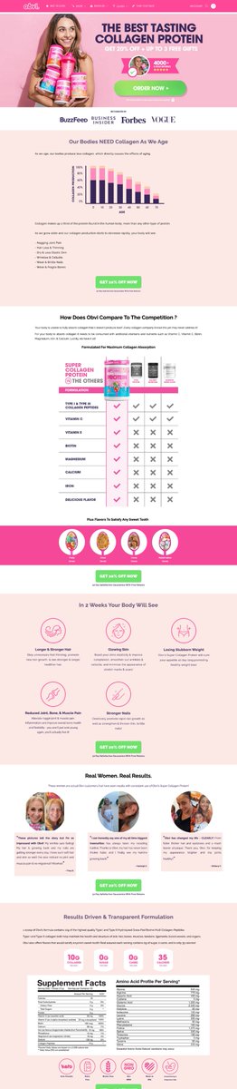
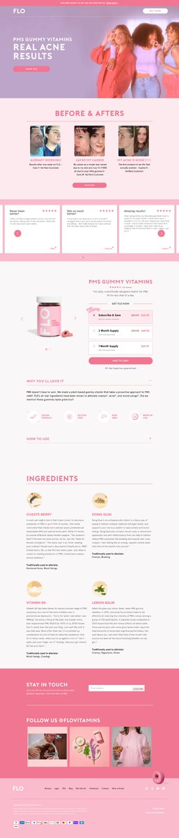
1/ Bundle and "Package" offers
// Thread 🧵 //
1/ Bundle and "Package" offers
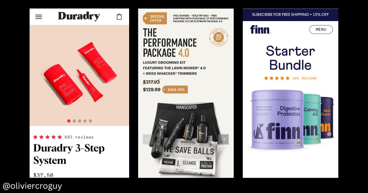
2/ the Upsell next to ATC button
>Must have a link with the main product
>Better if cheaper than the main product
>use with "Complete the look" or "Complete the routine" or "Frequently bought with..."
>Must have a link with the main product
>Better if cheaper than the main product
>use with "Complete the look" or "Complete the routine" or "Frequently bought with..."

3/ Cross-sell/Upsell pop-up that appears when a visitor adds a product to the card

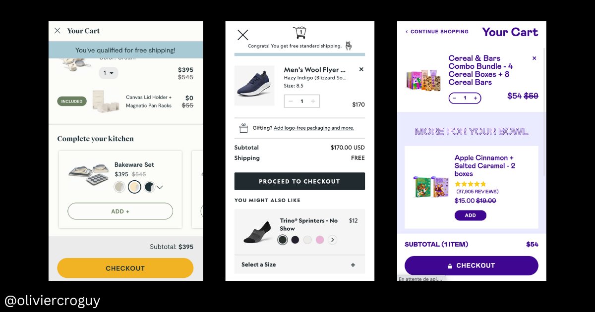
4/ The In-cart upsell
It must be relatively cheap, added to the cart in 1 click, and have a link with the main product added to the cart
If the product is shoes, an excellent in-cart upsell can be socks
It must be relatively cheap, added to the cart in 1 click, and have a link with the main product added to the cart
If the product is shoes, an excellent in-cart upsell can be socks
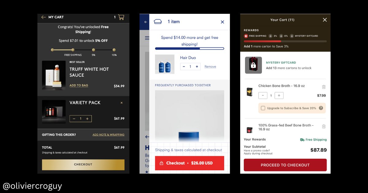
5/ The In-cart reward progress bar
The idea is to give gifts/rewards when visitors add more products to the cart. Gamification & scarcity
Example:
-25$ = Free Shipping
-50$ = 15% discount
-80$ = 20$ value Free Gift
The idea is to give gifts/rewards when visitors add more products to the cart. Gamification & scarcity
Example:
-25$ = Free Shipping
-50$ = 15% discount
-80$ = 20$ value Free Gift
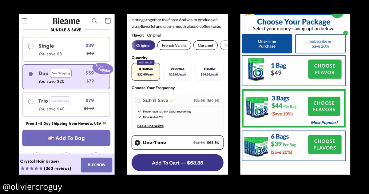
6/ Better UI & Offer for higher quantities
You can make your larger quantities offers more attractive by using better UI design, "most popular" badges, and by giving advantages (FS for example)
But be careful, if you do it wrong you can lower your CVR.
You can make your larger quantities offers more attractive by using better UI design, "most popular" badges, and by giving advantages (FS for example)
But be careful, if you do it wrong you can lower your CVR.
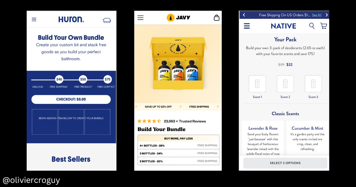
7/ A "Build your own" Bundle page
It's basically the same as a classic bundle page but you let people select the products they want and the more they add products to the bundle, the bigger the discount gets.
It Works well for consumables with multiple SKUs and CPGs in general
It's basically the same as a classic bundle page but you let people select the products they want and the more they add products to the bundle, the bigger the discount gets.
It Works well for consumables with multiple SKUs and CPGs in general
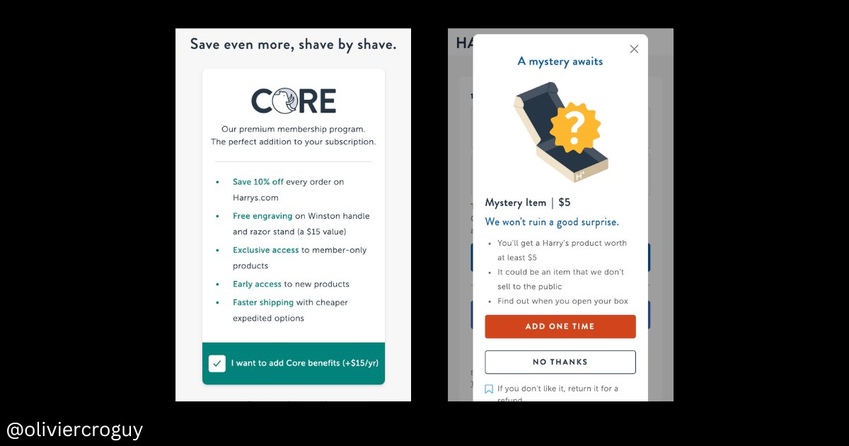
8/ Mini upsells to get advantages/gift
You can place them just before the checkout
it can be :
>A membership to give you access the discounts, community, get special advantages
>A Premium guarantee
>Faster/Safer shipping
>A free "mystery gift"
You can place them just before the checkout
it can be :
>A membership to give you access the discounts, community, get special advantages
>A Premium guarantee
>Faster/Safer shipping
>A free "mystery gift"
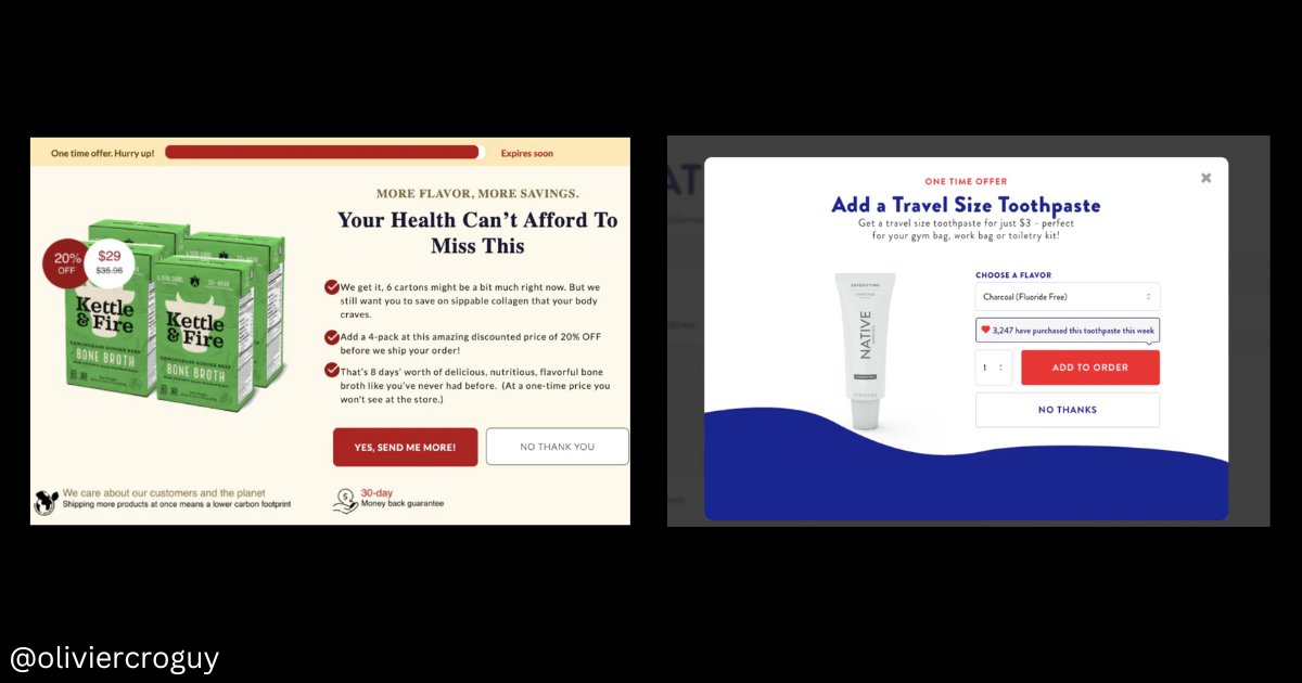
9/ Post-purchase upsell
The idea is the same as the pop-up upsell, but it's on the thank you page.
Ivery powerful because in 1 click to order. no friction at all
The idea is the same as the pop-up upsell, but it's on the thank you page.
Ivery powerful because in 1 click to order. no friction at all
That's all for today
If you like this kind of thread, let me know with a Like and RT
It will motivate me to make more
If you like this kind of thread, let me know with a Like and RT
It will motivate me to make more
If you're a brand doing +$100k per month and you want to increase your conversions & make your business recession-proof, shoot me a dm
I will offer you a free CRO audit and give you some quick wins
I will offer you a free CRO audit and give you some quick wins
• • •
Missing some Tweet in this thread? You can try to
force a refresh