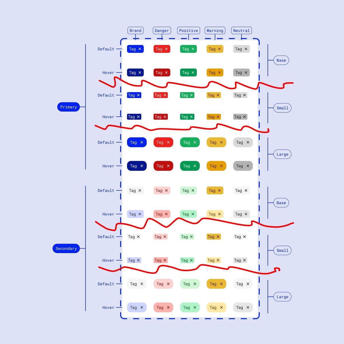
It's common during the handoff process to provide screens to our engineering teammates by "throwing designs over the fence"
We've all been there!
This puts pressure on devs to play a game of spot the difference, finding minor changes between screens 🔎
We can simplify this 📣
We've all been there!
This puts pressure on devs to play a game of spot the difference, finding minor changes between screens 🔎
We can simplify this 📣

The red circles are the true differences, sooooo why are we duplicating *everything* from each screen?
This is inefficient from both sides:
– Designer must track identical screens, with changes doubled* every time there's a modification
– Developer is playing spot the difference
This is inefficient from both sides:
– Designer must track identical screens, with changes doubled* every time there's a modification
– Developer is playing spot the difference

Let's remove duplicate screens!
Instead, we can show *component* differences alongside the main screen
Then group them with a section & use component labels to describe the differences
The developers then just need to look at one template, and read the component differences 🪄
Instead, we can show *component* differences alongside the main screen
Then group them with a section & use component labels to describe the differences
The developers then just need to look at one template, and read the component differences 🪄


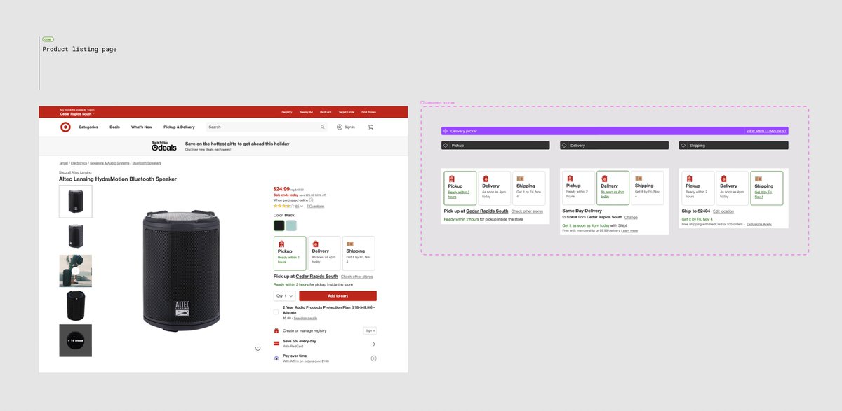
Let's look for a practical example
Here's the Target product listing page, sliced up to show the delivery toggle options
Thanks for asking about this one @jgdesignz
Here's the Target product listing page, sliced up to show the delivery toggle options
Thanks for asking about this one @jgdesignz

• • •
Missing some Tweet in this thread? You can try to
force a refresh