 Each size (base, small, large) is in itself an indication of...something. But what? Would a consuming designer know? I'm not confident
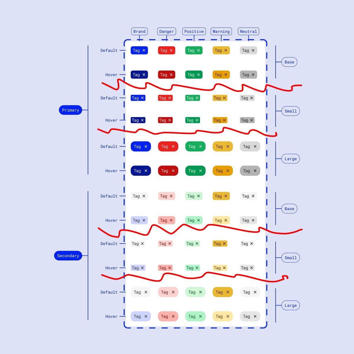
 That's right! There are two problems:
 As usual, before we get started here are some T&Cs:
 Atomic design is great! The issue we face though is that it’s best suited for frontend code architecture, and not necessarily within design files
 The last layer (component tokens) may be overkill for your needs, and you might not need to get that specific!
 As usual, these are thoughts / ideas!
 First things first, identify the component types
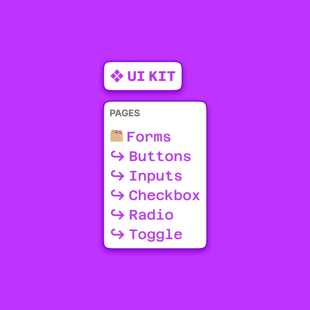
 I’ve used this before, but the starting point is always
 The first thing we want to decide is whether we use one file or many files


 For team structure, there are a few main approaches to align to:


 Before we get going, let's take a look at the components under the hood
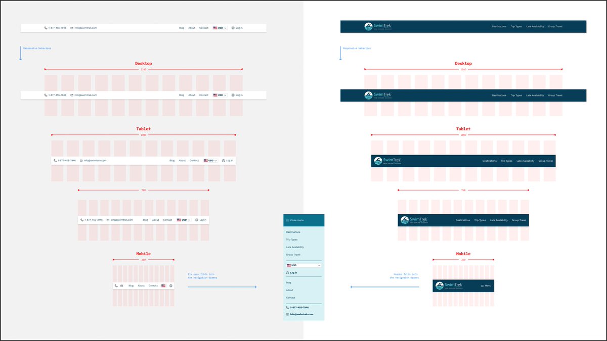 Here's the full view of the two menus (pre and main) and broken down into sequences
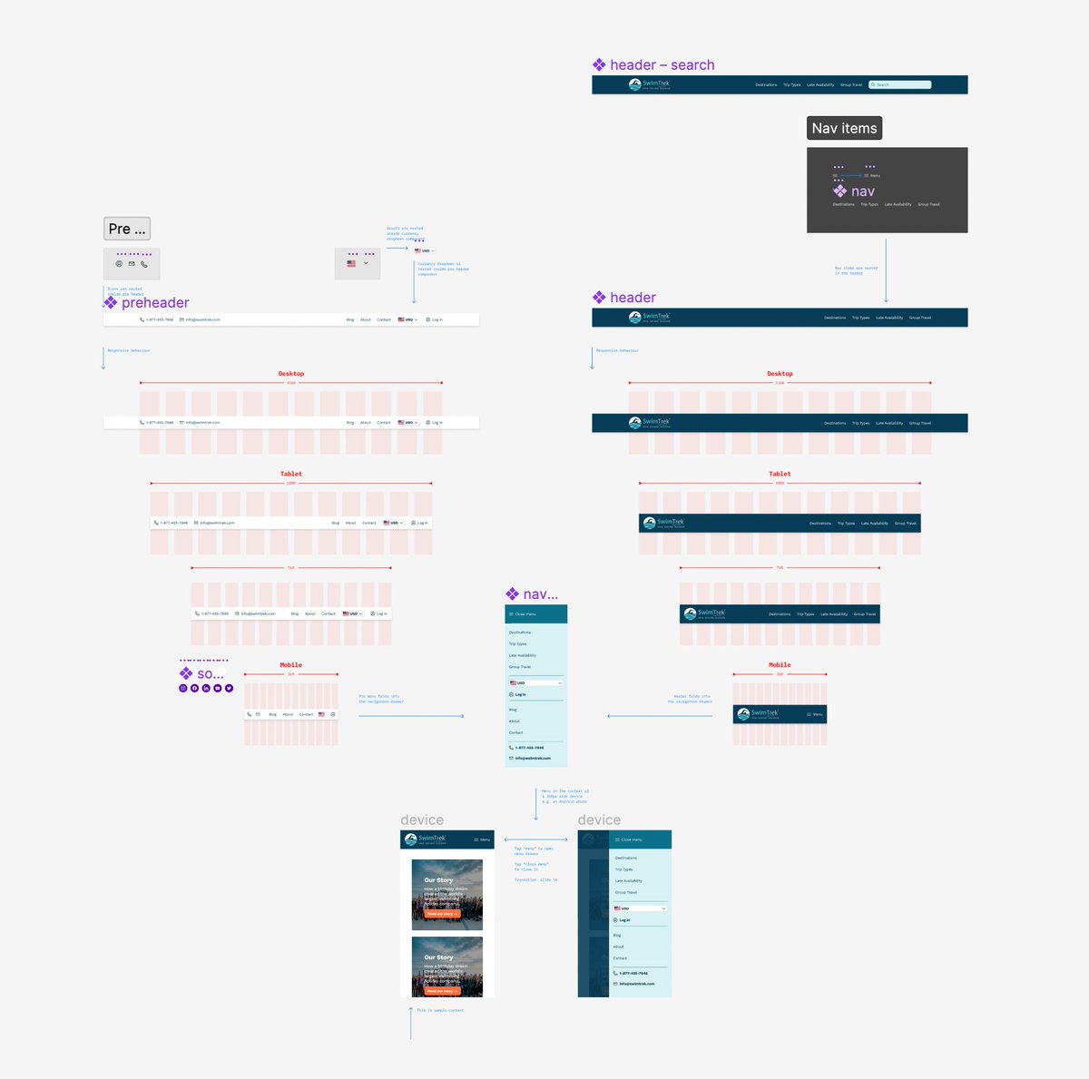


 First things first, and the main reason I’m doing this, is because I thought “hang on, there are a lot of different styles being used here"
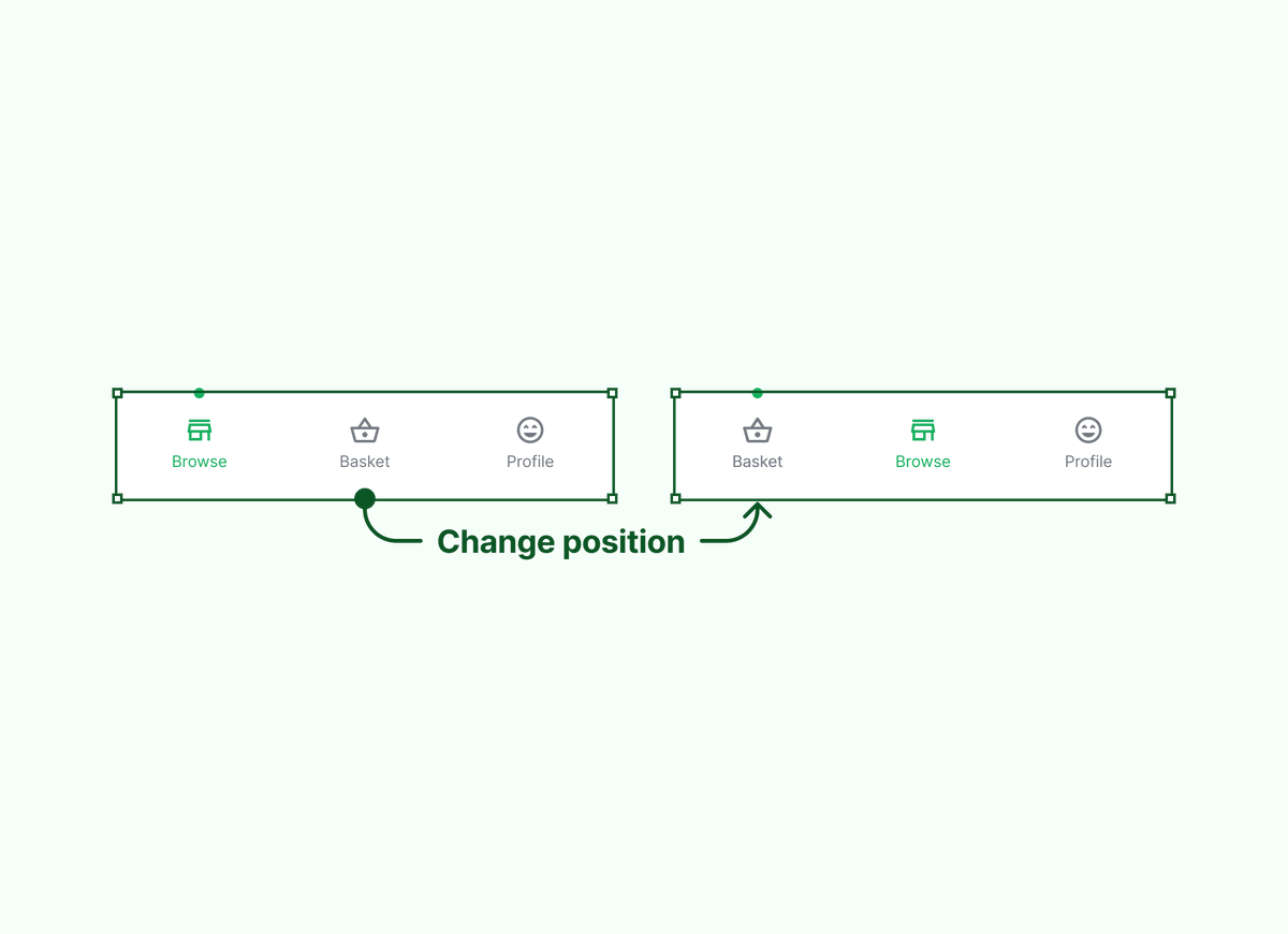 Question 2️⃣!


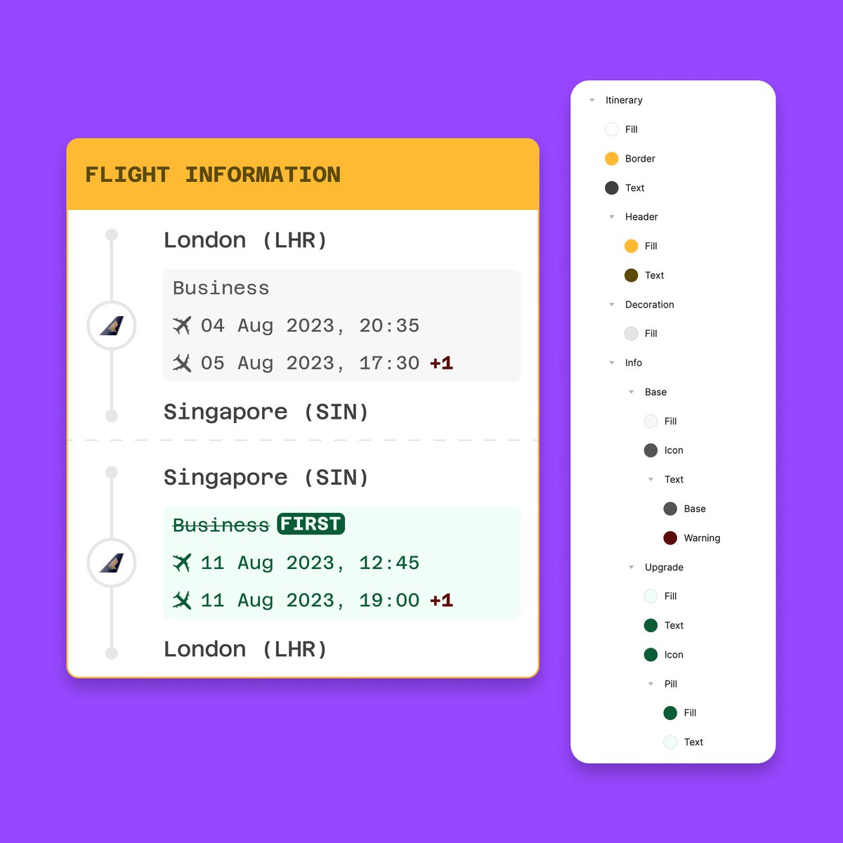
 The style/tokens supported are:
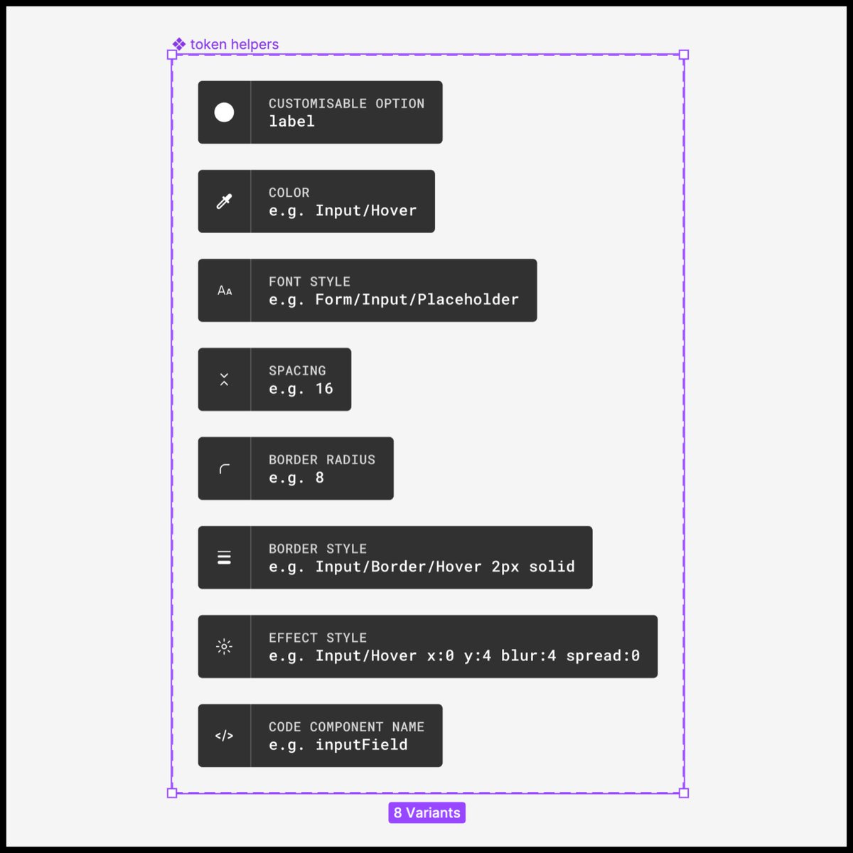
 The red circles are the true differences, sooooo why are we duplicating *everything* from each screen?

