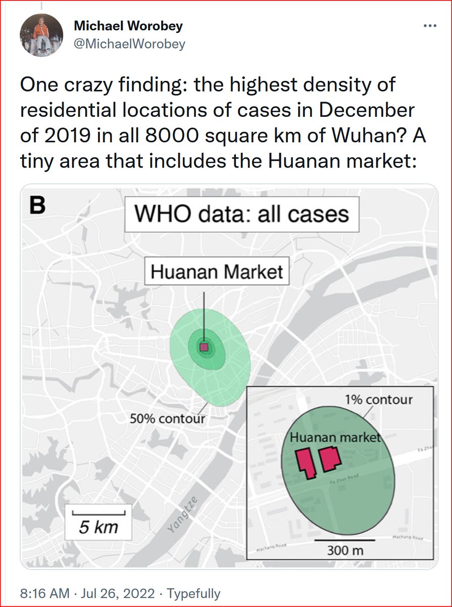
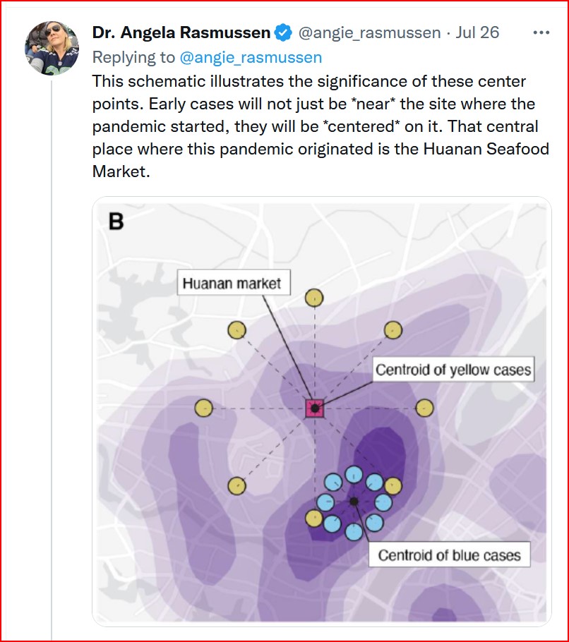
The geospatial analysis in Worobey2022 relies on a centering model to determine the origin point of COVID in Wuhan Dec 2019.
This model is not valid.
doi.org/10.1126/scienc…
This model is not valid.
doi.org/10.1126/scienc…
The centering model can be stated as follows: the spatial pattern of the home residence of severe cases is centered on the origin point, with spatial density decreasing away from the origin point.
Fig 2A and B of Worobey2022 provide insight into the authors' logic.
“We hypothesized that if the Huanan market were the epicenter of the pandemic, then early cases should fall not just unexpectedly near to it but should also be unexpectedly centered on it”
“We hypothesized that if the Huanan market were the epicenter of the pandemic, then early cases should fall not just unexpectedly near to it but should also be unexpectedly centered on it”

Worobey et al place considerable emphasis on the claim that the severe-case-residences are centered on the Huanan market, in the article itself, in media, and in tweets posted by the authors, e.g.:
https://twitter.com/MichaelWorobey/status/1551949577774739457?s=20&t=_22TJiqWyoUT09hPe38o0w

The centering model requires that most cases are infected near the origin, and that their residences are distributed in a circular pattern around the origin.
That is not compatible with the patterns of transmission of COVID or with the patterns of human movement in a city.
That is not compatible with the patterns of transmission of COVID or with the patterns of human movement in a city.
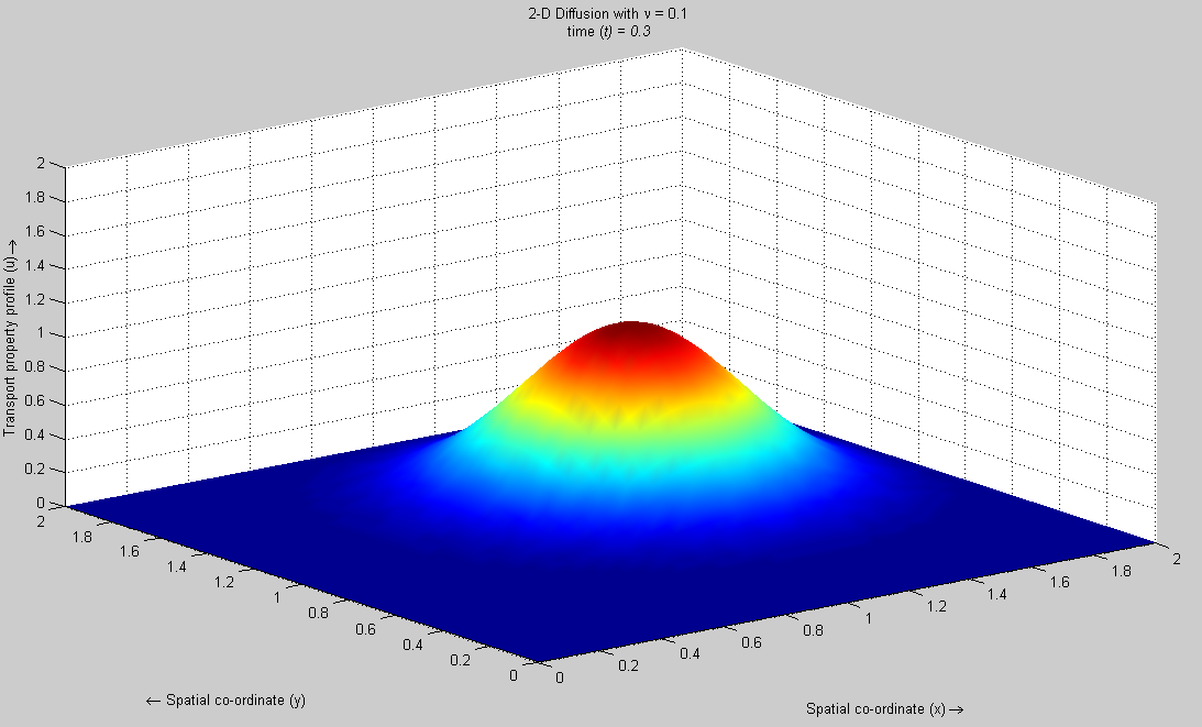
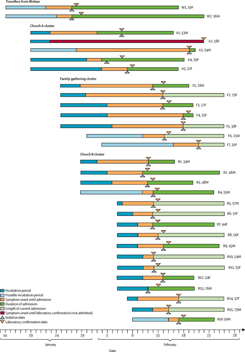
For purposes of illustration, consider this simple example of a COVID transmission pattern from Singapore, Jan 29-Feb 24, 2020.
Note how it gets complicated with only a few steps from the local origin.
doi.org/10.1016/S1473-…
Note how it gets complicated with only a few steps from the local origin.
doi.org/10.1016/S1473-…

Another view of the Singapore transmission pattern.
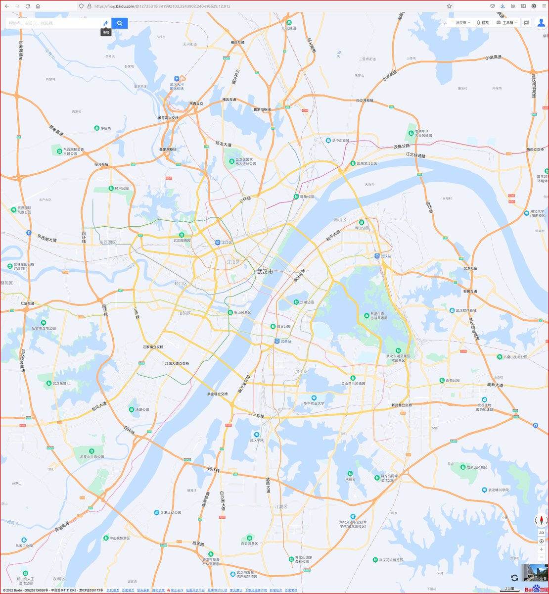
Now consider human movement in Wuhan.
Wuhan is a large urban center with modern transportation infrastructure. Millions of people move daily on complex networks, by car, scooter, bus, metro, rail.
map.baidu.com/@12735318.3419…
Wuhan is a large urban center with modern transportation infrastructure. Millions of people move daily on complex networks, by car, scooter, bus, metro, rail.
map.baidu.com/@12735318.3419…
Spatial pattern of daily population movements in Wuhan (2015).
Red: people entering an area.
Green: people leaving an area.
Yellow: little change.
journals.plos.org/plosone/articl…
Red: people entering an area.
Green: people leaving an area.
Yellow: little change.
journals.plos.org/plosone/articl…

The centering model is not compatible with the complexities of transmission chains and human movement.
We can test this conclusion.
There is one subset of Dec 2019 severe cases with a known point of infection: those with a link to Huanan market.
We can test this conclusion.
There is one subset of Dec 2019 severe cases with a known point of infection: those with a link to Huanan market.
Helpfully, the market-linked cases are plotted as orange dots on Worobey2022 Fig 1a.
It is evident by inspection that the orange dots are not close to the market, and do not form a pattern around the market.
It is evident by inspection that the orange dots are not close to the market, and do not form a pattern around the market.

The non-validity of the centering model is demonstrable for the subset of 155 severe cases considered in Worobey2022.
But there were many more cases in Wuhan in Dec 2019.
But there were many more cases in Wuhan in Dec 2019.
Estimates of the official number of severe cases in Wuhan Dec 2019 range from
174 (who.int/emergencies/di…
to
260 (bit.ly/2019Cases; @gdemaneuf).
wapo.st/3UWfdCv
174 (who.int/emergencies/di…
to
260 (bit.ly/2019Cases; @gdemaneuf).
wapo.st/3UWfdCv
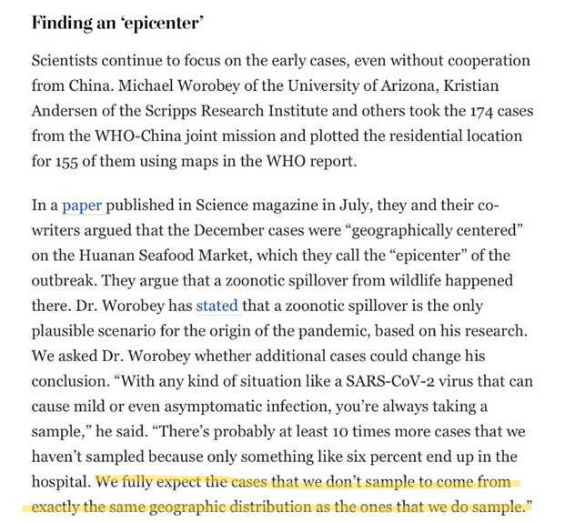
How many non-severe cases in Wuhan, Dec 2019?
@MichaelWorobey, in WaPo, wapo.st/3UWfdCv, estimated that “something like six percent end up in the hospital.”
174-260 severe cases➡️2726-4073 non-severe cases➡️3000-4000 in significant figures.
@MichaelWorobey, in WaPo, wapo.st/3UWfdCv, estimated that “something like six percent end up in the hospital.”
174-260 severe cases➡️2726-4073 non-severe cases➡️3000-4000 in significant figures.
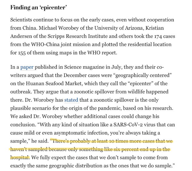
So, in addition to the 174-260 severe cases, it is reasonable to assume that 3000-4000 non-severe cases were circulating through the city of Wuhan during Dec 2019, each with an approximately 10-day window of infectiousness.
These 3000-4000 cases, plus the 174-260 severe cases, would have constituted a complex pattern of transmission. Imagine the Singapore example with thousands of nodes, rather than 30.
Now, imagine that transmission pattern translated into a geographic pattern of residences.
Of course, neither the transmission pattern nor the geographic pattern will ever be known.
Of course, neither the transmission pattern nor the geographic pattern will ever be known.
But, if we could add those 3000-4000 additional residences, the result would be … all over the map. Many new clusters and individual dots would appear, with their locations determined by random events, e.g., which metro car did an infected person get into?
It is not possible to predict what the unknown geographic pattern would look like, but it is not credible to assume that those 3000-4000 additional locations would simply follow the pattern of severe-case residences shown in Worobey2022 Fig 1A.

Consequently, there is no basis for the claim by @michaelworobey that “we fully expect the cases that we don’t sample to come from exactly the same geographic distribution as the ones that we do sample” (WaPo wapo.st/3UWfdCv)
CONCLUSION
Worobey2022 used an invalid centering model to interpret the geographic pattern of 155 residences of severe COVID cases in Wuhan, Dec 2019, in support of their claim that the Huanan market was the origin point of the pandemic.
Worobey2022 used an invalid centering model to interpret the geographic pattern of 155 residences of severe COVID cases in Wuhan, Dec 2019, in support of their claim that the Huanan market was the origin point of the pandemic.
• • •
Missing some Tweet in this thread? You can try to
force a refresh