💡Top 10 Figma mistakes I see my students make when they build their first design system.. and how to avoid them
Keep reading to learn how..
Keep reading to learn how..
#1. Using groups instead of frames
I often ban my Figma students from using groups. Why? Frames are better 99% of the time. So it's a good habit to start. They have super powers and are required for Figma’s best features like Auto Layout, Constrains, Components, Grids, etc..
I often ban my Figma students from using groups. Why? Frames are better 99% of the time. So it's a good habit to start. They have super powers and are required for Figma’s best features like Auto Layout, Constrains, Components, Grids, etc..

#2. Creating super-duper component sets
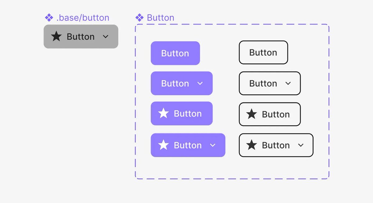
Creating a component set that can “do it all” with many variants and props is a fun exercise. But when it’s time to actually design, keeping different types/subtypes of components separate makes them easier to discover /use. For example..
Creating a component set that can “do it all” with many variants and props is a fun exercise. But when it’s time to actually design, keeping different types/subtypes of components separate makes them easier to discover /use. For example..
Instead of 1 super component set for all button types. Break them down into subtypes that are easy to discover in the asset panel and need little configuration. 

#3. Creating (way) too many color styles
10 tints and shades for each color is overkill for (almost) any system. And can lead to confusion and misuse. Instead, document all 10 tints and shades in your “color key” and save the most essential 1-5 as styles..
10 tints and shades for each color is overkill for (almost) any system. And can lead to confusion and misuse. Instead, document all 10 tints and shades in your “color key” and save the most essential 1-5 as styles..
..For example, document 10 tints/shade for your primary color. Then create styles for 50 (background), 600 (Base/Default), 700 (Hover), 800 (Pressed). 

#4. Mismanaging icons
Icons are a little deceptive. They look like harmless little components. But they can cause a lot of headache when not set up correctly. Follow these golden rules to ensure they’re always easy to use and preform correctly..
Icons are a little deceptive. They look like harmless little components. But they can cause a lot of headache when not set up correctly. Follow these golden rules to ensure they’re always easy to use and preform correctly..
..Golden icon rules
1) Keep all icon vector shapes inside standardized square frames
2) Make sure each icon is made up of only one vector shape
3) Never rotate icons to create new versions (ex. left/right arrow).
4) Only combine highly-related/stateful icons as variants
1) Keep all icon vector shapes inside standardized square frames
2) Make sure each icon is made up of only one vector shape
3) Never rotate icons to create new versions (ex. left/right arrow).
4) Only combine highly-related/stateful icons as variants

#5. Making every component public
Keep some components private. Meaning, they wont appear in the assets panel. By adding a “.” or “_” to the beginning of their name. This is v useful for atomic comps that help build other comps. But shouldn’t be used outside of that use case..
Keep some components private. Meaning, they wont appear in the assets panel. By adding a “.” or “_” to the beginning of their name. This is v useful for atomic comps that help build other comps. But shouldn’t be used outside of that use case..
..For example, with an avatar, name the nested status badges “.status” so it doesn't clutter the assets panel. And only the full avatar component can be dragged in. 

#6. Trying to make yellow work
Making yellow accessible is always a challenge. Consider choosing an orange for your warning color. At the very least, have the hue value for your warning color inch towards orange as it grows darker with each shade.
Making yellow accessible is always a challenge. Consider choosing an orange for your warning color. At the very least, have the hue value for your warning color inch towards orange as it grows darker with each shade.

#7. Under utilizing style & component descriptions
Use the description input for styles and components to make them easier to discover and use. For example..
Use the description input for styles and components to make them easier to discover and use. For example..
..Use descriptions to:
A) Describe when or where something should be used (ex. Primary/700 color: “hover”)
B) Add searchable keywords to make finding what you're looking for in the Asset panel easier (ex. heart icon: “like, love, favorite, save”)
A) Describe when or where something should be used (ex. Primary/700 color: “hover”)
B) Add searchable keywords to make finding what you're looking for in the Asset panel easier (ex. heart icon: “like, love, favorite, save”)

#8. Focusing on device sizes, rather than breakpoints
Figma suggests frame sizes based on common device widths. This is ok.. but basing your designs on common breakpoints is much more practical from a development point of view! For example..
Figma suggests frame sizes based on common device widths. This is ok.. but basing your designs on common breakpoints is much more practical from a development point of view! For example..
..Use these frame widths for your designs:
Small: 375px
Medium: 600px
Large: 900px
Extra large: 1200px
Learn more here 👇uiprep.com/blog/everythin…
Small: 375px
Medium: 600px
Large: 900px
Extra large: 1200px
Learn more here 👇uiprep.com/blog/everythin…

#9. Keeping the line height for text set to auto
Figma’s automatic line height is a good starting point for many text styles. But a little finesse goes a long way. For example..
Figma’s automatic line height is a good starting point for many text styles. But a little finesse goes a long way. For example..
Follow these line height guidelines..
1. Make paragraph text styles a little more spacious with a 150% line height.
2. Make header text styles a little more compact with a 120% line height.
3. Round all line heights to the nearest 8px or 4px number for better spacing/sizing.
1. Make paragraph text styles a little more spacious with a 150% line height.
2. Make header text styles a little more compact with a 120% line height.
3. Round all line heights to the nearest 8px or 4px number for better spacing/sizing.

#10. Saving styles in the same file as your components
It’s possible to save styles and comps in the same file. But this can make your system less flexible. Which might make designing multiple “things” (product + marketing) or themes (light + dark) difficult. Instead..
It’s possible to save styles and comps in the same file. But this can make your system less flexible. Which might make designing multiple “things” (product + marketing) or themes (light + dark) difficult. Instead..
..Save all styles in one file, and all components in a separate file. You can even go a step further and save all icons in a third file. 

Get more tips like this in your inbox twice a month by subscribing to my newsletter 👇
You'll also be the first to hear when my course, Design System Bootcamp, opens again! (which is happening pretty soon 🤫)
uiprep.com/newsletter
You'll also be the first to hear when my course, Design System Bootcamp, opens again! (which is happening pretty soon 🤫)
uiprep.com/newsletter
• • •
Missing some Tweet in this thread? You can try to
force a refresh


