Molly Hellmuth Profile picture
Teaching what I know about Figma & Design Systems Newsletter https://t.co/MyENQXL4Me Course https://t.co/mS04TlbZRZ
Sep 20, 2023 12 tweets 4 min read
💡 10 things I learned while adding variables to my Figma design system

Like the best ways to name, organize, use, and theme colors.. without getting overly complicated!

Some were easy, some took days of testing and re-testing... 👇 Image 1. Use two variable color collections

Create one collection for all primitive colors like “green/900” and another for all semantic colors like “bg/success/default”.

Primitive collection: add hex value to each color
Semantic collection: add a primitive variant to each color Image
Aug 11, 2023 12 tweets 4 min read
💡 Figma tip: 5 color best practices I'm stealing from Adobe Spectrum while I update my design system to include variables ✨🎨

Keep reading for tips & examples.. 1. Use theme-specific colors for best accessibility

Add separate (primitive) color ranges for each theme in your design system (light/dark). Eg, light-red-900 would be used for all the same things as dark-red-900. But each will have a stronger contrast with their backgrounds.. Image
Jun 16, 2023 12 tweets 5 min read
💡Figma tips: 5 places my students get stuck when building a component set in Figma..

and how to get unstuck 👇 #1. “Select matching layers” action doesn’t show

The “select matching layers” action (purple target) makes it easy to bulk select and edit matching layers in a large component set. If this action does not show when you have a layer selected try doing this.. Image
May 5, 2023 8 tweets 2 min read
3 Figma shortcuts I can't believe I'm only learning about now 🤯

1. Snap padding & spacing to multiples of 8
2. Find and zoom to any layer with a click
3. Slice tool.. it's actaully useful!

How to use each.. #1. Snap padding & spacing to multiples of 8

Snap all padding and spacing values in an auto layout frame to a multiple of 8!

ex. 8, 16, 24, 32, 48..
Apr 7, 2023 24 tweets 6 min read
💡 Top 10 places my students get stuck when building their first design system in Figma.

Keep reading for their questions & my answers.. #1. When should I use a shape instead of a frame?

(Almost) all rectangles, squares, and even ellipses are better off as frames when building comps! Frames can be styled just like shapes. PLUS they can use auto layout, constraints, and nested layers.

For example..
Jan 26, 2023 17 tweets 5 min read
💡Figma tips: 7 things I learned the hard way updating my 2023 design system.

Keep reading to learn new best practices for Figma’s latest property, variant, and auto layout features!.. #1. Make tables a little more DIY

Building the perfect table that can do it all AND be easy to use is impossible. Too often they get overcomplicated and end up being used as detached components. So why not optimize for that?!..
Dec 2, 2022 20 tweets 6 min read
💡Top 10 Figma mistakes I see my students make when they build their first design system.. and how to avoid them

Keep reading to learn how.. #1. Using groups instead of frames

I often ban my Figma students from using groups. Why? Frames are better 99% of the time. So it's a good habit to start. They have super powers and are required for Figma’s best features like Auto Layout, Constrains, Components, Grids, etc.. Image
Aug 26, 2022 8 tweets 3 min read
💡Figma Tip: Stop wasting time, just steal from better color palettes.

Don’t reinvent the wheel. Instead, steal your color palette from a popular, well-tested, framework or design system. Then make customizations to match your branding and needs.

Here's how.. 1) Copy the HEX codes from a well-tested framework or design system. And paste them into your Figma file. Creating a color key matrix.

Some solid options include Material Design, Ant Design, and Tailwind.
Aug 12, 2022 13 tweets 4 min read
💡Figma tip: Optimize color styles for your users, the design team

After years of building a refining design systems. Here are 4 ways I’ve learned to make color styles teams will actually use.. *correctly* Image 1. Make color pallets small yet scalable
Start every design system with a small number of cohesive color styles. And an easy way to scale them as your product grows and evolves (process fully stollen from @lindadong!). e.g..
Aug 11, 2022 11 tweets 3 min read
I just rebuilt my Design System from scratch (to include Config2022 updates)

Here are the 3 biggest thing I learned about using Component Properties during this process.. 1) Some components are better off NOT as variants

Sometimes it's better to not combine related components as variants. Especially ones destined to be nested inside bigger components. This allows them to be more easily updated with the Instance Swap property E.g..
Jun 1, 2022 14 tweets 3 min read
💡Figma Tip: Start Using Component Properties

Component Properties were Figma’s biggest release at Config2022. They’re shaking up how components should be built on a foundational level, in a big/great way!

Keep reading for 5 step-by-step examples on how and when to use them.. #1. Make Instance Customizations Obvious & Easy

Use component properties to make intended customizations for an instance both easy to discover and easy to make. Instead of team members having to guess what’s ok to change or dive deep into nested layers..
Mar 30, 2022 8 tweets 4 min read
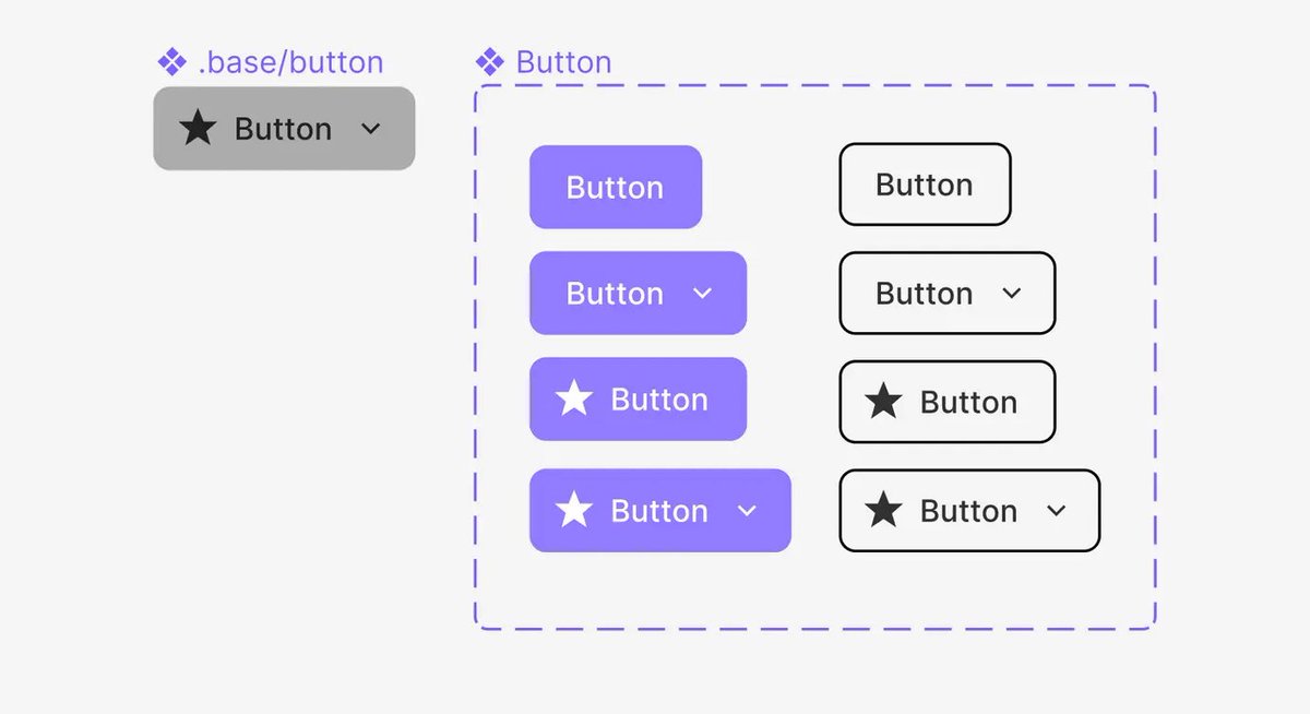
💡FIGMA TIP: Rethink how you use base components with large variant sets

Using one base component to rule them all (variants), is powerful but can lead to usability issues for designers and developers.

Keep reading to learn why UI Prep often prefers to use multiple bases.. Method 1: One Base Component

This method was originally suggested by Figma when variants were introduced.

Eg., Nesting one base component inside every button variant.. Image from Anthony DiSpezio...
Mar 14, 2022 6 tweets 3 min read
💡FIGMA TIP: Use global atoms/molecules to build local organisms.

- Global atoms/molecules keep products across multiple files consistent.
- Local organisms keep the team library truly “global”
- Local organisms are easily accessible/editable

Keep reading to learn how.. Image #1. Create global atom/molecule components in a team library file (e.g. logo, tabs, avatar, etc.). Image
Jan 28, 2022 8 tweets 3 min read
💡 FIGMA TIP: How to build a responsive tooltip with pointers that stay where they should

Keep reading for step-by-step instructions.. #1. Create the body frame

Create a frame and place a default text layer inside. Then add auto layout with the resizing behavior set to “hug”.
Sep 10, 2021 7 tweets 4 min read
🖐 Friday Five #9 is out!

Here are our top 5 finds from this week to help you level up as a designer. #1. @dmtors shares how @GustoHQ redesigned their Figma Design System to be more user-friendly in the long run.

medium.com/gusto-design/d…
Sep 9, 2021 25 tweets 7 min read
Prototyping in Figma crash course 💥

Learn how to build the most common prototype flows with these 11 micro tutorials.. 1) Navigate between pages: [tap] button to [navigate] to new page with an [instant] animation..
Aug 10, 2021 13 tweets 5 min read
I get asked about how to use icons in Figma a LOT so made a guide with every icon best practice you need to know.

Below are my top 10 tips from the guide: #1. Choose an icon library that is LARGE and has a supported icon font. Your developers will thank you! See @materialdesign, @getbootstrap, @fontawesome, @box_icons, @feather_icons