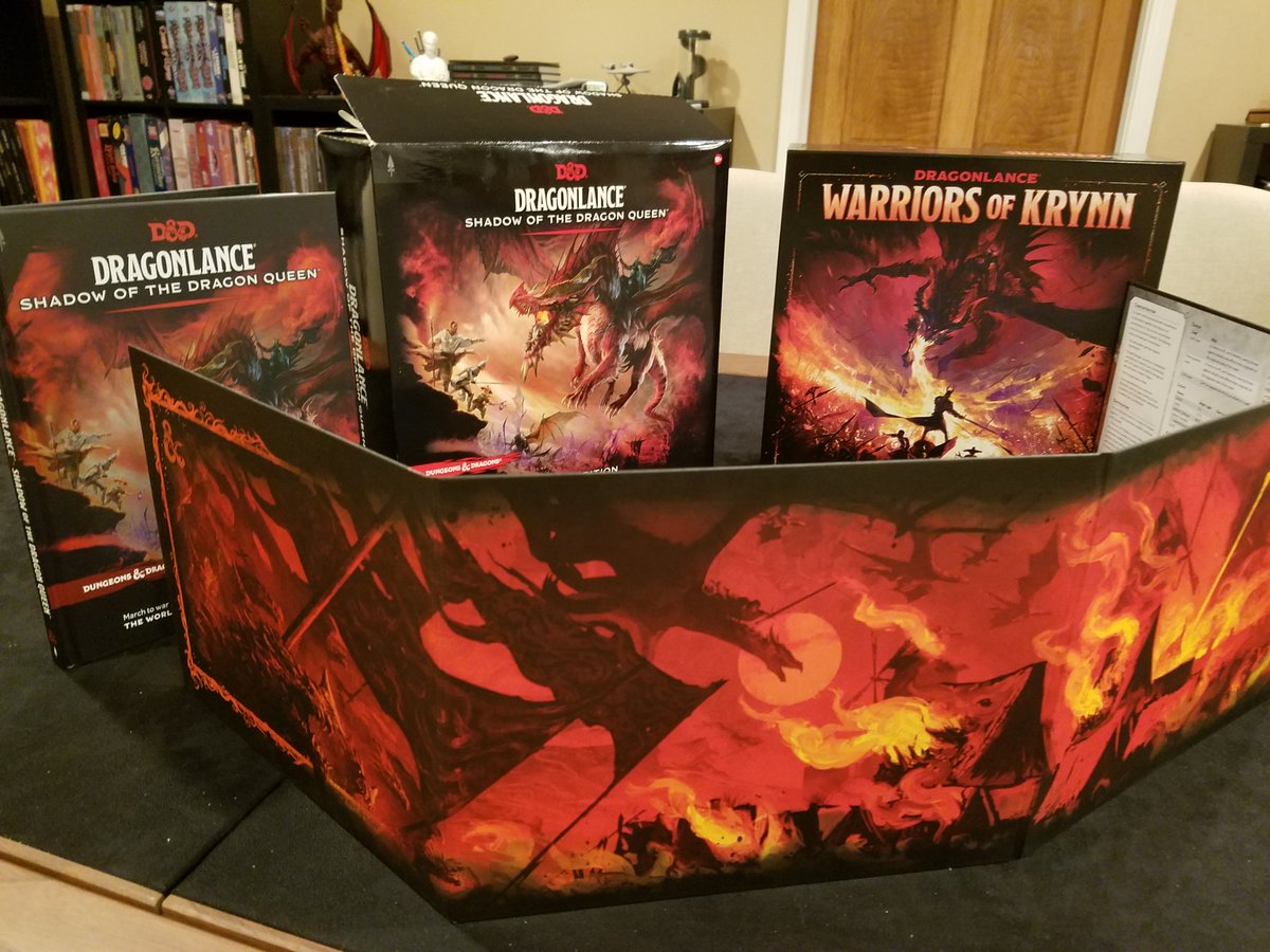
My deluxe edition of #Dragonlance: Shadow of the Dragon Queen has escaped from the maw of shipping!
I have not done much more than flip through it at this point, but let's take a quick peek.
I have not done much more than flip through it at this point, but let's take a quick peek.

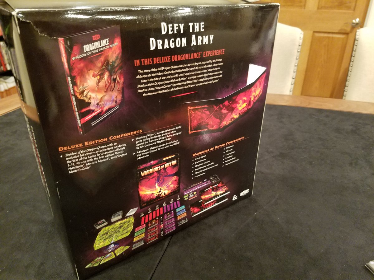
Back of the Deluxe Edition lays out what you've got here:
- The campaign book.
- The board game.
- The DM screen.
- The campaign book.
- The board game.
- The DM screen.

I do wish that the Deluxe Edition box was functional.
(It would be nice, for example, to pack everything up if I were taking it to a friend's house or game store.)
But with this tab design, it is not.
(It would be nice, for example, to pack everything up if I were taking it to a friend's house or game store.)
But with this tab design, it is not.

Also, the box is made out of tissue paper.
I actually made an effort to gentle separate the tab, but the force still somehow managed to rip the back corner of the box?
C'est la vie.
I actually made an effort to gentle separate the tab, but the force still somehow managed to rip the back corner of the box?
C'est la vie.
Inside the box we can see the good stuff securely packed away.
Great design on the cardboard insert. Keeps everything tight & protected, even when the box is wandering around the upper Midwest.
(Might be the only 5E book I've had mailed that didn't end up with a dinged corner.)
Great design on the cardboard insert. Keeps everything tight & protected, even when the box is wandering around the upper Midwest.
(Might be the only 5E book I've had mailed that didn't end up with a dinged corner.)

Early promo images had suggested the deluxe edition would have a copy of the regular edition cover. But it turns out the deluxe edition has its own, unique cover with a metallic treatment. 


Full spread, featuring the full DM screen.
Great spread on the DM screen. Would be more than happy to have this setting tone for the table.
Great spread on the DM screen. Would be more than happy to have this setting tone for the table.

I like seeing the skill list.
And organized alphabetically, rather than split up by ability score.
And organized alphabetically, rather than split up by ability score.
This was a debate we recently had while designing the Planegea GM screen. Utility of being able to glance at skill list for rulings is essential; and I'm a big fan of the variant rule for flexibly pairing of a skill to the most appropriate ability score.
I wish Conditions didn't chew up a full panel. It's incredibly useful to have that info on the screen, but it's something we actually ended up dropping from the Planegea screen because of what we would have to give up in other utility.
The other half of the screen has the campaign-specific stuff.
Pay particular attention to the visual reference for the many different flavors of draconians. I love this, because I know from experience that keeping them all straight can be tough for a new #Dragonlance DM.
Pay particular attention to the visual reference for the many different flavors of draconians. I love this, because I know from experience that keeping them all straight can be tough for a new #Dragonlance DM.

I actually think setting-specific and campaign-specific reference on a GM screen is great, but often overlooked because commercial screens usually go for system-generic.
I don't always agree with what WotC chooses to put on there...
I don't always agree with what WotC chooses to put on there...
https://twitter.com/desertedgm/status/1601793164691456000
...and I can't really judge for this specific screen yet (since I haven't actually read the campaign).
But, in principle, I like the approach.
The custom graphics for each campaign are also a great way to set tone.
But, in principle, I like the approach.
The custom graphics for each campaign are also a great way to set tone.
• • •
Missing some Tweet in this thread? You can try to
force a refresh


