Jeff Gilchrist Profile picture
Dec 14, 2022 51 tweets 14 min read Read on X
How #respirators actually work and which type is best?

I see many claims #masks don't work. This thread will explain *how* they block #viruses much smaller than the size of the holes in the #filter and why you can still smell nasty things while wearing effective masks. 🧵1/ Image showing size comparison of white blood cell, red blood cell, light dust particle and COVID-19 virus. Image from: https://theconversation.com/making-masks-at-home-what-you-need-to-know-about-how-to-reduce-the-transmission-of-coronavirus-136122
This thread is long so if you would like an unrolled one page web view that is easier to read or share, look at this tweet to find the link more quickly ( ). 2/
One of the issues is that there are different types of masks that are designed for different purposes. Cloth masks and the common blue earloop procedure masks were never designed to protect people from airborne pathogens that hang in the air for extended periods of time. 3/
#COVID and other respiratory viruses are transmitted via aerosols breathed, talked, coughed, sung, and sneezed into the air from an infected person. 4/
Someone can enter a poorly ventilated room after the infected person has left and still breathe in enough aerosols to become infected themselves. You can learn more about transmission and multiple methods to protect yourself here ( ). 5/
Some masks, more commonly known as respirators, are designed to stop aerosols and other particulate matter are used not only in medical settings but also industrial, commercial, and construction sectors to protect against many different airborne hazards. 6/
These are usually certified by some regulatory body with designations like N95 or N99 (NIOSH) in USA ( cdc.gov/niosh/npptl/to… ), FFP2 or FFP3 (EN 149) in Europe ( icc-iso.org/index.php/en/c… ), and CA-N95/N99/N100 (CSA Z94.4.1) in Canada ( csagroup.org/store/product/… ). 7/
The material these certified respirators are made from will be able to filter more than 95% of particles of a certain size, and often more than 98%/99% but that is only for air that passes through the filter. 8/
The most important part is how well the respirator fits on your face. If the fit is poor and there are gaps for air to go around, none of that air will be filtered. 9/
This image has been used as an example of how masks couldn't possibly work since the size of a single COVID-19 virus (virion) is 0.3 micron, smaller than a light dust particle. Many don't understand how viruses travel through the air and how the physics of masks actually work.10/ Image showing size comparison of white blood cell, red blood cell, light dust particle and COVID-19 virus. Image from: https://theconversation.com/making-masks-at-home-what-you-need-to-know-about-how-to-reduce-the-transmission-of-coronavirus-136122
First, viruses don't travel on their own through the air, they catch a ride inside larger aerosols which also contain water, mucins from the lining of the lungs, deep lung fluid and surfactants to make up the complex blob you see in the image ( ). 11/ Image showing respiratory aerosol and its contents (water, mucins from the lining of the lungs, deep lung fluid and surfactants). Image from: https://www.nytimes.com/interactive/2021/12/01/science/coronavirus-aerosol-simulation.html?smid=tw-share
It is these aerosols that the respirator blocks and filters, and therefore stops the virus particles at the same time. 12/
But even with aerosols, some are still smaller than the holes within the N95 respirator material, so how can they effectively filter out such small aerosols? @minutephysics created an amazing animation showing the astounding physics of N95 masks ( ). 13/
N95 respirators are actually very good at blocking both the largest and smallest particles, while medium size particles are actually the hardest to block. 14/ Image showing N95 material easily blocking smallest and largest particles but having a harder time with medium size particles. Image from: https://www.youtube.com/watch?v=eAdanPfQdCA
It is not the fibres themselves but because the size of the particles are so small, everything is sticky at a microscopic scale. The van der Waals forces between molecules is more than enough to hold very small things in place. 15/ Image showing very small particles are sticky to fibres. Image from: https://www.youtube.com/watch?v=eAdanPfQdCA
N95 respirators use several tricks to get particles to touch their fibres:
1. Capture by inertial impaction
2. Capture by diffusion
3. Capture by interception
4. Capture by electrostatic attraction

16/ Image showing N95s use inertial impaction, diffusion, interception, and electrostatic attraction to capture particles. Image from: https://www.youtube.com/watch?v=eAdanPfQdCA
With multiple layers of fibres, particles larger than 1 micron typically travel in a straight line so are almost guaranteed to hit a fibre and stick. 17/
Particles smaller than 0.1 micron are so light that collisions with air molecules bounce them around so they move in a random zigzag pattern (Brownian motion) making it extremely likely the particle will bump into a fibre and get stuck. 18/
Particles in between those sizes (around 0.3 microns) don't travel in straight lines and also don't zigzag randomly but get carried along with the air as it flows around fibres and likely past fibres so can possibly sneak by respirators even with multiple layers. 19/
N95s use a final trick of capturing particles of all sizes using an electric field where even neutral particles will still be attracted (as you can see from neutrally charged styrofoam sticking to a cat with static charged fur). 20/ Image showing neutral styrofoam pieces sticking to a cat with statically charged fur. Image from: https://www.youtube.com/watch?v=eAdanPfQdCA
N95s don't rely on static electricty, their fibres work like permanent magnets but for electricity called electrets. You can electrotize a piece of plastic to give it a permanent electric field which allows the fibres in N95s to capture 10x more particles than regular fibres. 21/
Respirators can block almost 100% of the smallest and largest particles and if more than 95% of the tricky medium size particles can be filtered out, the respirator is rated N95, and if it is 99% then is rated N99 and 99.97% is N100 ( ). 22/cdc.gov/niosh/npptl/to…
You may have also seen R95 or P100 ratings where N represents filtering of non-oily particles while R is somewhat resistant to oil and P represents strongly resistant to oily particles. 23/
Remember that even if the material in an N95 can filter >95-99% of particles, they need to go through the mask to work so fit is super important which Henry Reich (@minutephysics) highlights in the caveats part of his video ( ). 24/
If N95s can block all these tiny particles, how come you can still smell some nasty things like farts while wearing a fit tested N95 respirator and does this mean the respirator isn't working? 25/
Thankfully @Wikisteff has done some awesome calculations to explain why you can still smell through respirators ( ). 26/
A dalton (Da) or unified atomic mass unit (u) is commonly used in physics and chemistry to express the mass of atomic-scale objects such as atoms, molecules, and elementary particles ( ). 27/en.wikipedia.org/wiki/Dalton_(u…
As @Wikisteff points out, the smell of a fart comes from multiple molecules that range between 34 Da and 131 Da while a single COVID-19 virion is 6 billion Da and an aerosol droplet 160 billion Da, both monstrous sizes in comparison ( ). 28/pnas.org/doi/10.1073/pn…
The atomic mass of these molecules you can smell are more than a billion times less than the aerosols that COVID-19 virions catch a ride in. 29/
That is why molecules like oxygen (16 Da) can get in through respirators to you and exhaled carbon dioxide (44 Da) can get out so you don't suffocate. It is estimated that a COVID-19 infected person carries between 1 billion and 100 billion virions during peak infection. 30/
It is nice to know science and engineering have provided respirators that use the laws of physics to help protect people from all those virions doing damage to your body. 31/ Click "Show replies" 👇 to continue.
Now that you know how respirators work to capture very tiny particles, is it better to get a P100 that can filter more particles than an N95? Aaron Collins (@masknerd) created a video looking at the options ( ). H/T: @jasmith_yorku 32/
While a P100 respirator can filter more and protect against both oil and non-oil based particles compared to an N95, they are designed differently and as a result also typically less breathable (some by 2x) so there are trade-offs. 33/
It is much better to wear a great fitting N95 respirator than a less well fitting P100. 34/
@masknerd shows a table that if you have a proper fit factor of 100 (pass fit test) an N95 ends up with a worn filtration efficiency of 98.3% (since N95's in most cases actually filter closer to 99% when new), and N99 is 98.8% and P100 at 99%. 35/ Table showing as worn filtration efficiency for various respirators. Image from: https://www.youtube.com/watch?v=QH1xiOZFGxo
The better the fit, the higher the filtration efficiency and the worse the fit, the less well the respirator works in real life with some air going around the gaps and not being filtered at all. 36/
As an example, @masknerd creates a scenario of a 1 hour meeting where ventilation is 2 air changes per hour in an average size conference room (150 cubed feet) with 8 people and a community COVID rate of 12.5% (so at least one person in the meeting is infected). 37/
If nobody is wearing a respirator except you, what would happen with different masks and respirators at different fit/face leakage values? 38/
These are just high level rough estimates but if people were just talking, those without a mask have a 37% chance of becoming infected ( ). 39/ Table showing probability of infection via risk estimator for various respirators. Image from: https://www.youtube.com/watch?v=QH1xiOZFGxo
With a cloth mask, even if you seal it well and tape it to your face, because the filtration ability is low, your risk only drops from 37% down to 22%. "While cloth masks are better than nothing, they are closer to nothing than they are to better." 40/
Looking at N95, if you have a poor fit with 30% leakage, the risk of infection drops from 37% down to 16%, much better than nothing. Even without passing a quantitative fit test, leakage of 5% drops that even further to 3.4%. 41/
If you compare the N95 at 3.4% to N99 at 3.2% and P100 at 3.1% you can see there is very little difference between those respirator types so it may not be worth giving up extra breathability and additional cost if all of those types fit the same. 42/ Table showing probability of infection via risk estimator for various respirators. Image from: https://www.youtube.com/watch?v=QH1xiOZFGxo
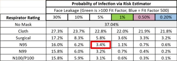
If you have the opportunity to do an actual fit test and can find an N95 respirator has a fit factor of 100 (so 1% face leakage) the risk drops from 37% to 1.1%. 43/
A great fitting N95 is 3x better than the slightly better filtration efficiency of an N99/P100 and slightly worse fit (5% face leakage) and many times better than one with even worse fit. 44/
Besides disposable respirators, there are also reusable elastomeric respirators that have replaceable often longer-lasting filters ( ). 45/
Some elastomeric respirators are much more breathable than any N95 I have tried, become cheaper to use fairly quickly and the soft material (e.g. silicone) allows more people to pass a fit test. 46/ Image showing [breathe] (https://prescientx.com/) and FloMask Pro (https://flomask.com/) elastomeric respirators.
Are you looking to buy a respirator, elastomeric or even a CO2 monitor? The @DonateMask store uses 100% of money they raise to send free N95-equivalent masks and rapid tests to people in need across Canada ( ). 47/buymask.ca
They also have affordable sample packs so you can more easily try and find masks that fit you and your family ( buymask.ca/collections/ma… ). You can also request masks and rapid tests or donate to their charity here ( donatemask.ca ). 48/
To read more about the science behind masks and their use, check out Bill Comeau's (@Billius27) excellent article ( ). 49/billius27.substack.com/p/masks-eviden…
For an easier to share link outside of Twitter and an unrolled one page web view of this thread, you can go here ( ).pingthread.com/thread/1602994…
I should also add that these physics principles also apply to non-mask filters as well. @JimRosenthal4 the "R" in Corsi-Rosenthal (CR) Boxes points out that the simple straining/sieve method only accounts for about 1% of particles being removed ( ). 50/

• • •

Missing some Tweet in this thread? You can try to force a refresh
 

Keep Current with Jeff Gilchrist

Jeff Gilchrist Profile picture

Stay in touch and get notified when new unrolls are available from this author!

Read all threads

This Thread may be Removed Anytime!

PDF

Twitter may remove this content at anytime! Save it as PDF for later use!

Try unrolling a thread yourself!

how to unroll video
  1. Follow @ThreadReaderApp to mention us!

  2. From a Twitter thread mention us with a keyword "unroll"
@threadreaderapp unroll

Practice here first or read more on our help page!

More from @jeffgilchrist

Feb 10
#Ottawa, #Ontario, #Canada Virus Update:

You can see in the graph, COVID makes up the majority of new hospitalizations due to #Flu, #RSV or #COVID throughout the year, and even stays ahead during winter respiratory virus season. 🧵1/ A line graph displaying the percentage of patients hospitalized due to COVID-19, Influenza, or RSV over time, from September 1, 2023, to January 26, 2025. The x-axis represents weeks within this period, and the y-axis shows percentages from 0% to 100%. The graph has three colored lines: blue for COVID-19, purple for Influenza, and teal for RSV. The graph shows fluctuations in the percentage of hospitalizations due to each cause over time, with COVID-19 consistently having the highest percentage, followed by Influenza and RSV.
New hospitalizations are increasing again. This last update was the first time Flu hospitalizations (42) were significantly higher than COVID (34) in the same week with RSV at 14 people. 2/ The bar chart shows the number of new hospitalizations per week in Ottawa from August 27, 2023, to January 26, 2025. The y-axis represents the number of patients, ranging from 0 to 100. The x-axis represents the weeks. The bars are color-coded: blue for COVID-19, purple for Influenza, and teal for RSV. The chart shows fluctuations in hospitalizations over time, with notable peaks around December 2023 and January 2025.
In Ottawa, test positivity for Flu A (bright green) has really increased, COVID is still in second place, but seasonal human coronavirus is almost the same level, followed by Entero/Rhinovirus, and then RSV for the top 5. 3/ A stacked area chart displaying the percentage of positive tests for various viruses over time, from October 1, 2022, to January 26, 2025. The x-axis represents weeks within this period, while the y-axis represents the percentage, cumulatively stacked to 100%. The chart features the following viruses, each depicted in a distinct color: COVID-19 (red), Entero/Rhinovirus (yellow), Seasonal human coronavirus (purple), RSV (green), Parainfluenza (all types) (blue), Influenza B (dark purple), Influenza A (light green), Human metapneumovirus (pink), and Adenovirus (dark blue). The data shows fluc...
Read 6 tweets
Jan 20
Similar to #Canada, babies in the #UK are at higher risk for #hospitalization and #ICU admission from #COVID. Their data looks deeper at infants < 6 months old which have higher ER attendance, hospital admission and severe hospitalisation rates than the oldest adults 90+! 🧵1/
That data from the UK was taken from this pre-print study ( ). 2/medrxiv.org/content/10.110…
In Canada, babies < 1 years old had the highest ICU admission rates of all age groups from Aug. 27, 2023 to Aug. 24, 2024. Read on to see more details including Flu and RSV too ( ). 3/
Read 7 tweets
Jan 19
The @elastomaskpro () is a NIOSH approved reusable N95 elastomeric respirator. It is made of silicone so a higher chance it will fit and seal well and is super breathable at the same time. Read on to find out more about my experience with it. 🧵1/ elastomaskpro.comA blue respirator mask, called ElastoMaskPro, rests on top of a blue and white box. The mask has a smooth, curved design with two circular filters on each side. The mask's straps are neatly arranged.
A light blue ElastoMaskPro N95 reusable respirator mask with a soft, flexible facepiece rests on top of its packaging box. The mask features a large opening in the center, showcasing white pleated filters. Two elastic straps are attached to the mask for securing it to the face.
Full disclosure: ElastoMaskPro sent me a unit to evaluate. There were no strings attached, they just asked that I provided feedback after I tried it. This thread is the first time they are seeing my feedback, they did not review anything before it being posted here. 2/
The ElastoMaskPro is very cost effective at the current sale price of $29.99 which includes two N95 filtering pucks. You can continue using the filters until they either get too dirty or there is increased breathing resistance. 3/ ElastoMaskPro Filter Puck. Filter Pucks are constructed using an adhesive-free process that incorporates a large volume of long-lasting, highly durable mechanical filtration media.
Read 43 tweets
Jan 6
#Ottawa, #Ontario, #Canada Virus Update:

Ottawa updated its #respiratory #virus data again after a break for the holidays, respiratory related ED visits are up especially in kids 0-3, then 4-11 and age 80+. 🧵1/ A line graph showing the number of respiratory-related emergency department (ED) visits per 100,000 population by week, from September 1, 2023, to November 1, 2024, across different age groups. Six lines represent the age groups: Age 0-3 (purple), Age 4-11 (blue), Age 12-17 (green), Age 18-54 (yellow), Age 55-79 (red), and Age 80+ (orange). The Age 0-3 group shows the highest number of visits, peaking around 1000 visits per 100,000 population, while other age groups generally have rates below 250 visits per 100,000 population. The graph exhibits seasonal fluctuations, with peaks in the wint...
Quite a mixture of different viruses testing positive in the lab right now so people can pick up a variety of bugs in the air. 2/ A stacked area chart displaying the percentage of positive tests for various viruses over time, from October 1, 2022, to December 22, 2024. The x-axis represents weeks within this period, while the y-axis represents the percentage, cumulatively stacked to 100%. The chart features the following viruses, each depicted in a distinct color: COVID-19 (red), Entero/Rhinovirus (yellow), Seasonal human coronavirus (blue), RSV (green), Parainfluenza (purple), Influenza B (light blue), Influenza A (light green), Human metapneumovirus (pink), and Adenovirus (dark blue). COVID-19 maintains a high posit...
New hospitalizations also jumped a lot in the last two reporting weeks, not just due to #RSV but a big spike in #COVID as well.

Follow the latest updates here ( ). 3/ covid.gilchrist.ca/Ottawa.htmlThe bar chart shows the number of new hospitalizations per week in Ottawa from August 27, 2023, to December 22, 2024. The y-axis represents the number of patients, ranging from 0 to 100. The x-axis represents the weeks. The bars are color-coded: blue for COVID-19, purple for Influenza, and teal for RSV. The chart shows fluctuations in hospitalizations, with peaks around late 2023 and early 2024, and another peak towards the end of 2024.
A line graph displaying the percentage of patients hospitalized due to COVID-19, Influenza, or RSV over time, from September 1, 2023, to December 22, 2024. The x-axis represents weeks within this period, and the y-axis shows percentages from 0% to 100%. The graph has three colored lines: blue for COVID-19, purple for Influenza, and teal for RSV. COVID-19 consistently shows the highest percentage of hospitalizations, with fluctuations throughout the period.
Read 4 tweets
Dec 24, 2024
#Variant update for #Ontario, #Canada (to Dec 10, 2024)

The KP.3.1.1 #DeFLuQE variant has finally been surpassed with XEC now in top place above 20% while the other 5 (MC.* and XEC.* descendants) remain < 7%. Graph tools by @Mike_Honey_ 🧵1/ A line graph showing the lineage frequency of the top 7 COVID-19 genomes in Ontario, Canada, up to December 10, 2024. The graph includes data from 4,928 sequenced genomes. The x-axis represents dates from October 27 to December 08, while the y-axis represents lineage frequency percentages from 0% to 35%. Different colored lines represent different genome lineages: KP.3.1.1 (blue), MC.1 (green), MC.13 (purple), MC.16 (pink), MC.24 (orange), XEC (brown), and XEC.8 (yellow). Below the main graph, there is a bar chart showing the number of samples (n) collected each day, ranging from 0 to 200 s...
XEC is a combination of KP.3.3 and KS.1.1 that recombined together. MC.1 is a direct descendant of KP.3.1.1 with one spike mutation at T571I. To learn more about how variant naming works, you can read this article I wrote with @paulseaman31 ( ). 2/docs.google.com/document/d/1q0…
This Sankey graph shows the proportion of variants from PCR test genomic sequencing in Ontario since October 27, 2024. You can follow the lineage backwards to see where a variant is a descendant from. 3/ The Sankey diagram visually displays the evolution and distribution of sequenced genomes in Ontario, Canada, up to December 10, 2024. The diagram uses colored bars and curved lines to show the flow and relationships between different genome variants over time. Each variant is labeled, such as "XEC," "BA.2," "BA.2.86," "JN.1," "KP.3," and various sub-variants. These bars and lines illustrate the transitions and derivations from one variant to another. The total number of sequenced genomes depicted is 4,928. This visualization helps to underst...
Read 16 tweets
Dec 22, 2024
Population rate vs raw numbers

This is a good example of why it is useful to understand the importance of population *rate* and not just look at raw numbers. The first graph shows raw numbers and the second graph population rate. 🧵1/ #ED #Respiratory #Virus #Population #Ottawa Chart of Respiratory Related ED Visits by Week and Age (Ottawa, ON, Canada) with raw numbers
Chart of Respiratory Related ED Visits by Week and Age (Ottawa, ON, Canada) with population rate per 100K
Ottawa Public Health makes only the raw data available for All causes and respiratory-related emergency department visits to Ottawa hospitals by age group and week ( ). 2/open.ottawa.ca/datasets/ottaw…
If I take the data and plot all the ages together, you can at least see all of the age groups at the same time but it is just the raw numbers. 3/
Read 12 tweets

Did Thread Reader help you today?

Support us! We are indie developers!


This site is made by just two indie developers on a laptop doing marketing, support and development! Read more about the story.

Become a Premium Member ($3/month or $30/year) and get exclusive features!

Become Premium

Don't want to be a Premium member but still want to support us?

Make a small donation by buying us coffee ($5) or help with server cost ($10)

Donate via Paypal

Or Donate anonymously using crypto!

Ethereum

0xfe58350B80634f60Fa6Dc149a72b4DFbc17D341E copy

Bitcoin

3ATGMxNzCUFzxpMCHL5sWSt4DVtS8UqXpi copy

Thank you for your support!

Follow Us!

:(