Here's a fun problem to solve when making NES games, that you might not even realize is a problem! #nesdev
Sprites on the NES are actually drawn in "screen space" and wrap around at the edges. But obviously in many games, this makes no sense! Here's how to solve it 🧵
Sprites on the NES are actually drawn in "screen space" and wrap around at the edges. But obviously in many games, this makes no sense! Here's how to solve it 🧵
The sprites are drawn in a range of 0-255 on the x-axis (0-239 on the y-axis), and have no concept of a "camera", or the level. It is up to the dev to draw them in a location on screen that makes sense, relative to the game's camera. 

It is also up to the dev to make sure that objects that are "off camera" do not get drawn.
But this can be tricky because "objects" are actually multiple 8x8 sprites drawn together to form a larger object.
But this can be tricky because "objects" are actually multiple 8x8 sprites drawn together to form a larger object.
There are times when an object is only *partially* on-camera (and partially off-camera) and we need to ensure that those partial parts, off-camera, do not get drawn, on a *sprite-by-sprite basis*.
This is technically a little tricky but very fixable!
This is technically a little tricky but very fixable!

However, once we fix that issue, a more complex problem presents itself. Take a look! 👀
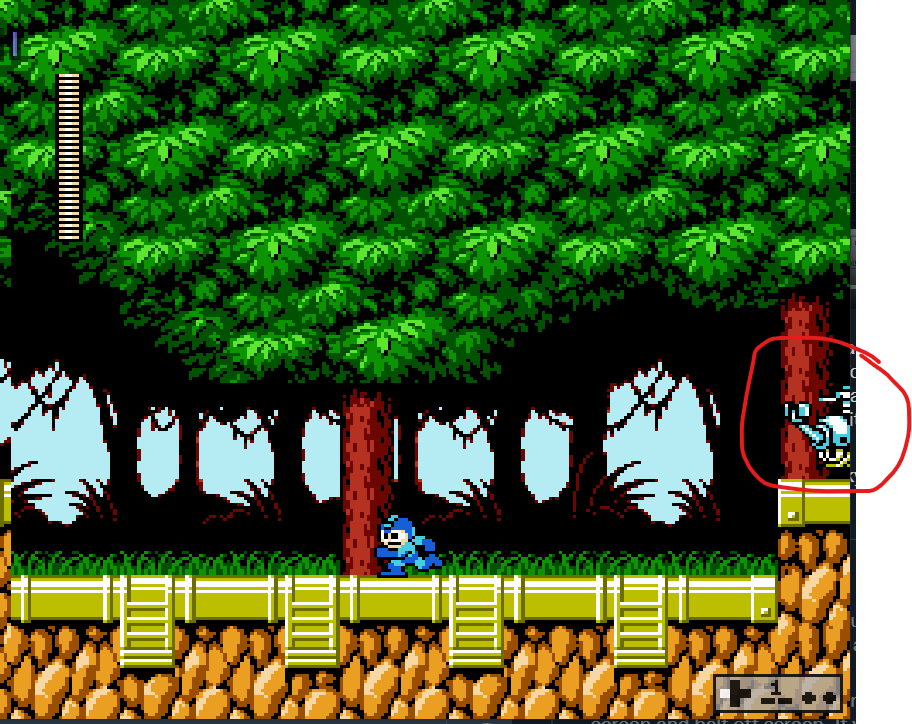
The problem: what to do when a single sprite is half on screen and half off screen. If we draw it, in this example, it will actually show up on the far right.
The solution is kind of ugly!
The problem: what to do when a single sprite is half on screen and half off screen. If we draw it, in this example, it will actually show up on the far right.
The solution is kind of ugly!
This NES actually has a built in feature to handle this, but probably not in the way you might expected. A game can set a flag to completely disable rendering sprites on the left 8 pixels of the screen. This "fixes" the issue by removing the glaring "pop" as a sprite vanishes.
That looks smoother, but it still looks weird having the object seem to slide out of existence. To improve this, we can also turn off rendering off the background for that same area of the screen. This creates the illusion that the entire left column of the screen are unused. 

And here is the final result!
So to recap, the solution is to:
1) Cull off-screen sprites.
2) Disable rendering on the left 8 pixels of the screen to avoid sprites *popping* in and out.
3) Rest easy knowing that many of your favorite games did this too! 😉


1) Cull off-screen sprites.
2) Disable rendering on the left 8 pixels of the screen to avoid sprites *popping* in and out.
3) Rest easy knowing that many of your favorite games did this too! 😉


• • •
Missing some Tweet in this thread? You can try to
force a refresh


