These are digital provenance of physical artworks, my gallerist can ship the art to you, or keep it in storage
A003 (Third Nature) one of four CNC aluminum ikebana vases that are hard anodized. Ikebana is a way of bringing the spirits of nature into your home, that's both symbolic and spiritual. Here a third nature, technology as organism, is in a triad with humanity and nature.
This is the full set of the ‘Third Nature’ series of machined aluminum vases
An extinction smbol made of #MOLLE nylon webbing, a military equipment fabric pattern that's popular in civilian militia and prepper culture. . It's partially about general civil unrest, and how we may want to treat ecological collapse as a national security issue
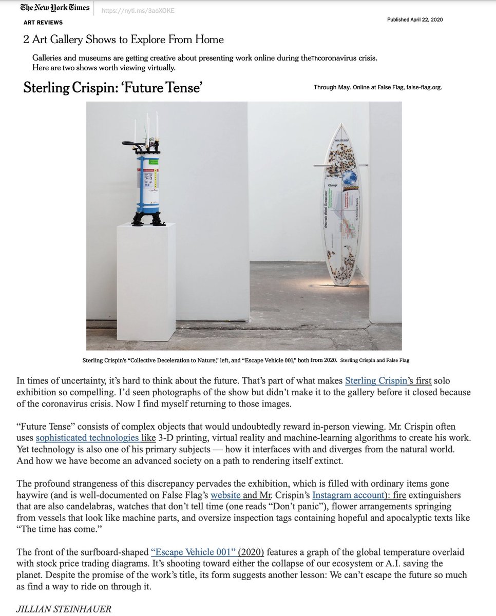
This piece is one of three fire extinguisher candelabras which reference two dualities: 'collectivism vs authoritarianism' and 'acceleration of technology vs deceleration to nature' these forces push against one another and shape our world as they find balance
The bases reference feet quelling demons, a common theme in religious iconography globally, which typically represents our higher selves vanishing our ignorance, misdeeds, and inner demons. The small ornate plants were generated with software I wrote, 3D printed, and cast in gold
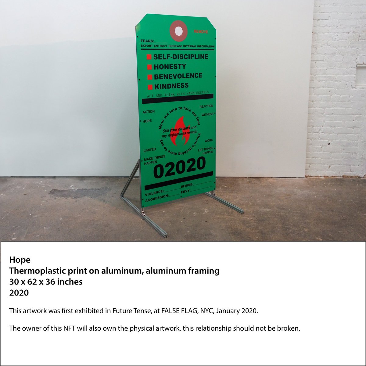
These sculptures are based on fire extinguisher safety inspection tags. At the time in late 2019 I wanted them to all reference 2020, but looking back their meaning has changed so much.
This imagery is from the infamous SoftBank vision deck, a fever dream of manic investment capital fantasies about extreme futures. Will we transmit our emotions to each other’s brains or get wiped out by a global virus or meteor?
• • •
Missing some Tweet in this thread? You can try to
force a refresh
My advice for designing and developing products for Vision Pro. This thread includes a basic overview of the platform, tools, porting apps, general product design, prototyping, perceptual design, business advice and more.
Disclaimer: I’m not an Apple representative. This is my personal opinion and does not contain non-public information.
Overview:
Apps on visionOS are organized into “scenes”, which are Windows, Volumes, and Spaces.
Windows are a spatial version of what you’d see on a normal computer. They’re bounded rectangles of content that users surround themselves with. These may be windows from different apps or multiple windows from one app.
Volumes are things like 3D objects, or small interactive scenes. Like a 3D map, or small game that’s not immersive.
Spaces are fully immersive experiences where only one app is visible. That could be full of many Windows and Volumes from your app. Or like VR games where the system goes away and it's all custom content. You can think of visionOS itself like a Shared Space where apps coexist together and you have less control. Whereas Full Spaces give you the most control and immersiveness, but don’t coexist with other apps. Spaces have immersion styles: mixed, progressive, and full. Which defines how much or little of the real world you want the user to see.
User Input:
Users can look at the UI and pinch like the demo videos show. But you can also reach out and tap on windows directly, sort of like it’s actually a floating iPad. Or use a bluetooth trackpad or video game controller. You can also look and speak in search bars, but that’s disabled by default for some reason on existing iPad and iOS apps running on Vision Pro. There’s also a Dwell Control for eyes-only input, but that’s really an accessibility feature. For a simple dev approach, your app can just use events like a TapGesture. In this case, you won't need to worry about where these events originate from.
Spatial Audio:
Vision Pro has an advanced spatial audio system that makes sounds seem like they’re really in the room by considering the size and materials in your room. Using subtle sounds for UI interaction and taking advantage of sound design for immersive experiences is going to be really important. Make sure to take this topic seriously.
Development:
If you want to build something that works between Vision Pro, iPad, and iOS, you'll be operating within the Apple dev ecosystem, using tools like XCode and SwiftUI. However, if your goal is to create a fully immersive VR experience for Vision Pro that also works on other headsets like Meta's Quest or PlayStation VR, you have to use Unity.
Apple Tools:
For Apple’s ecosystem, you’ll use SwiftUI to create the UI the user sees and the overall content of your app. RealityKit is the 3D rendering engine that handles materials, 3D objects, and light simulations. You’ll use ARKit for advanced scene understanding. Like if you want someone to throw virtual darts and have them collide with their real wall, or do advanced things with hand tracking. But those rich AR features are only available in Full Spaces. There’s also Reality Composer Pro which is a 3D content editor that lets you drag things around a 3D scene and make media rich Spaces or Volumes. It’s like Diet-Unity that’s built specifically for this development stack.
One cool thing with Reality Composer is that it’s already full of assets, materials, and animations. That helps developers who aren’t artists build something quickly and should help to create a more unified look and feel to everything built with the tool. Pros and cons to that product decision, but overall it should be helpful.
Existing iOS Apps:
If you're bringing an iPad or iOS app over, it will probably work unmodified as a Window in the Shared Space. If your app supports both iPad and iPhone, it’ll look like the iPad version.
You can use the Ornament API to make little floating islands of UI in front of, or besides your app, to make it feel more spatial. But that’s not something all existing apps get automatically. Ironically, if your app is using a lot of ARKit features, you’ll likely need to ‘reimagine’ it significantly as ARKit has been upgraded a lot.
If you’re excited about building something new for Vision Pro, my personal opinion is that you should prioritize how your app will provide value across iPad and iOS too. Otherwise you're losing out on hundreds of millions of users.
Unity:
You can build to Vision Pro with the Unity game engine, which is a massive topic. Again, you need to use Unity if you’re building to Vision Pro as well as a Meta headset like the Quest or PSVR.
Unity supports building Bounded Volumes for the Shared Space which exist alongside native Vision Pro content. And Unbounded Volumes, for immersive content that may leverage advanced AR features. Finally you can also build more VR-like apps which give you more control over rendering but seem to lack support for AR Kit scene understanding like plane detection. The Volume approach gives RealityKit more control over rendering, so you have to use Unity’s PolySpatial tool to convert materials, shaders, and other features.
Unity support for Vision Pro allows for tons of interactions you’d expect to see in VR, like teleporting to a new location or picking up and throwing virtual objects.
Vision Pro mega-thread part 2/5, Product Design:
Build a Foundation:
You could just make an iPad-like app that shows up as a floating window, use the default interactions, and call it a day. But like I said above, content can exist in a wide spectrum of immersion, locations, and use a wide range of inputs. So the combinatorial range of possibilities can be overwhelming.
If you haven’t spent 100 hours in VR, get a Quest 2 or 3 as soon as possible and try everything. It doesn’t matter if you’re a designer, or product manager, or a CEO, you need to get a Quest and spend 100 hours in VR.
I highly recommend checking out Hand Physics Lab for a broad overview of direct interaction demos. There’s a lot of subtle things they do which imbue virtual objects with a sense of physicality. And the Youtube VR app that was released in 2019 looks and feels pretty similar to visionOS, it’s worth checking out.
Keep a diary of what works and what doesn’t.
Ask yourself: What app designs are comfortable, or cause fatigue? What apps have the fastest “time-to-fun/value”? What’s confusing and what’s intuitive? What experiences would you even bother doing more than once? Be brutally honest. Learn from what’s been tried as much as possible.
General Design Advice:
I strongly recommend the @ideo style design thinking process, it works for spatial computing too. You should absolutely try it out if you’re unfamiliar. There’s with resources and this video from 1999 is a great example of the process .
The road to spatial computing is a graveyard of utopian ideas that failed. People tend to spend a very long time building grand solutions for the imaginary problems of imaginary users. It sounds obvious, but instead you should try to build something as fast as possible that fills a real human need, and then iteratively improve from there.
Spatial Formats and Interaction:
You should expect people to be ‘lazy’ and want to avoid moving most of the time. Generally in spatial computing the more calories people burn using your app the less they’ll use it. I’m not saying you shouldn’t build your VR boxing game. But you should minimize the required motion as much as possible, even if it’s a fundamental part of what your app is.
To that point, the purpose of your app should be reflected in its spatial arrangements and interaction pattern. Aka, form follows function.
So if you’re making a virtual piano app, you probably want to anchor it on a desk so people make contact with a physical surface when they touch a key.
There’s a saying like, “when you want to say something new, use a familiar language.” IIf every aspect of your app is totally innovative it will likely be incomprehensible to users. So pick and choose your battles and make sure there’s a familiarity in the UI and experience.
Prototyping:
I highly recommend paper and cardboard prototyping. Don’t start in Figma. Literally get some heavy weight paper or cardboard and make crude models of your interface. If you’re expecting users to directly touch your UI, pay attention to how much muscle strain in your shoulder the design creates. Use masking tape against a wall and sticky notes to mock up some UI. Then take a few steps back from it, pretend you’re in VR, and feel out how much head motion your layout requires.
Again I think everyone needs a Quest to try existing apps. And as prototyping tools they can be great, even before writing any code. There’s an app called ShapesXR that lets you sketch out ideas in space, create storyboards, and supports real time collaboration with remote users. It can be a great tool during early development.
You also use the Quest to mockup “AR in VR” by creating a scene with a realistic virtual living room, and having other objects appear as if they’re AR. It’s not as good as a full passthrough setup, but it’s better than nothing. And the virtual living room is helpful if you’re sharing the demo with people in other locations.
If you have the budget you might want a Varjo XR-3. It’s the current Rolls Royce of VR and the closest thing to the Vision Pro on the market with high quality passthrough, high res displays, hand tracking, world mapping, etc. But they’re $6500 each and need a $2-3k PC to power them. If you’re a giant company with the budget and worried about getting access to a Vision Pro dev kit I would probably get at least one XR-3 setup.
Disclaimer: I’m not an Apple representative. This is my personal opinion and does not contain non-public information.designkit.org
Vision Pro mega-thread part 3/5, Visual Design:
Visual and Perceptual Comfort:
When designing for spatial computing in general you need to consider the whole body of your user, their sensory systems, and how their brain integrates those senses.
For example, you might arrange an iPhone app to have a menu near the bottom of a screen for easy reach of a user’s thumb. Likewise in VR you might arrange the UI to be centrally located to a user’s natural line of sight, so that head and eye motion is minimized. Every design choice has both ergonomic and cognitive impacts. Fitts’ law is useful, but there are so many other things to consider.
I highly recommend watching this WWDC talk in its entirety if you’re new to spatial design . It covers a lot of perceptual and cognitive design constraints that are unique to spatial computing. Your design choices will either create or reduce eye fatigue, discomfort, and motion sickness. If your app makes people sick or hurts their neck, it’ll outweigh anything good your app does.
Users tend to attribute these problems to headsets themselves, but it’s also the responsibility of each app.
UI Design:
Honestly for UI design you should just copy as much of what Apple has already figured out and published as guidelines so your app blends in. They make it easy to create a good looking UI if you use their tools. But generally you want to be subtle with space and motion, don’t go wild just because you can. Don’t make icons or text 3D. Usually a 2.5D approach is best, where it’s basically a 2D UI with some depth to communicate hierarchy. Again, look around at what works on the Quest and the decisions Apple made. You don’t need to reinvent the wheel unless the point of your app is to experience novel kinds of interaction.
Web Design:
Vision Pro is another device for responsive web design, but don’t think of it like another 2D screen. Like I said above, when you’re designing for spatial computing it’s valuable to make some paper prototypes, stick some stuff to a wall, back up, and understand how your design decisions will impact someone's whole body. You have to unlearn habits from desktop and mobile design.
Also there’s cool opportunities to use WebXR, which allows websites to become fully immersive VR experiences. If your website is media rich or dealing with anything potentially 3D, you should do something with WebXR. There’s a few WWDC talks that cover this topic like
Quick analysis and insights of The Algorithm provided by @TwitterEng
UserMass .scala
- if you follow over 500, and your following to follower ratio is above .6 , you'll get punished and seen less. So if you follow 800 people and have 1000 followers, unfollow 200 people
👎
@TwitterEng HomeTweetTypePredicates .scala
- There's a whole section that tags tweets by Elon, "Power users" , Democrats and Republicans differently. This is used by the ClientEventsBuilder and other parts of the rec algorithm
👎
These biases suck
I’ve been digging around more in the repo , looking for what impacts quality scores of users and why some people get follow recommendations, it’s tough to fully pull apart because there’s queries to graph databases and neural networks I don’t have access to. I’m sure more will… twitter.com/i/web/status/1…
Imagine an AI model that's 3x larger and more powerful than GPT3 aka ChatGPT
Google already built that in April, called PaLM, on their own TPU hardware competing with NVIDIA. People think ChatGPT will replace Google but they basically invented transformers in '17 (the T in GPT)
Google's been using a transformer model called BERT billions of times a day for years, it powers their search, email, and probably lots more, but it's invisible to users
Google Assistant will suddenly outperform ChatGPT one day when Google flips the switch for a system like PaLM
PaLM stands for "Pathways Language Model." Google Pathyways is an ML system that can scale a model across tens of thousands of their proprietary TPU chips. Eventually they'll have a massive multimodal model across vision, sound, and language all at once blog.google/technology/ai/…
If many planets support life, where are the aliens? Their theory: civilizations grow and either burnout due to population + energy demand, or they de-growth to sustainability
This research is 🔥 Im going to summarize it, other interrelated teleological narratives, and my art 1/
I'll get back to this paper, but Ray Kurzweil has written at length about the exponential growth of civilization and computing, predicting by 2045 a $1000 computer will be as powerful as every human brain on the planet combined, an event he calls the Technological Singularity 2/
Kurzweil's singularity is a literal deus ex machina (god from the machine) it would suddenly resolve all our problems. A 'hard takeoff' of artificial general intelligence would occur, birthing super intelligent consciousness spreading through the universe at the speed of light 3/
@opensea The phrases on the images were created using OpenAI’s GPT3 neural network which makes new writing based on provided examples. My past artwork series ‘NFT Concepts’ were input to GPT3, which then generated thousands of phrases based on my ideas. sterlingcrispin.com/ideas_of_mount…
I carefully sifted through the generated text for poetic truths and bizarre financial propositions. Because GPT3 was trained on the internet, in a way, I'm using AI to hold up a mirror to society and this current collision of technology, art, and finance