All right, let’s do a 🧵 about the D&D For All Kit I helped design with @Wizards_DnD. I’m incredibly proud of this project, and I want to highlight some of the thought that went into ensuring this kit was accessible and inclusive.
1/
1/

This project took about a year, and I worked closely with the spectacular @djdubow, who tirelessly advocated for it and the features we included, as well as several other folks on the Wizards team and the wonderful folks at FlightDeck Studios, who made the kits a reality.
2/
2/
The goal was to create as inclusive and accessible a kit for community members across as many access needs as possible. That meant that from the start, we needed to consider ensuring that things were high-contrast, textured, easy to open, etc. This informed EVERYTHING. 2/
It was also important that this wasn’t “the disabled kit,” but rather a kit of fantastic, useful, cool items that ALSO were chosen and designed with access needs in mind. These are items everyone would enjoy, but that have been selected with care and access considerations.
3/
3/
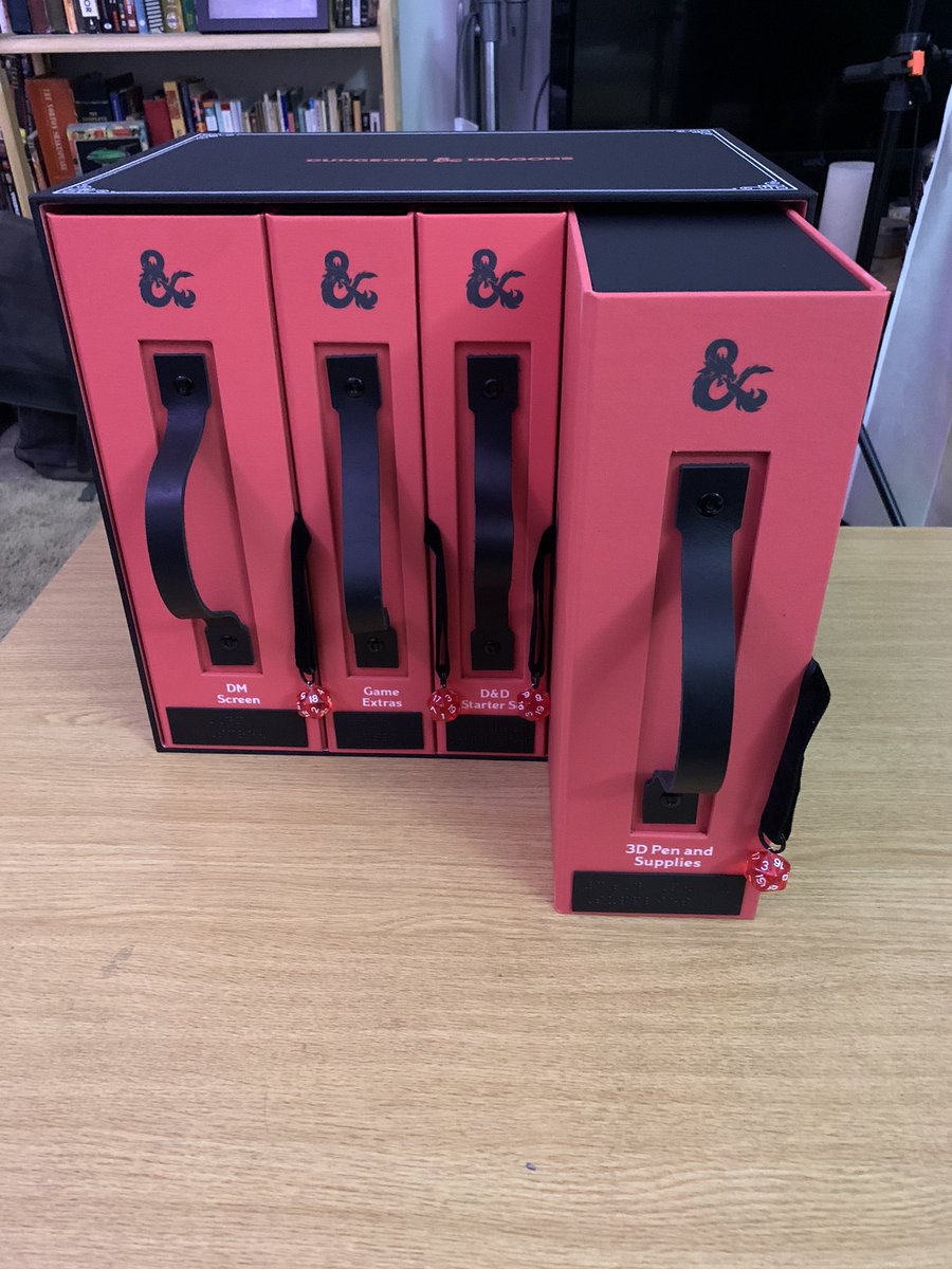
Let’s start with packaging. This box was designed to be easy to open and carry, even with limb difference, reduced manual dexterity, or limited mobility. We added magnetic closures, large handles, pull loops, eliminated fiddly packaging, etc.
4/
4/
We also used high-contrast colors and ensured all of the writing in the kit was also available in Braille and/or screen-reader friendly formats (we’ll get to that in a minute).
5/
5/

Each section pulls out independently for organization and clarity, and each section box has a magnetic closure and opens with the d20 pull if desired, so you can use a tool, hook, etc., if hands or fingers aren’t the way you like to roll (dice).
6/

6/

Inside each section is a QR code (key for lots of blind folks) leading to a screen reader-compatible website with high-contrast text and information/instructions about the items in the kit, and written and Braille instructions. The QR code is indicated by a tactile dot.
7/
7/

I recommended we include the 3D pen because of a conversation with @BlindTemple, where he mentioned that he adds puff-pen grid lines to his battlemaps, so he can count squares while DMming. This also led to the inclusion of the Tactical Maps Reincarnated Set.
8/
8/

We included heat-protective items as well as high-contrast color filament, in hopes that folks can find fun ways to design with the pen. (It also can be used with the initiative trackers we’ll discuss later.) Only retail items were left in shrink wrap or original packaging.
9/
9/
Every bag is easy to open and also has a tag in Braille identifying the included item. The bags are black velvet with high contrast lettering. @aannggeellll mentioned “the elbow test” for packaging—if you can’t open it with just your elbows, it’s not accessible.
11/
11/

Onto Section Two: The Starter Set. Again, this includes a QR code and information on redeeming a digital copy of the adventure on @DnDBeyond. This was really important so blind/low-vision folks could enlarge the font or use a screen reader.
12/
12/

You’ll notice that there’s an easy-removal velvet loop to remove the kit from the box. Again, because this was a retail item, we presented it in its original packaging. There’s also a Braille tag to identify it.
13/
13/
Third Section: Game Extras. Again, QR Code and instructions. This section has some protective fluff to safeguard the wooden items.
This was divided into sections, and most of these items go with the DM screen.
14/
This was divided into sections, and most of these items go with the DM screen.
14/

It was important to include an item for neurodivergent folks, so a fidget toy was one of the earliest items we discussed. I loved this one bc it was on theme with the Starter Set adventure. The two textures feel nice, and it’s quiet, since many folks are sound sensitive.
15/

15/


Now we are onto the DM Screen accessories. @dogmight made STUNNING screens for us. We chose accessories that would be useful for folks with a range of mobility and dexterity, so a dice tower and tray in high-contrast colors was one of the first things we picked.
16/

16/


As always, these have pull loops and Braille tags. The Inspiration tokens are magnetic and also adhere to the screen, and are textured and high contrast. The ball bearings are magnets used to attach items, but also feel nice to roll around as fidgets.
17/

17/


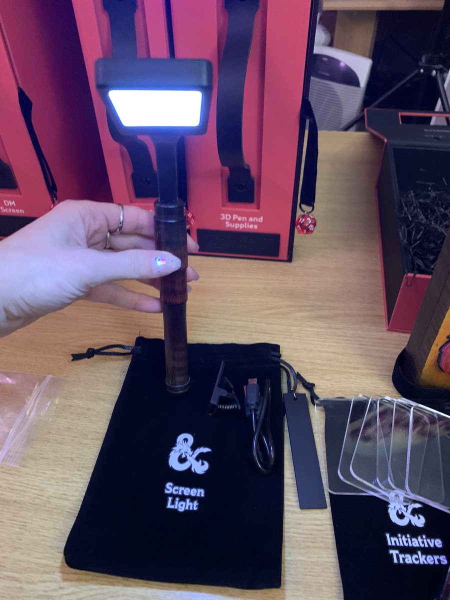
The Initiative Trackers are great, fit in the top of the screen, and the plexi material can be backed with dark paper and used with the white chalk pen we included for high contrast and/or they can be marked with the 3D pen for texture/Braille.
18/
18/

Many folks with low vision need good lighting, so the Screen Light was an EASY choice. It allows access in a wider variety of environments and can help the players and the DM. It also attaches to the DM screen.
19/
19/
Box 4: The DM Screen. @dogmight collaborated to make a GORGEOUS 3D, textured, high contrast screen with a ton of modular options. The texture makes it enjoyable for all vision levels and folks who like tactile items.
20/
20/

The back of the screen has plexi page holders in a few sizes as well as instructions (Also in accessible PDFs on QR page). Dark paper behind the plexi + chalk pen works for high-contrast notes. All silver dots are magnetic points to attach the extras. Panels are numbered.
23/


23/


And finally, the screens are engraved and painted with the recipient’s name. This keeps them textured and identifiable.
24/
24/

I’m so, so proud of these kits and what they represent. I’ve heard from several people who said “EVERYTHING ABOUT THIS FEELS LIKE IT WAS DESIGNED FOR ME.”
Yes, it was. On every level. Because inclusion MATTERS. Everyone deserves access and a seat at the gaming table.
💜
/end

Yes, it was. On every level. Because inclusion MATTERS. Everyone deserves access and a seat at the gaming table.
💜
/end


Addendum: In terms of public availability, I’ll quote @djdubow: “Can't share a ton of info on sourcing for items just yet, but the potential for wider availability is something we did take into consideration! No promises, but I'll be sure to share if there are any updates!”
I hope that just by sharing the process and considerations that went into this, it inspires folks to think about how to make their own products more accessible moving forward, or sparks ways to integrate things like tactile maps or high-contrast notes into your own games.
We ALL win when games are inclusive and accessible, whether we are creators, storytellers, players, collectors, or any other type of enthusiast, and considering how to ensure access makes the future of gaming even more exciting for everyone.
(And if you want to see an accessible table in action, please check out the work we did on Galesong: Dragon’s Convergence. youtube.com/playlist?list=…)
(Also, PLEASE let companies know that you want accessible products and products like this. It’s so important that they receive feedback and have data reinforcing that there is market demand and appreciation for accessible, inclusive products.)
Thanks to @NalaWu, I was reminded that I neglected to share the Braille label on the outer carton, which reads “Dungeons & Dragons For All.” All of our amazing Braille work was printed by @candoable, who did an incredible job making beautiful, accessible accessories.
https://twitter.com/nalawu/status/1605755664407543808
• • •
Missing some Tweet in this thread? You can try to
force a refresh


