
1/9
🧵above this "doom chart" that FinTwit likes to send around.
It is not what you think, the Fed change the accounting making this chart highly misleading.
So, what does it really mean? ...
@LynAldenContact
🧵above this "doom chart" that FinTwit likes to send around.
It is not what you think, the Fed change the accounting making this chart highly misleading.
So, what does it really mean? ...
@LynAldenContact

2/9
First ... when the Fed did QE, it bought bonds. When they started QT last spring, they let bonds mature (not sold).
This activity make changes the Fed's balance sheet.
On Dec 28 the Fed balance sheet was $8.55T. Of this, $8.04T was bonds, detailed below.
First ... when the Fed did QE, it bought bonds. When they started QT last spring, they let bonds mature (not sold).
This activity make changes the Fed's balance sheet.
On Dec 28 the Fed balance sheet was $8.55T. Of this, $8.04T was bonds, detailed below.

3/9
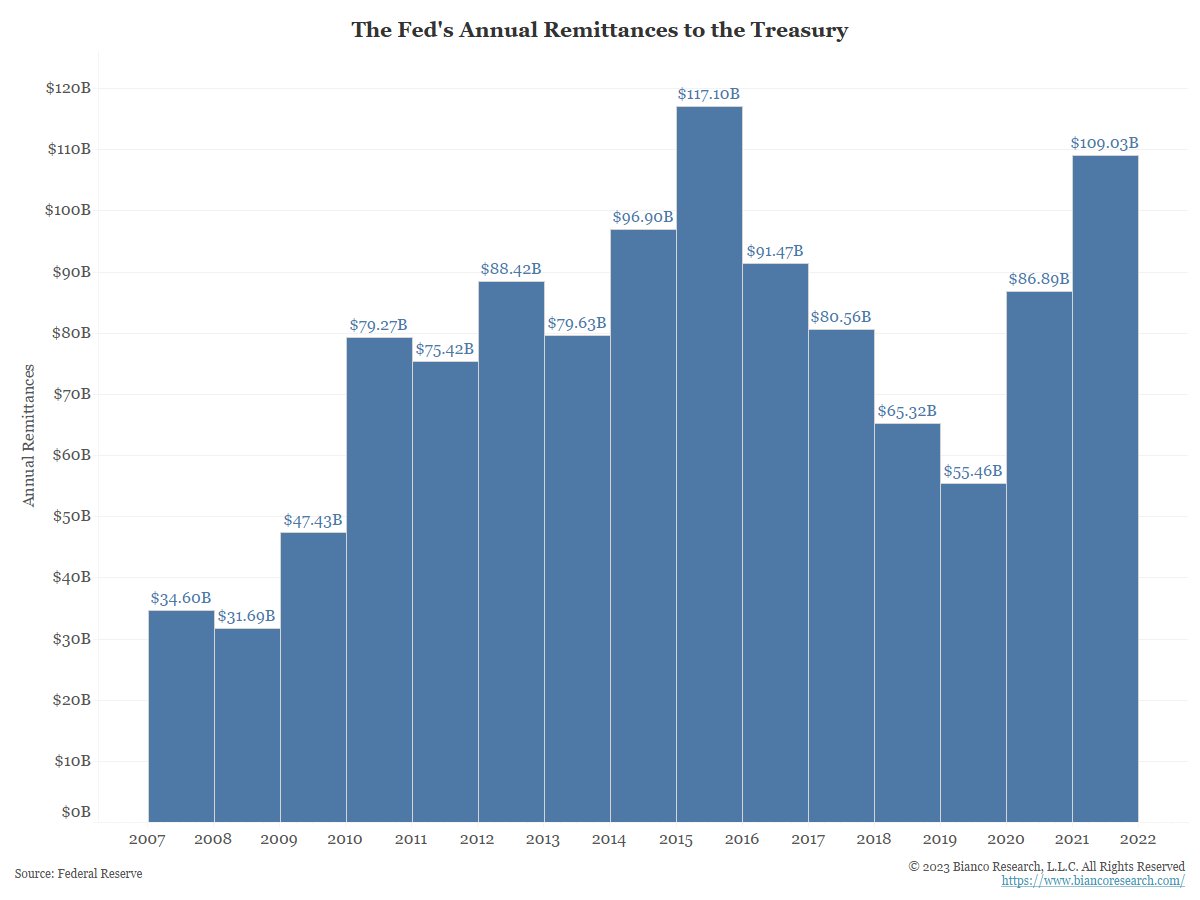
This $8.04T of bonds all pay a coupon. The Fed uses this income to pay RRP and interest on reserves. What is left over is returned to the the Treasury as a "remittance."
Here is the official amount they have remitted back to Treasury, over $1 trillion since 2011.
This $8.04T of bonds all pay a coupon. The Fed uses this income to pay RRP and interest on reserves. What is left over is returned to the the Treasury as a "remittance."
Here is the official amount they have remitted back to Treasury, over $1 trillion since 2011.
4/9
By the way, the Fed has an official annual audit done by KPMG.
Here is the 2021 version that includes lots of detail about the remittances, if anyone wants to nerd out on this topic.
federalreserve.gov/aboutthefed/fi…
By the way, the Fed has an official annual audit done by KPMG.
Here is the 2021 version that includes lots of detail about the remittances, if anyone wants to nerd out on this topic.
federalreserve.gov/aboutthefed/fi…
5/9
In Sept the Fed changed this series from WEEKLY changes to CUMULATIVE changes. Vertical line.
See table 6, footnote 8
federalreserve.gov/releases/h41/2…
Good explanation why this accounting change makes sense … see the part that starts with “switcharoo.”
wolfstreet.com/2022/12/09/how…
In Sept the Fed changed this series from WEEKLY changes to CUMULATIVE changes. Vertical line.
See table 6, footnote 8
federalreserve.gov/releases/h41/2…
Good explanation why this accounting change makes sense … see the part that starts with “switcharoo.”
wolfstreet.com/2022/12/09/how…

6/9
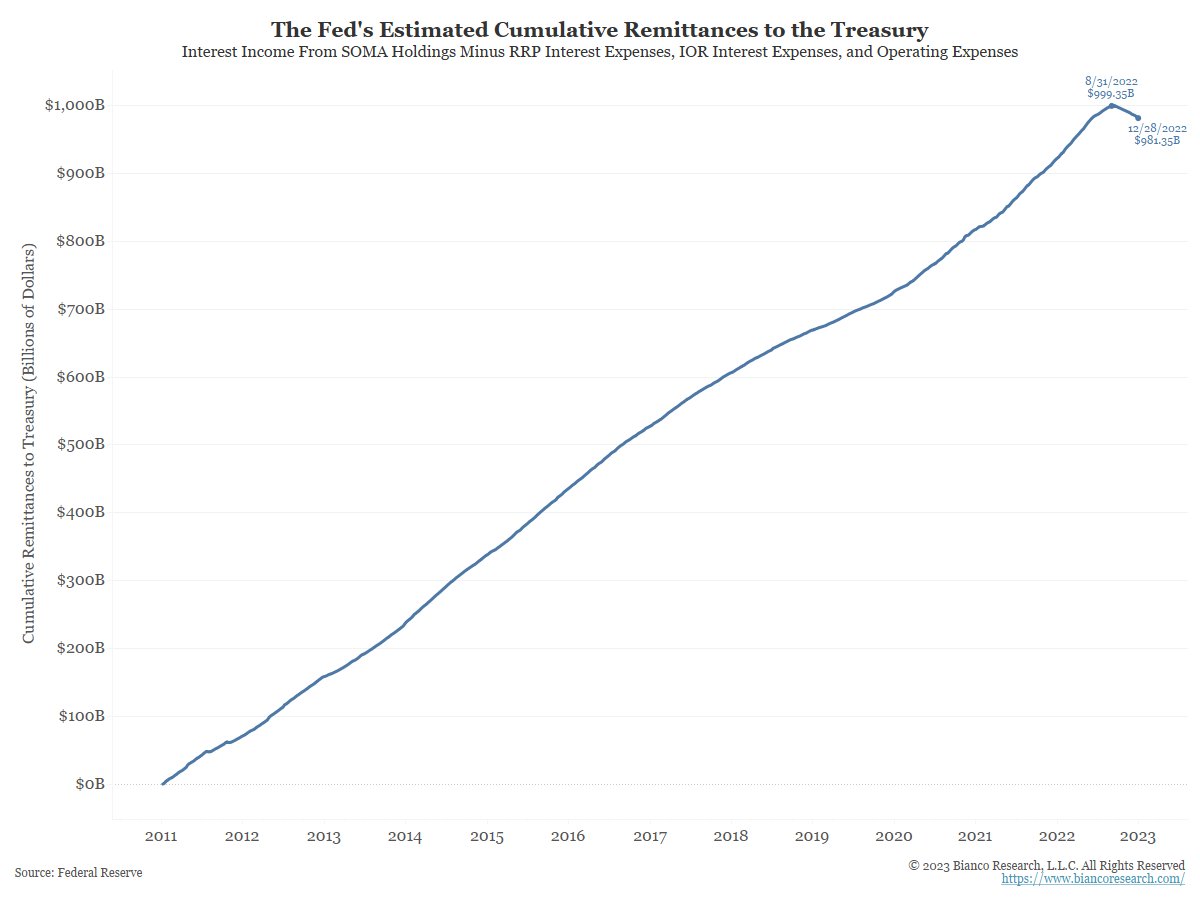
So if I was to rework this chart to all cumulative changes back to 2011, it would look like this.
Now it doesn't look like the end of the financial system anymore.
So if I was to rework this chart to all cumulative changes back to 2011, it would look like this.
Now it doesn't look like the end of the financial system anymore.
7/9
What about 2022?
Same chart as above but now starts on Jan 1, 2022.
The estimate is about $60B will be remitted to the Treasury in 2022, down from $109B in 2021.
What about 2022?
Same chart as above but now starts on Jan 1, 2022.
The estimate is about $60B will be remitted to the Treasury in 2022, down from $109B in 2021.

8/9
Yes, 2023 their will be no remittances to the Treasury as RRP and Interest on Reserve payments will exceed coupon income. What does it mean?
@judyshel detailed it last summer in the WSJ. Good read on this subject.
wsj.com/articles/some-…
Yes, 2023 their will be no remittances to the Treasury as RRP and Interest on Reserve payments will exceed coupon income. What does it mean?
@judyshel detailed it last summer in the WSJ. Good read on this subject.
wsj.com/articles/some-…
9/9
tl:dr on what happens in 2023.
The Fed will account for these losses by writing an IOU to the Treasury in the form of a ‘deferred asset’.
In English, the Treasury will make these losses back whenever the Fed begins to turn a profit once again.
federalreserve.gov/econres/notes/…
tl:dr on what happens in 2023.
The Fed will account for these losses by writing an IOU to the Treasury in the form of a ‘deferred asset’.
In English, the Treasury will make these losses back whenever the Fed begins to turn a profit once again.
federalreserve.gov/econres/notes/…
• • •
Missing some Tweet in this thread? You can try to
force a refresh


