Ian Harnett Profile picture
Jan 8, 2023 8 tweets 3 min read Read on X
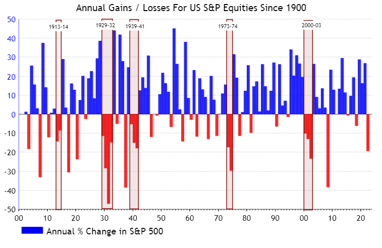
At @asr_london, we believe that you will see another down year for US (and Global) Equities in 2023. Two down years in a row are unusual (outside world wars), but a not unheard of... 1/8
There is no single indicator that has predicted multi-year down markets... apart from World War... but rapidly rising inflation or policy rates have played a role... 2/8
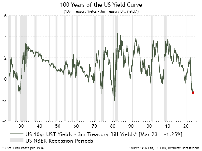
In 1929 rates were raised into slowing inflation; in 1973, rates were raised into rapidly rising inflation but real rates were negative; while in 2000 rates were raised and inflation picked up - but real rates remained positve... 3/8
Multi-year down markets tended to see recessions in both activity and earnings during the second year of the market downturn (exactly what we @asr_london are forecasting for 2023). 4/8
Extended valuations tend to play a role in multi-year down markets... but we find that the detrended Bond/Equity yield ratio seems to give the best signal - but even this appears 'necessary but not sufficient'... 5/8
Extended market cycles (in age and scale) also yield multi-year declines... if we exclude the 'biological' pandemic bear market (short-lived as looser policy extended the cycle), the Bull market ending Jan-2022 lasted almost 13 years and saw a 5-fold rise in Equities 6/8
A final word of warning... previous multi-year bear markets (other than 1913-14) saw the second year deliver larger losses than the first. 7/8
If you are a professional investor and would like to see the in-depth analysis behind why we at @asr_london are suggesting clients are maximum underweight Global Equities and maximum overweight Cash, visit absolute-strategy.com and sign up for a research trial END

• • •

Missing some Tweet in this thread? You can try to force a refresh
 

Keep Current with Ian Harnett

Ian Harnett Profile picture

Stay in touch and get notified when new unrolls are available from this author!

Read all threads

This Thread may be Removed Anytime!

PDF

Twitter may remove this content at anytime! Save it as PDF for later use!

Try unrolling a thread yourself!

how to unroll video
  1. Follow @ThreadReaderApp to mention us!

  2. From a Twitter thread mention us with a keyword "unroll"
@threadreaderapp unroll

Practice here first or read more on our help page!

More from @IanRHarnett

Jan 21
There has been a lot of focus on the $6trn of cash sitting on the sidelines being able to drive the next phase of this equity bull market…it certainly looks pretty spectacular 1/5 Image
Relative to the size of the US equity market there is nothing unusual about the amount of cash on the sidelines - for either institutions or private investors 2/5 Image
A high level of cash is simply a rational response to the fact that you can get almost 4x the yield of the S&P in cash…3/5 Image
Read 5 tweets
Oct 13, 2023
It was great to see that Simon White at @bloomberg @markets used this chart yesterday, linking the yield curve and the VIX... It was one of the first charts that @David_Bowers55 and I built together when we launched @asr_london back in 2006/7 1/5 Image
This is what the yield curve vs VIX chart looked like back in 2007. It was signalling that the VIX would likely rise dramatically - and by the middle of the year this process had already started to happen - it also signalled that worse was yet to come... 2/5 Image
The link between the yield curve and the VIX was one reason that we warned our clients in 2007 that "The Global Liquidity Crisis Will Be a Trillion Dollar Event"... today we worry that the inverted yield curve is also signalling risk ahead - this time for Non-bank Financials 3/5 Image
Read 5 tweets
Apr 2, 2023
As a thank you for people's patience while I was away talking to clients, three key charts we flagged to them. Maybe its our lack of imagination, but when we started @asr_london, we never dreamed we would have three macro charts giving signals similar to those seen in 1929! 1/6
2/6 #1 US 10yr Treasury - 3m Treasury Bill Yield Curve It's popular to doubt the usefulness of yield curves, but this is only the forth time in 100 years the Yield Curve has been this inverted: 1980, 1973 and 1929 were the others - they did not end well for US economy or markets
3/6 #2 US Shiller CAPEs and Tobin’s ‘Q’ Ratio - I posted this recently - but just a reminder that the only times, other than today and the Tech bubble, that these 'fundamental' long run valuations were as extended was in 1929
Read 6 tweets

Did Thread Reader help you today?

Support us! We are indie developers!


This site is made by just two indie developers on a laptop doing marketing, support and development! Read more about the story.

Become a Premium Member ($3/month or $30/year) and get exclusive features!

Become Premium

Don't want to be a Premium member but still want to support us?

Make a small donation by buying us coffee ($5) or help with server cost ($10)

Donate via Paypal

Or Donate anonymously using crypto!

Ethereum

0xfe58350B80634f60Fa6Dc149a72b4DFbc17D341E copy

Bitcoin

3ATGMxNzCUFzxpMCHL5sWSt4DVtS8UqXpi copy

Thank you for your support!

Follow Us!

:(