CRO Insights #13 📈
This time we focus on optimising our clients football betting home page above the fold.
In the following thread, I will explain the specific modifications we have implemented to increase their conversion rate and the number of sign-ups per visit.
🧵
This time we focus on optimising our clients football betting home page above the fold.
In the following thread, I will explain the specific modifications we have implemented to increase their conversion rate and the number of sign-ups per visit.
🧵
CRO Insights 📈: My company @conversionwise has been in businesses for 10 years. We do 50-70 new CRO projects per month.
I'm lifting the lid on internal projects and breaking down:
1. Before and after designs
2. What we've changed and why it will increase conversion rates
I'm lifting the lid on internal projects and breaking down:
1. Before and after designs
2. What we've changed and why it will increase conversion rates
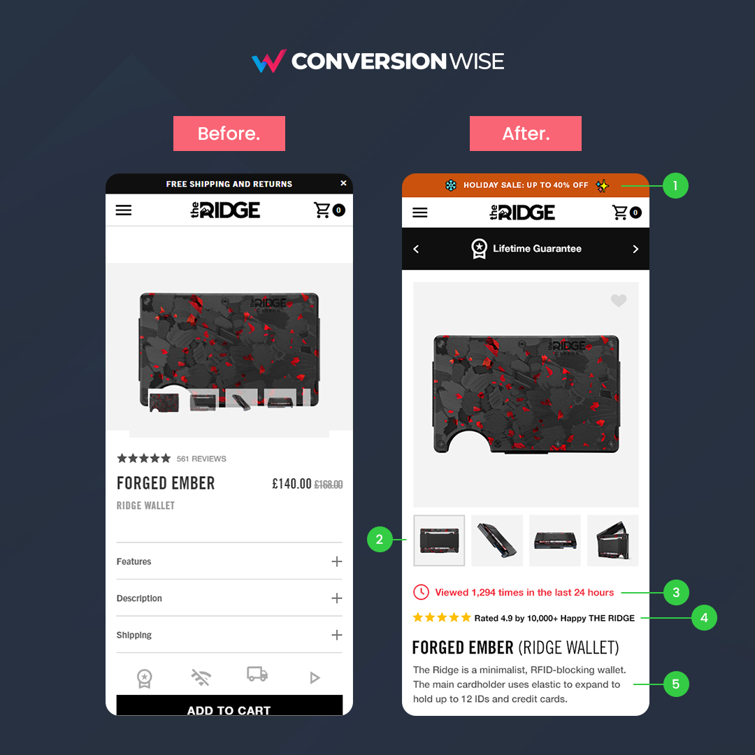
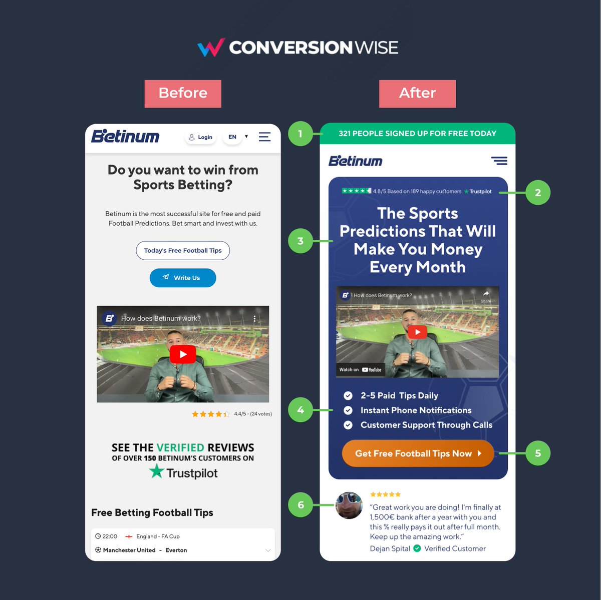
1. Added a toolbar
❌ Before: The page didn't utilise the valuable real estate that comes from using a small toolbar.
✅ After: We've added a toolbar that stands out and dynamically shows how many people have signed up today to increase social proof and inclusivity.
❌ Before: The page didn't utilise the valuable real estate that comes from using a small toolbar.
✅ After: We've added a toolbar that stands out and dynamically shows how many people have signed up today to increase social proof and inclusivity.
2. Pushed social proof way up the page
❌ Before: They did a great job of including social proof but it was all done below the headline and other elements.
✅ After: We've pushed the social proof way up to get it more eyeballs and also added the text "189 happy customers".
❌ Before: They did a great job of including social proof but it was all done below the headline and other elements.
✅ After: We've pushed the social proof way up to get it more eyeballs and also added the text "189 happy customers".
3. Enhanced value proposition
❌ Before: The headline just asked a question, this can work but there has to be a clear answer/benefit.
✅ After: Instead we've used the benefit clear for everyone to see. It's the first thing you look at and states you can make money (benefit).
❌ Before: The headline just asked a question, this can work but there has to be a clear answer/benefit.
✅ After: Instead we've used the benefit clear for everyone to see. It's the first thing you look at and states you can make money (benefit).
4. Replace boring text with benefit bullet points
❌ Before: Nothing described to potential sign ups exactly what they company offered/did.
✅ After: By adding simple bullet points we're able to clearly outlay the benefits of the sign up in 3 short pointers.
❌ Before: Nothing described to potential sign ups exactly what they company offered/did.
✅ After: By adding simple bullet points we're able to clearly outlay the benefits of the sign up in 3 short pointers.
5. We made the call to action POP
❌ Before: White call to action on a grey background = no! Also never put two CTA's next to each other.
✅ After: We've replaced the confusing call to actions with one clear and assertive button. Don't forget that directional cue >.
❌ Before: White call to action on a grey background = no! Also never put two CTA's next to each other.
✅ After: We've replaced the confusing call to actions with one clear and assertive button. Don't forget that directional cue >.
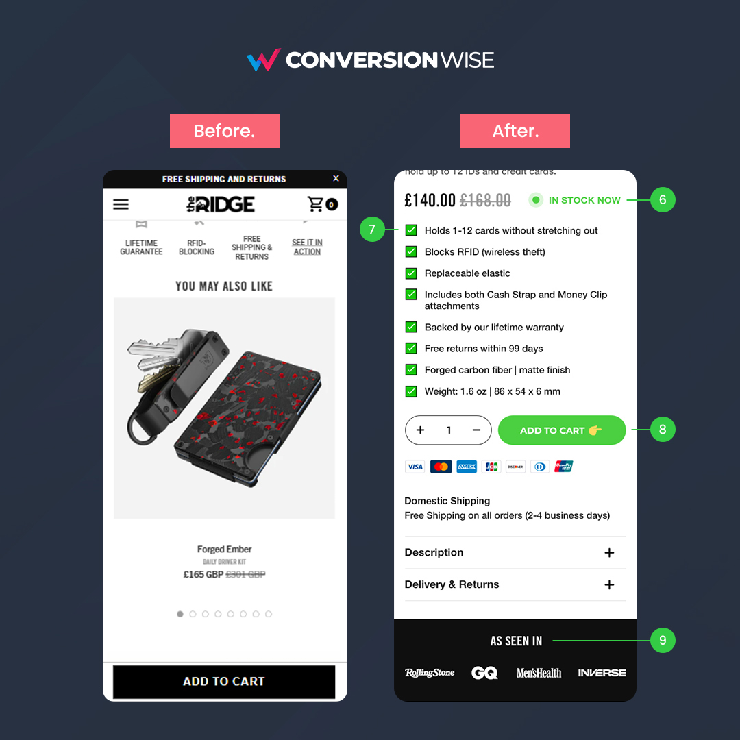
6. Added more social proof from real people!
❌ Before: Although star ratings were shown, there's no reviews from real people.
✅ After: We've added a real reviews featuring a real picture, first and last name + "Verified customer" icon to anchor the call to action button.
❌ Before: Although star ratings were shown, there's no reviews from real people.
✅ After: We've added a real reviews featuring a real picture, first and last name + "Verified customer" icon to anchor the call to action button.
TL;DR
🚀 Use a toolbar with a clear message
🚀 Push your social proof way up the fold
🚀 Make your headline all about the benefits
🚀 Use bullet points over paragraphs of text
🚀 Make your call to actions direct and POP
🚀 Anchor all buttons with social proof
🚀 Use a toolbar with a clear message
🚀 Push your social proof way up the fold
🚀 Make your headline all about the benefits
🚀 Use bullet points over paragraphs of text
🚀 Make your call to actions direct and POP
🚀 Anchor all buttons with social proof
That's all from todays CRO Insights 📈.
If you enjoyed this please follow @oliverkenyon and retweet. 🙏
📧 Join 10k+ marketers getting my weekly Conversion Rate Optimisation newsletter
getrevue.co/profile/oliver…
If you enjoyed this please follow @oliverkenyon and retweet. 🙏
📧 Join 10k+ marketers getting my weekly Conversion Rate Optimisation newsletter
getrevue.co/profile/oliver…
• • •
Missing some Tweet in this thread? You can try to
force a refresh