The Warming Stripes are a popular visual way of highlighting the observed rise in global temperatures since 1850. #ShowYourStripes
But, the concept can also be used in different ways for different purposes... a thread🧵
For those who want numbers and a timeline to go along with the stripes...
For those who want a longer timescale...
(This version uses the @PAGES_IPO proxy-based global temperature data for years 1-2000 and the observations for 2001-2022.)
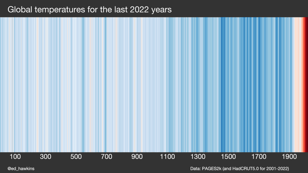
For those who want to look at the recent rapid rise of global temperatures in the context of the last 2000 years...
For those who want to highlight why global temperatures have increased so rapidly since the start of the industrial revolution...
(Of course, we also understand the physics of why increasing carbon dioxide levels in the atmosphere would cause global temperatures to rise.)
• • •
Missing some Tweet in this thread? You can try to
force a refresh
"The data from 2022 is stark, however you look at it. Whether you view the raw figures, or look at the data as another red line added to the climate stripes, the message is clear. Excess heat is building up across the planet at a rate unprecedented in the history of humanity."
"The latest stripe added is the second-darkest red, but is very close to being in the darkest red category. This is remarkable, given that La Nina has helped to hold temperatures down. When we see a return of a warming phase of El Nino, the darkest red stripes will return."
Why are we still building housing developments with gas for heating, no solar panels on roofs and no cycling infrastructure?
This provoked a LOT of discussion!
Focussing on UK, there will be no gas boilers in newly built homes after 2025. Positive step but could have come much earlier & has locked-in expensive retrofitting. Heat pumps rather than hydrogen boilers are planned solution for most homes.
And, many commenters added other issues that could be improved in new housing developments: harvesting rainwater, improved biodiversity, avoiding floodplains, community infrastructure... would all need more regulations & joined-up planning.
How do the warming stripes start conversations about climate change? #ShowYourStripes
They are stark visuals which, with a single glance, instantly communicate the simple message that the climate is heating up.
Their strength is the innovative ways that people have adapted them.
At London Fashion Week, @HouseOfTammam put on a catwalk show with dresses, accessories and a cape with the stripes as a theme, reaching a new audience and winning awards for sustainability engagement.
The rock band @ENTERSHIKARI used the warming stripes to start climate conversations with music fans during a sell-out festival tour.
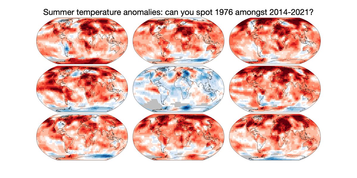
Whenever climate change & UK heatwaves are discussed someone will always say: 'but what about 1976?', as if this was evidence that the climate has not changed.
And, yes, summer 1976 was hot in the UK. It may not be obvious which map is 1976 when comparing with the last 8 summers.
But, taking a global view is important. Variations in the weather mean that locally some years are hotter & some cooler.
1976 clearly stands out as unusual. It was far cooler virtually everywhere when compared to the last 8 summers.
The UK happened to be an exception that year.
Local experiences of weather events are important - people are realising that we are living through more frequent & more intense heatwaves overall.
But relying on feelings about events from nearly 50 years ago is not a reliable way to understand the changes that are happening.
Delighted that the Warming Stripes were chosen for the cover of @GretaThunberg's new book.
These 172 coloured stripes represent how global average temperatures have increased from 1850 to 2021. Billions of observations taken by many thousands of observers in one simple graphic.
The graphic used for this book continues the stripes backwards in time on the spine & back cover. For the period before 1850, information from 'paleo' sources are used, i.e. data from tree rings, corals etc. Because of the dimensions of the book the back cover goes back to 1630s.
The paleo-data is actually available for the last 2000 years, and highlights the unprecedented nature of the recent warming. The rapid change is mainly caused by our burning of fossil fuels to generate energy, starting with the invention of the steam engine.