
One of #STOIC's most useful features is its signature Summary Charts, which are these bar charts displayed at the top of every column in a table. They work really well, unless your table has very few rows. Here is how we'll improve them for some interesting corner cases. 

Relative Baseline in Bar Plots
When a table has less than 50 rows, we replace the Histogram displayed for a numerical column with a Bar Plot visualizing discrete values, but we keep 0 as baseline. We should use MIN or MAX instead, as we do for cell summaries below.
When a table has less than 50 rows, we replace the Histogram displayed for a numerical column with a Bar Plot visualizing discrete values, but we keep 0 as baseline. We should use MIN or MAX instead, as we do for cell summaries below.

Bar Plot with All Equal Values
When a Bar Plot is produced for a set of values that are all equal, we would want to know that at a glance. To do so, the length of bars will be reduced by 50%, while keeping the plot horizontally centered.
When a Bar Plot is produced for a set of values that are all equal, we would want to know that at a glance. To do so, the length of bars will be reduced by 50%, while keeping the plot horizontally centered.

Bar Plot with All Values Equal to 0
When all values are equal to 0, the length of bars should be 2px (instead of 1px as we do here). This allows to communicate that all values are equal, and that they're equal to 0 (very common case).
When all values are equal to 0, the length of bars should be 2px (instead of 1px as we do here). This allows to communicate that all values are equal, and that they're equal to 0 (very common case).

Bar Plot with All Values Equal to 1
When all values are equal to 1, bars should become squares (as we do here). This allows to communicate that all values are equal, and that they're equal to 1 (very common case as well).
When all values are equal to 1, bars should become squares (as we do here). This allows to communicate that all values are equal, and that they're equal to 1 (very common case as well).

Single Value
When you have a single value, you essentially have very little information to visualize, and we want to communicate that fact clearly. Therefore, we'll replace the single bar by a smaller square, horizontally and vertically centered.
When you have a single value, you essentially have very little information to visualize, and we want to communicate that fact clearly. Therefore, we'll replace the single bar by a smaller square, horizontally and vertically centered.

Furthermore, the cell summary shown below contains zero information, and we want to communicate that fact as well. Therefore, we'll replace it with a 2px-wide tick, left-aligned for positive values, centered for 0, and right-aligned for negative values.
Single Bin
Whenever a histogram has a single bin, its single bar should have half the width of the column, in order to properly convey the information that we have a vertical bar, not a horizontal one.
PS: Don't pay attention to the "Single value" title (bug).
Whenever a histogram has a single bin, its single bar should have half the width of the column, in order to properly convey the information that we have a vertical bar, not a horizontal one.
PS: Don't pay attention to the "Single value" title (bug).

Bar Plot with Two Values
When a Bar Plot renders two values, things get interesting. If you use a non-zero baseline, the top bar will show 100%, and the bottom one 0% (on a relative scale). Therefore, your Bar Plot ends up visualizing no information at all.
When a Bar Plot renders two values, things get interesting. If you use a non-zero baseline, the top bar will show 100%, and the bottom one 0% (on a relative scale). Therefore, your Bar Plot ends up visualizing no information at all.
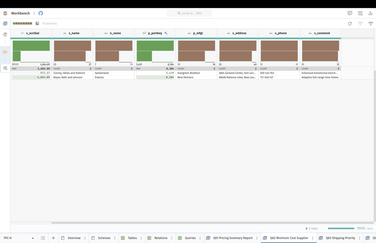
As a result, we must keep 0 as baseline, as we did on the previous screenshot. But when doing so, we should remove the range bar, because it is superfluous, as it always starts where the bottom bar stops, by design.
Baseline Value Cell Summary
Whenever we use a non-zero baseline for cell summaries, cells with values equal to the baseline (MIN for positive, MAX for negative) are shown with no bar. They should be shown with a 2px-wide bar instead to show that we have data.
Whenever we use a non-zero baseline for cell summaries, cells with values equal to the baseline (MIN for positive, MAX for negative) are shown with no bar. They should be shown with a 2px-wide bar instead to show that we have data.

Percentile Ticks
Percentile ticks in cell summaries should be displayed with a darker color to be more readable. But most importantly, they should have a thickness equal to 1% of the full range's width (100%), because they represent a 1% bin.
Percentile ticks in cell summaries should be displayed with a darker color to be more readable. But most importantly, they should have a thickness equal to 1% of the full range's width (100%), because they represent a 1% bin.

Others in Frequency of Frequency Charts
Frequency of Frequency Charts with more than 25 frequencies should display an "Others" bars at the bottom, like we do for all other summary charts.
Frequency of Frequency Charts with more than 25 frequencies should display an "Others" bars at the bottom, like we do for all other summary charts.

Frequency Chart with All Equal Values
Frequency Charts with all equal values should have bars with length equal to 50% of the full range, while the bar chart remains horizontally centered (same as what should be done for Bar Plots).
Frequency Charts with all equal values should have bars with length equal to 50% of the full range, while the bar chart remains horizontally centered (same as what should be done for Bar Plots).

Bottomline: univariate summary charts are devilishly tricky. They're all bar charts, but they're bar charts of many different kinds (bar plots, histograms, frequency charts, frequency of frequency charts), applied to the data or to metadata on data (e.g. length of string).
And depending on the number of rows in the table, the number of bars in the chart, and whether numerical values are signed or not, many different rules must be applied for the chart to make any sense at all. Some of these rules are obvious, but many are not.
Most importantly, some of these rules reflect common practices, but many are innovative and have yet to stand the test of time (e.g. range bars for non-zero baselines). This is making for a very challenging project.
Fortunately, we're finally seeing light at the end of the tunnel...
• • •
Missing some Tweet in this thread? You can try to
force a refresh


