Want to look better on Video + Zoom calls?
Here's 8️⃣ Principles of Interior Design ✨ to elevate your camera background
👇👇👇


Here's 8️⃣ Principles of Interior Design ✨ to elevate your camera background
👇👇👇


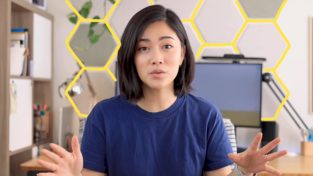
1️⃣ Balance
We humans find beauty & order in balance
Our goal as designers is to distribute visual weight evenly.
Balance the visual intensity so the shot doesn't feel "lopsided" or "too heavy" on one side.
@phlearn
We humans find beauty & order in balance
Our goal as designers is to distribute visual weight evenly.
Balance the visual intensity so the shot doesn't feel "lopsided" or "too heavy" on one side.
@phlearn

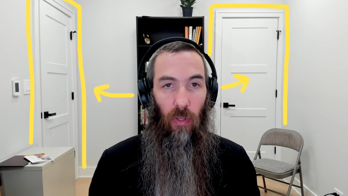
One literal way to create balance is with symmetry.
In the example below, the left and right half of the background is a near mirror image.
This makes the shot feel very stable and grounded.
In the example below, the left and right half of the background is a near mirror image.
This makes the shot feel very stable and grounded.

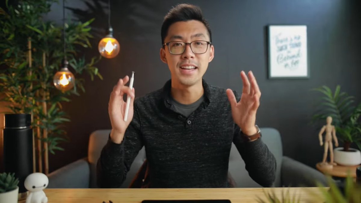
You can also create balance without such literal symmetry.
This is an example of asymmetrical balance in my own studio, and feels more organic & less rigid.
@theKevinShen
This is an example of asymmetrical balance in my own studio, and feels more organic & less rigid.
@theKevinShen
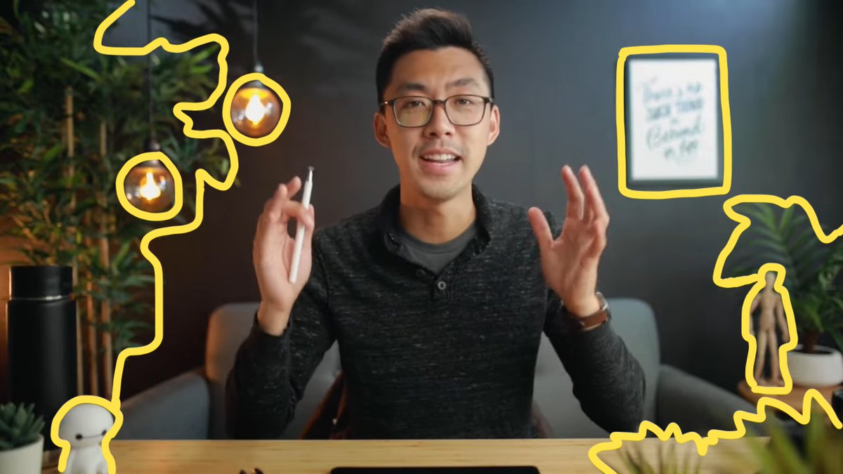
Here, I've created a sense of equilibrium with equal amounts of visual intensity on both sides.
- On the left, small decorative lights and a large bamboo tree
- On the right, high contrast wall art and other decor
- On the left, small decorative lights and a large bamboo tree
- On the right, high contrast wall art and other decor
Another example of how to achieve balance is "The Rule of Sixths" here: 👇
https://twitter.com/theKevinShen/status/1613190994802900993
2️⃣ Proportion
You want your decor to fit the size of your camera frame.
Many people have a sparse background which feels desolate & cold.
Instead, find ways to fill up your *whole* background.
You are the painter & the frame is your canvas.
Paint the whole thing!
@AnnaAkana
You want your decor to fit the size of your camera frame.
Many people have a sparse background which feels desolate & cold.
Instead, find ways to fill up your *whole* background.
You are the painter & the frame is your canvas.
Paint the whole thing!
@AnnaAkana

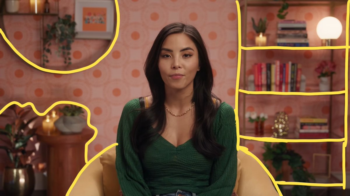
You can get quite creative with how you fill up your shot.
Here Anna uses:
- a large chair at the center
- a display shelf to occupy the right side
- and a coffee table + frame to fill the left side
And besides furniture, you can also fill space with wallpaper or lighting
Here Anna uses:
- a large chair at the center
- a display shelf to occupy the right side
- and a coffee table + frame to fill the left side
And besides furniture, you can also fill space with wallpaper or lighting
3️⃣ Harmony
Design your background so all elements "go together" & "make sense" in the same space.
This keeps your audience from being confused & can establish context for your content.
When done right, this creates a cohesive theme + consistent aesthetic.
@stalman
Design your background so all elements "go together" & "make sense" in the same space.
This keeps your audience from being confused & can establish context for your content.
When done right, this creates a cohesive theme + consistent aesthetic.
@stalman

Tyler has created a world for us to experience with him 🎄.
You can already feel the fireplace 🔥, hear the snowstorm outside ☃️, and smell the hot cocoa ☕️.
This is the power of context.
You can already feel the fireplace 🔥, hear the snowstorm outside ☃️, and smell the hot cocoa ☕️.
This is the power of context.

4️⃣ Movement
This refers to a sense of flow + direction within your space.
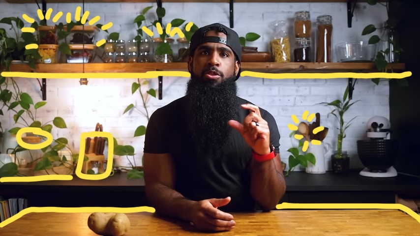
Lines, shapes, and colors are like tour guides for the eyes 👀.
The goal is to guide your audience's eyes smoothly around the frame as if they're reading a book.
@MakeItDairyFree
This refers to a sense of flow + direction within your space.
Lines, shapes, and colors are like tour guides for the eyes 👀.
The goal is to guide your audience's eyes smoothly around the frame as if they're reading a book.
@MakeItDairyFree

In Andrew's case, he creates movement with color (wood 🌳) & shapes (plant leaves 🌿), which are woven throughout the frame. 
5️⃣ Emphasis
Interior designers center a room design around a focal point.
This may be a piece of art or colorful furniture.
But for your video background, *YOU* should be that focal point.
Done properly, your studio is a powerful tool to command attention.
@petermckinnon
Interior designers center a room design around a focal point.
This may be a piece of art or colorful furniture.
But for your video background, *YOU* should be that focal point.
Done properly, your studio is a powerful tool to command attention.
@petermckinnon

📌 Pro Tip
Your background should be designed *around* you–not compete with you. It should draw the viewer's eye 👀 from outside the frame toward you in the center.
In this example, Peter uses leading lines to position himself as the focus of your attention.
Your background should be designed *around* you–not compete with you. It should draw the viewer's eye 👀 from outside the frame toward you in the center.
In this example, Peter uses leading lines to position himself as the focus of your attention.

6️⃣ Contrast
Our eyes naturally gravitate toward contrast.
Use contrasting elements to create visual interest and captivate your audience.
Examples:
- dark areas vs light areas
- smooth textures vs rough textures
- large shapes vs small shapes
Our eyes naturally gravitate toward contrast.
Use contrasting elements to create visual interest and captivate your audience.
Examples:
- dark areas vs light areas
- smooth textures vs rough textures
- large shapes vs small shapes
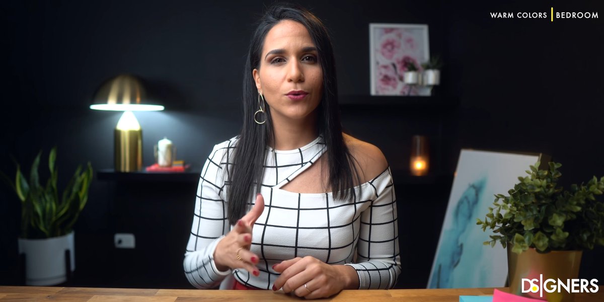
Here, Zahira shows how powerful contrast can be when done right.
Most notably, she contrasts her bright white clothing against a dark black wall.
This plus her bright light, paintings, and candle make for a striking eye-grabbing camera-presence.
Most notably, she contrasts her bright white clothing against a dark black wall.
This plus her bright light, paintings, and candle make for a striking eye-grabbing camera-presence.

7️⃣ Personality
Showcase who YOU are.
Remember, we humans want to connect with other humans!
It's the quirky little details that others are drawn to + make us relatable.
@SimoneGiertz is one of my heroes 🤓


Showcase who YOU are.
Remember, we humans want to connect with other humans!
It's the quirky little details that others are drawn to + make us relatable.
@SimoneGiertz is one of my heroes 🤓

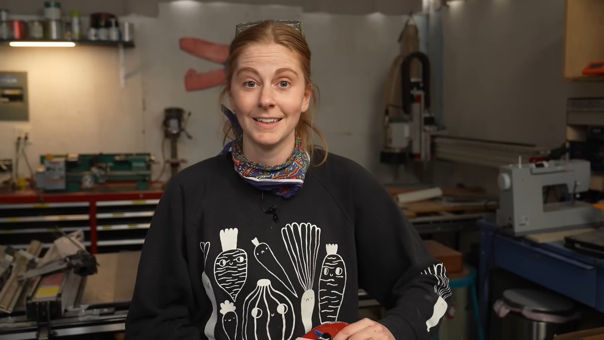
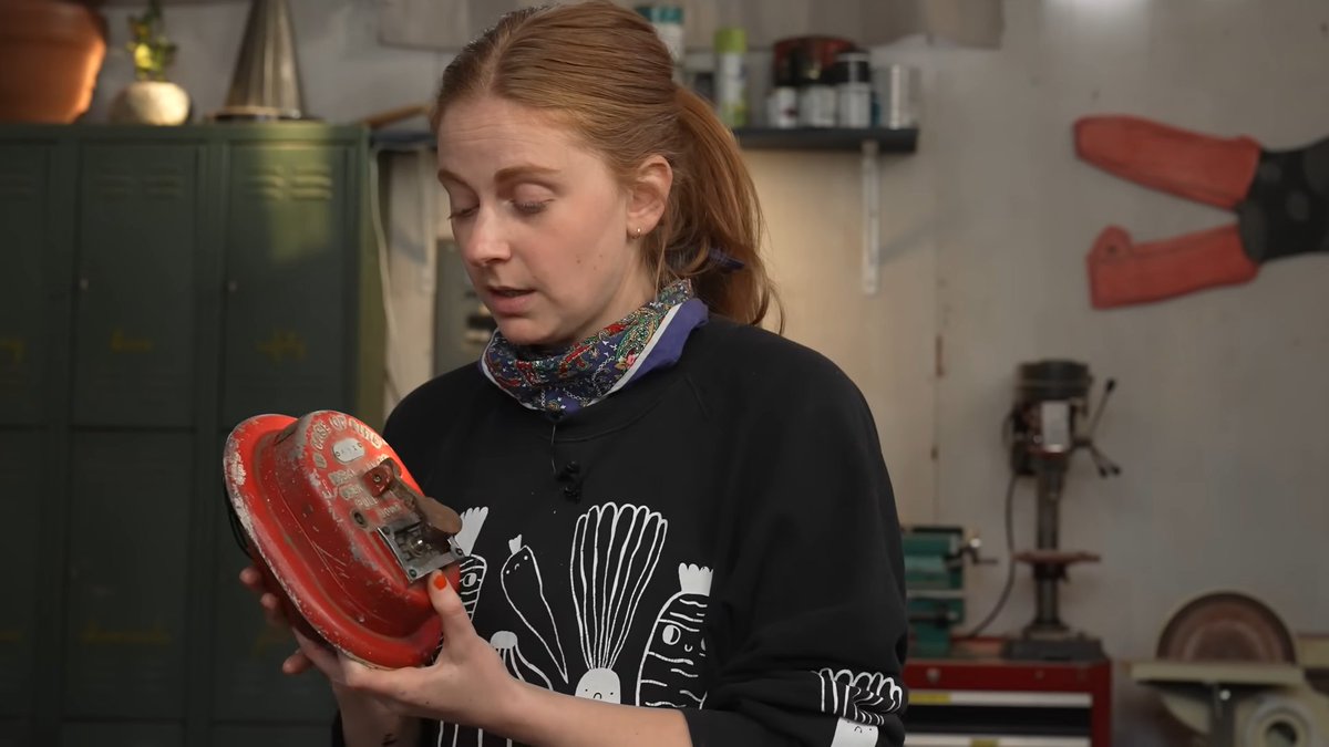
Personal touches include hobbies, sports, music, movies, etc.
Think: tools, toys, posters, instruments!
Think: tools, toys, posters, instruments!

8️⃣ Repetition
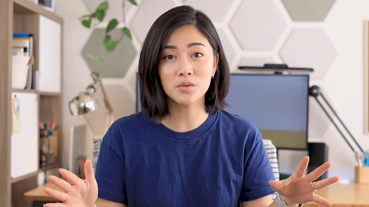
Having repeating elements such as colors, shapes, or textures draws your eye around the image.
@hellomayuko
Having repeating elements such as colors, shapes, or textures draws your eye around the image.
@hellomayuko
📌 To go deeper into this topic, here's another 🧵 on background design
https://twitter.com/532577213/status/1556804818378833927
A studio done right... is a powerful tool 💪
If you spend lots of time on camera (for videos or Zoom calls), how you craft your video presence makes a huge difference.
That includes your background, camera, lighting design, audio–all designed around you.
If you spend lots of time on camera (for videos or Zoom calls), how you craft your video presence makes a huge difference.
That includes your background, camera, lighting design, audio–all designed around you.
We've helped 400+ people design & build their studios via our course + consulting services, saving them tons of time & headache.
If you want us to design your studio for you ✨, here's how we can help you with 1:1 consulting.
👉 dreamstudiocourse.com/p/consulting
If you want us to design your studio for you ✨, here's how we can help you with 1:1 consulting.
👉 dreamstudiocourse.com/p/consulting
https://twitter.com/532577213/status/1589673448111939584
We also have a self-serve digital course & host a live cohort every so often.
Click for details 👇
dreamstudiocourse.com
Click for details 👇
dreamstudiocourse.com
That's a wrap!
If you enjoyed this thread:
1. Follow me @theKevinShen for more of these
2. RT the tweet below to share this thread with others who may benefit
3. Give yourself a hug today because you're awesome 😊
If you enjoyed this thread:
1. Follow me @theKevinShen for more of these
2. RT the tweet below to share this thread with others who may benefit
3. Give yourself a hug today because you're awesome 😊
https://twitter.com/532577213/status/1623808299907907584
• • •
Missing some Tweet in this thread? You can try to
force a refresh

