There are a lot of questions at the moment about colour tokens and Figma soooo
I thought I'd thread some thoughts on it to create a healthy discussion in public 🧂
I thought I'd thread some thoughts on it to create a healthy discussion in public 🧂
Some assumptions first:
• This is *in Figma*, not talking about code
• You have a Figma design systems team set up
• You're at least splitting up styles and components into two files
• This is *in Figma*, not talking about code
• You have a Figma design systems team set up
• You're at least splitting up styles and components into two files

And very importantly!
There is almost no *right* answer, but you've got to start somewhere
I'll be using some terminology in this thread which makes sense to me right now, but will probably horrify you 😱
There is almost no *right* answer, but you've got to start somewhere
I'll be using some terminology in this thread which makes sense to me right now, but will probably horrify you 😱
The style ➡️ components relationship in Figma
Right now, the recommendation is to use slash naming conventions to create folders with your styles
This will eventually map to a similar model for your non-Figma tokens too
(these are example style names)
Right now, the recommendation is to use slash naming conventions to create folders with your styles
This will eventually map to a similar model for your non-Figma tokens too
(these are example style names)

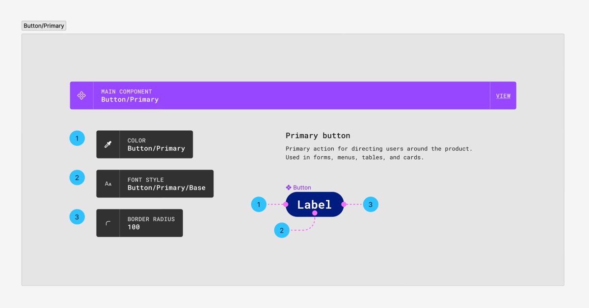
Alright, the token relationship!
The relationship goes like this:
1️⃣ Your base value (e.g. #ffffff for white)
2️⃣ Your base token (e.g. Mono/100)
3️⃣ Your token alias (e.g. Input/Fill)
The relationship goes like this:
1️⃣ Your base value (e.g. #ffffff for white)
2️⃣ Your base token (e.g. Mono/100)
3️⃣ Your token alias (e.g. Input/Fill)

An example – an input field
A question to ask: are there shared component values?
Yes? You can bundle the tokens to start with
Here, we bundle border, text, icon into a token & fill is split
(Content) + (fill)
Remember when I said this would cause discussion? 😅
A question to ask: are there shared component values?
Yes? You can bundle the tokens to start with
Here, we bundle border, text, icon into a token & fill is split
(Content) + (fill)
Remember when I said this would cause discussion? 😅

What if you don't have shared values? Split the tokens!
Here's an example that isn't too realistic, but shows how you could structure the styles, with a separate token alias for:
• Border
• Icon
• Text
• Fill
This would compound when we add states too 😬
Here's an example that isn't too realistic, but shows how you could structure the styles, with a separate token alias for:
• Border
• Icon
• Text
• Fill
This would compound when we add states too 😬

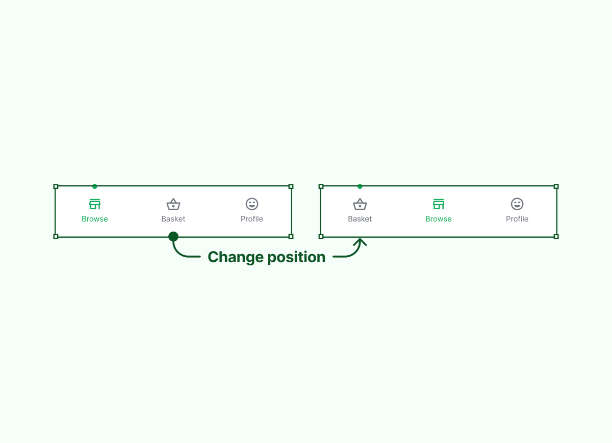
Alright, alright, what about variations of components?
Well, they will still likely have shared styles, so we can bundle certain bits and split the differences
Here's an example of the input/search with a default and error state
Well, they will still likely have shared styles, so we can bundle certain bits and split the differences
Here's an example of the input/search with a default and error state

If you want to be *even more descriptive*, you could do something like this
This example shows the same token value, but the application is hyper specific
e.g. grey/400 is split into every aspect of the input – border, icon, text
Overkill? Probably, yes
Readable? Definitely!
This example shows the same token value, but the application is hyper specific
e.g. grey/400 is split into every aspect of the input – border, icon, text
Overkill? Probably, yes
Readable? Definitely!

Important notes:
• Specificity is easier to read, harder to manage
• Within Figma, it's (probably) easier to optimise for reuse, rather than being overly descriptive
• Right now, your code tokens and Figma styles will probably have to be differently named
• Specificity is easier to read, harder to manage
• Within Figma, it's (probably) easier to optimise for reuse, rather than being overly descriptive
• Right now, your code tokens and Figma styles will probably have to be differently named
More notes:
• I've used "fill" here to represent what other people call background or surface, this is something we argue about in the team all the time
• I've used "content" to bundle the inner elements of components. This is *my* name, which again might not be what you use
• I've used "fill" here to represent what other people call background or surface, this is something we argue about in the team all the time
• I've used "content" to bundle the inner elements of components. This is *my* name, which again might not be what you use
Finally, tokens are really difficult to learn and I'm not an expert at all – just ask my team!
It'll take time to learn, and even longer to use effectively, but start somewhere
I'd advise taking a component in your library and trying to break it down first into logical aliases
It'll take time to learn, and even longer to use effectively, but start somewhere
I'd advise taking a component in your library and trying to break it down first into logical aliases
Thank you to @HonzaTmn for helping me to simplify the visuals 🙌🏻
• • •
Missing some Tweet in this thread? You can try to
force a refresh