Mostly we set up trials to test if a new treatment is better than another (ie we test for superiority) but in a #NonInferiority design we wish to test if a treatment is not unacceptably worse than a comparator. 2/8
The main reasons why we might look for non-inferiority is when an alternative treatment is say much cheaper, or has fewer side effects … but we would only wish to use it if the benefits of the standard treatment are not significantly compromised. 3/8 onlinelibrary.wiley.com/doi/full/10.10…
There are key elements to a non-inferiority design. You have to set the “non-inferiority margin”-how much worse can the alternative treatment be but still be acceptable.This requires careful consideration & needs input from all key stakeholders even if formal methods are used 4/8
It is also important to note from the outset that you generally need a larger sample size to show something is non-inferior (compared to showing something is superior) 5/8
Additionally, while in a superiority design an intention-to-treat analysis is usually the most conservative approach, this is often not the case in a non-inferiority trial - here a per-protocol analysis is usually more conservative. Both should show non-inferiority 6/8
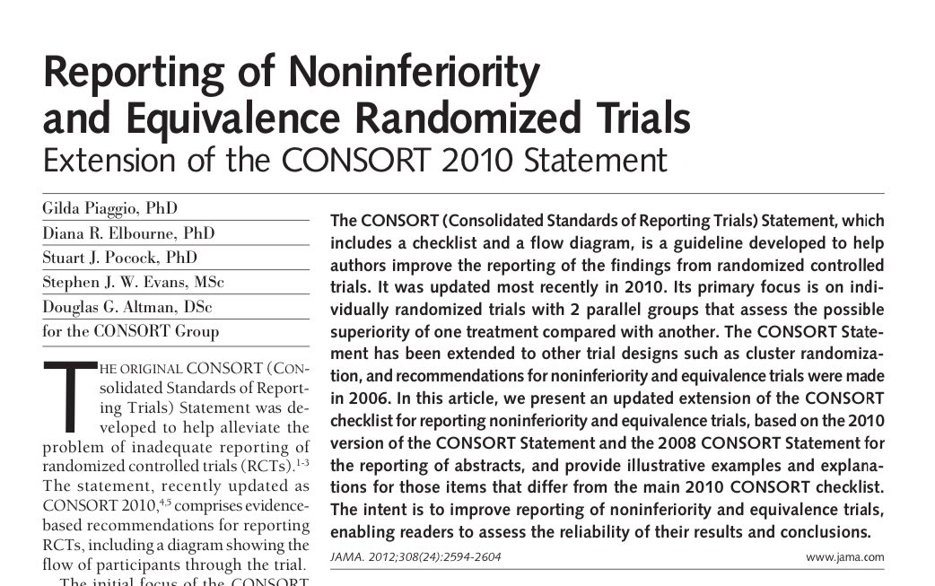
Reporting of non-inferiority trials also requires special considerations. There is a dedicated CONSORT extension to help 8/8
see jamanetwork.com/journals/jama/…
• • •
Missing some Tweet in this thread? You can try to
force a refresh
Having spent the last couple of weeks discussing composite & surrogate outcomes, I was reminded this week of the importance of thoughtful planning on the choice of outcomes in the first place 1/6 #MethodologyMonday
In particular I was reminded of the fundamental work of #Donabedian to conceptualise what is important to measure to assess quality of (and improvement in) health care. Although developed decades ago, it remains just as relevant today 2/6 jamanetwork.com/journals/jama/…
When we seek to assess the impact of a new intervention on care, the Donabedian model suggests there are 3 elements that may be impacted - the #structure the #process and the #outcome of care 3/6
Last week I discussed composite endpoints and how while they can be useful, they can also be fraught with difficulty. The same descriptors could equally be applied to #SurrogateOutcomes in clinical trials 1/9 #MethodologyMonday
A #SurrogateOutcome is a substitute measure (eg blood pressure) that one might use to stand in for the real outcome of interest (eg stroke) when the real outcomes of interest may take a very long time to measure - to allow trials to be completed more quickly & efficiently 2/9
Surrogate outcomes can take many forms and may be histological, physiological, radiological etc … biomarkers that predict events 3/9
Choosing the right outcome is key to a clinical trial. Sometimes a #CompositeOutcome
- an outcome that combines more than one dimension into a single measure - is felt to be most appropriate. These can be useful but can be fraught with difficulty 1/8 #MethodologyMonday
One of the primary reasons for using a composite outcome is trial efficiency - you can get more events quickly compared to the individual components thus increasing precision and efficiency in sample size calculations 2/8 jamanetwork.com/journals/jama/…
However, the validity of a composite relies on consistency of the individual components -see Montori et al 3/8
Given the complexity of delivering clinical trials, they are a fertile ground to gain from #interdisciplinary thinking. For example, the field of trial #recruitment has already gained enormously from insights from other disciplinary approaches 1/7 #MethodologyMonday
A recent paper highlighted the use of #StatedPreference methods in this space. It showed aspects of trial design can affect recruitment 2/7
#StatedPreference methods eg discrete choice experiments are more commonly used by health economists to value and quantify aspects of health care but can be used to determine preference priorities in any domain 3/7
It’s good to start a new year getting the basics right. It’s the same with methods; important not to slip into using common errors.The recent Xmas BMJ paper which showed the most common stats/methods errors is a great place to start 1/7 #MethodologyMonday
The BMJ stats editors highlighted the top 12 most common stats errors they come across. They are summarised in a neat infographic 2/7
All are important,but a couple particularly resonate. One is “dichotomania” (the term coined by Stephen Senn for this) where a perfectly good continuous measure eg blood pressure or weight is then arbitrarily dichotomised into two categories - good/bad; high/low etc 3/7
Following the paper noted this week to have just added capital “T”s to a graph to depict standard errors 😱🤯, a short note on the importance of accurate data visualisation in any research report … 1/8 #MethodologyMonday
This was the tweet & thread which highlighted T-gate. There are lots of other issues with that paper, but data visualisation is a core element 2/8
The paper had attempted to use a #DynamitePlot (sometimes known as a Plunger Plot) to display the data. Even without adding T’s there are major issues with dynamite plots and frankly most statisticians would like them consigned to history! 3/8