joseph francis Profile picture
Mar 18, 2023 12 tweets 4 min read Read on X
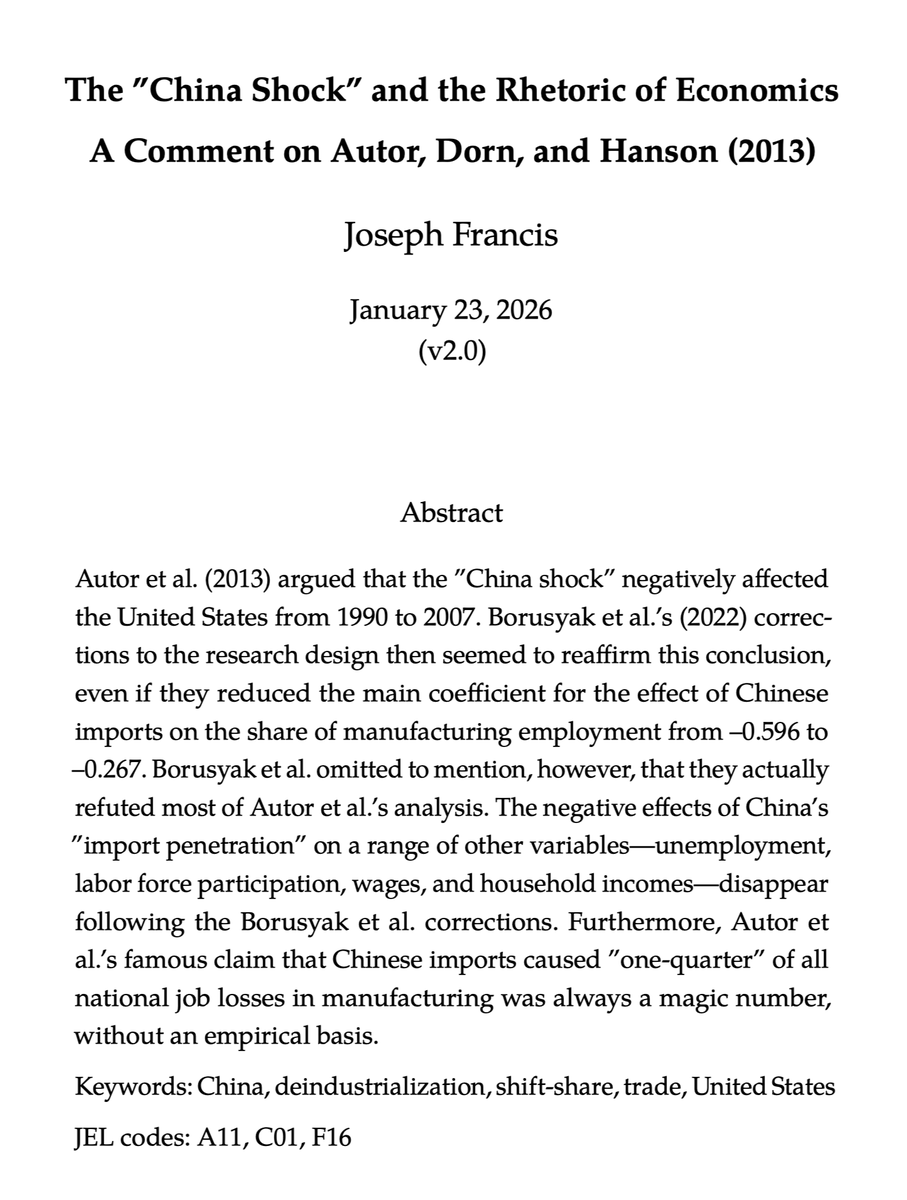
It's probably time to write a requiem for the stock-'net liquidity' correlation.

Why? He dying, if not dead.

1/
To clarify, I'm referring to the Fed's total assets, minus the Treasury General Account and the Reverse Repo Agreements.

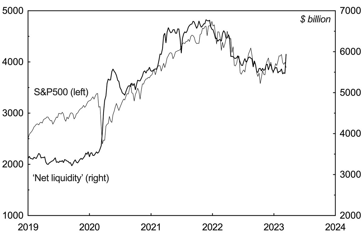
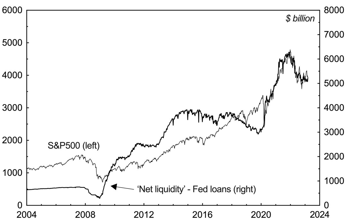
It's supposed to have been driving stock market prices since the Covid Crash. You can see the correlation using weekly data here.

2/
However, the correlation between the two hasn't been perfect.

It held from the second half of 2020 through the first half of 2021, but then faltered, before reestablishing itself in 2022.

Recently it has been faltering again.

3/
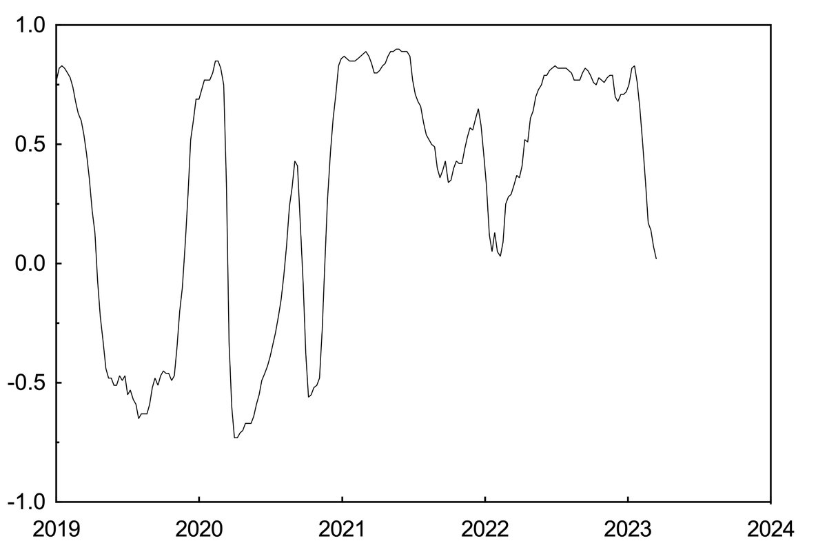
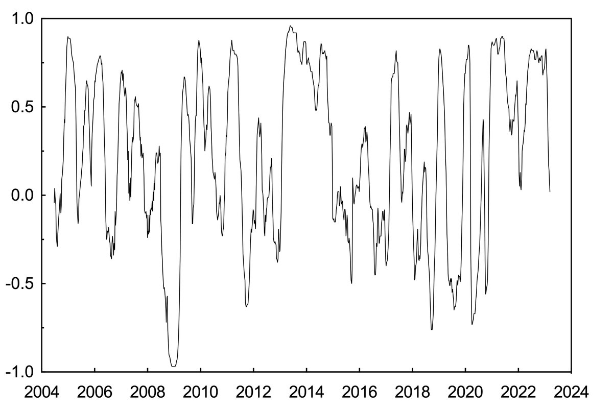
You can see this pattern here by looking at the 26-week Pearson correlation coefficient between the S&P500 and 'net liquidity'. It has fallen rapidly and is now almost negative.

4/
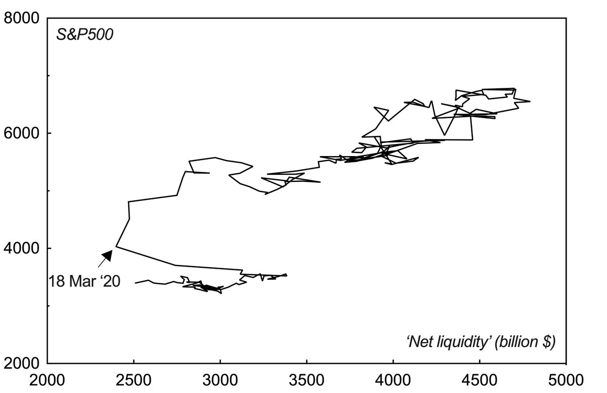
If you zoom out, moreover, the correlation looks shaky in the longer term.

Both have tended to go up over time, but their fluctuations haven't exactly been in sink.

5/
There has also been a surprising increase in the number of black-footed ferrets in the Northern Great Plains over the past 20 years, but they probably didn't inflate the stock market.

aza.org/connect-storie…

6/
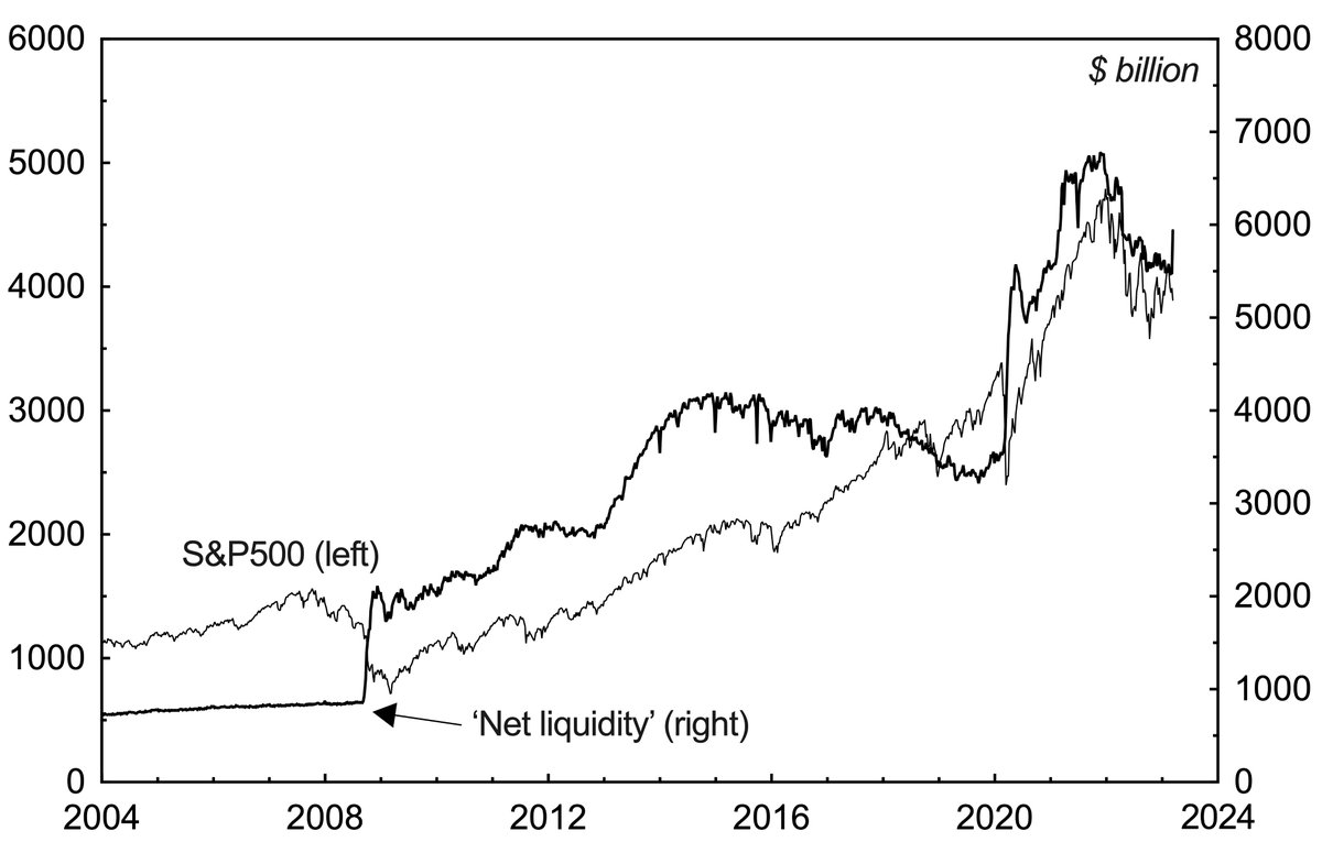
If you look at the 26-week Pearson correlation coefficient since 2004, you can see the problem more clearly.

There have been periods in which the 'net liquidity'-S&P500 correlation has been negative, and others in which it was non-existent. Overall, it looks fairly random.

7/
I'm not saying that liquidity isn't important. But perhaps this isn't the best way to measure it.

8/
One way to get a better correlation is to look at 'net liquidity' but also subtract the Fed's loans from its balance sheet.

The correlation still isn't perfect, and flips negative from around 2018 up to the Covid Crash. Nonetheless, it is better.

9/
Notably, with loans subtracted, the positive correlation can be seen for the 2007-09 bear market.

Two things strike me.

10/
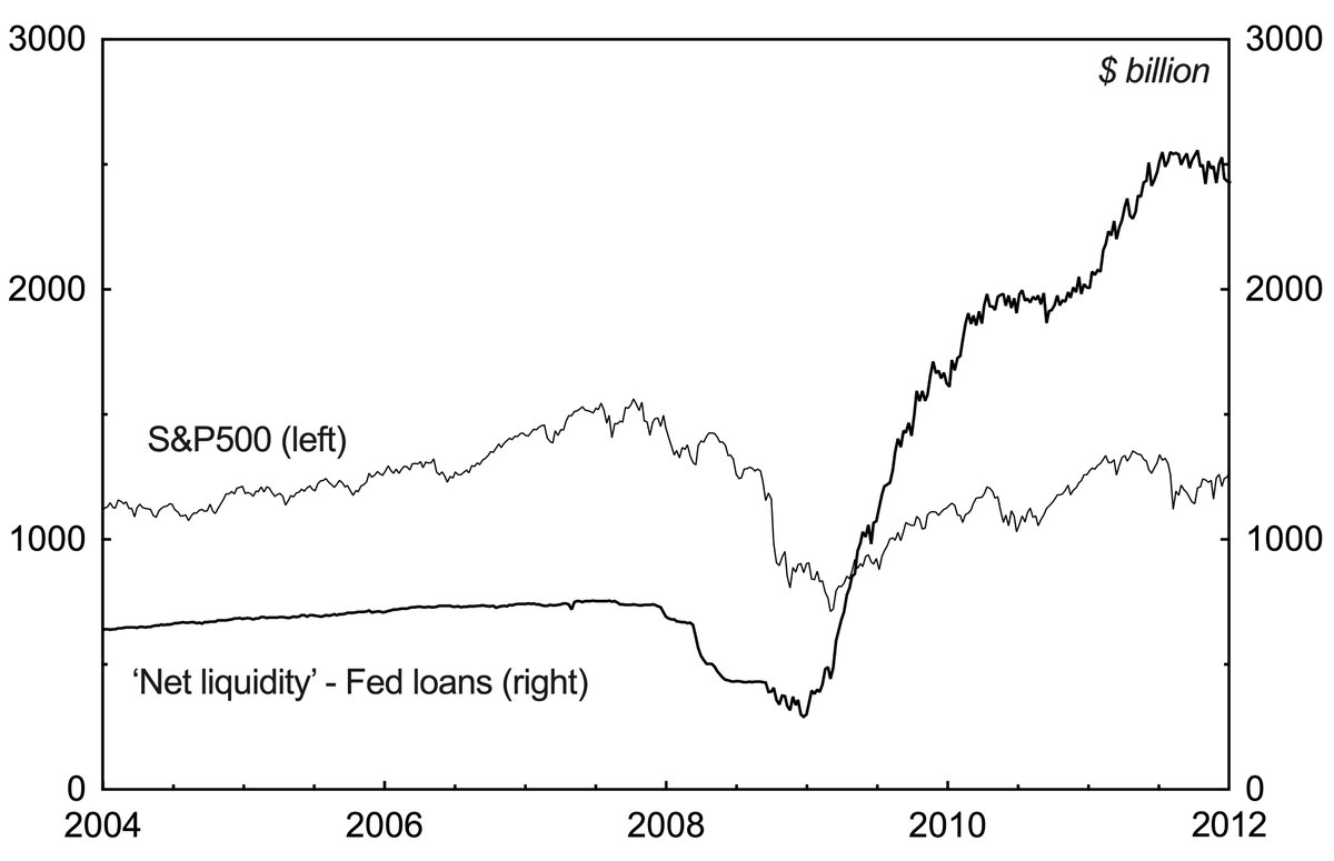
First, there was a withdrawal of liquidity during the 2007-08 crash phase, which you don't see in the 'net liquidity' measure.

Second, the Fed had to provide A LOT of liquidity to get even a moderate recovery in stocks (assuming there was causality).

11/
These are just observations from historical statistics, of course, and you might be better off counting ferrets to predict what will happen next in the stock market.

12/

• • •

Missing some Tweet in this thread? You can try to force a refresh
 

Keep Current with joseph francis

joseph francis Profile picture

Stay in touch and get notified when new unrolls are available from this author!

Read all threads

This Thread may be Removed Anytime!

PDF

Twitter may remove this content at anytime! Save it as PDF for later use!

Try unrolling a thread yourself!

how to unroll video
  1. Follow @ThreadReaderApp to mention us!

  2. From a Twitter thread mention us with a keyword "unroll"
@threadreaderapp unroll

Practice here first or read more on our help page!

More from @joefrancis505

Jan 23
Here is my comment on Autor, Dorn, and Hanson (2013).

In short, I found that the "China shock" weren't all it was made out to be.

The caveat is that I am often wrong. 1/11 Image
I think that previous critiques of Autor, Dorn, and Hanson (ADH) have tended to concede a key piece of ground: they assume that manufacturing employment's share of the working population is the key dependent variable. 2/11
(As a side note, this is similar to how critics of Piketty concede that the top 1% income share is the correct metric to be focusing on... 3/11)
Read 11 tweets
Aug 19, 2025
As Gavin Wright has explained in the Journal of Economic Perspectives, the consensus view is that slavery––if anything––impeded the growth of American capitalism. Matt is correct in this. But I will show why that consensus view is a castle made of sand.🧵⚒️ 1/14
Consider the evidence that Wright presents to make his case. Figure 1 shows that farm values per acre were higher in the North compared to the South in 1860. 2/14 Image
And Table 4 shows that, once the value of the enslaved is subtracted, the South's wealth per capita was 55% the Northern level in 1850 and 61% in 1860. 3/14 Image
Read 14 tweets
Jun 2, 2025
Abadie, Diamond, and Hainmueller (2015) is where the replication crisis comes to economics and political science.

Simply put, this chart is impossible. It implies that West Germany’s real GDP per capita grew by almost 8% per year from 1960 to 1990. But it clearly didn’t… 1/20 Image
To put this in perspective:

- ADH (2015) was written by Ivy League professors.
- It was published in the prestigious American Journal of Political Science.
- It has 1,504 citations on Web of Science and 3,415 on Google Scholar.

2/20 onlinelibrary.wiley.com/doi/abs/10.111…Image
In other words, people have been reading and citing ADH (2015) for a decade without, it seems, anyone stopping to think “Oh wait, West Germany’s real GDP per capita probably didn’t grow by 8% per year from 1960 to 1990. That would be a miracle.” 3/20 Image
Read 21 tweets
May 28, 2025
In this article, Magness and Makovi have done a public service. They have accidentally shown how nonsense is being published in major economics journals.

As such, there are broader lessons to be learned from the Synthetic Marx Affair. Here goes… 1/15 Image
Magness and Makovi’s article uses the Synthetic Control Method (SCM), an econometric technique designed to infer causality: .

It constructs a counterfactual control from a pool of donors to test for a treatment effect. 2/15journals.uchicago.edu/doi/abs/10.108…
According to Alberto Abadie, the pioneer of the SCM, “each of the units of the donor pool have to be chosen judiciously to provide a reasonable control for the treated unit.”

The goal is to select donors who are similar to the treated unit. ) 3/15 aeaweb.org/articles?id=10…Image
Read 16 tweets
May 26, 2025
“Why the South Fought” is my latest paper on American economic history.

In it, I argue that white Southerners defended slavery because they had benefited from it. The idea that a mass of “poor whites” had been impoverished by slavery is a myth. 1/12 Image
The paper tests my broader hypothesis is that American racism has proved so persistent because it has historically allowed one group to get ahead at the expense of another. 2/12
In this case study, I look at the wealth reported by white Americans to the census takers in 1860. On average, white Southerners were prosperous. They were far wealthier than their counterparts in the North. 3/12 Image
Read 13 tweets
Apr 12, 2025
My paper “Accounting for Slavery” presents a new database of state-level GDP divided into 15 sectors for every census year in the US from 1839 to 1899.

I then use this new database to make a few gentle interventions in the slavery debates. 1/19 Image
These data are more granular and frequent than anything economic historians have worked with before for the 19th century.

As such, I have been able to shed some new light on old questions. 2/19
For example, Easterlin long ago found that Southern personal incomes were relatively high before the Civil War and then declined afterward.

In “Time on the Cross,” Fogel and Engerman then took these numbers and used them to argue that slavery had aided the South’s growth. 3/19 Image
Read 19 tweets

Did Thread Reader help you today?

Support us! We are indie developers!


This site is made by just two indie developers on a laptop doing marketing, support and development! Read more about the story.

Become a Premium Member ($3/month or $30/year) and get exclusive features!

Become Premium

Don't want to be a Premium member but still want to support us?

Make a small donation by buying us coffee ($5) or help with server cost ($10)

Donate via Paypal

Or Donate anonymously using crypto!

Ethereum

0xfe58350B80634f60Fa6Dc149a72b4DFbc17D341E copy

Bitcoin

3ATGMxNzCUFzxpMCHL5sWSt4DVtS8UqXpi copy

Thank you for your support!

Follow Us!

:(