Some more "styles in Figma" thoughts
Let's take a look at the four types of colour styles you might build / encounter in your systems 🎨
• Raw values e.g. #CC8700
• Base tokens e.g. Yellow/400
• Global tokens e.g. Warning/Primary
• Component tokens e.g. Alert/Warning/Text
Let's take a look at the four types of colour styles you might build / encounter in your systems 🎨
• Raw values e.g. #CC8700
• Base tokens e.g. Yellow/400
• Global tokens e.g. Warning/Primary
• Component tokens e.g. Alert/Warning/Text

The last layer (component tokens) may be overkill for your needs, and you might not need to get that specific!
The "levels of abstraction" are down to how sophisticated your system might be, and you may not even need...any of the last three if you're okay with raw values😄
The "levels of abstraction" are down to how sophisticated your system might be, and you may not even need...any of the last three if you're okay with raw values😄

The way I have structured this, with the arrow inheritance, should indicate that you follow a path down from abstract raw value down to specific component token value
Each level introduces control – providing the systems team with a much stricter way of managing styles
Each level introduces control – providing the systems team with a much stricter way of managing styles
Important! The naming conventions that I'm using here will almost certainly raise some eyebrows – people do things differently in different teams – it's more about the stack of inheritance that I'm trying to highlight 😅
Will come back to this later
Will come back to this later
Let's maybe look at how a base token would be converted into a global one
Assigning a more descriptive name, and taking the actual colour name out of it, means we are building for intent and not the look of the colour
This is the first layer of abstraction
Assigning a more descriptive name, and taking the actual colour name out of it, means we are building for intent and not the look of the colour
This is the first layer of abstraction

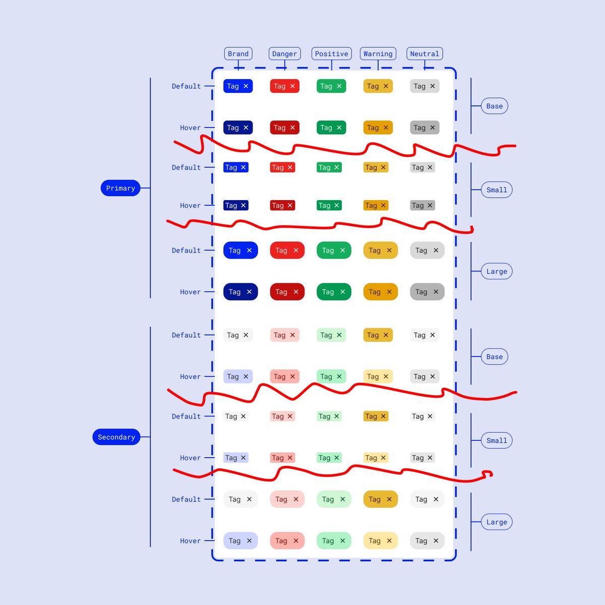
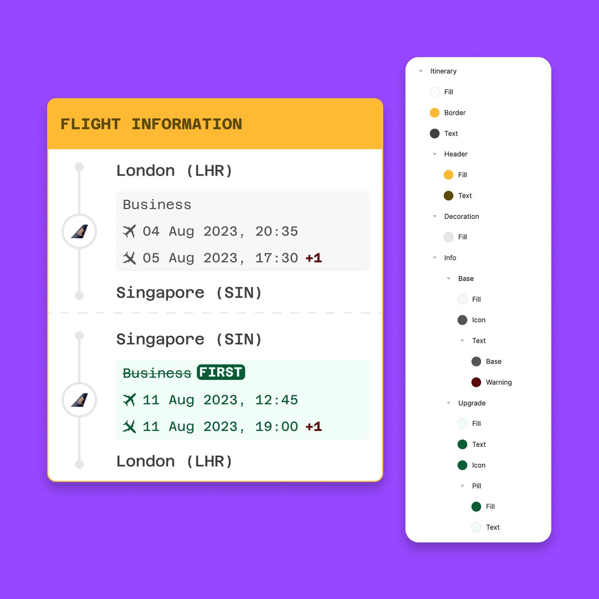
Looking at a component example helps visualise the control we get from this abstraction (how many times can I say this word?)
Here we see the Warning/Primary global token being sliced up into two component tokens: text and icon
Hyper-specificity helps with that future-proofing
Here we see the Warning/Primary global token being sliced up into two component tokens: text and icon
Hyper-specificity helps with that future-proofing

Again, that specificity but with a real component
This alert component's "component tokens" are associated with each child element
Alert/Warning/Background
Alert/Warning/Text
Alert/Warning/Border
Alert/Warning/Icon
States (hover, focus) would make them more specific too
This alert component's "component tokens" are associated with each child element
Alert/Warning/Background
Alert/Warning/Text
Alert/Warning/Border
Alert/Warning/Icon
States (hover, focus) would make them more specific too

As I mentioned earlier, you might not need that component level, because it could be over-designed
In this case, we might rely on the previous "global token" level at all stages
Warning/Accent
Warning/Tertiary
Warning/Secondary
In this case, we might rely on the previous "global token" level at all stages
Warning/Accent
Warning/Tertiary
Warning/Secondary

Global tokens become very useful for *new* ideas too
When designing, you likely won't be going deep on the component abstraction level, and just want to ideate on new things
This means we can use all global, descriptive, tokens to rapidly iterate
When designing, you likely won't be going deep on the component abstraction level, and just want to ideate on new things
This means we can use all global, descriptive, tokens to rapidly iterate

I mentioned naming conventions earlier and said they are done differently at different companies, which is great but means these things can be hard to learn
Some resources:
polaris.shopify.com/design/colors
pie.design/foundations/co…
primer.style/design/foundat…
Some resources:
polaris.shopify.com/design/colors
pie.design/foundations/co…
primer.style/design/foundat…

As rightly pointed out by @edgarasben & @auareyou, the style names here are perhaps a little misleading
Signaling usage intent at the first level & component at the second you could do something like:
Background/Warning
Border/Warning
Foreground/Warning
https://twitter.com/disco_lu/status/1638915567993192450?s=20
Signaling usage intent at the first level & component at the second you could do something like:
Background/Warning
Border/Warning
Foreground/Warning

@edgarasben @auareyou Oh also, these threads are mostly just me thinking out loud 💭
They are an open space for discussion and sharing too, so if your team are doing things you would like us to see, share as a reply!
They are an open space for discussion and sharing too, so if your team are doing things you would like us to see, share as a reply!
@edgarasben @auareyou A thread within a thread? Sure 😂
Here is a nice back and forth about the topic as well
Here is a nice back and forth about the topic as well
https://twitter.com/auareyou/status/1638928551377526784?s=20
• • •
Missing some Tweet in this thread? You can try to
force a refresh