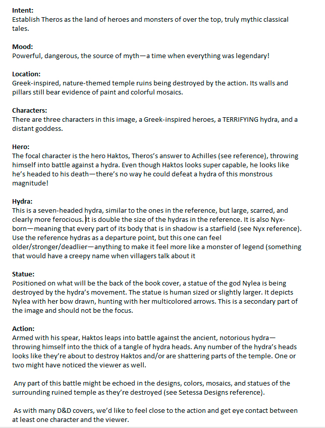
“Name Unknown” AD Taylor Ingvarsson #MTGMOM
Well, what can I say. The response to this has been incredible
Coming off a bad move, losing my cat, taking a break & coming back feeling like I had something to prove after a lot of MTG set FOMO led to this. Let's talk abt it
Thread->
Well, what can I say. The response to this has been incredible
Coming off a bad move, losing my cat, taking a break & coming back feeling like I had something to prove after a lot of MTG set FOMO led to this. Let's talk abt it
Thread->
First off if anyone's interested in a print, I appreciate the support! I don't have a good setup for signed prints, but that and playmats are being looked into!
(file is lightened to avoid an over-dark print)
inprnt.com/gallery/jasonr…
(file is lightened to avoid an over-dark print)
inprnt.com/gallery/jasonr…
Every so often I have a “new best” reflecting growth, either with “skill” or ideas. It's been happening pretty steadily even with less time for studies which makes me happy. Some notable ones through the years, to hopefully show it's possible to keep growing 

A lot comes together to make a new best, it can't happen all the time. Not only my skills, where I'm at in life/emotionally but also the creative team, concepts and art direction that provide the basis.
So-
So-
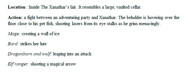
brief!
I was concerned from the get RE the complexity. That's 4 required characters already, with many more implied, in a grand setting, with a very specific formation. Thats... hard. But! I love narrative, and as a story beat at a desperate moment there's tons of room for drama
I was concerned from the get RE the complexity. That's 4 required characters already, with many more implied, in a grand setting, with a very specific formation. Thats... hard. But! I love narrative, and as a story beat at a desperate moment there's tons of room for drama

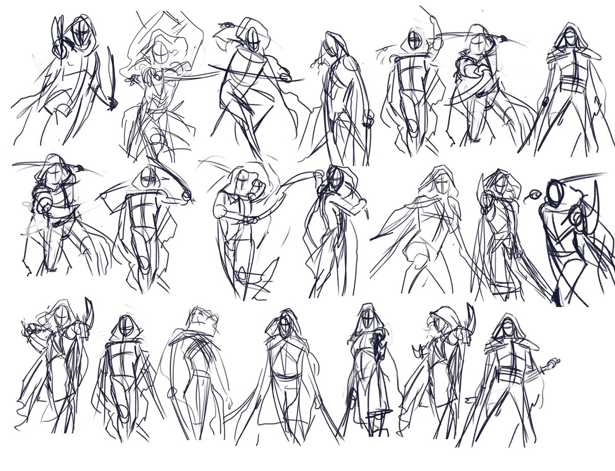
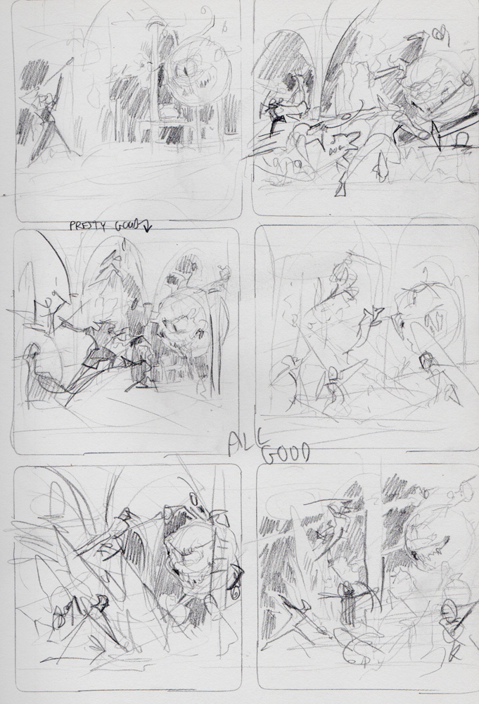
My pencil thumbnails for this one are on the much rougher side. Can't spend time detailing all of it, needed to just try to find... something to latch onto. Values? Shapes? a singular pose? something to "make" this. Top view, in-the-action, I'm trying anything 


I really struggled to refine this one into a usable, digital sketch to send in. Some early contenders were also central or "flatly" presented scenes, one from behind with Wrenn looking at us, another from above. was really trying to make the "wedge" shaped formation work 

My difficulty with this is best shown with this rough attempt at an eye-level, in-the-action view of the scene. Trying to fit the background, overlapping characters, figure out heights, where the feet are... but there's also less impact, less drama, less of what im interested in 
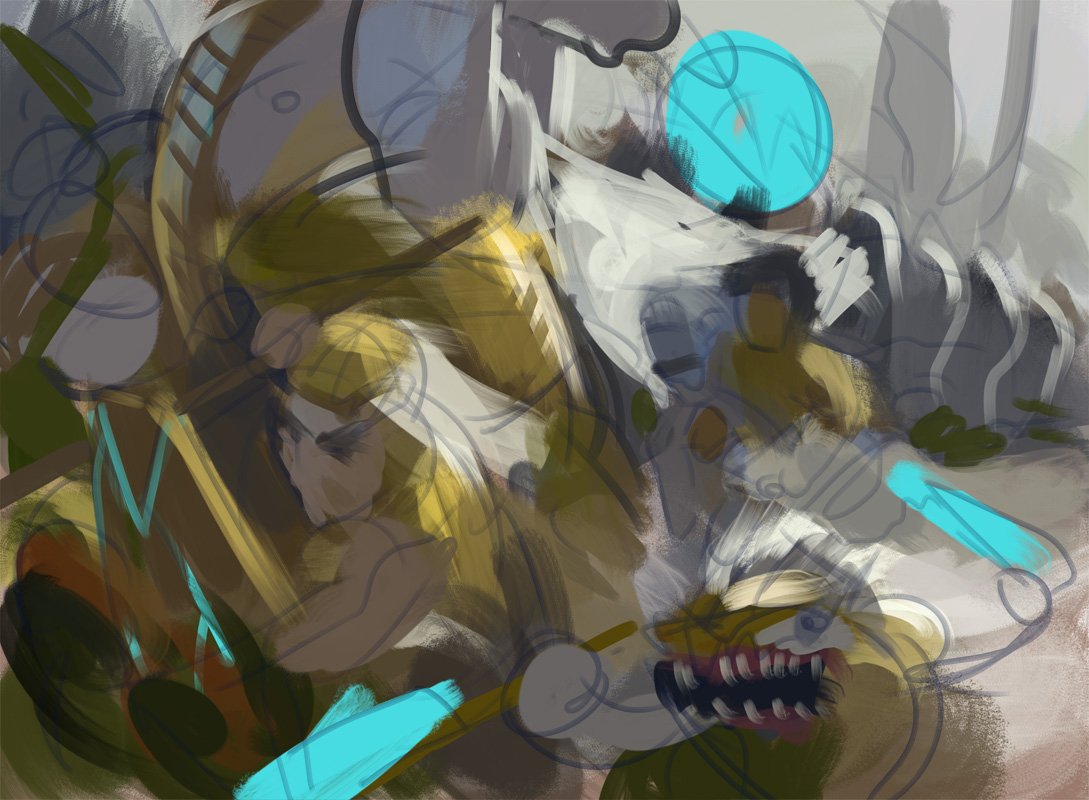
and so we get to this. An attempt at a classically composed scene, formal, flat, lateral movement. no real focal point (focus was on the wedge formation) but flagging Wrenn and her savior's heads with white capes for contrast created a minor one. Really wanted to do these. 

2 options, the white one is great because it's the more "main" baddies but as subtle and creamy as it was, gave an option for a darker contrast.
Also, here I'm interpreting that spearhead literally, trying to create that shape through colour and value:
Also, here I'm interpreting that spearhead literally, trying to create that shape through colour and value:

Trying to keep things cohesive and that wedge visible involves values, sure, but also colour. had to be verrrry careful about how I separated the two groups, especially in the warm colours. grey, yellow, orange for Mirrans, greens and reds for the baddies 

The darker, more classical one was chosen, so let's talk influences! One of the most discussed aspects is whether this is "Wrennaisance" art.
I'm not going to be too pedantic largely because my art history game is, noooot the best, so:
I'm not going to be too pedantic largely because my art history game is, noooot the best, so:
Renaissance art, a lot of the time, is what a lot of folks think a lot of European art was like before the impressionists and such came around. It's understandable because art history is complicated. but it's a little rougher in general than people think as - 


it starts right out of the medieval period! however there is some overlap/influence with other art movements that people mistake it for, like early-modern's baroque. Which IS an influence of mine, and one for the painting as well 


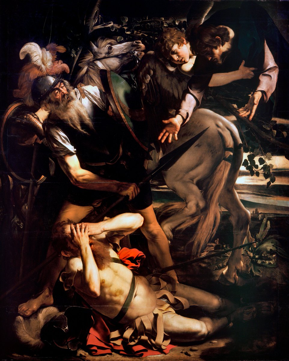

later in the 1800's you get other influences of mine like neoclassicism and romanticism, maybe mistaken for Ren art because of the similar subjects. but the fidelity and craft, if realistic depiction is the goal, is much further along. I like my waterhouse and Bougie too :) 


But this piece isn't just influenced by "classical" "old masters" or whtv you want to call anything before 1900. Donato's drama & Rockwell's flattening of perspective play a role in influencing me and this piece too.
In the end, the influences combine. I take it, it becomes me.

In the end, the influences combine. I take it, it becomes me.


I wasn't trying for a style, referencing any particular piece or movement or even time period. My main thought was how all those formally composed paintings created drama. I loved the idea that this could be a painting created -in world- to commemorate the Mirran's sacrifice
So let's go from high culture to a dozen of my hairy ass selves doing whatever here.
Seriously though it's this easy to create ref! A single light set in the right spot, holding a swaddled pillow as a stand-in then sitting on a chair for Wrenn. It's goofy as hell but it works
Seriously though it's this easy to create ref! A single light set in the right spot, holding a swaddled pillow as a stand-in then sitting on a chair for Wrenn. It's goofy as hell but it works
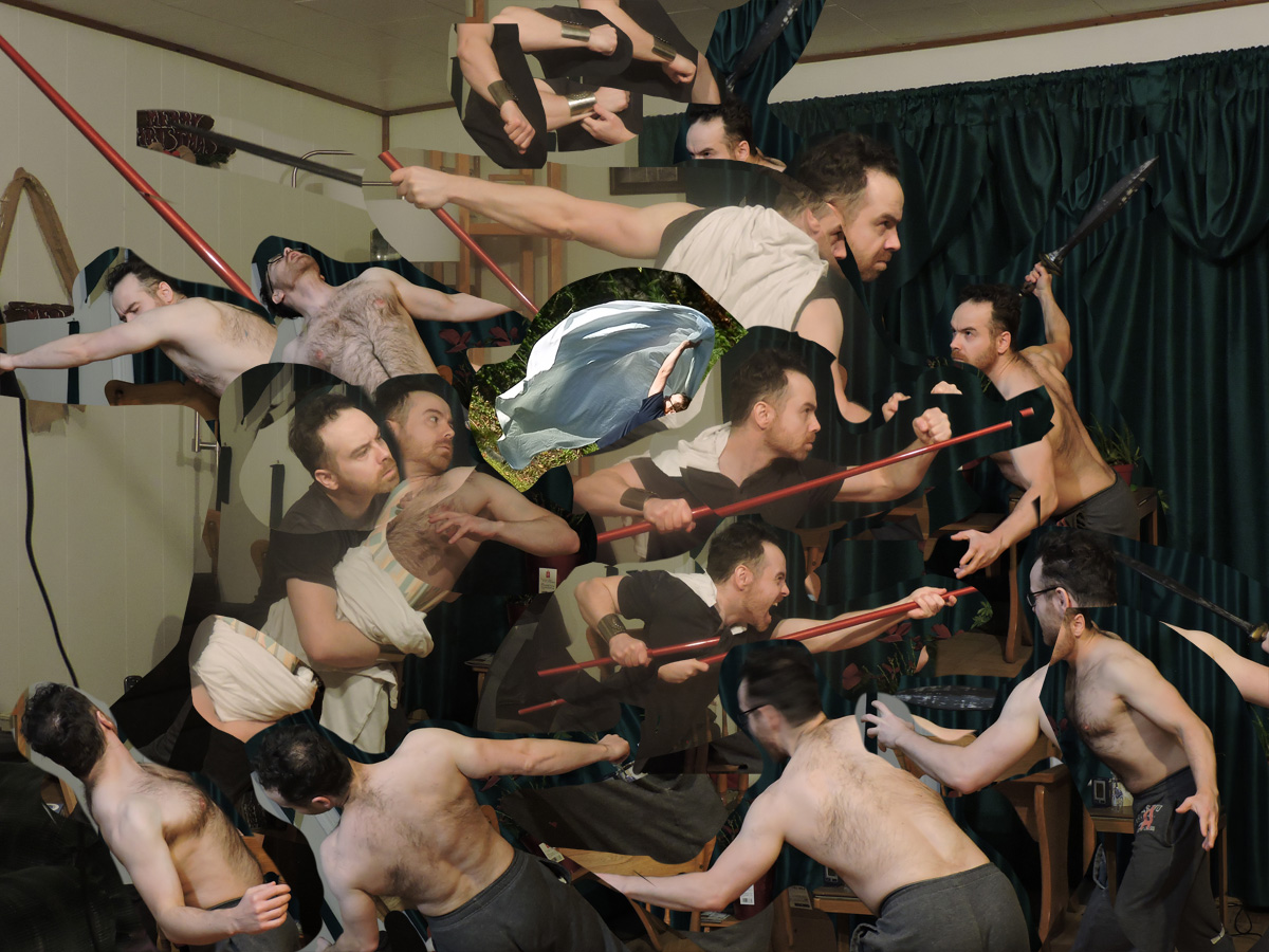
From there it's the usual: following my shot and gathered ref as a guide, I iterate on sketches, rough to tight. This one only had 3 passes because time was limited and there was soooo much to draw. I could have gotten more detailed but it'd have to do. 


After that I set the sketch to multiply & paint in the "rough colours" that are going to be representative of the final art, so i best get it right. I don't have to be too detailed, and maybe shouldn't, but making sure the right values and colours are mostly there is key 


Gif!
Lots of rendering in the end, w/ a great new brush from Kieran Yanner that helped
Cloaks! they represent each character: noble humans are flowing and graceful, goblin's is hunched & scrunched, and elephant's is bunched into a powerful mass like their arm
Lots of rendering in the end, w/ a great new brush from Kieran Yanner that helped
Cloaks! they represent each character: noble humans are flowing and graceful, goblin's is hunched & scrunched, and elephant's is bunched into a powerful mass like their arm
As we look at more close-ups I want to talk about something; about effort, and "raising the bar."
I'm incredibly humbled that folks responded as positively and strongly as they did with this. This feels like a new high water-mark for me. Proof I'm still improving.
But
I'm incredibly humbled that folks responded as positively and strongly as they did with this. This feels like a new high water-mark for me. Proof I'm still improving.
But

This image was a base pay card, 1k. it took a solid (as in, up, work, sleep) week to render this after the sketch was approved. A couple days for sketches. I don't think 1k pays for something of this (TBH) high quality that took, at minimum, 9 days of nonstop work. 

So no, this should not be "the new standard" for me, or any MTG artist.
I don't think it should take everything an artist has to work literally all day creating the best thing they've ever done to make, extrapolated, 3k a month. Before taxes.
So why the effort?
I don't think it should take everything an artist has to work literally all day creating the best thing they've ever done to make, extrapolated, 3k a month. Before taxes.
So why the effort?

Well, a lot of the reasons are the same as why I try my best each time.
One is, I like to do good work for who I'm working for. Not the suits or the company, but the creative team. I want them to be happy with choosing me. I want to impress them.
One is, I like to do good work for who I'm working for. Not the suits or the company, but the creative team. I want them to be happy with choosing me. I want to impress them.

I also want to impress my fellow artists! I don't know if we admit this often or not, but artists I think are in a constant cold war of trying to get each other to be fans XD Artists know how hard it is to do this, know the intricacies, so their approval... it means a lot. 

I also do it for the fans. I don't really know a ton about MTG, still, but I know a lot of people really care about it. My doing a good job is indicated often by how well the people who know the game the best connect with my art. i get to be a part of why they love the game :) 
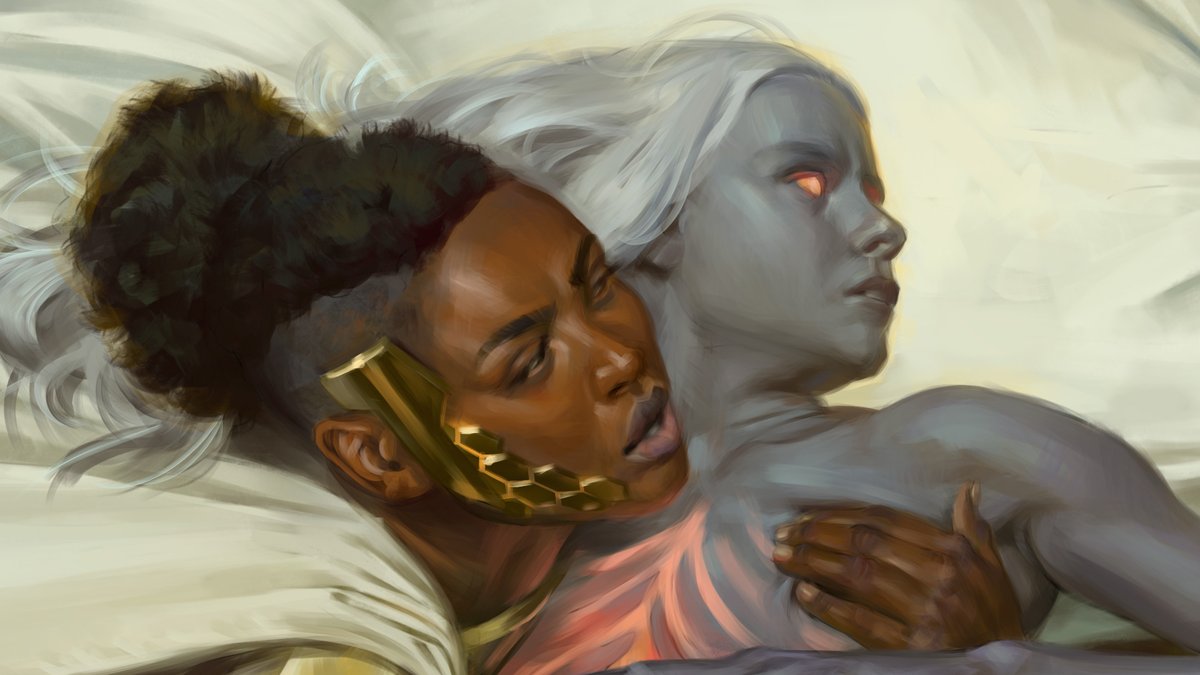
But mostly, I did it for me. I had something to prove. I was able to do the sketch I wanted, something narrative and full of drama, and I worked all evening every day because it was.... fun. It was very very satisfying working on this, seeing it come together & knowing -I- did it 

Yup, we're going there:
Fuck AI art. Please, try art. To be able to create something is a joy. It's even better when you see yourself improve. no you don't have to be a pro. anyone can get better at it and everyone who does should feel pride. it's an enjoyable thing to do.
Fuck AI art. Please, try art. To be able to create something is a joy. It's even better when you see yourself improve. no you don't have to be a pro. anyone can get better at it and everyone who does should feel pride. it's an enjoyable thing to do.

No it's not always fun. so much of it sucks, not just being exploited by companies not paying fare wages if you DO try to make a living, but confronting your own ego as you struggle to reshape the way your brain interprets the world. breaking pencils because faces don't work 


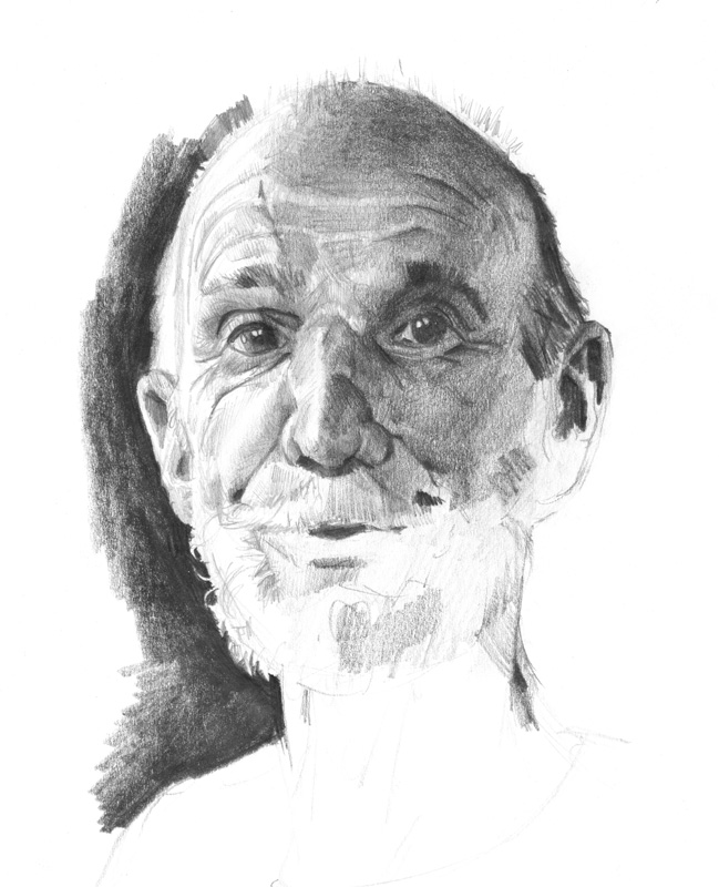


But it's not something to be automated away. There's a reason people (esp those who know the game) reacted to my latest piece the way they did. it's because I understand what I'm doing, and they understand that i understand.
Art is not just a picture. It's the connection.
Art is not just a picture. It's the connection.

I'm talking to you through pixels, trying to tell you that I understand what's happening in the scene, the world, the story. I understand why you're interested in all this & I understand how to present it to you & make it richer. I like this dramatic moment, & I want to share it 

You can get a pretty picture from a machine. One that could maybe render something "better" than me. Certainly quicker, and in huge quantity.
But there's no connection.
But there's no connection.
It doesn't know why you like it or what drama even is. it doesn't know why Wrenn's brow is slightly furrowed, why these gold-plated warriors are stoically pushing forward.
This piece worked because a human made it. Because humans made all the MTG art you love

This piece worked because a human made it. Because humans made all the MTG art you love


WotC has no plans to implement AI, as far as I know. A lot of companies don't. but a lot of them do. People have lost work already, and more probably will. Artists are scared.
If you like this piece, if it moved you, please remember a person created it.
Thanks for reading
If you like this piece, if it moved you, please remember a person created it.
Thanks for reading

Some extra bits!
* this is all digital, the only physical thing to auction are those terrible pencils above
** with this and upcoming work, musical inspiration played a bigger role. This one has a bf5 inspiration, esp when it gets going after halfway:
soundcloud.com/battlefield_of…
* this is all digital, the only physical thing to auction are those terrible pencils above
** with this and upcoming work, musical inspiration played a bigger role. This one has a bf5 inspiration, esp when it gets going after halfway:
soundcloud.com/battlefield_of…
• • •
Missing some Tweet in this thread? You can try to
force a refresh
 Read on Twitter


