This is starting to get ridiculous.
Global oceans have never been this warm: 20.1°C.
Does this help people outside the aerosol and Earth Energy Imbalance community understand the effects of reducing sulfur emissions over the oceans?
Global oceans have never been this warm: 20.1°C.
Does this help people outside the aerosol and Earth Energy Imbalance community understand the effects of reducing sulfur emissions over the oceans?
https://twitter.com/LeonSimons8/status/1641895970966487040
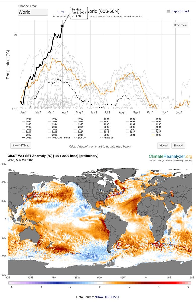
21.1°C that is..
See here all the past 42 years and the Sea Surface Temperature map (not anomalies).
Note that the Equatorial Pacific is still relatively cold. An El Niño event would have made SSTs much warmer still..
See here all the past 42 years and the Sea Surface Temperature map (not anomalies).
Note that the Equatorial Pacific is still relatively cold. An El Niño event would have made SSTs much warmer still..

This is clear from the Sea Surface Temperature Anomaly (SSTA) Difference from the Global Mean SSTA:

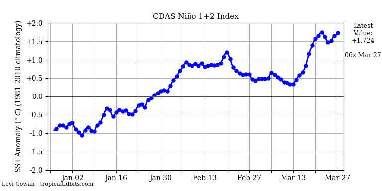
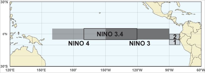
Niño 3.4 Index is still neutral.
And global surface air temperatures are kept relatively low by La Niña of the past months (~5 month delay).
And global surface air temperatures are kept relatively low by La Niña of the past months (~5 month delay).

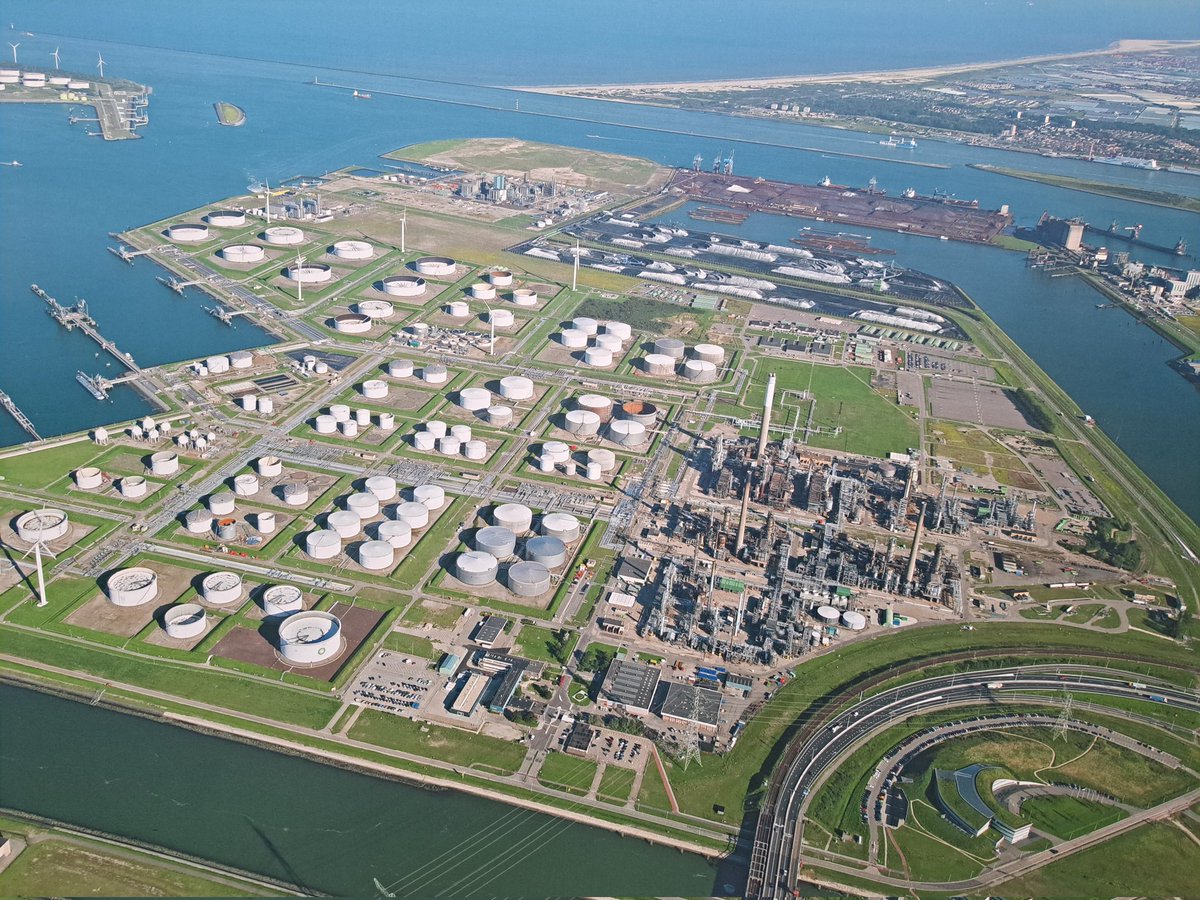
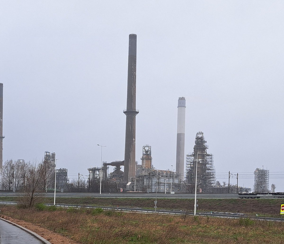
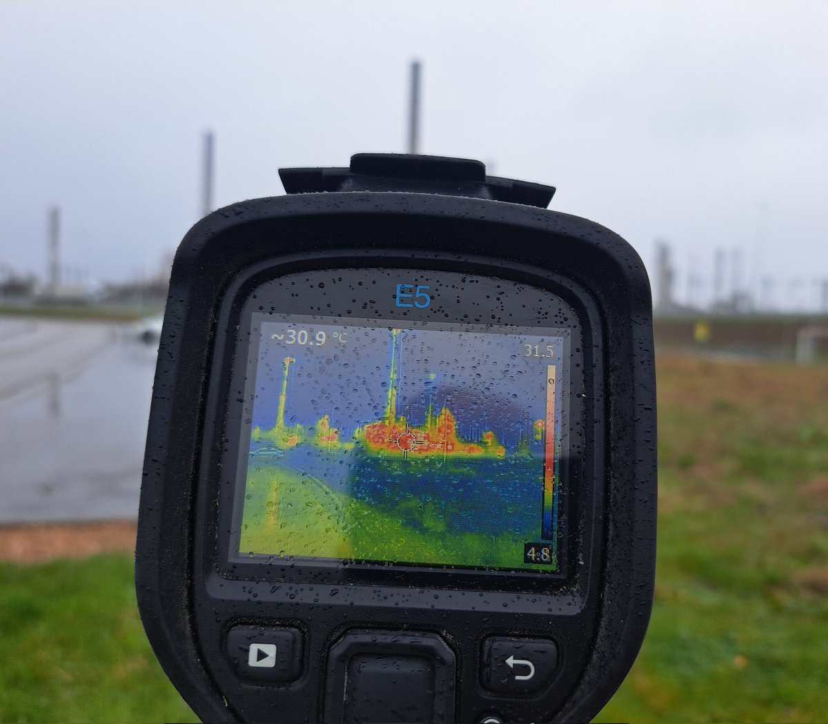
The International Maritime Organization (@IMOHQ) didn't do an extensive assessment of potential climatic effects of rapidly reducing sulfur fuels.
They did get an analysis done on Marine Cloud Brightening, which gives some insight in doing the opposite:
They did get an analysis done on Marine Cloud Brightening, which gives some insight in doing the opposite:


• • •
Missing some Tweet in this thread? You can try to
force a refresh