Got frustrated lately about how the transit map in KL is now inaccurate and even misinforming for many unfamiliar with the system
So here is a modified map of the Klang Valley transit map, which accurately shows the current service of the Ampang/Sri Petaling Lines and others:
So here is a modified map of the Klang Valley transit map, which accurately shows the current service of the Ampang/Sri Petaling Lines and others:

You can grab a high-resolution map download here: drive.google.com/file/d/1MREkAu…
A thread explaining the design process starts from here:
A thread explaining the design process starts from here:
Before you proceed, if you have read through the map, compared to the existing KL transit map, do you find the map to be improved, much more cluttered, or did not change your experience viewing the map compared to before?
If you think otherwise, do comment!
If you think otherwise, do comment!
First, a preface -
I wanted to produce a map that adheres with these principles:
- accurate at publication and easily understood
- makes minimal changes to the existing map
- minimise the introduction of new elements to fulfil the first principle
I wanted to produce a map that adheres with these principles:
- accurate at publication and easily understood
- makes minimal changes to the existing map
- minimise the introduction of new elements to fulfil the first principle
Hence, the map doesn’t:
1. Show the names and service patterns of all LRT replacement buses, as that adds clutter and bus services can change
2. Change the structure of the map - while the current map isn’t well designed, changing the form was not the focus - only changing errors
1. Show the names and service patterns of all LRT replacement buses, as that adds clutter and bus services can change
2. Change the structure of the map - while the current map isn’t well designed, changing the form was not the focus - only changing errors


With that out of the way, let’s discuss some of the major challenges I had editing the map, starting with the first one: how should non-active and special lines be shown on the map?
Precedence dictates that dashed lines means ‘not active’ but that took a paragraph to explain
Precedence dictates that dashed lines means ‘not active’ but that took a paragraph to explain

@JugCerovic’s then method of illustrating planned and upcoming lines by fading them struck me as a good idea - it can be easily understood to be a line that isn’t active
This is very much seen in the space of UX, where a faded button nowadays represent a “disabled” state
This is very much seen in the space of UX, where a faded button nowadays represent a “disabled” state


There was a phase where I struggled the choice between illustrating the ‘faded’ idea or just got rid of the lines that didn’t exist entirely (eg LRT3)
But this will break principle 2, and will disrupt the perception of the map to existing viewers, so the first option was chosen
But this will break principle 2, and will disrupt the perception of the map to existing viewers, so the first option was chosen


Lines under construction? Faded.
Lines suspended? Faded.
Lines shut down? Faded.
Problem? Solved.
Hotel? Trivago
Lines suspended? Faded.
Lines shut down? Faded.
Problem? Solved.
Hotel? Trivago


Now we have addressed how LRT3, KTM Skypark and Bandaraya-Sentul Timur should be shown, how should the masjid jamek-hang tuah be depicted?
I experimented with making the line a dashed line to illustrate a ‘special service’ with various lengths
I experimented with making the line a dashed line to illustrate a ‘special service’ with various lengths


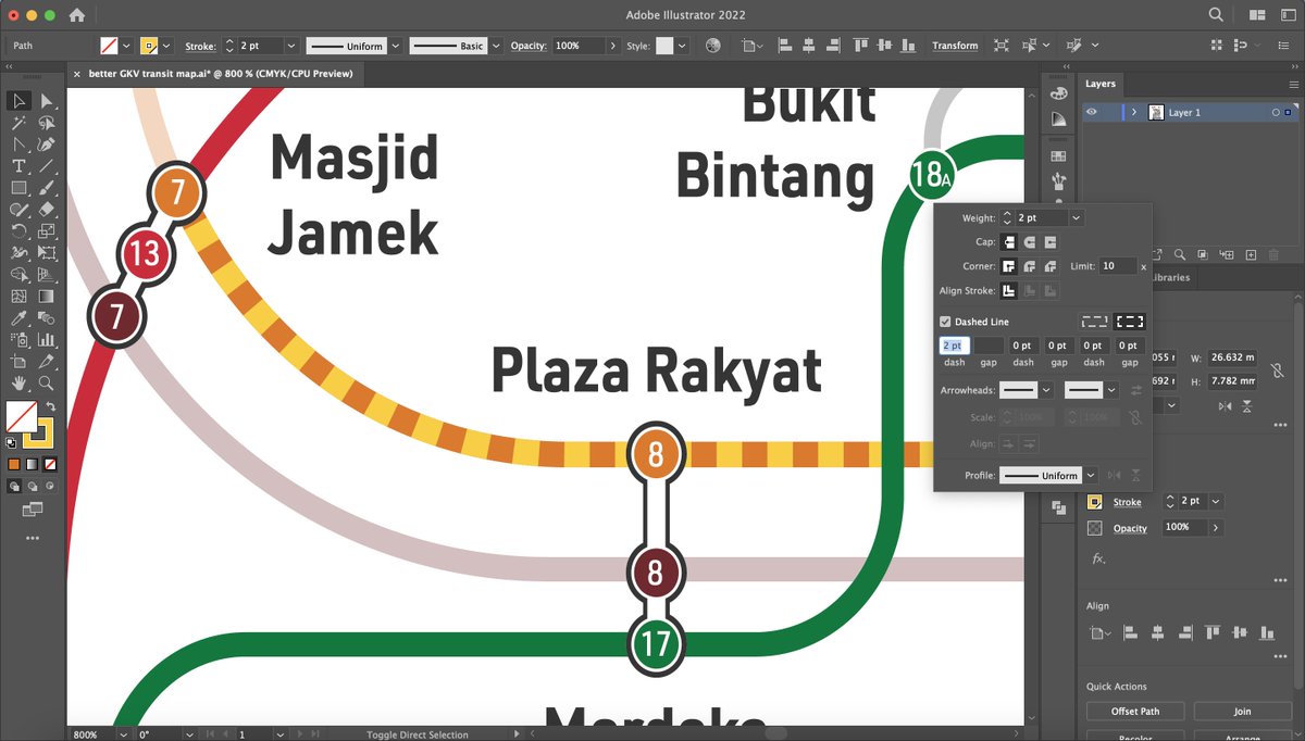

Eventually, I settled on a length I liked (its 7pt), and started experimenting the colours of the dashes.
I initially chose yellow to represent ‘warning’ but that had poor contrast with AGL, then switched to black, but that had poor contrast with SPL. Changing to white works tho
I initially chose yellow to represent ‘warning’ but that had poor contrast with AGL, then switched to black, but that had poor contrast with SPL. Changing to white works tho


A bit of feedback and the dashed line was later changed to be a dashed line enclosed in the colour line itself
This made it a bit more visible while viewed from a distance, while also distancing from the existing precedence of using dashes to denote ‘under construction’
This made it a bit more visible while viewed from a distance, while also distancing from the existing precedence of using dashes to denote ‘under construction’

To wrap up, we have now created two new lines that requires the modification of the map legend to explain the functions of the lines.
Here, you can also see KTM Skypark line is now marked as ‘suspended’, reflecting its current status since February
Here, you can also see KTM Skypark line is now marked as ‘suspended’, reflecting its current status since February


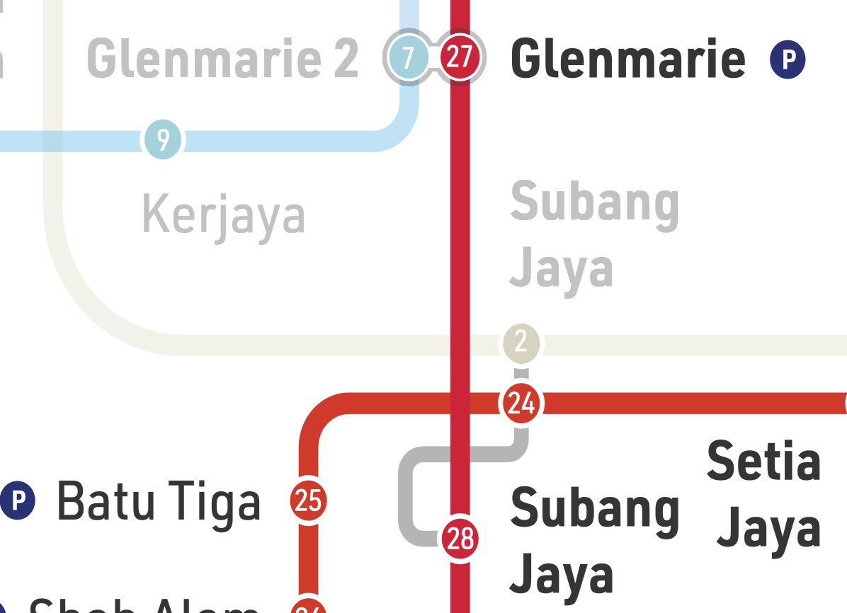
The legend includes the illustration of a grey line and a faded line, which looks confusing when looked together as they are both in similar shades of grey
They say old is gold and the previous way of showing connecting stations is indeed gold than a grey, squiggly line
They say old is gold and the previous way of showing connecting stations is indeed gold than a grey, squiggly line

Moving on: how do we communicate about the service disruption between masjid jamek & sentul timur?
Since I chose not to illustrate the shuttle bus routes, showing which stations where one can board the shuttle bus serves best
This is what was similarly done in London before
Since I chose not to illustrate the shuttle bus routes, showing which stations where one can board the shuttle bus serves best
This is what was similarly done in London before


As its established that yellow would be the theme of ‘warning’ (the difference with MRT2’s yellow is that the ‘warning; yellow is more luminescent), next part is to determine the colour of the bus icon
Pure white or blacks didn’t look good but the 75% black looks a bit nicer
Pure white or blacks didn’t look good but the 75% black looks a bit nicer
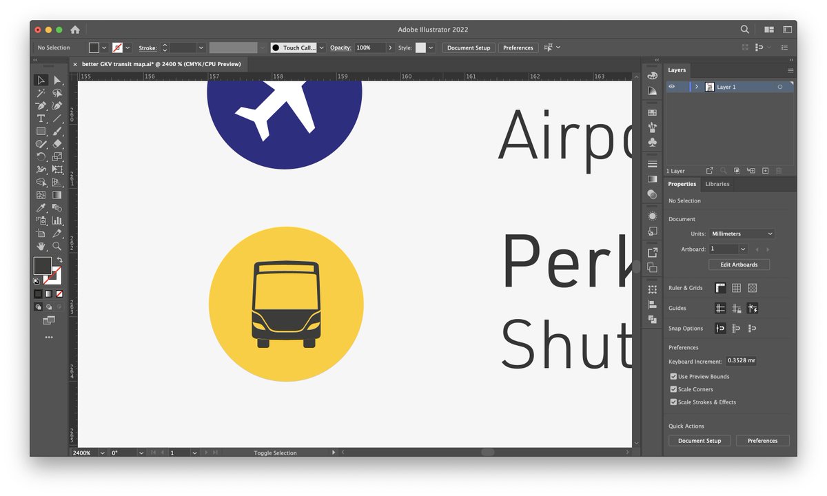


Since we want to establish a higher order of service hierarchy given the importance of the information, the size of the icons are 25% larger than the existing icons


To determine the distance between the icons and the station text names, I had to measure them and this is very annoying - it seems that no one icon has the same spacing distance from the next one!
the widths varied from 0.77 to 0.81mm, so I settled on 0.75mm as a safe choice
the widths varied from 0.77 to 0.81mm, so I settled on 0.75mm as a safe choice


There are some instances where the icons could not be there as it is affecting the space of the text of other stations, so it had to be stacked vertically.
Interestingly, most station icons are spaced approximately 0.83mm vertically, so I went with that
Interestingly, most station icons are spaced approximately 0.83mm vertically, so I went with that


The next undertaking is to provide the context for Ampang/Sri Petaling Line’s dysfunction.
For this, an infobox was created to allow for commuters to easily understand:
- the line affected
- the stations affected
- when will it be fixed
- alternative transportation provided
For this, an infobox was created to allow for commuters to easily understand:
- the line affected
- the stations affected
- when will it be fixed
- alternative transportation provided

The infobox is divided into two parts:
- context
- solution
Most people may know the context but want to know or confirm the solution, and providing an easy way to show this is key
A contrasting design works best as it creates a ‘separation’ of idea while being themed, example:
- context
- solution
Most people may know the context but want to know or confirm the solution, and providing an easy way to show this is key
A contrasting design works best as it creates a ‘separation’ of idea while being themed, example:

Since there is nothing from the document itself I can extract to illustrate ‘fixing, I just created a spanner icon
it was an easy creation, didn’t think hard and just created it under 2 minutes
it was an easy creation, didn’t think hard and just created it under 2 minutes
Contemplated to add the ‘download PULSE’ stock message as part of the infobox that would add to clutter, so that would need to be foregone.
In the meantime, here is an image of how close it could’ve been integrated into the infobox:
In the meantime, here is an image of how close it could’ve been integrated into the infobox:

An interesting design question: as stations that are not active are faded, should Sultan Ismail, a station with no train nor shuttle bus service, be shown faded as well?
It can be argued for that it is a connection to Medan Tungku, but really no one is walking for 10mins for it
It can be argued for that it is a connection to Medan Tungku, but really no one is walking for 10mins for it


Also, this map is riddled with design inconsistencies - like, why are the numbers not centred against the circles they’re in?
It gets better when you realise that even the circles arent even full circles…
It gets better when you realise that even the circles arent even full circles…


A small design touch - add the date of publication of the map!
This practice has unfortunately been discontinued since the publication of the newer maps, as older maps contain the dates of when they are published
This practice has unfortunately been discontinued since the publication of the newer maps, as older maps contain the dates of when they are published


To sum it up - this was an impulsive, 7-hour session of me suffering with illustrator to show what that has been itching in my brain since February
The map is likely to be false for 6 months so RapidKL should update their maps to not trick their customers lowyat.net/2023/294675/am…
The map is likely to be false for 6 months so RapidKL should update their maps to not trick their customers lowyat.net/2023/294675/am…
The map is also licensed under Creative Commons under the following terms: creativecommons.org/licenses/by-nc…
If you try and print this on a t shirt and sell it without giving me a good cut I will do unspeakable things
If you try and print this on a t shirt and sell it without giving me a good cut I will do unspeakable things
Anyways, this has been a cool and fun project to do, while also relearning the loops of illustrator, as I havent touched that in a while.
What’s the one thing you liked or hated about the map? Suggestions? Would love to hear feedback!
What’s the one thing you liked or hated about the map? Suggestions? Would love to hear feedback!
With the modified map, this reaction will be quite common - the realisation that some services that we think are there, but no longer exists
This is why conveying accurate and timely information via the transit map is important, especially when it is a very powerful design tool
This is why conveying accurate and timely information via the transit map is important, especially when it is a very powerful design tool
https://twitter.com/aruncipun/status/1648150213125890048
But tldr why KTM skypark is suspended: low ridership, northern commuter sector needed trains and suspension meant funds can now be used to provide free train rides for students and PWDs
nst.com.my/amp/news/natio…
nst.com.my/amp/news/natio…
The ball’s court is now in @myrapidkl and @MOTMalaysia to now fix our transit map
Could this be an irresistible offer they can’t turn down?
Could this be an irresistible offer they can’t turn down?

TIL this exists
But yes, you can also grab a ready-to-go version instead of a PDF supplied by doing this too!
And a tip: the QR code at the bottom right correctly links to the modified map
But yes, you can also grab a ready-to-go version instead of a PDF supplied by doing this too!
And a tip: the QR code at the bottom right correctly links to the modified map
https://twitter.com/spencerificvsco/status/1648126331752951809
While doing this will conform with the first principle (accurate information), this will be at the expense of the second (minimal change) and third (minimal introduction of new ideas) principle
Also, until ERL changes the names to reflect this (TBD July), the names stands as-is
Also, until ERL changes the names to reflect this (TBD July), the names stands as-is
https://twitter.com/mnhidayatfisal/status/1648083317898747905
• • •
Missing some Tweet in this thread? You can try to
force a refresh


![A notice on KTMB's online ticketing site [Important] Larangan Basikal 28 Mar 2024 10:02 Semua jenis basikal tidak dibenarkan di dalam ETS, KTM Intercity, Shuttle Timuran dan Shuttle Tebrau All types of bicycles are not allowed onboard ETS, KTM Intercity, Shuttle Timuran dan Shuttle Tebrau](https://pbs.twimg.com/media/GKLHiqzaQAE-o6h.jpg)